Viene visualizzato lo strumento editor di report con il riquadro Aggiungi dati al report aperto. Nel riquadro sono presenti due schede: Connessione ai dati e Le mie origini dati.
Scopri di più sui connettori e sulle origini dati nell'argomento Connessione ai dati.
Nella scheda Connessione ai dati, seleziona un connettore, crea una nuova origine dati e aggiungila al report:
Seleziona il tipo di dati da visualizzare.
Indica il tuo account o altri dettagli.
In basso a destra, fai clic su Aggiungi.
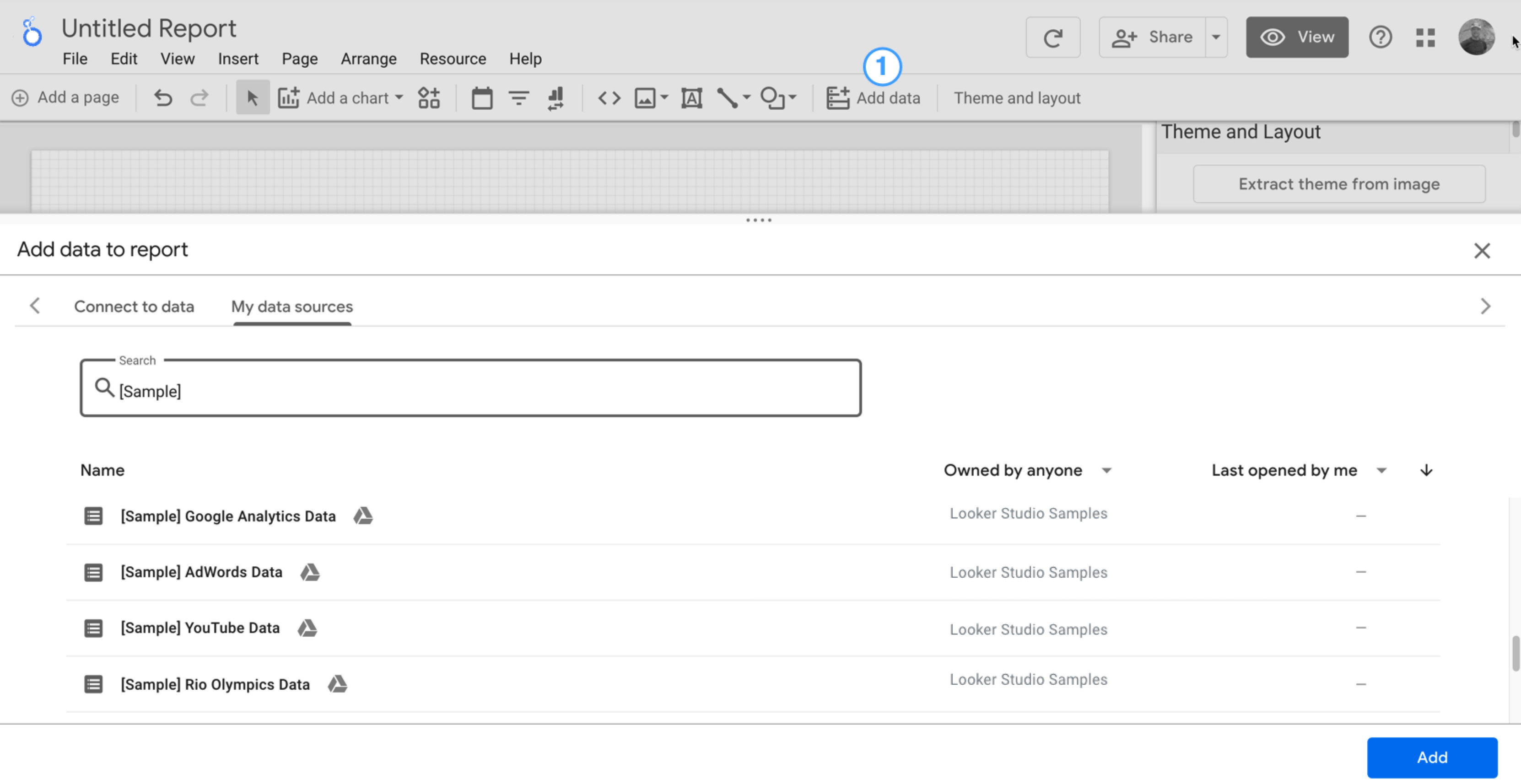
Utilizza Le mie origini dati per aggiungere un'origine dati esistente al report:
La scheda Le mie origini dati include una serie di origini dati di esempio.
Per seguire questo tutorial, seleziona l'origine dati [Sample] GA4 - Google Merchandise Store. Se aggiungi un'origine dati diversa, i risultati potrebbero variare rispetto a quelli descritti nei passaggi di questo tutorial.
Individua l'origine dati che ti interessa.
In basso a destra, fai clic su Aggiungi.
L'origine dati viene aggiunta al report.
Viene visualizzata una tabella con i campi di questa origine dati.
Per impostazione predefinita, il tipo di layout è impostato su Layout a mano libera. Per utilizzare un report adattabile, seleziona il tipo Layout adattabile. Puoi modificare l'impostazione del layout in un secondo momento.
Un report senza un formato prestabilito è personalizzato per gli schermi dei computer. Scegli questo tipo di report se vuoi un controllo perfetto sul posizionamento e sul dimensionamento di ogni componente del report.
Un report adattabile si adatta bene a molte dimensioni dello schermo diverse. Scegli questo tipo di report se prevedi che gli utenti visualizzino regolarmente il report su un tablet o un altro dispositivo mobile.
In alto a sinistra, assegna un nome al report facendo clic su Report senza titolo e inserendo un nuovo nome.
(Facoltativo) Aggiungi una descrizione al report facendo clic sul menu con tre puntini e selezionando Dettagli. Poi aggiungi una descrizione al campo Descrizione.
Aggiungi altri dati
Per aggiungere altre origini dati a un report, fai clic su Aggiungi dati nella barra degli strumenti.
Passaggio 2: aggiungi un altro grafico al report
Il grafico delle serie temporali mostra l'andamento dei dati nel tempo.
Nella barra degli strumenti, fai clic su Aggiungi un grafico.
Seleziona un grafico Serie temporali.
Fai clic sul canvas nel punto in cui deve comparire il grafico.
Looker Studio aggiunge automaticamente la dimensione Data e la metrica Visualizzazioni (supponendo che tu stia utilizzando un'origine dati Analytics).
Per modificare la sua posizione, trascinalo oppure selezionalo e spostalo con i tasti freccia della tastiera.
Per regolare le dimensioni del grafico, selezionalo e trascina un angolo o un punto intermedio.
Analizziamo il grafico per Categoria dispositivo:
Assicurati che il grafico delle serie temporali sia selezionato.
A destra, nel riquadro Dati, utilizza lo strumento di ricerca per trovare la dimensione Categoria del dispositivo.
Trascina il campo e rilascialo sulla destinazione Dimensione di distribuzione.
Il grafico ora dovrebbe mostrare le serie di dati per le varie categorie di dispositivi (Dispositivi mobili, Computer e Tablet).
Passaggio 3: applica uno stile al report
I temi preimpostati ti consentono di applicare opzioni di colore e stile all'intero report.
Modifica il report.
Nella barra degli strumenti, fai clic su Tema e layout.
Nella scheda TEMA, fai clic sul tema da applicare.
Puoi personalizzare qualsiasi tema preimpostato. Ad esempio, puoi selezionare un colore di sfondo diverso che si adatti meglio al tuo brand:
Nel riquadro Tema e layout, fai clic su Personalizza.
Scorri verso il basso fino alla sezione Sfondo e bordo.
Utilizza il selettore colori per impostare il colore di Sfondo che preferisci. Che ne dici di un rosa pesca?
Passaggio 4: aggiungi un banner
Per l'intestazione del report, utilizza un rettangolo colorato come sfondo del banner.
Seleziona il componente Pagina facendo clic su un punto qualsiasi della griglia.
Seleziona lo strumento Rettangolo dalla barra degli strumenti.
Disegna un rettangolo sulla parte superiore della pagina.
A destra, nel riquadro Proprietà rettangolo, imposta il colore di sfondo del rettangolo su blu.
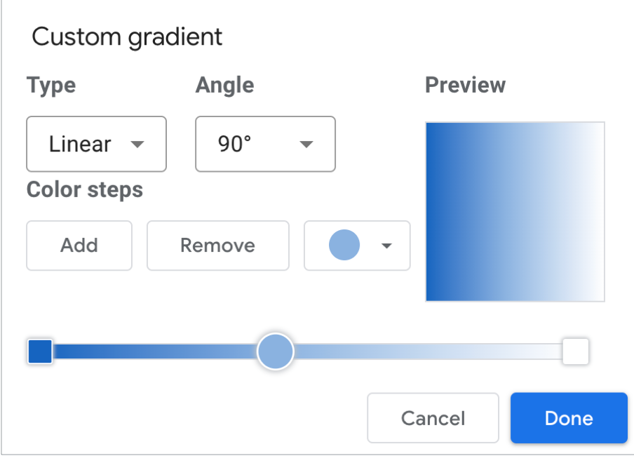
Crediti extra! Aggiungi un gradiente al banner.
Quando un colore sfuma gradualmente nell'altro si ha un gradiente. I gradienti sono un'opzione della proprietà del colore di sfondo.
Fai clic sul controllo relativo al colore di sfondo: .
Fai clic su Gradiente.
I campioni di colore a destra e a sinistra mostrano i colori dell'inizio e della fine della sfumatura. Per selezionare il colore, puoi immettere i valori esadecimali specifici del colore, sceglierlo dalla tavolozza oppure utilizzare i dispositivi di scorrimento verticale.
La freccia di orientamento stabilisce la direzione del gradiente.
Passaggio 5: aggiungi un titolo al report
Lo strumento di testo ti consente di inserire annotazioni nei report e nei grafici.
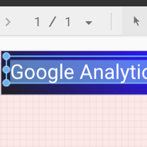
Seleziona lo strumento Testo dalla barra degli strumenti.
Disegna una casella di testo dentro il rettangolo del banner.
Digita Google Analytics Demo Dashboard nel campo.
Evidenzia il testo. Utilizza il riquadro Proprietà testo a destra per modificare il colore e la dimensione dei caratteri in base alle tue preferenze.
Ehi. Dov'è il pulsante SALVA?
Looker Studio salva automaticamente ogni modifica apportata, quindi non c'è bisogno di fare clic su Salva quando modifichi un report. Meglio di così…
[[["Facile da capire","easyToUnderstand","thumb-up"],["Il problema è stato risolto","solvedMyProblem","thumb-up"],["Altra","otherUp","thumb-up"]],[["Difficile da capire","hardToUnderstand","thumb-down"],["Informazioni o codice di esempio errati","incorrectInformationOrSampleCode","thumb-down"],["Mancano le informazioni o gli esempi di cui ho bisogno","missingTheInformationSamplesINeed","thumb-down"],["Problema di traduzione","translationIssue","thumb-down"],["Altra","otherDown","thumb-down"]],["Ultimo aggiornamento 2025-09-04 UTC."],[],[],null,["# Tutorial: Create a new report\n\nIn this tutorial, you'll learn how to create a new report in Looker Studio.\n\nStep 1: Create a new blank report\n---------------------------------\n\n1. [Sign in to Looker Studio.](https://lookerstudio.google.com)\n\n2. Click **Create** and then select **Report**.\n\n3. You'll see the report editor tool, with the *Add data to report* panel open. This panel has two tabs: *Connect to data* and *My data sources*.\n\n \u003e You'll learn more about connectors and data sources in the [Connect to your data](/looker/docs/studio/about-connectors-data-sources-and-credentials) topic.\n 1. In the *Connect to data* tab, select a [connector](/looker/docs/studio/connector), create a new data source, and add that to your report:\n\n 1. Select the type of data that you want to visualize.\n 2. Provide your account or other details.\n 3. In the bottom right, click **Add**.\n 2. Use *My data sources* to add an existing [data source](/looker/docs/studio/data-source) to your report:\n\n \u003e \u003cbr /\u003e\n \u003e\n \u003e The **My data sources** tab includes a number of sample data sources.\n \u003e\n \u003e To follow along with this tutorial, select the `[Sample] GA4 - Google Merchandise Store` data source. If you add a different data source, your results may vary from the steps described in this tutorial.\n \u003e\n \u003e \u003cbr /\u003e\n \u003e\n \u003e | **Tip:** If you have a lot of data sources, use the search bar to locate the data source that you want.\n \u003e |\n \u003e | \u003cbr /\u003e\n \u003e |\n \u003e \u003cbr /\u003e\n \u003e\n 1. Locate the data source that you want.\n 2. In the bottom right, click **Add**.\n 3. The data source is added to your report.\n4. A table appears with fields from that data source.\n\n Use the [properties panel](/looker/docs/studio/properties-panel) on the right to change the data and style of the table.\n5. By default, the layout type is set to **Freeform layout** . To use a [responsive report](/looker/docs/studio/create-a-responsive-report) instead, select the **Responsive layout** type. You can change the layout setting later.\n\n - A freeform report is tailored for desktop screens. Choose this report type if you want pixel-perfect control over the placement and sizing of each report component.\n - A responsive report scales well across many different screen sizes. Choose this report type if you expect your users to regularly view the report on a tablet or other mobile device.\n6. In the top left, name your report by clicking *Untitled Report* and then entering a new name.\n\n7. (Optional) Add a description to your report by clicking the three-dot menu and selecting **Details** . Then add a description to the **Description** field.\n\n### Add more data\n\nTo add more data sources to a report, in the toolbar, click **Add data**.\n\nStep 2: Add another chart to the report\n---------------------------------------\n\nThe time series chart plots data over the course of time.\n\n1. In the toolbar, click **Add a chart**.\n\n2. Select a **Time series** chart .\n\n3. Click the canvas where you want the chart to appear.\n\n4. Looker Studio automatically adds the *Date* dimension and the *Views* metric (assuming you're using an Analytics data source).\n\n5. To adjust the chart's position, drag it, or select the chart and move it by using your keyboard arrow keys.\n\n | **Tip:** Each press of the arrow key moves the chart one full column or row (10 px) on the grid. Hold the Shift key down while using your arrow keys to nudge the selected components into place one pixel at a time.\n6. To adjust the chart's size, select it, and then drag a corner or mid-line point.\n\n7. Break down the chart by *Device Category*:\n\n 1. Make sure that the time series chart is selected.\n 2. On the right, in the **Data** panel, use the search tool to find the *Device Category* dimension.\n 3. Drag the field and drop it on the **Breakdown Dimension** target.\n\nYour chart should now display data series for the different device categories (Mobile, Desktop, and Tablet).\n\nStep 3: Style the report\n------------------------\n\nPreset themes let you apply color and style options to your entire report.\n\n1. Edit the report.\n2. In the toolbar, click **Theme and layout**.\n3. In the THEME tab, click the theme that you want to apply.\n\nYou can customize any of the preset themes. For example, you can select a different background color that better matches your brand:\n\n1. In the *Theme and Layout* panel, click **Customize**.\n2. Scroll down to the *Background and Border* section.\n3. Use the color picker to set the **Background** color to your favorite color. Something in a mauvy-peach, perhaps?\n\nStep 4: Add a banner\n--------------------\n\nUse a colored rectangle as a background banner for your report header.\n\n1. Select the [Page](/looker/docs/studio/page) component by clicking anywhere in the grid area.\n2. Select the **Rectangle** tool from the toolbar.\n3. Draw a rectangle across the top of the page.\n4. On the right, in the *Rectangle Properties* panel, set the rectangle background color to blue.\n\n#### Extra credit! Add a gradient to the banner.\n\nWhen one color fades into another, the effect is called a gradient. Gradients are an option of the background color property.\n\n1. Click the background color control:\n2. Click **Gradient**.\n\nThe left and right color swatches determine the starting and ending colors. Enter the specific color hex values, choose from the palette, or use the vertical sliders to select the color.\n\nThe orientation arrow controls the flow of the gradient.\n\nStep 5: Add a title to the report\n---------------------------------\n\nThe text tool lets you annotate your reports and charts.\n\n1. Select the **Text** tool from the toolbar.\n2. Draw a textbox inside the banner rectangle.\n3. Type `Google Analytics Demo Dashboard` in the field.\n4. Highlight the text. Use the *Text Properties* panel on the right to change the font color and the font size to something that looks nice to you.\n\n\u003e #### Hey! Where's the SAVE button?\n\u003e\n\u003e Looker Studio automatically saves every change you make, so there's no need to click **Save** when editing a report. Pretty sweet!\n\nNext steps\n----------\n\n[Add more charts to your report.](/looker/docs/studio/tutorial-add-charts-to-your-report)"]]