The dimension value color map is a table of the dimension values that appear in your report, with an associated color for each value. Charts that use the color by dimension values option get their colors from this map. The dimension value color map is created automatically from the data in your report. You can also edit the map directly to add values and change colors.
How the dimension value color map works
For editors
Whenever you add or edit a chart, any new dimension values that are displayed by that chart are added to the map. The colors in the map come from the report-level color theme that is currently in effect when the values are added.
Example
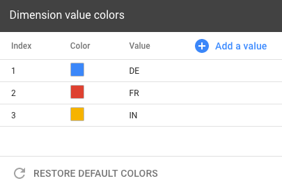
In a new blank report, the dimension value color map is empty. If you add a pie chart with the Country dimension and limit it to three slices, the dimension value color map now contains three values: one for each of the countries that appears in the chart.

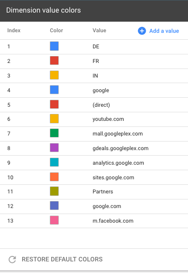
If you then edit the chart and increase the number of slices to 10, the new country values are added to the dimension value color map.
Next, you add a time series that is broken down by the Source dimension. The new dimension values are added to the map, so it now includes items like " google ," "( direct )", " youtube.com ," etc., along with colors for each value.

As you edit the report, only the dimension values that are actually displayed in the charts are added to the dimension value color map. Paginated charts, or charts that contain data only for certain date ranges, won't be added to the map until those values are actually displayed.
The dimension value color map can contain a maximum of 1,000 entries. If the map exceeds this limit, you'll be prompted restore the default colors. Currently, there is no way to selectively remove values from the map.
For viewers
When someone views dimension values that haven't been added to the dimension value color map, Looker Studio will select colors automatically. These colors might be different for different viewers, and they won't be added to the map.
Manage dimension value colors
To edit the dimension value color map, follow either of these methods:
- From the Theme and Layout panel, on the THEME tab, in the Primary styles section, click Manage dimension value colors.
- From the Resource menu, click Manage dimension value colors.
Add a new value to the map
To add an individual value to the dimension value color map, follow these steps:
- Edit the dimension value color map by using one of the methods that was described previously .
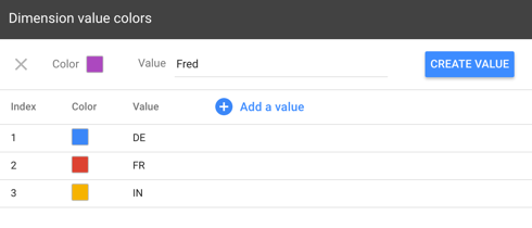
- Click Add a value .
- Click the color swatch to select a new color, if desired.
- Enter the new dimension value.
- Click CREATE VALUE .
 /><>
/><>
Change the color of an existing value
To change a dimension value's color, follow these steps:
- Edit the dimension value color map by using one of the methods that was described previously .
- Locate the dimension value to be changed (use the Search box on the right if you have a lot of values).
- Click the color swatch for that dimension value.
- Select the new color.
Restore default colors
To reset the dimension value color map, follow these steps:
- Edit the dimension value color map by using one of the methods that was described previously .
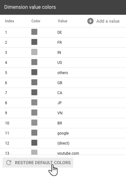
- Click RESTORE DEFAULT COLORS .

Important: Restoring the dimension value color map will discard any values that you've added manually. In addition, the new map will only contain values for the charts that are currently displayed on the report page. Restoring the colors cannot be undone , so proceed with caution.
