The information in this article provides advice and in-depth information about data blending to help you understand how blending works and to solve complex use cases. To get the most from this article, you should already be familiar with the basics of data blending, which are covered by the other articles in this topic.
Blends should contain only a subset of the available data
As a best practice, you should only include the specific fields you'll want to visualize in charts that are based on a blend. Here's why this is important:
- Blending can create very large datasets, which can lead to slow performance and possibly higher query costs for paid services such as BigQuery.
- Charts that are based on blends calculate all rows in the blend even if they are not used in the chart.
- For example, say you create a blend containing 10 fields. You then define a chart that only uses 1 of those fields. Looker Studio calculates the 10-field blend and then queries that 1 field in the output of the blend to create the chart.
- Reaggregation only happens if your blend contains a subset of the underlying data.
Use blending to reaggregate metrics
Metrics that you include from the underlying data source become unaggregated numbers in a blend. When the blend includes less than the full set of fields from the underlying data source, these numbers are reaggregated based on the new data. Using blending in this way can be useful if you need to apply a different aggregation to an already aggregated field, such as calculating an average of averages.
See Use blending to reaggregate data for more information.
Create blends from a single data source
Blends don't have to use different data sources. You may also find it useful to reaggregate data by blending multiple tables from the same data source.
For example, say you have a dataset that contains population data for the top three counties in the most populous US states, as shown in the following table:
| State |
County |
Population (2023 Estimate) |
|---|---|---|
| California |
Los Angeles County |
10,014,009 |
| California |
San Diego County |
3,298,634 |
| California |
Orange County |
3,186,989 |
| Texas |
Harris County |
4,731,145 |
| Texas |
Dallas County |
2,613,539 |
| Texas |
Tarrant County |
2,110,640 |
| New York |
Kings County (Brooklyn) |
2,736,074 |
| New York |
Queens County |
2,405,464 |
| New York |
Bronx County |
1,418,890 |
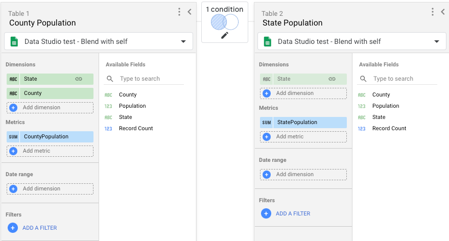
You'd like to calculate the percentage of population for each county in the state; but, to do that, you need to have the total population of each state as its own field. In the dataset, that metric isn't available -- but you can get it by blending your population data source with itself, by performing the following steps:
- Create a data source using your base dataset.
- Add a chart that uses that data source to a report.
- Create a blend with two tables. Each table will use the same data source that you created in step 1.
- For Table 1, include the following fields:
- State, County, Population.
- Rename Population to CountyPopulation.
- For Table 2, include only the Population field, and rename that field to StatePopulation.
- For Table 1, include the following fields:
- For the join condition, use a Left Outer join, linking State in Table 1 to State in Table 2.
- Click Save.
- Return to the report editor by clicking X.

Next, add a new chart (for example, a table) to your report and select the blend as the data source for the chart by performing these steps:
- Add the State, County, CountyPopulation, and StatePopulation fields to the chart.
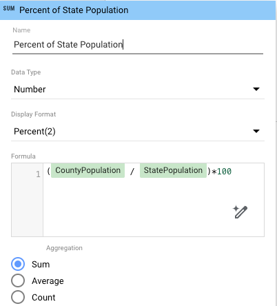
- To calculate the percentage of state population for each county, add a calculated field to the chart that uses your new reaggregated data:
- In the properties panel, click Add metric, and then click Add field.
- Name the field (for example) Percent of State Population.
- In the Formula box, enter
(CountyPopulation / StatePopulation)*100. - (Optional) Set the Display Format to show the percentage values to a specific level (for example, Percent (2) for two decimal digits).

When you're done, your table should look something like this:
| State |
County |
CountyPopulation |
StatePopulation |
Percent of State Population |
|---|---|---|---|---|
| California |
Los Angeles County |
10014009 |
16499632 |
60.69 |
| Texas |
Harris County |
4731145 |
9455324 |
50.04 |
| California |
San Diego County |
3298634 |
16499632 |
19.99 |
| California |
Orange County |
3186989 |
16499632 |
19.32 |
| New York |
Kings County (Brooklyn) |
2736074 |
6560428 |
41.71 |
| Texas |
Dallas County |
2613539 |
9455324 |
27.64 |
| New York |
Queens County |
2405464 |
6560428 |
36.67 |
| Texas |
Tarrant County |
2110640 |
9455324 |
22.32 |
| New York |
Bronx County |
1418890 |
6560428 |
21.63 |
Table order in the blend
Looker Studio evaluates the join configurations in the blend in order, starting with the leftmost configuration. The results of each join are then applied to the next join to the right. For example, in a three-table blend, the join configuration between table 1 (leftmost) and table 2 (middle) is evaluated, and then those results are used by the join configuration between table 2 and table 3 (rightmost).
Table order in automatically created blends
When you blend a selection of charts, Looker Studio creates a table for each chart and then adds the fields in the chart to the corresponding table. The order of the tables in the blend matches the order in which you select the charts: the first chart selected becomes the first (leftmost) table, the second chart selected becomes the second table, etc.
Looker Studio also automatically creates a join configuration for each table and uses the left outer join type.
If the default configuration isn't what you want, or if there aren't clear linkages between the tables, you can edit the blend to suit your goals.
Tables are created before the blend
The data for each table in a blend is queried before that data is joined into the final blend. Date ranges, filters, and calculated fields in a table are applied to the query that generates the table before any joins are performed. These factors can affect the data that is included in the blend tables and change the output of the blend.
Blends may contain more rows than the original data
You might see more data in a blended chart than you'll see in charts that are based on the individual data sources that make up the blend. The result can depend on your data and on the join configuration chosen for the blend. For example, a left outer join includes all the records from the left hand table, as well as all the records from the tables to the right that share the same values across the join condition. Multiple matches for the join condition can result in more rows appearing in the blended data than exist in the leftmost data source.
Blends and explicit date ranges and filters
Two ways to limit the number of rows in your blends are by using a date range or applying a filter. You can limit the rows either on charts that are based on a blend or on the tables that make up the blend. It's helpful to think about the process as being either "pre-blend" or "post-blend."
When you apply a date range or filter to a table in the blend, it takes effect before the data is joined with the other tables in the blend. Rows that are outside the date range or that are excluded by the filter aren't available for the join query to work on.
When you apply a date range or filter to a chart based on a blend, you're applying it to the data after the blend has been created ("post-blend").
This difference could have a big impact on the results that you see in your charts, depending on your data and how you've configured the blend.
Blends and inherited filters
Blends inherit report, page, or group level filters as long as the filter is compatible with the pre-blend or post-blend data. If the filter is compatible with the underlying data source(s) that the blend uses, then the filter acts on the pre-blended data. Otherwise, the filter acts on the post-blended data. If the filter isn't compatible with either the pre-blend or post-blend data, the filter is ignored.
Learn more about filter inheritance.
When a chart that is based on a blend is subject to an inherited filter, Looker Studio processes the data in five steps:
(Pre-blend):
- Step 1: The data is grouped and aggregated based on the dimensions that are specified in the Blend Data panel.
- Step 2: Inherited dimension filters and compatible metric filters are applied to the data sources that are included in the Blend Data panel.
(Blend):
- Step 3: The data is blended using the specified join configuration.
(Post-blend):
- Step 4: The data is grouped and aggregated based on the dimensions in the chart.
- Step 5: Metric filters, if compatible with blended data, are applied to the chart.
