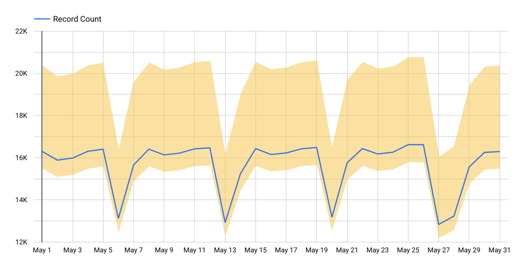
Looker Studio lets you plot intervals around the series in a time series chart. Intervals can be represented as shaded bands (area intervals), boxes, lines, or other shapes, depending on the interval type you specify. Based on the interval type you specify, you can use intervals to effectively depict the level of confidence in your data's accuracy or the range of possible values for your data.
You can use intervals to depict statistical measures using preset calculations for confidence intervals, standard deviation, standard error, or range. Alternatively, you can specify custom top and bottom interval metrics, or you can specify a center interval metric and a width metric.
For example, you could define an interval that shows confidence intervals for a mean value over time. The following example shows an uncertainty in record counts that we expect could be up to 25% more or 4% less than what is plotted.

In this example, the interval type used is Area interval, and the interval mode used is Top and bottom. In this case, the top interval metric is 25% greater than the value that is plotted, and the lower interval metric is 4% smaller.
Add an interval
You can add intervals to time series charts.
- Edit your report.
- Create a time series chart, or select an existing time series chart.
- In the properties panel, select the STYLE tab.
- Select Add interval.
- Configure the intervals using the options described in the Interval options section.
You can add up to four intervals per chart.
Interval options
When you add an interval to a time series chart, you can specify the following options.
Type
Select the Type drop-down menu to specify how the interval will be depicted on the chart.
- Area interval: Intervals are visualized as shaded areas around the series.
- Bar interval: Intervals are visualized as bars extending vertically from your data points.
- Box interval: Intervals are visualized as boxes, or boxplots. The box encompasses the range between the lower and upper bounds.
- Stick interval: Intervals are depicted as sticks, or vertical lines extending from the data points. The length of the sticks represents the range or variability of the data.
- Point interval: Intervals are represented as points in the time series chart. A point is placed at the upper and lower boundary of each series.
- Line interval: Separate lines are used to plot the upper and lower boundaries of intervals.
Interval label
Display a custom label that will appear in a tooltip when users hover over data points in the time series chart.
If you leave this option blank, Looker Studio supplies a default label of "Interval #n,"" with "#n" representing which interval this is: the first through the fourth.
Mode
The Mode section, not to be confused with statistical mode, lets you choose the type of interval you will plot and how the interval values will be calculated. You can specify custom interval metrics using the Top and bottom or Center and width options for Mode, or you can use a preset calculation for confidence intervals, standard error, standard deviation, or range.
- Top and bottom: Specify one metric each for Top interval metric and Bottom interval metric . The top metric represents the upper boundary of the interval, and the bottom metric represents the lower boundary.
- Center and width: Specify one metric each for Center interval metric and Width interval metric . The upper boundary is calculated by adding the center and width interval metric values, and the lower boundary is calculated by subtracting the width from the center interval metric values.
- Range: Specify a metric in the Center interval metric field. Looker Studio plots intervals using the minimum and maximum values for the centering metric.
- Confidence Interval: Specify a metric in the Center interval metric field. Then, select a confidence level from the Select confidence level drop-down menu.
Looker Studio performs a calculation to determine the values to plot based on the selected confidence level value and then plots an interval that is centered on the line for the centering metric.
- Standard Error: Specify a metric in the Center interval metric field. Looker Studio calculates the standard error and then plots an interval that is centered on the line for the centering metric.
- Standard Deviation: Specify a metric in the Center interval metric field. Looker Studio calculates the standard deviation, then plots an interval that is centered on the line for the centering metric.
Select confidence level
When you select the Confidence Interval option in the Mode section, you can choose a confidence level of 90%, 95%, 98%, or 99%.
Color
To choose a color for the interval, select the Color drop-down menu and choose the desired color.
Interval metrics
The Add metric drop-down menu displays the metrics that are available to be used for plotting intervals.
When you plot intervals, in addition to selecting an existing metric from the Add metric drop-down, you can create new calculated fields by selecting the CREATE FIELD option at the bottom of the list of fields.
Top interval metric
Available when you choose Top and bottom mode. Sets the values for the top of the interval range.
Bottom interval metric
Available when you choose Top and bottom mode. Sets the values for the bottom of the interval range.
Center interval metric
Available when you choose the Center and width, Range, Confidence interval, Standard Error, or Standard Deviation mode. Sets the values for the center of the interval range.
Width interval metric
Available when you choose Center and width mode. Sets the values for the width of the interval.
View an interval
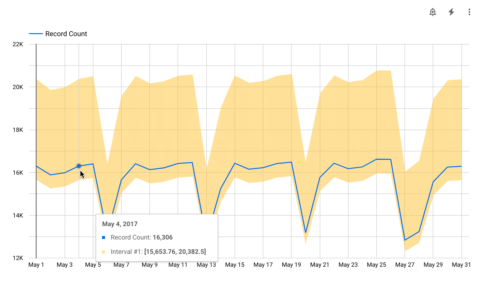
Intervals appear either with a default label or with a custom label that you supply. Hover over a series to display a tooltip that shows the details about the data point and its interval.
For example, the following time series chart shows record counts for the month of May. The top interval metric is defined as a metric that is 25% greater than the value being plotted, and the lower interval metric is defined as a metric that is 4% smaller. Hovering over each data point reveals a tooltip with the value of Record Count for that date, as well as the values for the top and bottom of the interval range.

Remove an interval
To remove an interval from a chart, follow these steps:
- Edit your report.
- Select the chart.
- On the right, in the properties panel, select the STYLE tab.
- Locate the interval you want to remove, and then click Delete interval
 .
.
Edit charts with intervals
If you change the chart type, Looker Studio deletes any intervals that are not supported by the new chart type.
If you remove a metric from the chart, Looker Studio deletes any intervals that are associated with that metric.
