Consistent and meaningful use of color makes your reports more attractive and easier to understand. You can apply color and style options to a variety of aspects of a report, including static elements, such as page and component backgrounds, text fonts and font colors, chart borders, grids, and more. You can also apply colors to data elements, such as bars and lines, metric and dimension values, pie slices, and geographic regions.
This page describes the ways that you can work with color in Looker Studio.
Themes
Built-in color themes let you quickly create attractive and visually consistent reports. When you apply a theme, it updates the settings for all the static and data elements in the report at once, saving you time and effort.
You can customize a theme by changing its properties.
Learn more about themes.
Style components individually
You can change color and style settings for individual components:
- Edit your report.
- Select one or more components.
- Select the STYLE tab.
- Change the desired style settings. If you've selected more than one component, you'll see only the settings that are common to all the selected components.
When you style an individual component, that component is no longer part of the report theme. If you apply a different theme to the component, it won't inherit the new theme's settings.
Color your data
You can use the following techniques to color the data that appears in charts:
- Color by the dimension value. For example, you decide that "France" should always represented in blue, no matter where it appears in the chart. The dimension value colors are set by the current report theme, but you can override them by editing the dimension value color map.
- Color by the order of the dimension data. For example, say you want to set the first series in the chart to always be blue. You can set the series colors by editing individual charts.
- Use shades of a single color. For example, you want to color the data series using a single color from your company's logo. This option is most effective when you don't need to show exact differences between values in the chart.
You can mix different techniques in the same report, depending on your goals and tastes.
Learn more about data coloring techniques.
The color picker

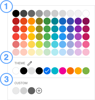
Use the color picker to select colors for themes and components. The color picker has three sections:
- The standard color palette. This is the same for all components in every report.
- The THEME palette. This will change depending on your current theme.
- The CUSTOM color palette. Custom colors that you create appear here.
Access the color picker
To open the color picker, follow these steps:
- Edit your report.
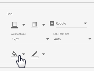
- Select a component and then open the STYLE tab, or customize the current theme.
- Click a color option to display the color picker, and then select the color that you want for that option.

Create custom colors

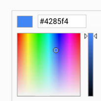
Click ![]() in the CUSTOM colors row of the color picker to create a custom color. Click anywhere in the color bars to pick a base color, and then use the sliders to adjust the shade. You can also enter a color hex value to render that color. The current color's hex value can also be used to exactly duplicate a custom color in another component. For example, you can copy a color hex value from one component and paste it into another component's color picker to set it to the same color.
in the CUSTOM colors row of the color picker to create a custom color. Click anywhere in the color bars to pick a base color, and then use the sliders to adjust the shade. You can also enter a color hex value to render that color. The current color's hex value can also be used to exactly duplicate a custom color in another component. For example, you can copy a color hex value from one component and paste it into another component's color picker to set it to the same color.
Color gradients

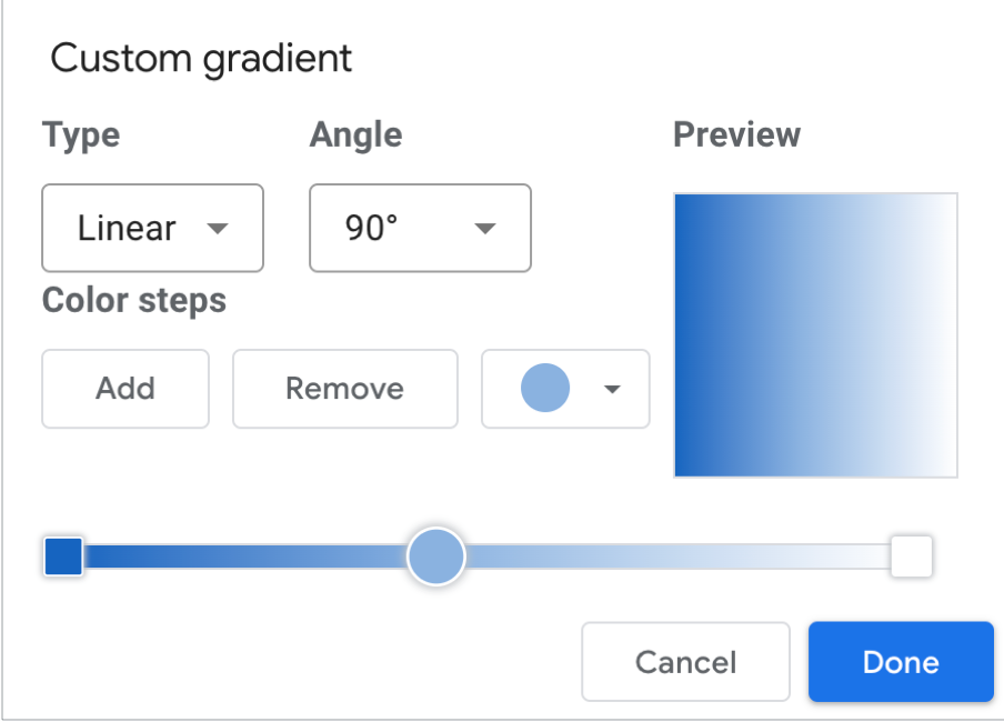
When one color fades into another, the effect is called a gradient. You can use a color gradient in a component's Background color property. To set a gradient, follow these steps:
- Select a component and then click STYLE.
- Click Background
 .
. - Click Gradient.
- Select the boxes at the beginning and end of the gradient bar, and then click the color drop-down menu to set the starting and ending colors for the gradient.
- To add more color steps to the gradient, click Add.
- To remove a color step from the gradient, click Remove.
- Use the Type menu to set the overall appearance of the gradient, either Linear or Radial.
- Use the Angle menu to set the direction of flow for the gradient:
- Center
- Top left
- Top right
- Bottom left
- Bottom right
