A Geo chart provides a way to visualize how a measurement varies across a geographic area. The Looker Studio Geo chart is based on Google's GeoChart visualization.
Geo charts in Looker Studio
A Looker Studio Geo chart requires you to provide the following information:
- A geographic dimension, such as Country, City, or Region.
- A metric, such as Sessions, Units Sold, or Population.
- The map's zoom area.
Learn more about geographic dimensions.
Zoom area
The zoom area determines how much of the world the map displays. It also can restrict the data shown by the Geo chart. For example, selecting the City dimension and setting the zoom area to Germany (DE) limits the Geo chart to showing cities in Germany. The map itself zooms in to focus on Germany.
Geo chart examples
These examples get their data from a Google Analytics data source.
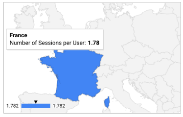
Example 1: Limit the map display to a specific country (France)
Step 1: Set the dimension and visible area
- Dimension: Country
- Metric: Number of Sessions per User
- Zoom Area: Western Europe
Step 2: Filter the country dimension to only include France.
- Dimension: Country
- Match Type: Equals
- Expression: France

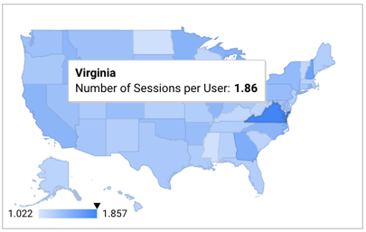
Example 2: Display a US state map
Step 1: Set the dimension and visible area
- Dimension: Region
- Metric: Number of Sessions per User
- Visible Area: US
Step 2: Filter the country dimension to only include the United States
- Dimension: Country
- Match Type: Equals
- Expression: United States

Geo chart limits
Geo charts include the first 5,000 rows of data, unless otherwise mentioned for a field type. Chart data is sorted in descending order based on the selected metric.
Geo functions
Looker Studio provides a number of geo functions that can be used to work with and transform geographic information in your data sources.
To learn more about these functions, view the Looker Studio function list and filter the functions by Geo type.
Add the chart
Add a new chart or select an existing chart. Then, use the Properties panel to configure the chart's Setup tab and Style tab properties to set up the chart data and style the chart, respectively.
Set up the chart data
The options in the Setup tab of the Properties panel determine how the chart's data is organized and displayed.
Data source
A data source provides the connection between the component and the underlying dataset.
- To change the chart's data source, click the current data source name.
- To view or edit the data source, click the
 Edit data source icon. (You must have at least Viewer permission to see this icon.)
 - Click Blend data to see data from multiple data sources in the same chart. Learn more about data blending.
Geo dimension
Dimensions are data categories. Dimension values (the data that is contained by the dimension) are names, descriptions, or other characteristics of a category.
A single valid geo dimension is required. See the Geo dimension reference for more information.
Drill down
This option appears on charts that support it.
Drilling down gives viewers a way to reveal additional levels of detail within a chart. When you turn on the Drill down switch, each dimension that you add becomes another level of detail that you can drill into. Learn more about chart drill down.
Metric
Metrics measure the things that are contained in dimensions and provide the numeric scale and data series for the chart.
Metrics are aggregations that come from the underlying dataset or that are the result of implicitly or explicitly applying an aggregation function, such as COUNT(), SUM(), or AVG(). The metric itself has no defined set of values, so you can't group by a metric as you can with a dimension.
Any single available metric is required. Your data will be displayed on the map using a color progression to indicate relative value, with higher intensity color gradient representing higher values than lower intensity colors. You can change the color of the map using the STYLE tab.
Optional metrics
You can add optional metrics by turning on the Optional metrics switch and selecting metrics from the Add metric field selector. You can also click metrics from the fields list on the Data panel and place them in the Optional metrics selector.
Metric sliders
Turn on the Metric sliders switch to add a metric slider to your chart.
Filter
Filters restrict the data that is displayed in the component by including or excluding the values that you specify. Learn more about the filter property.
Filter options include the following:
- Filter name: Click an existing filter to edit it. Mouse over the filter name and click X to delete it.
- Add filter: Click this option to create a new filter for the chart.
Date range dimension
This option appears if your data source has a valid date dimension.
The date range dimension is used as the basis for limiting the date range of the chart. For example, this is the dimension that is used if you set a date range property for the chart or if a viewer of the report uses a date range control to limit the timeframe.
Default date range filter
The default date range filter lets you set a timeframe for an individual chart.
Default date range filter options include the following:
- Auto: Uses the default date range, which is determined by the chart's data source.
- Custom: Lets you use the calendar widget to select a custom date range for the chart.
Learn more about working with dates and time.
Zoom area
Zoom area limits the map display to the selected area. The choices available depend on the scope of the geo field type used for a given chart. For example, when you select a continent geo field as the Geo dimension, World is the only available option. When you visualize a city geo dimension, on the other hand, you can restrict the Zoom area to World, Continent, Subcontinent, Country, or Region.
Chart interactions
When the Cross-filtering option is enabled on a chart, that chart acts like a filter control. You can filter the report by clicking or brushing your mouse across the chart. Learn more about cross-filtering.
Style the chart
The options in the Style tab control the overall presentation and appearance of the chart.
Chart title
Turn on the Show title switch to add a title to your chart. Looker Studio can automatically generate a title, or you can create a custom title for the chart. You can also customize the title's styling and placement.
Autogenerate
This option is enabled by default. When Autogenerate is enabled, Looker Studio generates a title that is based on the chart type and the fields that are used in the chart. The autogenerated title will be updated if you change the chart type or make changes to the fields that are used in the chart.
To add a custom title to your chart, enter it into the Title field. This will turn off the Autogenerate setting.
Title options
When the Show title setting is enabled, you can use the following title options:
- Title: Provides a text field where report editors can enter a custom title for the chart.
- Font family: Sets the font type for the title text.
- Font size: Sets the font size for the title text.
- Font color: Sets the font color for the title text.
- Font styling options: Applies bold, italic, or underline styling to the title text.
- Top: Positions the chart title at the top of the chart.
- Bottom: Positions the chart title at the bottom of the chart.
- Left: Aligns the chart title to the left side of the chart.
- Center: Centers the chart title horizontally.
- Right: Aligns the chart title to the right side of the chart.
Geo chart
These properties control the appearance of the chart elements:
- Max color value: Sets the color for the highest value in the data range. Typically, this should be the darkest shade in the chart.
- Mid color value: Sets the color for the median value in the data range. Typically, this should be a medium shade.
- Min color value: Sets the color for the lowest value in the data range. Typically, this should be the lightest shade in the chart.
- Dataless value: Sets the color for values that are not in the data range.
- Show legend: When enabled, shows the metric legend.
Font
Sets the font type for the labels in the chart.
Background and border
These options control the appearance of the chart background container:
- Background: Sets the chart background color.
- Opacity: Sets the chart opacity. 100% opacity completely hides objects behind the chart. 0% opacity makes the chart invisible.
- Border color: Sets the chart border color.
- Border radius: Adds rounded borders to the chart background. When the radius is 0, the background shape has 90° corners. A border radius of 100° produces a circular shape.
- Border weight: Sets the chart border line thickness.
- Border style: Sets the chart border line style.
- Add border shadow: Adds a shadow to the chart's lower and right borders.
Chart header
The chart header lets viewers perform various actions on the chart, such as exporting the data, drilling up or down, or sorting the chart. Chart header options include the following:
- Chart header: Controls where the chart header appears on the chart. The Chart header options include the following:
- Do not show: The header options never appear. Note that report viewers can always access the options by right-clicking the chart.
- Always show: The header options always appear.
- Show on hover (default): Three vertical dots appear when you hold the pointer over the chart header. Click these to access the header options.
- Header font color: Sets the color of the chart header options.
Reset to report theme
Click Reset to report theme to reset the chart settings to the report theme settings.
