Utilizza i grafici per visualizzare ed esplorare i dati. In questa lezione imparerai ad aggiungere un grafico a torta, un grafico a barre e un grafico geografico a questo report.
Come aggiungere un grafico
Per aggiungere un grafico alla pagina corrente:
- Modifica il report.
- Accedi alla pagina che conterrà il grafico.
- Nella barra degli strumenti, fai clic su Aggiungi un grafico.
- Seleziona il grafico da aggiungere.
- Fai clic sul canvas per aggiungere il grafico al report.
- Seleziona uno o più grafici per spostarli o ridimensionarli come preferisci.
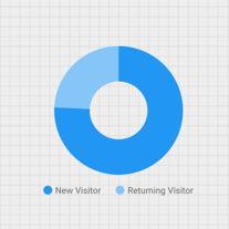
Passaggio 1: aggiungi un grafico a torta
 Utilizza grafici a torta per un confronto generale tra un numero ridotto di metriche o variabili.
Scopri di più sui grafici a torta.
- Segui la procedura descritta in [Come aggiungere un grafico](#how-to-add-a-chart) per aggiungere un grafico a torta al report.
- Nel riquadro Proprietà, seleziona la scheda CONFIGURAZIONE.
- Fai clic sul chip della dimensione Sorgente per accedere al Selettore dimensione.
- Fai clic sulla dimensione Tipo di utente.
- Fai clic sulla scheda STILE.
- Utilizza il dispositivo di scorrimento a ciambella per modificare lo spessore, in modo che sia più o meno sottile.

- Utilizza la proprietà Legenda per posizionare le etichette delle metriche sotto la torta:

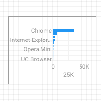
Passaggio 2: aggiungi un grafico a barre
Utilizza grafici a barre per mostrare e confrontare l'entità di più variabili.
Scopri di più sui grafici a barre.
- Segui la procedura descritta in Come aggiungere un grafico per aggiungere un grafico a barre al report.
- Nel riquadro Proprietà, seleziona la scheda CONFIGURAZIONE.
- Fai clic sulla dimensione Sorgente e impostala su Browser.
- Fai clic sulla freccia per tornare indietro:

- Fai clic sulla metrica Sessioni e impostala su Utenti.
- Fai clic sulla scheda STILE.
- Modifica l'orientamento su Orizzontale :

- Scorri fino alla sezione Sfondo e bordo della scheda STILE.
- Imposta il colore del bordo su grigio:

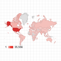
Passaggio 3: aggiungi una mappa di Google Maps
Utilizza una mappa di Google per visualizzare la distribuzione delle sessioni o altre metriche nel mondo.
- Segui la procedura descritta in Come aggiungere un grafico per aggiungere una mappa di Google Maps al report. Scegli lo stile mappa a bolle.
- Nel riquadro Proprietà, seleziona la scheda CONFIGURAZIONE.
- Fai clic sul campo predefinito Posizione e sostituiscilo con la dimensione Città.
- Aggiungi le metriche per il colore e la dimensione delle bolle. Ad esempio, seleziona Sessioni per Dimensione e Tempo medio sulla pagina per Colore.
- Seleziona la scheda Stile.
- Utilizza i cursori per regolare i dettagli dello sfondo, ad esempio strade, punti di riferimento ed etichette.
- Nella sezione Colori, seleziona i colori per l'intervallo di valori delle metriche.
- Nella sezione Controlli della mappa, attiva o disattiva i controlli che vuoi far utilizzare ai tuoi visitatori.
- Visualizza il report. Panoramica, zoom e scorrimento. Puoi anche utilizzare Street View.
Passaggio successivo
Complimenti! Hai creato il tuo primo report di Looker Studio.
Se vuoi, puoi aggiungere titoli, cambiare colori e stili, nonché aggiungere altre visualizzazioni. Quando è tutto pronto per proseguire, inizia la lezione successiva: Visualizzare e condividere il report.
Risorse correlate
Tipi di grafici in Looker Studio