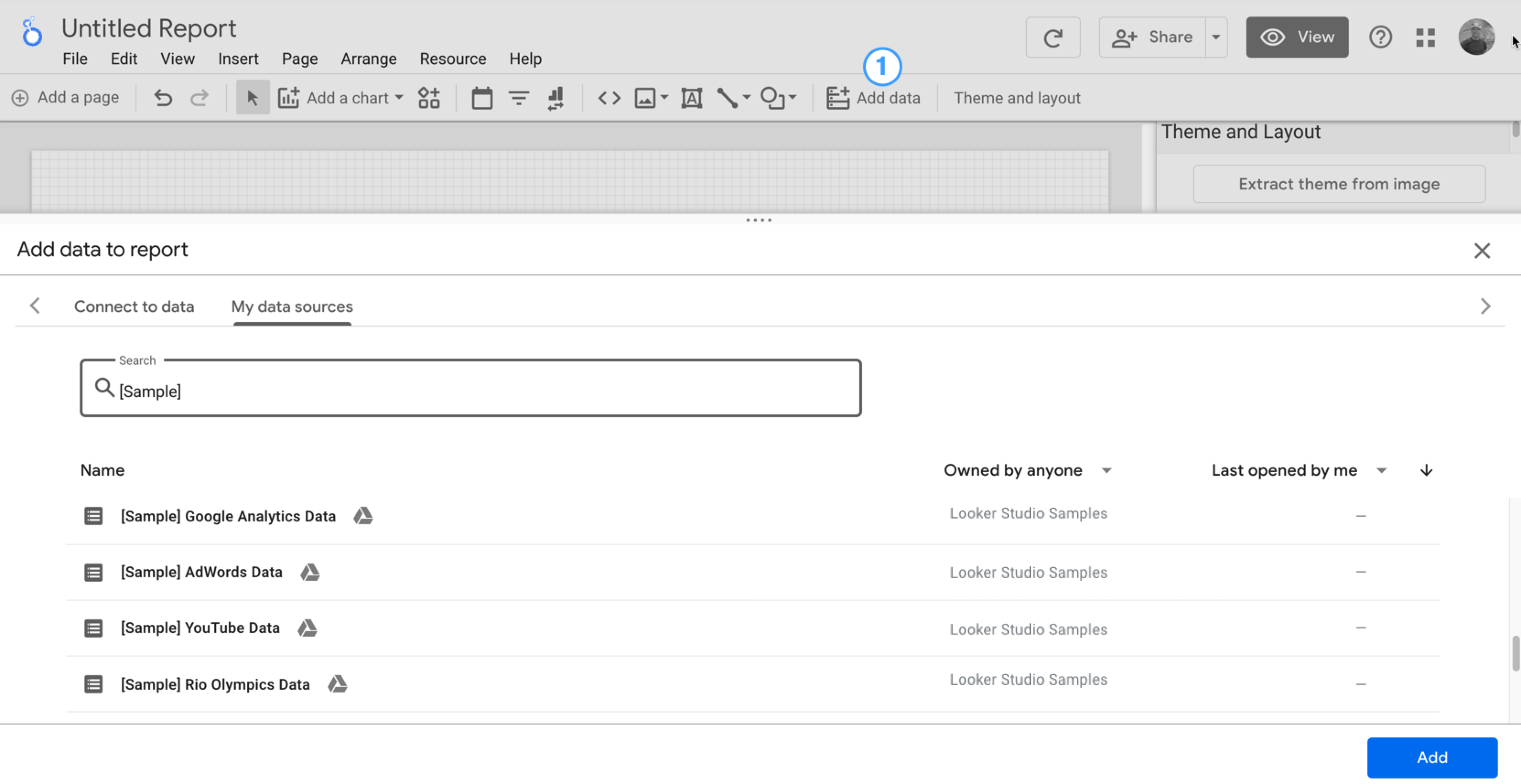
Verás la herramienta para editar informes, que tendrá abierto el panel Agregar datos al informe. Este panel tiene dos pestañas: Conectar con datos y Mis fuentes de datos.
Obtendrás más información sobre los conectores y las fuentes de datos en el tema Conéctate a tus datos.
En la pestaña Connect to data, selecciona un conector, crea una nueva fuente de datos y agrégala a tu informe:
Selecciona el tipo de datos que deseas visualizar.
Proporcionar los detalles de tu cuenta o cualquier otra información
En la esquina inferior derecha, haz clic en Agregar.
Usa Mis fuentes de datos para agregar una fuente de datos existente a tu informe:
La pestaña Mis fuentes de datos incluye varias fuentes de datos de muestra.
Para continuar con este instructivo, selecciona la fuente de datos [Sample] GA4 - Google Merchandise Store. Si agregas una fuente de datos diferente, es posible que tus resultados varíen con respecto a los pasos que se describen en este instructivo.
Ubica la fuente de datos que deseas.
En la esquina inferior derecha, haz clic en Agregar.
La fuente de datos se agrega a tu informe.
Aparecerá una tabla con los campos de esa fuente de datos.
Usa el panel de propiedades de la derecha para cambiar los datos y el estilo de la tabla.
De forma predeterminada, el tipo de diseño se establece en Diseño de formato libre. Para usar un informe responsivo, selecciona el tipo Diseño responsivo. Puedes cambiar el parámetro de configuración de diseño más adelante.
Un informe de formato libre se adapta a las pantallas de computadoras. Elige este tipo de informe si deseas tener un control perfecto sobre la ubicación y el tamaño de cada componente del informe.
Un informe responsivo se adapta bien a muchos tamaños de pantalla diferentes. Elige este tipo de informe si esperas que los usuarios lo consulten con frecuencia en una tablet o en otro dispositivo móvil.
En la parte superior izquierda, haz clic en Informe sin título y, luego, ingresa un nombre nuevo para nombrar tu informe.
(Opcional) Para agregar una descripción a tu informe, haz clic en el menú de tres puntos y selecciona Detalles. Luego, agrega una descripción en el campo Descripción.
Agregar más datos
Para agregar más fuentes de datos a un informe, haz clic en Agregar datos en la barra de herramientas.
Paso 2: Agrega otro gráfico al informe
El gráfico de series temporales representa los datos a lo largo del tiempo.
En la barra de herramientas, haz clic en Agregar un gráfico.
Selecciona un gráfico de serie temporal.
Haz clic en el lienzo en el cual quieres que aparezca el gráfico.
Looker Studio agrega automáticamente la dimensión Fecha y la métrica Vistas (siempre que uses una fuente de datos de Analytics).
Para ajustar la posición del gráfico, arrástralo o selecciónalo y muévelo con las teclas de flecha del teclado.
Para ajustar el tamaño del gráfico, selecciónalo y, luego, arrastra un punto de esquina o de línea media.
Desglosa el gráfico por Categoría de dispositivo:
Asegúrate de que el gráfico de serie temporal esté seleccionado.
A la derecha, en el panel Datos, usa la herramienta de búsqueda para encontrar la dimensión Categoría del dispositivo.
Arrastra el campo y suéltalo en el destino Dimensión de desglose.
Ahora, el gráfico debería mostrar series de datos para las diferentes categorías de dispositivos (dispositivos móviles, computadoras y tablets).
Paso 3: Define el diseño del informe
Los temas predeterminados te permiten aplicar opciones de color y estilo a todo el informe.
Edita el informe.
En la barra de herramientas, haz clic en Tema y diseño.
En la pestaña TEMA, haz clic en el tema que quieras aplicar.
Puedes personalizar cualquiera de los temas predeterminados. Por ejemplo, puedes seleccionar un color de fondo diferente que coincida mejor con tu marca:
En el panel Tema y diseño, haz clic en Personalizar.
Desplázate hacia abajo hasta la sección Fondo y borde.
Usa el selector de color para establecer el color de Fondo en tu color favorito. ¿Quizás algo en un tono durazno malva?
Paso 4: Agrega un banner
Usa un rectángulo de color como banner de fondo para el encabezado del informe.
Selecciona el componente Página haciendo clic en cualquier parte del área de la cuadrícula.
Selecciona la herramienta Rectángulo en la barra de herramientas.
Dibuja un rectángulo en la parte superior de la página.
A la derecha, en el panel Propiedades del rectángulo, establece el color de fondo del rectángulo en azul.
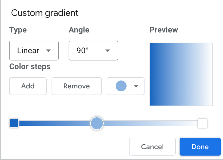
¡Crédito adicional! Agrega un gradiente al banner.
Cuando un color se desvanece en otro, el efecto se denomina gradiente. Los gradientes son una opción de la propiedad de color de fondo.
Haz clic en el control de color de fondo:
Haz clic en Degradado.
Las muestras de color de la izquierda y la derecha determinan los colores inicial y final. Ingresa los valores hexadecimales de color específicos, elige un color de la paleta o usa los controles deslizantes verticales para seleccionar el color.
La flecha de orientación controla el flujo del gradiente.
Paso 5: Agrega un título al informe
La herramienta de texto te permite anotar tus informes y gráficos.
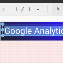
Selecciona la herramienta Texto en la barra de herramientas.
Dibuja un cuadro de texto dentro del rectángulo del banner.
Escribe Google Analytics Demo Dashboard en el campo.
Destaque el texto. Utilice el panel Propiedades de texto ubicado a la derecha para cambiar el color y el tamaño de la fuente hasta estar satisfecho con el resultado.
Hola. ¿Dónde está el botón GUARDAR?
Looker Studio guarda automáticamente cada cambio realizado, por lo que no es necesario hacer clic en Guardar cuando edites un informe. ¡Qué genial!
[[["Fácil de comprender","easyToUnderstand","thumb-up"],["Resolvió mi problema","solvedMyProblem","thumb-up"],["Otro","otherUp","thumb-up"]],[["Difícil de entender","hardToUnderstand","thumb-down"],["Información o código de muestra incorrectos","incorrectInformationOrSampleCode","thumb-down"],["Faltan la información o los ejemplos que necesito","missingTheInformationSamplesINeed","thumb-down"],["Problema de traducción","translationIssue","thumb-down"],["Otro","otherDown","thumb-down"]],["Última actualización: 2025-09-04 (UTC)"],[],[],null,["# Tutorial: Create a new report\n\nIn this tutorial, you'll learn how to create a new report in Looker Studio.\n\nStep 1: Create a new blank report\n---------------------------------\n\n1. [Sign in to Looker Studio.](https://lookerstudio.google.com)\n\n2. Click **Create** and then select **Report**.\n\n3. You'll see the report editor tool, with the *Add data to report* panel open. This panel has two tabs: *Connect to data* and *My data sources*.\n\n \u003e You'll learn more about connectors and data sources in the [Connect to your data](/looker/docs/studio/about-connectors-data-sources-and-credentials) topic.\n 1. In the *Connect to data* tab, select a [connector](/looker/docs/studio/connector), create a new data source, and add that to your report:\n\n 1. Select the type of data that you want to visualize.\n 2. Provide your account or other details.\n 3. In the bottom right, click **Add**.\n 2. Use *My data sources* to add an existing [data source](/looker/docs/studio/data-source) to your report:\n\n \u003e \u003cbr /\u003e\n \u003e\n \u003e The **My data sources** tab includes a number of sample data sources.\n \u003e\n \u003e To follow along with this tutorial, select the `[Sample] GA4 - Google Merchandise Store` data source. If you add a different data source, your results may vary from the steps described in this tutorial.\n \u003e\n \u003e \u003cbr /\u003e\n \u003e\n \u003e | **Tip:** If you have a lot of data sources, use the search bar to locate the data source that you want.\n \u003e |\n \u003e | \u003cbr /\u003e\n \u003e |\n \u003e \u003cbr /\u003e\n \u003e\n 1. Locate the data source that you want.\n 2. In the bottom right, click **Add**.\n 3. The data source is added to your report.\n4. A table appears with fields from that data source.\n\n Use the [properties panel](/looker/docs/studio/properties-panel) on the right to change the data and style of the table.\n5. By default, the layout type is set to **Freeform layout** . To use a [responsive report](/looker/docs/studio/create-a-responsive-report) instead, select the **Responsive layout** type. You can change the layout setting later.\n\n - A freeform report is tailored for desktop screens. Choose this report type if you want pixel-perfect control over the placement and sizing of each report component.\n - A responsive report scales well across many different screen sizes. Choose this report type if you expect your users to regularly view the report on a tablet or other mobile device.\n6. In the top left, name your report by clicking *Untitled Report* and then entering a new name.\n\n7. (Optional) Add a description to your report by clicking the three-dot menu and selecting **Details** . Then add a description to the **Description** field.\n\n### Add more data\n\nTo add more data sources to a report, in the toolbar, click **Add data**.\n\nStep 2: Add another chart to the report\n---------------------------------------\n\nThe time series chart plots data over the course of time.\n\n1. In the toolbar, click **Add a chart**.\n\n2. Select a **Time series** chart .\n\n3. Click the canvas where you want the chart to appear.\n\n4. Looker Studio automatically adds the *Date* dimension and the *Views* metric (assuming you're using an Analytics data source).\n\n5. To adjust the chart's position, drag it, or select the chart and move it by using your keyboard arrow keys.\n\n | **Tip:** Each press of the arrow key moves the chart one full column or row (10 px) on the grid. Hold the Shift key down while using your arrow keys to nudge the selected components into place one pixel at a time.\n6. To adjust the chart's size, select it, and then drag a corner or mid-line point.\n\n7. Break down the chart by *Device Category*:\n\n 1. Make sure that the time series chart is selected.\n 2. On the right, in the **Data** panel, use the search tool to find the *Device Category* dimension.\n 3. Drag the field and drop it on the **Breakdown Dimension** target.\n\nYour chart should now display data series for the different device categories (Mobile, Desktop, and Tablet).\n\nStep 3: Style the report\n------------------------\n\nPreset themes let you apply color and style options to your entire report.\n\n1. Edit the report.\n2. In the toolbar, click **Theme and layout**.\n3. In the THEME tab, click the theme that you want to apply.\n\nYou can customize any of the preset themes. For example, you can select a different background color that better matches your brand:\n\n1. In the *Theme and Layout* panel, click **Customize**.\n2. Scroll down to the *Background and Border* section.\n3. Use the color picker to set the **Background** color to your favorite color. Something in a mauvy-peach, perhaps?\n\nStep 4: Add a banner\n--------------------\n\nUse a colored rectangle as a background banner for your report header.\n\n1. Select the [Page](/looker/docs/studio/page) component by clicking anywhere in the grid area.\n2. Select the **Rectangle** tool from the toolbar.\n3. Draw a rectangle across the top of the page.\n4. On the right, in the *Rectangle Properties* panel, set the rectangle background color to blue.\n\n#### Extra credit! Add a gradient to the banner.\n\nWhen one color fades into another, the effect is called a gradient. Gradients are an option of the background color property.\n\n1. Click the background color control:\n2. Click **Gradient**.\n\nThe left and right color swatches determine the starting and ending colors. Enter the specific color hex values, choose from the palette, or use the vertical sliders to select the color.\n\nThe orientation arrow controls the flow of the gradient.\n\nStep 5: Add a title to the report\n---------------------------------\n\nThe text tool lets you annotate your reports and charts.\n\n1. Select the **Text** tool from the toolbar.\n2. Draw a textbox inside the banner rectangle.\n3. Type `Google Analytics Demo Dashboard` in the field.\n4. Highlight the text. Use the *Text Properties* panel on the right to change the font color and the font size to something that looks nice to you.\n\n\u003e #### Hey! Where's the SAVE button?\n\u003e\n\u003e Looker Studio automatically saves every change you make, so there's no need to click **Save** when editing a report. Pretty sweet!\n\nNext steps\n----------\n\n[Add more charts to your report.](/looker/docs/studio/tutorial-add-charts-to-your-report)"]]