Usa gráficos para visualizar y explorar tus datos. En esta lección, agregarás un gráfico circular, un gráfico de barras y un gráfico geográfico a este informe.
Cómo agregar un gráfico
Para agregar un gráfico a la página actual, sigue estos pasos:
- Edita tu informe.
- Navega a la página que contendrá el gráfico.
- En la barra de herramientas, haz clic en Agregar un gráfico.
- Selecciona el gráfico que deseas agregar.
- Haz clic en el lienzo para agregar el gráfico al informe.
- Selecciona uno o más gráficos para moverlos o cambiarles el tamaño según sea necesario.
Paso 1: Agrega un gráfico circular
 Usa un gráfico circular para comparar de forma general una pequeña cantidad de métricas o variables.
Obtén más información sobre los gráficos circulares.
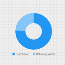
- Sigue los pasos que se indican en [Cómo agregar un gráfico](#how-to-add-a-chart) para agregar un gráfico circular al informe.
- En el panel Propiedades, selecciona la pestaña CONFIGURACIÓN.
- Haz clic en el chip de dimensión Fuente para acceder al Selector de dimensiones.
- Haz clic en la dimensión Tipo de usuario.
- Haz clic en la pestaña ESTILO.
- Usa el control deslizante de rosquilla para cambiar la forma sólida a una forma de anillo.

- Usa la propiedad Legend para colocar las etiquetas de métricas debajo del gráfico circular:

Paso 2: Agrega un gráfico de barras
Los gráficos de barras son excelentes para mostrar y comparar la magnitud de varias variables.
Obtén más información sobre los gráficos de barras.
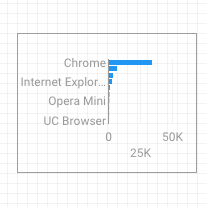
- Sigue los pasos que se indican en Cómo agregar un gráfico para agregar un gráfico de barras al informe.
- En el panel Propiedades, selecciona la pestaña CONFIGURACIÓN.
- Haz clic en la dimensión Fuente y cámbiala a Navegador.
- Haz clic en la flecha de retorno:

- Haz clic en la métrica Sesiones y cámbiala a Usuarios.
- Haga clic en la pestaña ESTILO.
- Cambia la orientación a Horizontal :

- Desplázate hasta la sección Fondo y borde de la pestaña ESTILO.
- Establece el color del borde en gris:

Paso 3: Agrega un mapa de Google
Usa un mapa de Google para ver la distribución de las sesiones (o de otras métricas) en todo el mundo.
Obtén más información sobre Google Maps.
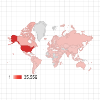
- Sigue los pasos que se indican en Cómo agregar un gráfico para agregar un Mapa de Google al informe. Elige el diseño de mapa de burbujas.
- En el panel Propiedades, selecciona la pestaña CONFIGURACIÓN.
- Haz clic en el campo predeterminado Ubicación y reemplázalo por la dimensión Ciudad.
- Agrega métricas para el color y el tamaño de las burbujas. Por ejemplo, selecciona Sesiones para Tamaño y Tiempo promedio en la página para Color.
- Selecciona la pestaña Estilo.
- Usa los controles deslizantes para ajustar los detalles del fondo, como rutas, puntos de referencia y etiquetas.
- En la sección Colores, selecciona los colores para el rango de valores de la métrica.
- En la sección Controles del mapa, activa o desactiva los controles del mapa que quieras que usen los usuarios.
- Consulta tu informe. Desplazamiento lateral, zoom y desplazamiento También puedes usar Street View.
Próximo paso
¡Felicitaciones! Creaste tu primer informe de Looker Studio.
Si lo deseas, agrega títulos, cambia los colores y los estilos, y agrega más visualizaciones. Cuando quieras continuar, comienza la siguiente lección: Cómo ver y compartir tu informe.
Recursos relacionados
Tipos de gráficos en Looker Studio