Haz clic en Crear y, a continuación, selecciona Informe.
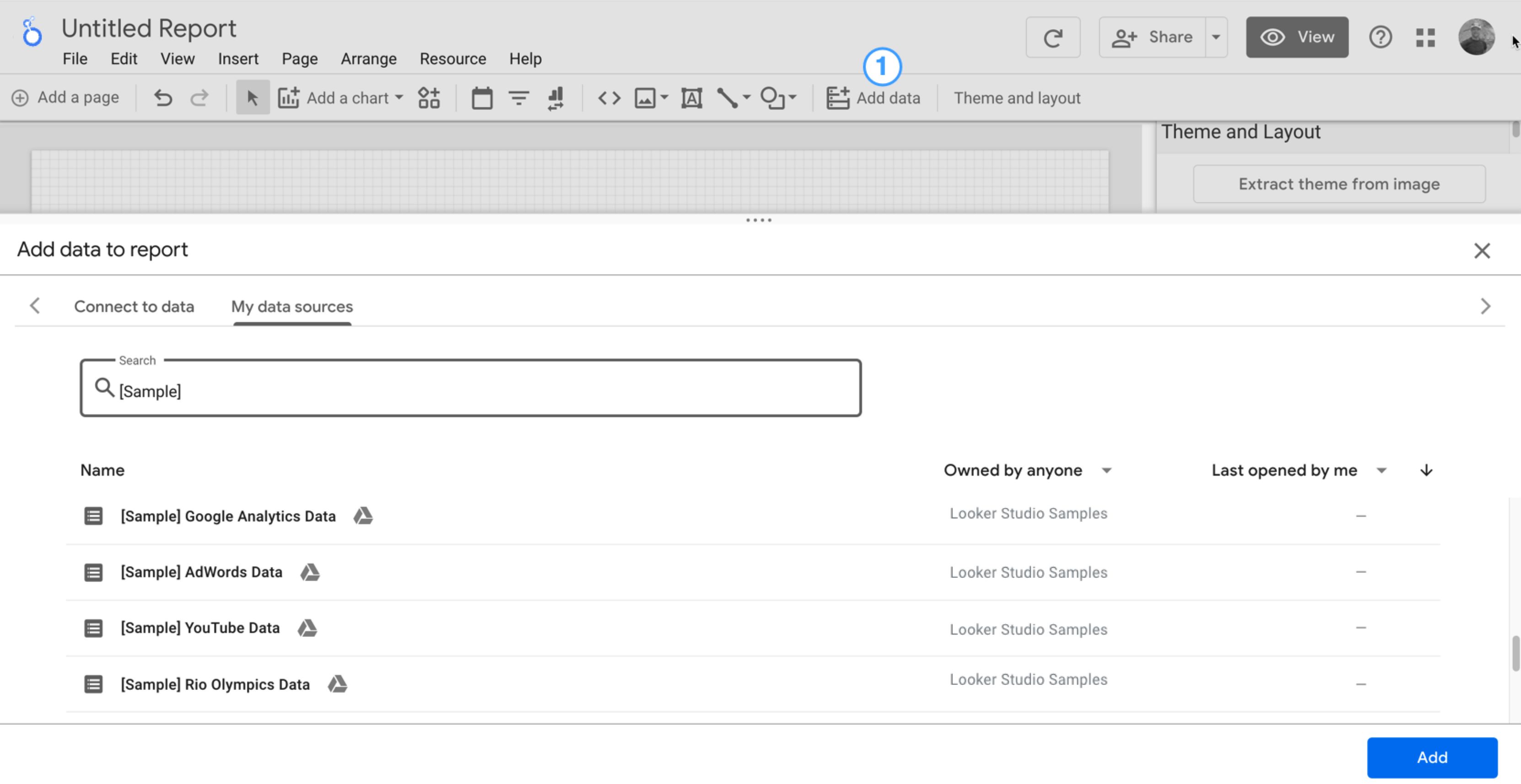
Verás el editor de informes, con el panel Añadir datos al informe abierto. Este panel tiene dos pestañas: Conectarse a datos y Mis fuentes de datos.
Consulta más información sobre los conectores y las fuentes de datos en el tema Conectarse a datos propios.
En la pestaña Conectarse a datos, selecciona un conector, crea una fuente de datos y añádela al informe:
Selecciona el tipo de datos que quieres visualizar.
Proporciona la información de tu cuenta u otros datos.
En la parte inferior derecha, haz clic en Añadir.
Utiliza la pestaña Mis fuentes de datos para añadir una fuente de datos a tu informe:
La pestaña Mis fuentes de datos incluye varias fuentes de datos de ejemplo.
Para seguir este tutorial, seleccione la fuente de datos [Sample] GA4 - Google Merchandise Store. Si añades otra fuente de datos, los resultados pueden ser distintos de los pasos que se describen en este tutorial.
Busca la fuente de datos que quieras.
En la parte inferior derecha, haz clic en Añadir.
La fuente de datos se añadirá al informe.
Se mostrará una tabla con campos de esa fuente de datos.
Usa el panel de propiedades de la derecha para cambiar los datos y el estilo de la tabla.
De forma predeterminada, el tipo de diseño es Diseño con formato libre. Si quieres usar un informe adaptable, selecciona el tipo Diseño adaptable. Puedes cambiar el ajuste de diseño más adelante.
Los informes de formato libre están diseñados para pantallas de ordenadores. Elige este tipo de informe si quieres controlar con precisión la colocación y el tamaño de cada componente del informe.
Los informes adaptables se ajustan bien a muchos tamaños de pantalla diferentes. Elige este tipo de informe si crees que tus usuarios van a consultarlo con frecuencia en una tablet u otro dispositivo móvil.
En la parte superior izquierda, da un nombre al informe haciendo clic en Informe sin título y, a continuación, escribe un nombre.
(Opcional) Para añadir una descripción al informe, haz clic en el menú de tres puntos y selecciona Detalles. A continuación, añade una descripción en el campo Descripción.
Añadir más datos
Para añadir más fuentes de datos a un informe, en la barra de herramientas, haz clic en Añadir datos.
Paso 2: Añade otro gráfico al informe
En los gráficos de serie temporal se presentan los datos en función del tiempo.
En la barra de herramientas, haz clic en Añadir un gráfico.
Selecciona un gráfico de serie temporal.
Haz clic en el lienzo en el que quieras que se muestre el gráfico.
Si estás usando una fuente de datos de Analytics, Looker Studio añadirá automáticamente la dimensión Fecha y la métrica Vistas.
Para ajustar la posición del gráfico, arrástralo o selecciónalo y muévelo con las teclas de flecha del teclado.
Para ajustar el tamaño del gráfico, selecciónalo y arrastra una de las esquinas o uno de los puntos que hay en la mitad de sus lados.
Desglosa el gráfico por Categoría de dispositivo:
Asegúrate de que el gráfico de serie temporal está seleccionado.
En el panel Datos, situado a la derecha, usa la herramienta de búsqueda para encontrar la dimensión Categoría de dispositivo.
Arrastra el campo y suéltalo en el objetivo Dimensión de desglose.
En el gráfico se mostrarán series de datos correspondientes a las diferentes categorías de dispositivo (móvil, ordenador y tablet):
Paso 3: Aplica un estilo al informe
Los temas predefinidos permiten aplicar opciones de color y estilo a todo el informe.
Edita el informe.
En la barra de herramientas, haz clic en Tema y diseño.
En la pestaña TEMA, haz clic en el que quieras aplicar.
Puedes personalizar cualquiera de los temas predefinidos. Por ejemplo, puedes seleccionar un color de fondo diferente que se ajuste mejor a tu marca:
En el panel Tema y diseño, haz clic en Personalizar.
Desplácese hacia abajo hasta la sección Fondo y borde.
Utilice el selector de color para configurar su color favorito como color de fondo. Puedes elegir, por ejemplo, un tono melocotón.
Paso 4: Añade un banner
Usa un rectángulo coloreado como fondo del encabezado del informe.
Selecciona el componente Página haciendo clic en cualquier parte del área de la cuadrícula.
Selecciona la herramienta Rectángulo de la barra de herramientas .
Dibuja un rectángulo en la parte superior de la página.
En la parte derecha, en el panel de propiedades del rectángulo, cambia el color de fondo del rectángulo a azul.
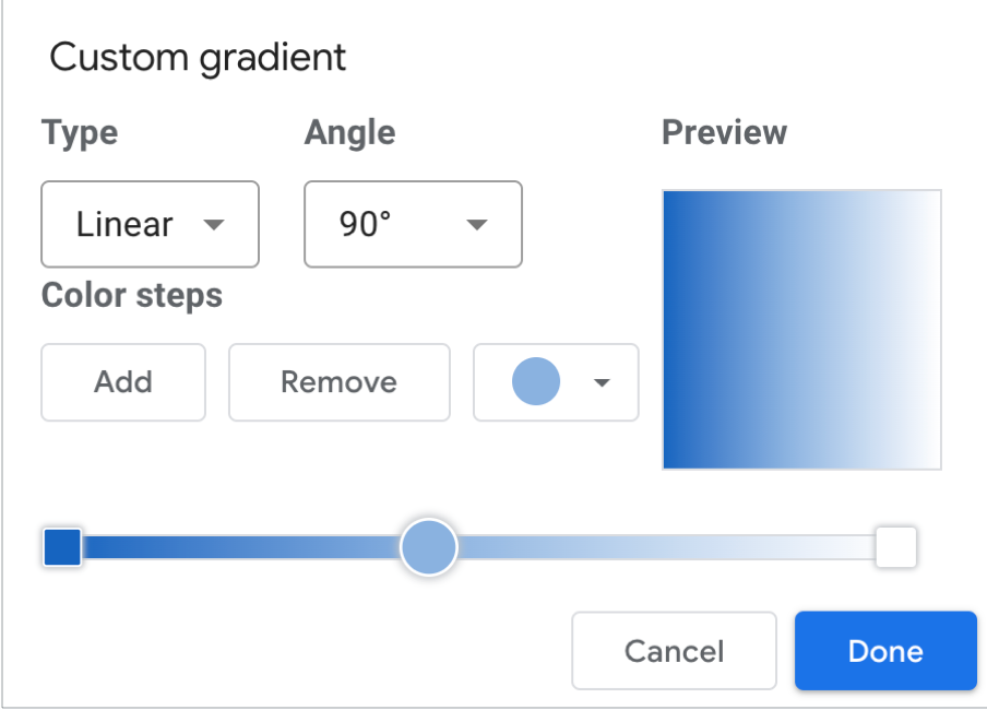
¡Puntos adicionales! Añadir un gradiente al encabezado
Un gradiente es la fusión gradual de un color con otro, Los gradientes son una opción de la propiedad del color de fondo.
Haz clic en el control del color de fondo: .
Haz clic en Gradiente.
Las muestras de color de la izquierda y la derecha determinan los colores inicial y final del gradiente. Introduce los valores hexadecimales de color específicos; puedes seleccionar un color de la paleta o utilizar los controles deslizantes verticales.
La flecha de orientación controla el flujo del gradiente.
Paso 5: Añade un título al informe
La herramienta de texto permite comentar los informes y gráficos.
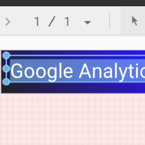
Selecciona la herramienta Texto de la barra de herramientas.
Dibuja un cuadro de texto en el rectángulo del banner.
Escribe Google Analytics Demo Dashboard en el campo.
Destaca el texto. Utiliza el panel de propiedades del texto de la parte derecha para cambiar el color y el tamaño de la fuente por los que más te gusten.
¡Hola! ¿Dónde está el botón GUARDAR?
Looker Studio guarda automáticamente cada cambio que hagas. De esta manera, no tendrás que hacer clic en Guardar cuando modifiques un informe. ¡Genial!
[[["Es fácil de entender","easyToUnderstand","thumb-up"],["Me ofreció una solución al problema","solvedMyProblem","thumb-up"],["Otro","otherUp","thumb-up"]],[["Es difícil de entender","hardToUnderstand","thumb-down"],["La información o el código de muestra no son correctos","incorrectInformationOrSampleCode","thumb-down"],["Me faltan las muestras o la información que necesito","missingTheInformationSamplesINeed","thumb-down"],["Problema de traducción","translationIssue","thumb-down"],["Otro","otherDown","thumb-down"]],["Última actualización: 2025-08-20 (UTC)."],[],[],null,["# Tutorial: Create a new report\n\nIn this tutorial, you'll learn how to create a new report in Looker Studio.\n\nStep 1: Create a new blank report\n---------------------------------\n\n1. [Sign in to Looker Studio.](https://lookerstudio.google.com)\n\n2. Click **Create** and then select **Report**.\n\n3. You'll see the report editor tool, with the *Add data to report* panel open. This panel has two tabs: *Connect to data* and *My data sources*.\n\n \u003e You'll learn more about connectors and data sources in the [Connect to your data](/looker/docs/studio/about-connectors-data-sources-and-credentials) topic.\n 1. In the *Connect to data* tab, select a [connector](/looker/docs/studio/connector), create a new data source, and add that to your report:\n\n 1. Select the type of data that you want to visualize.\n 2. Provide your account or other details.\n 3. In the bottom right, click **Add**.\n 2. Use *My data sources* to add an existing [data source](/looker/docs/studio/data-source) to your report:\n\n \u003e \u003cbr /\u003e\n \u003e\n \u003e The **My data sources** tab includes a number of sample data sources.\n \u003e\n \u003e To follow along with this tutorial, select the `[Sample] GA4 - Google Merchandise Store` data source. If you add a different data source, your results may vary from the steps described in this tutorial.\n \u003e\n \u003e \u003cbr /\u003e\n \u003e\n \u003e | **Tip:** If you have a lot of data sources, use the search bar to locate the data source that you want.\n \u003e |\n \u003e | \u003cbr /\u003e\n \u003e |\n \u003e \u003cbr /\u003e\n \u003e\n 1. Locate the data source that you want.\n 2. In the bottom right, click **Add**.\n 3. The data source is added to your report.\n4. A table appears with fields from that data source.\n\n Use the [properties panel](/looker/docs/studio/properties-panel) on the right to change the data and style of the table.\n5. By default, the layout type is set to **Freeform layout** . To use a [responsive report](/looker/docs/studio/create-a-responsive-report) instead, select the **Responsive layout** type. You can change the layout setting later.\n\n - A freeform report is tailored for desktop screens. Choose this report type if you want pixel-perfect control over the placement and sizing of each report component.\n - A responsive report scales well across many different screen sizes. Choose this report type if you expect your users to regularly view the report on a tablet or other mobile device.\n6. In the top left, name your report by clicking *Untitled Report* and then entering a new name.\n\n7. (Optional) Add a description to your report by clicking the three-dot menu and selecting **Details** . Then add a description to the **Description** field.\n\n### Add more data\n\nTo add more data sources to a report, in the toolbar, click **Add data**.\n\nStep 2: Add another chart to the report\n---------------------------------------\n\nThe time series chart plots data over the course of time.\n\n1. In the toolbar, click **Add a chart**.\n\n2. Select a **Time series** chart .\n\n3. Click the canvas where you want the chart to appear.\n\n4. Looker Studio automatically adds the *Date* dimension and the *Views* metric (assuming you're using an Analytics data source).\n\n5. To adjust the chart's position, drag it, or select the chart and move it by using your keyboard arrow keys.\n\n | **Tip:** Each press of the arrow key moves the chart one full column or row (10 px) on the grid. Hold the Shift key down while using your arrow keys to nudge the selected components into place one pixel at a time.\n6. To adjust the chart's size, select it, and then drag a corner or mid-line point.\n\n7. Break down the chart by *Device Category*:\n\n 1. Make sure that the time series chart is selected.\n 2. On the right, in the **Data** panel, use the search tool to find the *Device Category* dimension.\n 3. Drag the field and drop it on the **Breakdown Dimension** target.\n\nYour chart should now display data series for the different device categories (Mobile, Desktop, and Tablet).\n\nStep 3: Style the report\n------------------------\n\nPreset themes let you apply color and style options to your entire report.\n\n1. Edit the report.\n2. In the toolbar, click **Theme and layout**.\n3. In the THEME tab, click the theme that you want to apply.\n\nYou can customize any of the preset themes. For example, you can select a different background color that better matches your brand:\n\n1. In the *Theme and Layout* panel, click **Customize**.\n2. Scroll down to the *Background and Border* section.\n3. Use the color picker to set the **Background** color to your favorite color. Something in a mauvy-peach, perhaps?\n\nStep 4: Add a banner\n--------------------\n\nUse a colored rectangle as a background banner for your report header.\n\n1. Select the [Page](/looker/docs/studio/page) component by clicking anywhere in the grid area.\n2. Select the **Rectangle** tool from the toolbar.\n3. Draw a rectangle across the top of the page.\n4. On the right, in the *Rectangle Properties* panel, set the rectangle background color to blue.\n\n#### Extra credit! Add a gradient to the banner.\n\nWhen one color fades into another, the effect is called a gradient. Gradients are an option of the background color property.\n\n1. Click the background color control:\n2. Click **Gradient**.\n\nThe left and right color swatches determine the starting and ending colors. Enter the specific color hex values, choose from the palette, or use the vertical sliders to select the color.\n\nThe orientation arrow controls the flow of the gradient.\n\nStep 5: Add a title to the report\n---------------------------------\n\nThe text tool lets you annotate your reports and charts.\n\n1. Select the **Text** tool from the toolbar.\n2. Draw a textbox inside the banner rectangle.\n3. Type `Google Analytics Demo Dashboard` in the field.\n4. Highlight the text. Use the *Text Properties* panel on the right to change the font color and the font size to something that looks nice to you.\n\n\u003e #### Hey! Where's the SAVE button?\n\u003e\n\u003e Looker Studio automatically saves every change you make, so there's no need to click **Save** when editing a report. Pretty sweet!\n\nNext steps\n----------\n\n[Add more charts to your report.](/looker/docs/studio/tutorial-add-charts-to-your-report)"]]