Visualiza y examina datos mediante gráficos. En esta lección veremos cómo añadir al informe un gráfico circular, un gráfico de barras y un mapa geográfico.
Cómo añadir un gráfico
Para añadir un gráfico a la página actual, siga estos pasos:
- Edite el informe.
- Ve a la página en la que vas a colocar el gráfico.
- En la barra de herramientas, haz clic en Añadir un gráfico.
- Selecciona el gráfico que quieras añadir.
- Haz clic en el lienzo para añadir el gráfico al informe.
- Selecciona uno o varios gráficos para moverlos o cambiar su tamaño según sea necesario.
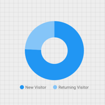
Paso 1: Añade un gráfico circular
 Para ofrecer una comparación general de un pequeño número de métricas o variables, use gráficos circulares.
Más información sobre los gráficos circulares
- Sigue los pasos descritos en la sección [Cómo añadir un gráfico](#how-to-add-a-chart) para añadir un gráfico circular al informe.
- En el panel Propiedades, selecciona la pestaña CONFIGURACIÓN.
- Para acceder al selector de dimensiones, haz clic en el chip de dimensión Fuente.
- Haz clic en la dimensión Tipo de usuario.
- Haz clic en la pestaña ESTILO.
- Usa el control deslizante para cambiar el aspecto del gráfico.

- Utiliza la propiedad Leyenda para colocar las etiquetas de métricas debajo del gráfico circular:

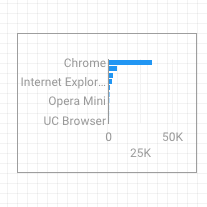
Paso 2: Añade un gráfico de barras
Los gráficos de barras son muy útiles para mostrar y comparar la magnitud de diversas variables.
Más información sobre los gráficos de barras
- Siga los pasos descritos en la sección Cómo añadir un gráfico para añadir un gráfico de barras al informe.
- En el panel Propiedades, selecciona la pestaña CONFIGURACIÓN.
- Haz clic en la dimensión Fuente y cambia su valor a Navegador.
- Haz clic en la flecha de retroceso:
 .
. - Haga clic en la métrica Sesiones y cámbiela a Usuarios.
- Haz clic en la pestaña ESTILO.
- Cambia la orientación a Horizontal :
 .
. - Desplázate hasta la sección Fondo y borde de la pestaña ESTILO.
- Asigna a Color de borde el color gris:
 .
.
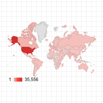
Paso 3: Añade un mapa de Google
Los mapas de Google permiten ver la distribución global de las sesiones o de otras métricas.
Más información sobre Google Maps
- Sigue los pasos descritos en la sección Cómo añadir un gráfico para añadir un mapa de Google al informe. Elige el estilo del mapa de burbujas.
- En el panel Propiedades, selecciona la pestaña CONFIGURACIÓN.
- Haz clic en el campo predeterminado Ubicación y sustitúyelo por la dimensión Ciudad.
- Añade métricas para el color y el tamaño de las burbujas. Por ejemplo, selecciona Sesiones para Tamaño y Tiempo medio en la página para Color.
- Selecciona la pestaña Estilo.
- Utilice los controles deslizantes para ajustar los detalles del fondo, como las vías, los puntos de referencia y las etiquetas.
- En la sección Colores, selecciona los colores del rango de valores de métricas.
- En la sección Controles del mapa, activa o desactiva los controles del mapa que quieras que utilicen los usuarios.
- Consulta el informe. Puedes arrastrar la imagen, desplazarte por ella y ampliarla. También puedes usar Street View.
Paso siguiente
¡Enhorabuena! Has creado tu primer informe de Looker Studio.
Si quieres, puedes añadir títulos y más visualizaciones o cambiar colores y estilos. Cuando lo tengas todo listo para continuar, ve a la lección siguiente: Ver y compartir un informe.
Recursos relacionados
Tipos de gráficos de Looker Studio