Learn how to add charts and controls to your reports.
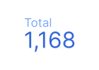 Scorecard
Use a scorecard to display a summary of a single metric. Learn more about scorecards.
Chart variations: Scorecard with compact numbers.
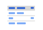 Table
Table
Use a table to turn your data into a chart that can be sorted and paged. Learn more about tables.
Chart variations: Table with bars, table with heatmap.
 Pivot table
Use a pivot table to reorganize and summarize your data. Learn more about pivot tables.
 Time series
Use a time series chart to look at how your data changes over time. Learn more about time series charts.
Chart variations: Sparkline chart, smoothed time series chart.
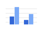 Bar and Column
Use a bar or column chart to show one or more categories, or groups, of data, especially if each category has subcategories. Learn more about bar and column charts.
Chart variations: Bar chart, column chart, stacked column chart, 100% stacked column chart, stacked bar chart, 100% stacked bar chart.
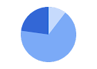 Pie
Pie
Use a pie chart to show data as "slices of pie," or proportions of a whole. Learn more about pie charts.
Chart variations: Donut chart
 Combo
Combo
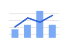
Use a combo chart to show each data series as a different marker type, either a column or a line. Learn more about combo charts.
Chart variations: Stacked combo chart, line chart, smoothed line chart.
 Geo
Geo
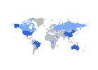
Use a geo chart to show a map of a country, continent, or region. The values for each location will be shown with colors. Learn more about geo charts.
 Google Maps
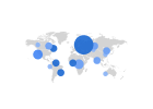
Use a Google Map to explore geographic data. Learn more about Google Maps.
Chart variations: Bubble map, filled map, heat map, line map.
 Area
Area
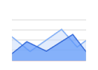
Use an area chart to emphasize graphically the differences of changes in value between categories of data. Learn more about area charts.
Chart variations: Stacked area chart, 100% stacked area chart.
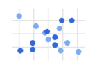 Scatter
Use a scatter chart to show numeric coordinates along the horizontal (X) and vertical (Y) axes and to look for trends and patterns between two variables. Learn more about scatter charts.
Chart variations: Bubble chart
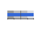 Bullet
Use a bullet chart to track progress of a given metric towards a range of goals. Learn more about bullet charts.
See also: Gauge chart.
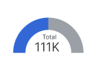 Gauge
Gauge
Use a gauge to see how well a given metric is performing against a target goal. Learn more about gauge charts.
Chart variations: Gauge with range.
See also: Bullet chart.
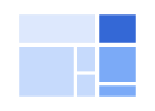 Tree map
Use a tree map to show a data tree, where objects are organized into parent-child hierarchies. Learn more about tree map charts.
 Sankey
Use a sankey chart to display a flow from one set of values to another. Learn more about sankey charts.
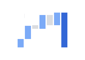 Waterfall
Use a waterfall chart to visualize how a sequence of positive and negative values adds up to a total. Learn more about waterfall charts.
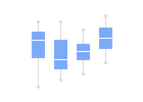 Boxplot
Use a boxplot chart to help you visualize the distribution and spread of values in your dataset. Boxplot charts can be especially useful for comparing values across categories. Learn more about boxplot charts.
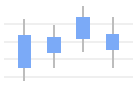 Candlestick
Use a candlestick chart to help you visualize ranges in your data, including opening and closing values, and the highs and lows of each range. Learn more about candlestick charts.
Timeline
Use a timeline chart to help you visualize the relationships between groups of events and compare the timespans over which these events took place. Learn more about timeline charts.
Funnel
Use a funnel chart to help you visualize how a metric changes over events in a sequential process. Learn more about funnel charts.
 Community visualizations
Use a chart created by third-party developers to display your data in various ways. Learn more about community visualizations.
