This page describes how to use Key Visualizer to check for performance issues that are related to your Firestore in Datastore mode usage patterns.
Before you begin
To use Key Visualizer for Datastore mode, you must enable the Firestore Key Visualizer API.
Roles required to enable APIs
To enable APIs, you need the Service Usage Admin IAM
role (roles/serviceusage.serviceUsageAdmin), which
contains the serviceusage.services.enable permission. Learn how to grant
roles.
Required roles
Make sure that your account is granted one of the following IAM roles:
- Cloud Datastore Owner
- Cloud Datastore Key Visualizer Viewer
- Editor
- Owner
These roles include the following IAM permissions which are required to access Key Visualizer:
datastore.keyVisualizerScans.getdatastore.keyVisualizerScans.listdatastore.databases.getMetadataresourcemanager.projects.get
You can also define a custom role with the required permissions.
Viewing a scan for a time period
Each Key Visualizer scan covers a two hour period. A scan for a given period is available for databases with traffic that exceeds 3000 document operations in any given minute in that period.
To launch Key Visualizer:
In the Google Cloud console, go to the Databases page.
Select the required database from the list of databases.
In the navigation menu, click Key Visualizer.
Select a time span and a metric from the available Key Visualizer scans:
Click the Pencil icon in the upper right. Select a Date and a Time Span.
Scans are available based on scan eligibility. You can't select time spans that did not meet scan eligibility or that are still processing. The two most recent scans of the day will take some time to process before they are available.
Select All entity data or All index data as the source.
Click Update.
Select a metric to analyze:
Click the metrics dropdown in the upper left and select a metric to view. Key Visualizer opens in the Ops/s metric for entity keys and Index Write Ops/s metric for index keys by default.
To compare metrics or look for data correlations, you can display multiple Key Visualizer metrics together. See Finding connections between different metrics.
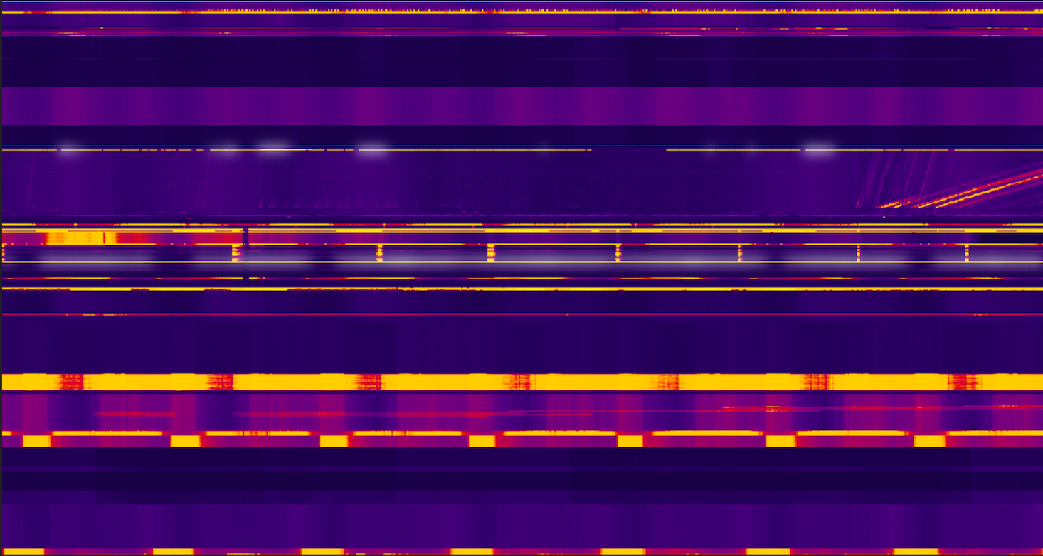
Viewing an activity overview
To get an overview of activity during the selected two-hour time period, review the heatmap for the default metric.
The following example shows a heatmap where there are major differences in the usage pattern for different key ranges:
- Ranges shown in dark colors have little or no activity.
- Ranges in bright colors have significantly more activity.
- The glowing white range in the middle has very high activity.
Entity keys scan
The Ops/s metric measures the number of requests per second for each key range. This metric is a sum of write, lookup, and query requests. Key Visualizer shows this metric by default when you open a heatmap.
After getting an idea of the overall activity in your database, you can continue your investigation by looking at other metrics and focusing on key ranges that might be causing problems. Learn more.
Index keys scan
The Index Write Ops/s metric at a given cell measures the average index writes per second within the corresponding 10-second time interval and key range.
What's next
- Learn to recognize common patterns in heatmaps for entity keys.
- Learn to recognize common patterns in heatmaps for index keys.
- Find out how to explore a heatmap in depth.