以下各个部分介绍性能信息中心可以提供帮助的各种情况。 本页面介绍了项目性能用例。如需了解Google Cloud 性能,请参阅Google Cloud 性能用例。
当前性能诊断:它是网络还是应用?
性能信息中心让您可以实时了解项目的底层网络性能。它可以帮助您确定应用问题是由软件问题还是网络问题造成的。如果您看到大量丢包或高延迟时间,则可能至少一部分是Google Cloud 网络问题。如果丢包率和延迟时间看起来很正常,则可能是该应用有问题。
场景:调查当前发生的问题
您打开了性能信息中心,并在过去一个小时内的丢包率摘要图表中看到较大峰值。由于此图表汇总了所有可用区的丢包率,因此您还不知道发生丢包的位置。
选择区域和可用区
如需查看特定区域的数据,您需要从位置菜单中选择区域。您最多可以选择五个区域。
如要查看区域对的地区到地区数据,请点击与区域对相对应的区域热图中的方形。

查看所选时间的数据
为了进一步调查,请点击峰值出现的时间。这会打开所选时间的热图。
您可以通过拖动摘要图表时间轴上的光标来调整您的选择。
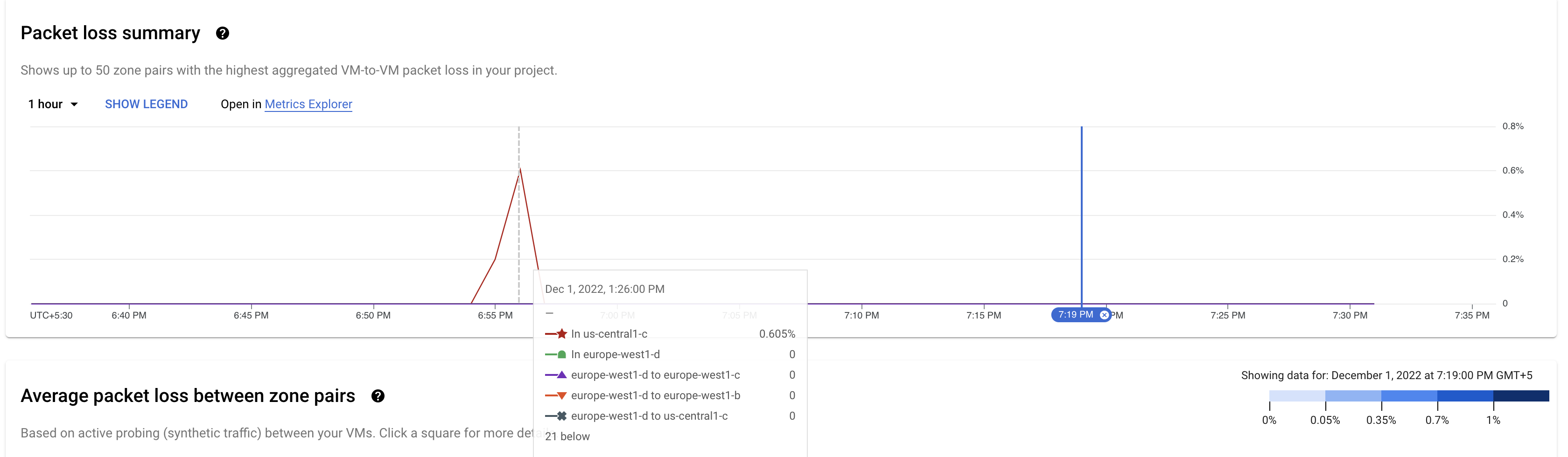
显示的热图会显示您所选时段的数据。热图中的方块用颜色标记。如热图左侧的图例所示,每种颜色反映了不同的丢包百分比。

由于丢包率仅在一个方向上测量,因此显示丢包率的方块表示从源轴上的区域到目标轴上的区域的丢包率。
要查看专用于可用区对的图表,请点击源可用区 us-central1-c 对应的蓝色方块。详情图表会保留您从前一页中选择的时间。

您会在图表上看到两条线,每个数据流方向一条。在此示例中,紫色线条显示了来自源可用区 us-central1-c 的流量的丢包。
查看更多详细信息
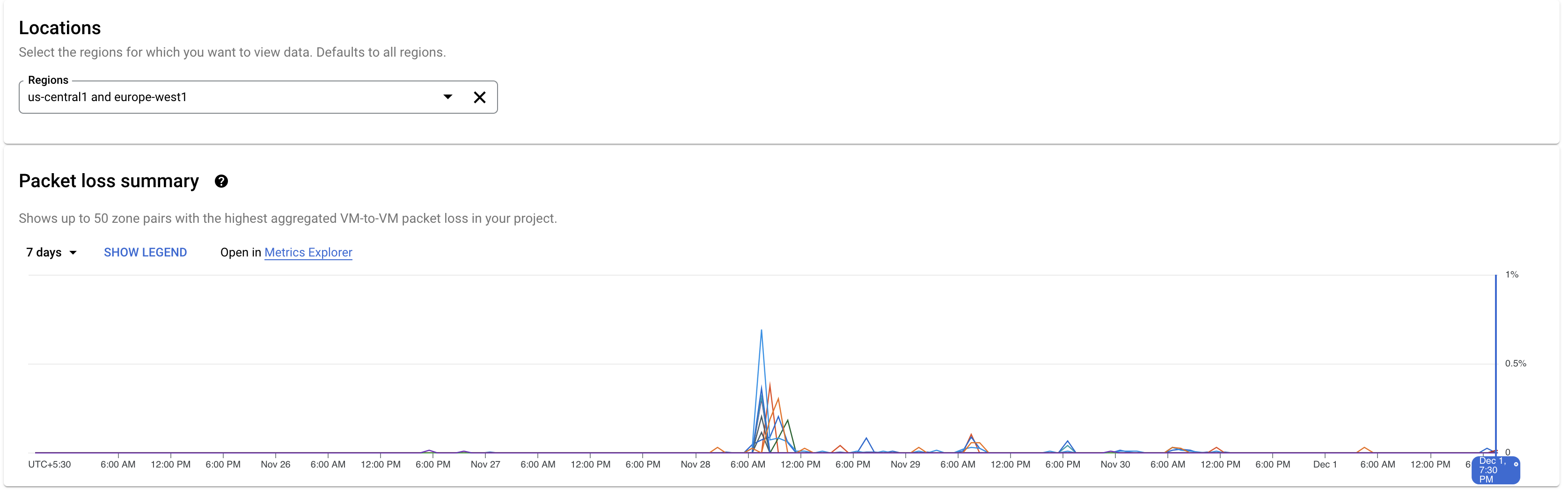
图表显示此丢包峰值是一个离群值。 您可以点击右上角的时间选择器来更改此可用区数据的显示时间范围。您最多可以查看 6 周的数据。在此示例中,您可以点击 7 天来查看所选可用区对的丢包率趋势。
历史性能诊断
通过性能信息中心,您可以查看项目在过去特定时间段内的网络性能。您最多可以查看 6 周的历史数据。
场景:调查最近发生的问题
您正在调查本周早些时候发生的延迟时间问题。
确定存在延迟问题的区域
您可以使用性能信息中心中的历史性能数据检查有问题的区域。
要更改视图,请点击延迟时间标签页。
查看所选时间的延迟时间数据
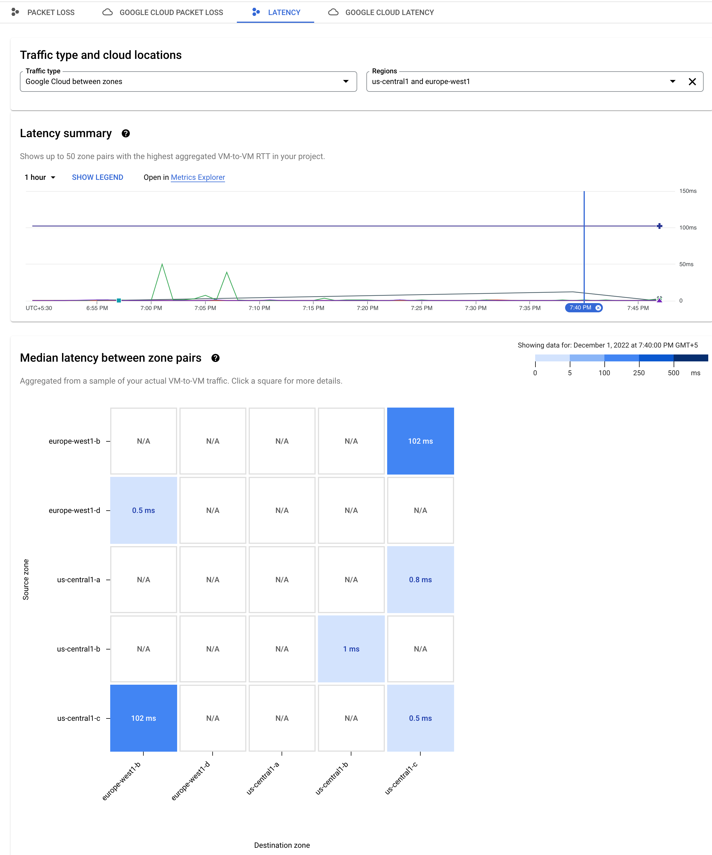
如需调整延迟时间摘要图表的时间窗口,您可以使用右上角的时间选择器。在此示例中,将其设置为 1 小时。要查看热图以了解特定时间的延迟情况,请在图表的时间轴上点击该时间。

由于图表左侧一直显示较高的值,因此,请点击时间轴以查看在该时间点的延迟时间热图。

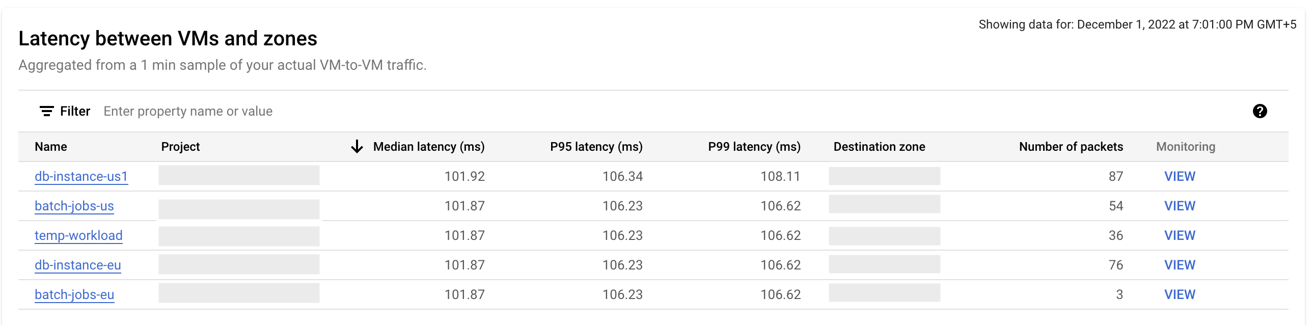
热图中的深色蓝色方块显示可用区 us-central-1c 和 europe-west1-b 之间的延迟时间为 102 毫秒。如需进行进一步调查,请点击深蓝色方块。随即打开的延迟时间详情图表会保留您从前一页中选择的时间,并显示蓝色的“固定”图标。
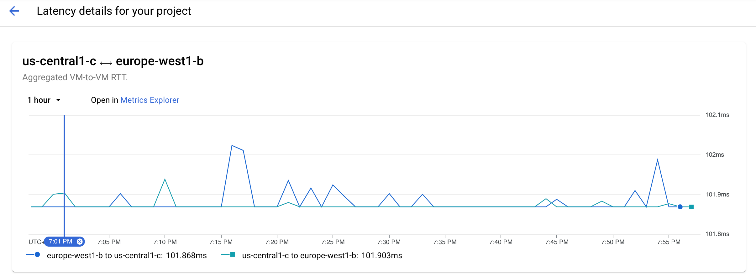
蓝线显示了从 us-central-1c 到 europe-west1-b 的流量的延迟时间峰值。
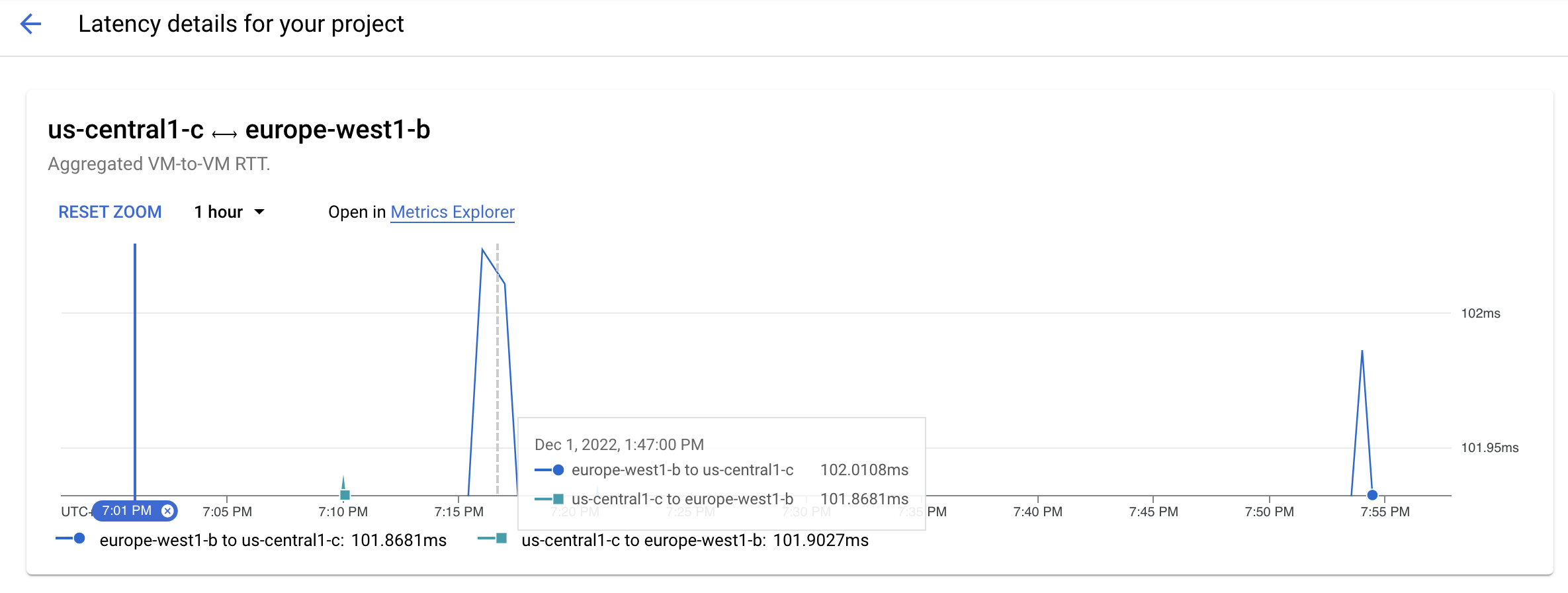
如需放大峰值,请拖动鼠标。
您现在可以看到高峰持续了 2 到 3 分钟,并在晚上 7:18 达到峰值。
查看更多详细信息
您还可以在“虚拟机与地区之间的延迟时间”表格中查看虚拟机及其项目的详细信息,以及每小时总延迟时间。因此,您可以准确地确定哪些虚拟机导致了峰值,并重新考虑现有配置或部署新资源以解决此问题。