This page features common use cases for planning for performance across geographies by using the map view. Performance Dashboard gives you visibility into the latency and packet loss of the entire Google Cloud network and the performance of your project's resources. With the map feature of the Performance Dashboard, you can view the latency details of a specific location and point to the geographic location on the map.
Map view is only available when Traffic type is set to To the internet. Map view shows the median round-trip time (RTT) to internet endpoints, excluding hybrid traffic. For more information, see Latency views.
Scenario: Investigate latency from a city to a Google Cloud region
A typical use case of the map view is to find the latency from a city to a Google Cloud region. For example, you might want to host your application in a Google Cloud region and know a range of latencies that your users might see when they try to access your application from different geographies.
To view the median RTT between selected geographic areas and Google Cloud regions, select the View options tab on the Performance Dashboard page and then select To the internet for the traffic type. By default, the Latency (RTT) metric is selected.
You can view the latency summary in three ways:
- Table
- Map
- Timeline
Select the map view to see a world map that shows the median RTT between selected geographic areas and Google Cloud regions. For more information about how to use these views, see View project-specific latency data for traffic between Google Cloud regions and internet endpoints.
In map view, you can do the following:
- To view the median latency details of a geographic location, point to the geographic location on the map.
- To view the median latency between a Google Cloud region and geographic locations, click the Google Cloud region. The map refreshes to display the locations with traffic in the selected region.
- To view the latency over an interval from 1 hour to 6 weeks, click View timeline for a selected location and then select the interval.
- To view the latency details for a specific region, select the region, hold the pointer over a city, and then click View timeline. The line in the timeline indicates the latency for that traffic path. A traffic path is a route taken by the selected Google Cloud region and internet locations to reach its destination.
- To view the latency details over a time period, click a geographic location. The location-specific details appear in a timeline view in the sidebar panel that shows the traffic from the selected location to regions that contain VM instances.
Regions and endpoints are identified with the icons specified in the following table.
| Icon | Description |
|---|---|
| Identifies a Google Cloud region that is not selected. | |
| Identifies a Google Cloud region that is selected. | |
| Identifies a city. The color of a circle showing a given city on a global map indicates the latency of that city from a given Google Cloud region. The lighter the shade of blue, the lesser the latency. |
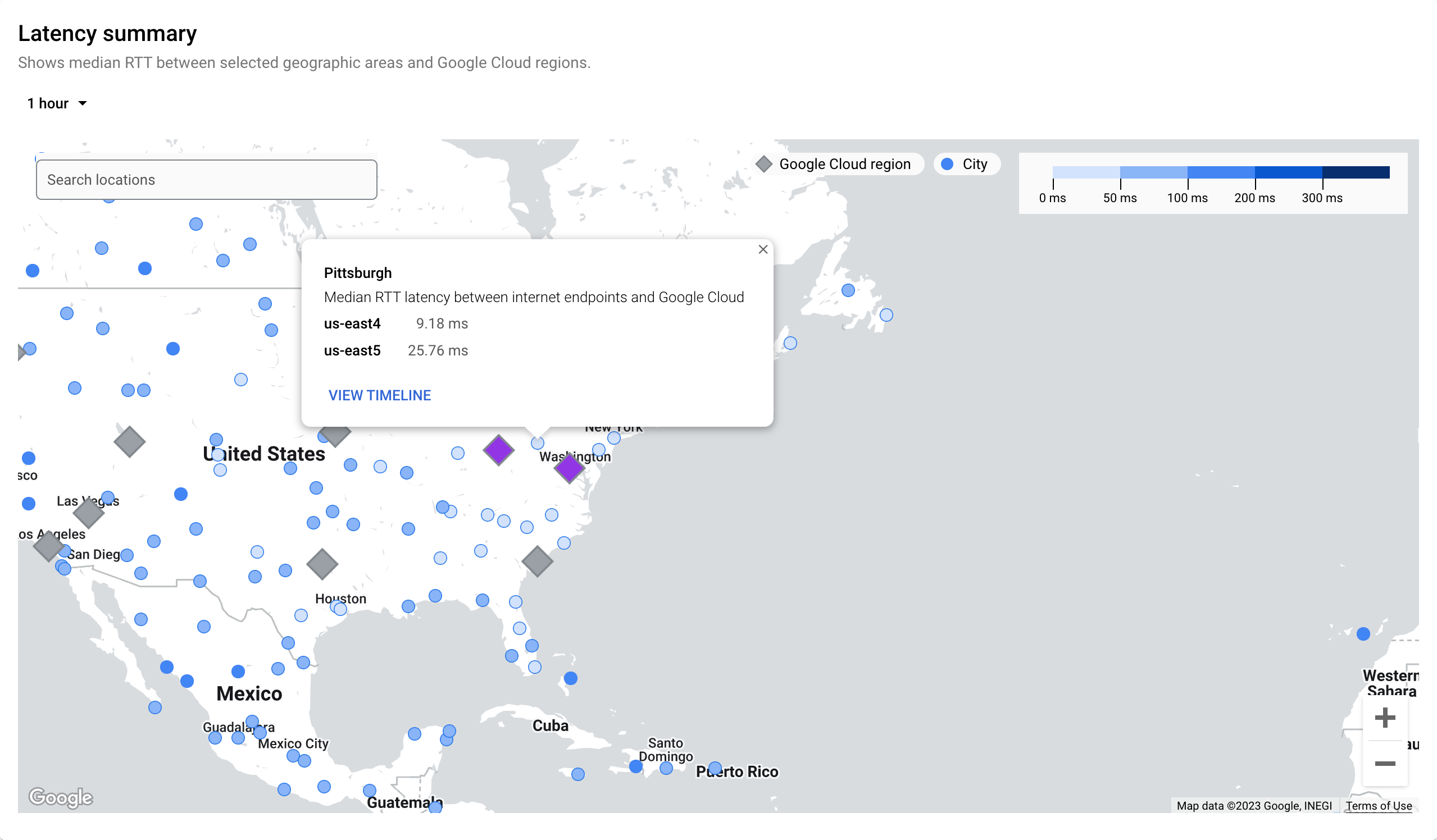
The following example shows the latency summary for the location Pittsburgh,
and the regionus-east4 and us-east5. The map shows that the latency between
us-east4 and Pittsburgh is 9.18 ms, and between Pittsburgh and
us-east5 is 25.76 ms.
This data can help you decide to deploy or move future workloads
to us-east4 because of the lower latency experienced by the end users in
Pittsburgh.
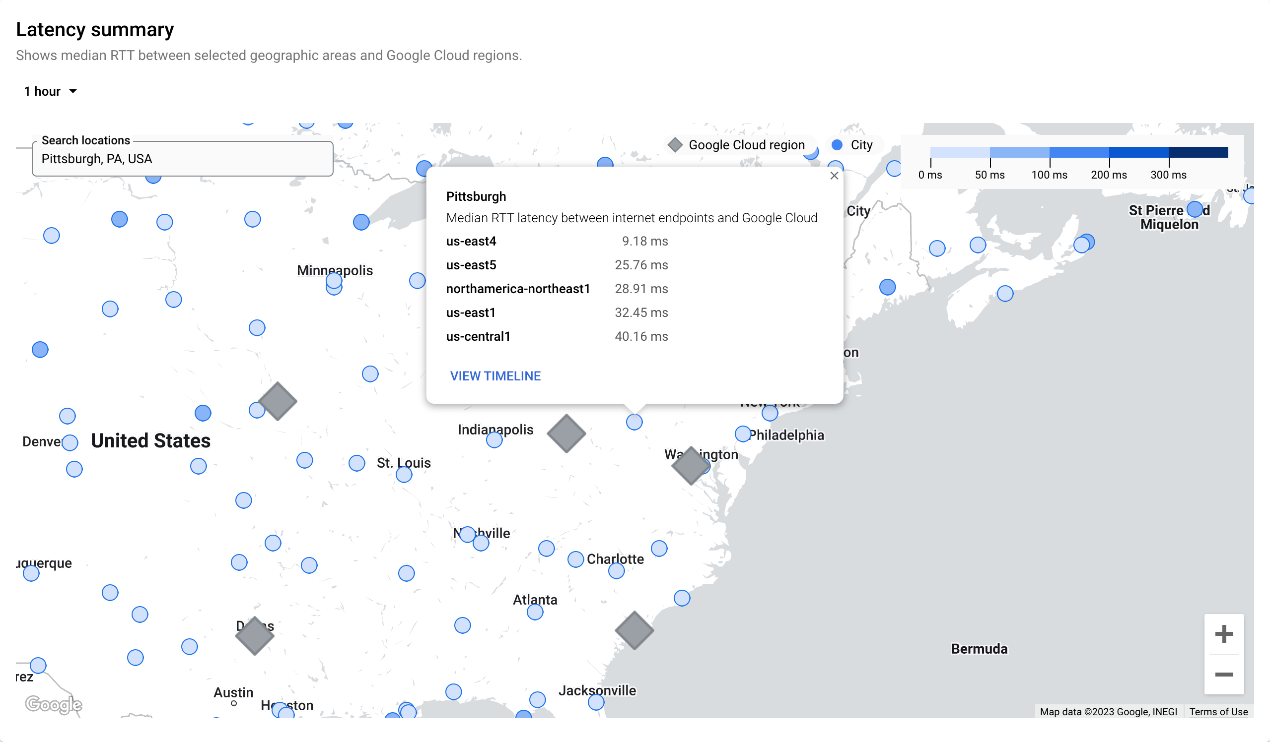
Scenario: Identify a list of nearby Google Cloud regions with the least latency from a city
A majority of users access your application from Pittsburgh and you want to minimize the latency for your end users.
The following image shows a list of Google Cloud regions that are near
to Pittsburgh and have the least latency. The list appears when you search for
Pittsburgh. This list helps you to choose the region that has the lowest latency
and that can optimize the deployment. In this example it's us-east4.
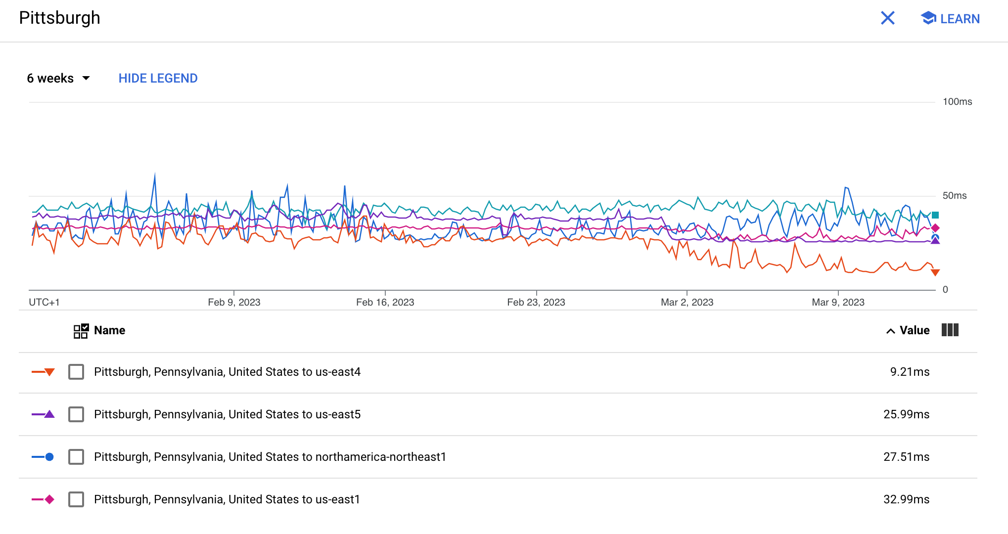
If you want to view the latency graph for a specific duration,
click View timeline.
To view latency information on the Performance Dashboard page, click Project for Google Cloud projects or Google Cloud for non-Google Cloud projects.
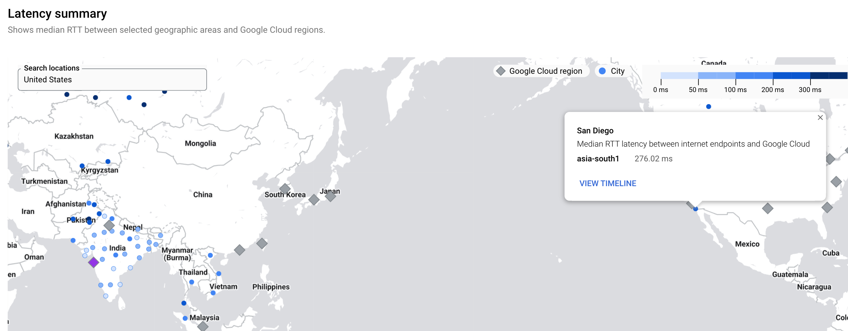
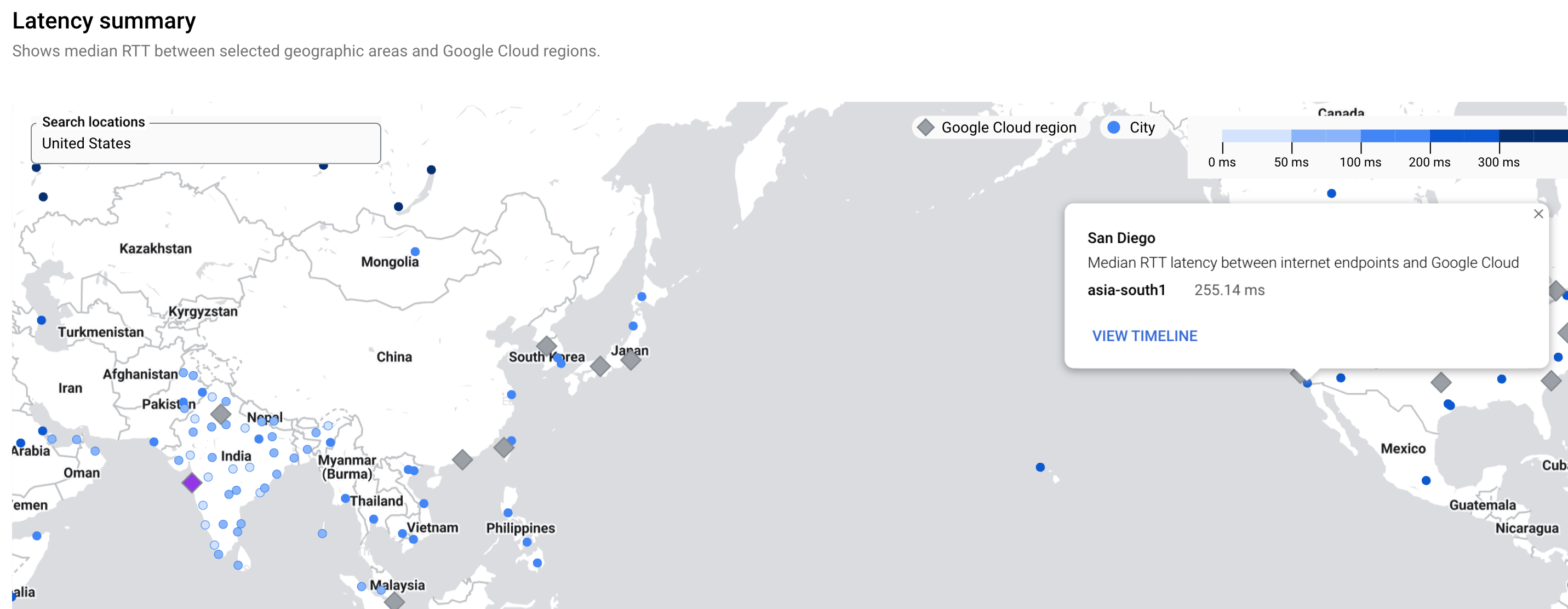
Scenario: Investigate latency from a city to a Google Cloud region for standard versus premium tier
You want to understand the latency numbers from a city to a Google Cloud region for standard versus premium tier networks.
In the Performance Dashboard, you can select the following options to define your network tier.
- Show data for any tier: projects use only one tier
- Show data only for the selected tier: available only if the traffic type is selected as To the internet. You can select the network tier as Standard or Premium. For more information about the network service tiers, see Network tiers.
The following images show the latency for the asia-south1 region
over Standard tier (276.02 ms) and Premium tier network (255.14 ms).
What's next
- Project performance use cases
- Planning for performance use cases
- View project-specific packet loss dashboard
- View Google Cloud packet loss dashboard
- Troubleshoot Performance Dashboard