Google Cloud のパフォーマンス ビューでは、選択したリージョンまたはゾーンペアのパフォーマンスの平均値を確認できます。 Google Cloud コンソールの Network Intelligence Center で Google Cloudのパフォーマンス ビューを使用すると、アプリケーションのパフォーマンス管理を計画できます。 Google Cloud のパフォーマンス ビューは、新しいリソースをデプロイする、または既存のワークロードを最適化するのに最適なリージョンとゾーンを特定するのに便利です。たとえば、現在特定のゾーンとリージョンで実行されているものの、他のリージョンのユーザーやその他のワークロードによってアクセスされていることがわかっているとします。
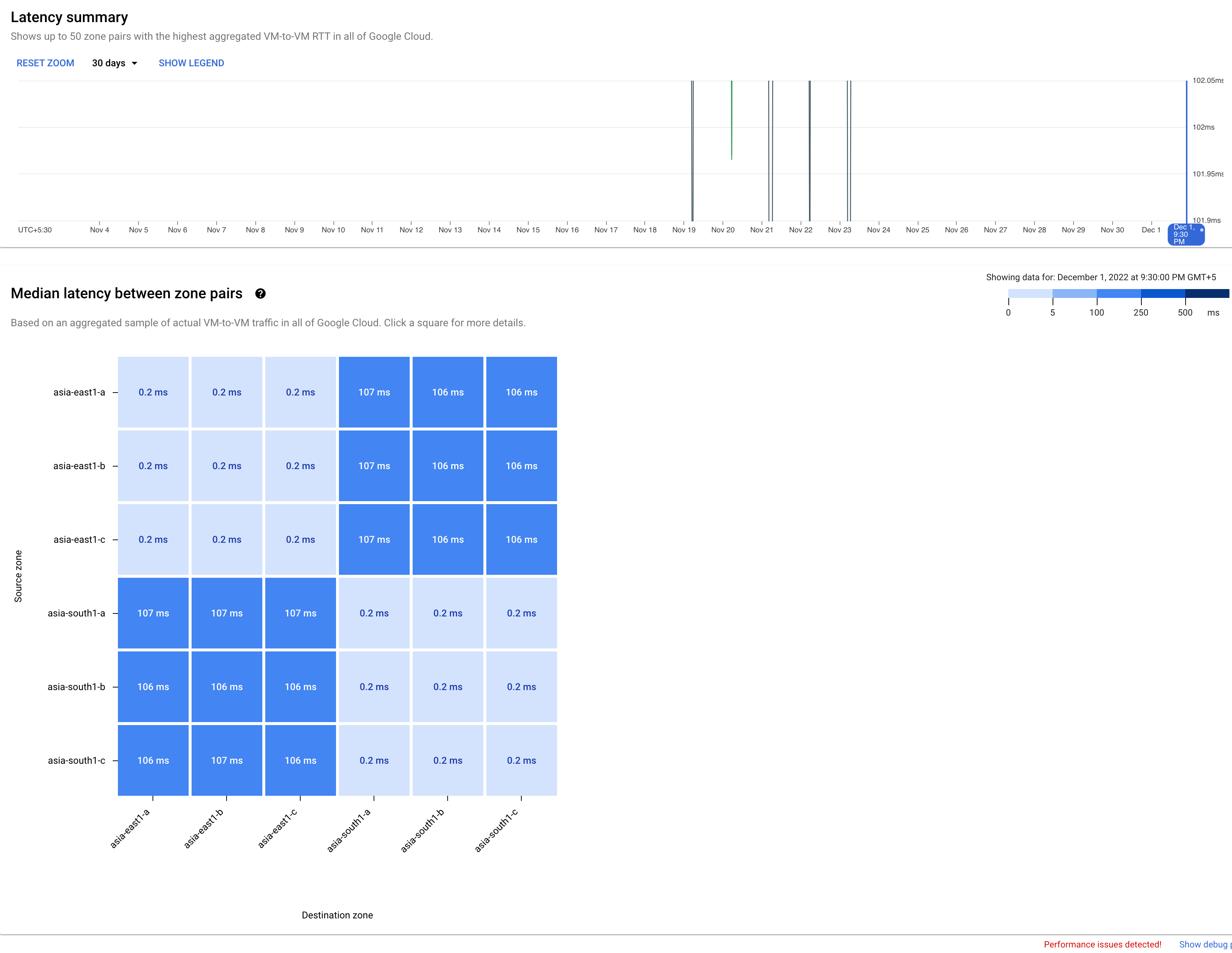
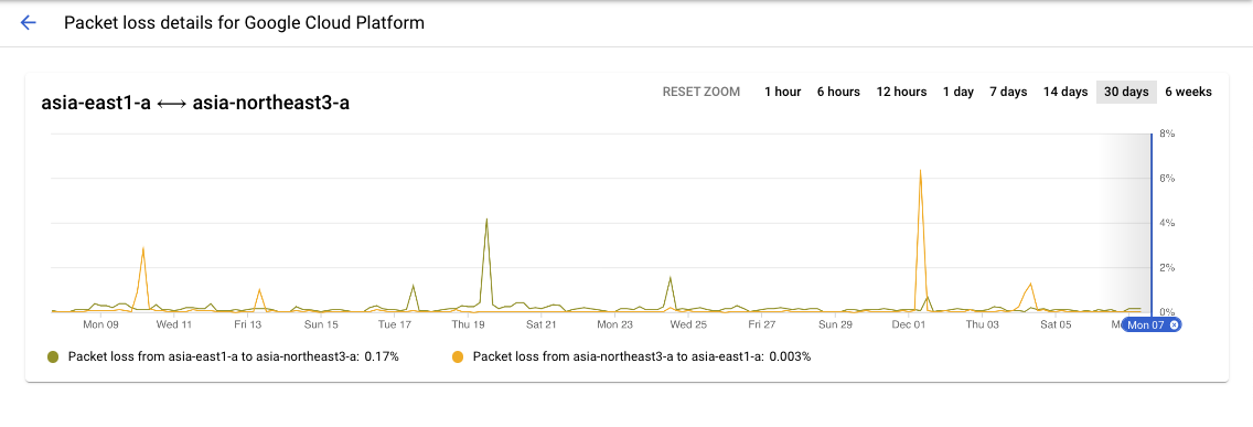
[[["わかりやすい","easyToUnderstand","thumb-up"],["問題の解決に役立った","solvedMyProblem","thumb-up"],["その他","otherUp","thumb-up"]],[["わかりにくい","hardToUnderstand","thumb-down"],["情報またはサンプルコードが不正確","incorrectInformationOrSampleCode","thumb-down"],["必要な情報 / サンプルがない","missingTheInformationSamplesINeed","thumb-down"],["翻訳に関する問題","translationIssue","thumb-down"],["その他","otherDown","thumb-down"]],["最終更新日 2025-09-04 UTC。"],[],[],null,["# Planning for performance use cases\n\nThe Google Cloud performance view provides an average performance\nview for selected region or zone pairs. You can use the Google Cloud\nperformance view in the Network Intelligence Center in the Google Cloud console to plan the\nperformance management of your applications. The Google Cloud performance\nview helps you to identify the best regions and zones to deploy new resources or\nto optimize your existing workloads. For example, you are currently running in\nspecific zones and regions, but you know they are accessed by users or other\nworkloads from other regions.\n\n### Scenario: Understand performance in new zones and regions\n\nYou want to add workloads to a region, and you want to know which zone best\nserves your requirements.\n\nYou use the source and destination region selection menu to select\nsource-destination pairs where you want to see the global average metrics for\nlatency or packet loss.\n\nTo view the zones within a region pair, you select the region pair from the heatmap.\nIn this example, you clicked the heatmap square for the region pair\n`asia-east1` and `asia-south1` and adjusted the time selector to 30 days.\n[](/static/network-intelligence-center/docs/performance-dashboard/images/gcpd-pl-sum-hm-blue.png) Packet loss region pair heatmap (click to enlarge)\n\n### Scenario: View historical data for regions or zone pairs\n\nUse the time series chart capability to display historical data for selected\nzone pairs. In this example, you can see the heatmap square for the zone pair\n`asia-east1-a` and `asia-northeast3-a` and the time selector adjusted to 30\ndays.\n[](/static/network-intelligence-center/docs/performance-dashboard/images/gpd-pl-dets-zonepairs.png) Zone pairs historical data (click to enlarge)\n\nWhat's next\n-----------\n\n- [Project performance use cases](/network-intelligence-center/docs/performance-dashboard/concepts/use-cases-project)\n- [Planning for performance across geographies use cases](/network-intelligence-center/docs/performance-dashboard/concepts/use-cases-performance-across-geographies)\n- [View project-specific packet loss dashboard](/network-intelligence-center/docs/performance-dashboard/how-to/view-project-specific-packet-loss)\n- [View Google Cloud packet loss dashboard](/network-intelligence-center/docs/performance-dashboard/how-to/view-google-cloud-packet-loss)\n- [Troubleshoot Performance Dashboard](/network-intelligence-center/docs/performance-dashboard/support/troubleshooting)"]]