This page describes how Performance Dashboard can help you diagnose performance issues in a Google Cloud project. The following sections describe commonly observed performance issues and their root causes.
Performance diagnostics: Is it the project or Google Cloud?
You observe latency or packet loss values in your project, and you want to validate and compare against reference data outside of your projects. The Performance for all of Google Cloud view in Performance Dashboard lets you correlate per-project network performance, such as VM-to-VM packet loss or latency, to performance over all of Google Cloud, to show packet loss and latency across all relevant Google Cloud infrastructure.
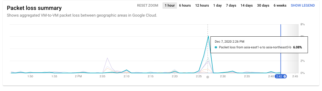
In the following example, you can see that Google Cloud traffic experienced
packet loss recently. By holding the pointer over the chart, you can see that
the peak loss occurred between asia-east1-a and asia-northeast3-b at 2:26 PM.
If your project's issues correspond to this time and location, you save
troubleshooting time because the issues impact all of Google Cloud.
Holding the pointer over a time series shows data for the source and destination. To show the chart legend, you click the Show Legend button on the time series chart. Holding the pointer over a zone pair in the legend highlights the time series data for that pair.
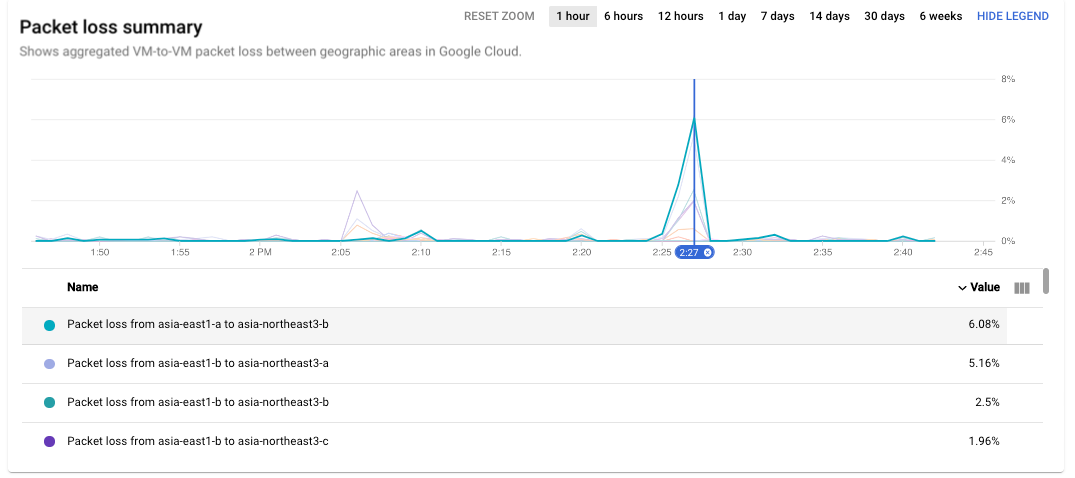
To see all the areas where the packet loss issue occurred at 2:26 PM, you update the heatmap by moving the time selector on the time series chart.
Scenario: Validate if the project performance differs from Google Cloud
Using the per-project Performance Dashboard in the Network Intelligence Center, you identified a region or zone pair with high latency or packet loss. You want to see if they differ significantly from the Google Cloud average.
Hold the pointer over the region or zone pair that you want to validate. You can see the value of latency or packet loss for your project and the value of the Google Cloud average for the same pair underneath. If they are similar, it indicates that the performance observed in your projects is similar to the average across all projects within the same region or zone pair.
Scenario: Investigate current high latency or packet loss issue
You identified the region or zone pairs with high packet loss or latency, and you want to compare those with the overall Google Cloud values. You can refine the Google Cloud performance view of Performance Dashboard by using the source and destination region selection capability. There are two ways in which you can refine the Google Cloud performance view:
To view data for specific regions, you select the regions from the Locations menu. You can select up to five regions.
To view zone-to-zone data for a region pair, you click the square in the regional heatmap that corresponds to the region pair.
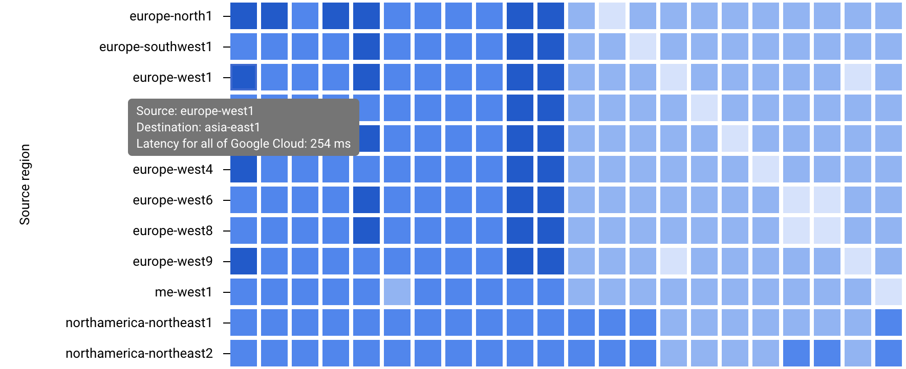
Regional heatmap (click to enlarge)
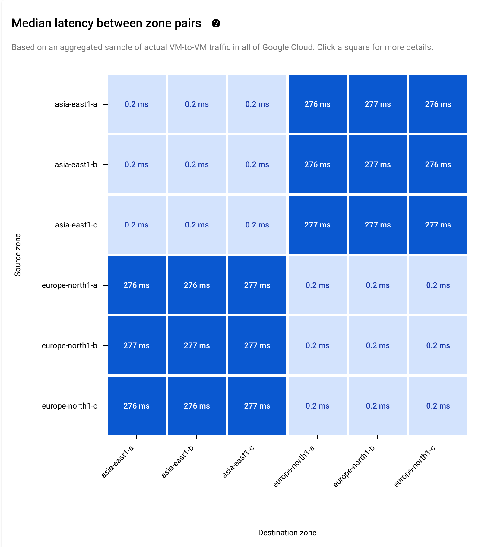
With both selection methods, the time series data and heatmap for the
selected pairs are displayed. In the following example, you selected
asia-east1 and europe-north1.
Scenario: Investigate historic high latency or packet loss issue
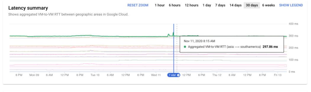
If you want to investigate a specific time slot in which you observed abnormal latency or packet loss values, you can use the time zoom in the time series. In this example, you have selected 30 days.
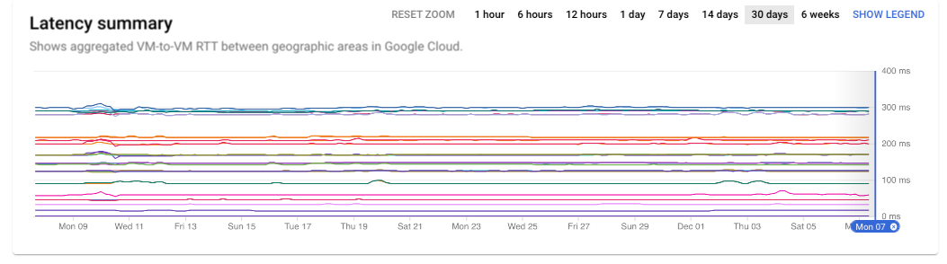
You can further refine the time selection by clicking and dragging on the time series chart to select the days or hours related to your investigation.
The chart displays the data for Monday the 9th through Friday the 13th. You can pinpoint a modest spike in latency on November 11 at 8:15 AM.
What's next
- Project performance use cases
- Planning for performance across geographies use cases
- Planning for performance use cases
- View project-specific packet loss dashboard
- Troubleshoot Performance Dashboard