The following sections describe various ways that Performance Dashboard can help you. This page describes project performance use cases. For Google Cloud performance, see Google Cloud performance use cases.
Current performance diagnostics: Is it the network or the application?
Performance Dashboard gives you live visibility into the network performance underlying your project. It helps you to determine whether application issues are the result of software or network problems. If you see significant packet loss or high latency, it is possible that a Google Cloud network problem is at least part of the issue. If packet loss and latency look normal, it is likely a problem with the application.
Scenario: Investigate an issue happening right now
You open Performance Dashboard and see a big spike in the Packet loss summary chart within the last hour. Because this chart summarizes packet loss across all zones, you don't yet know where the packet loss took place.
Select the regions and zones
To view data for specific regions, you select the regions from the Locations menu. You can select up to five regions.
To view zone-to-zone data for a region pair, you click the square in the regional heatmap that corresponds to the region pair.
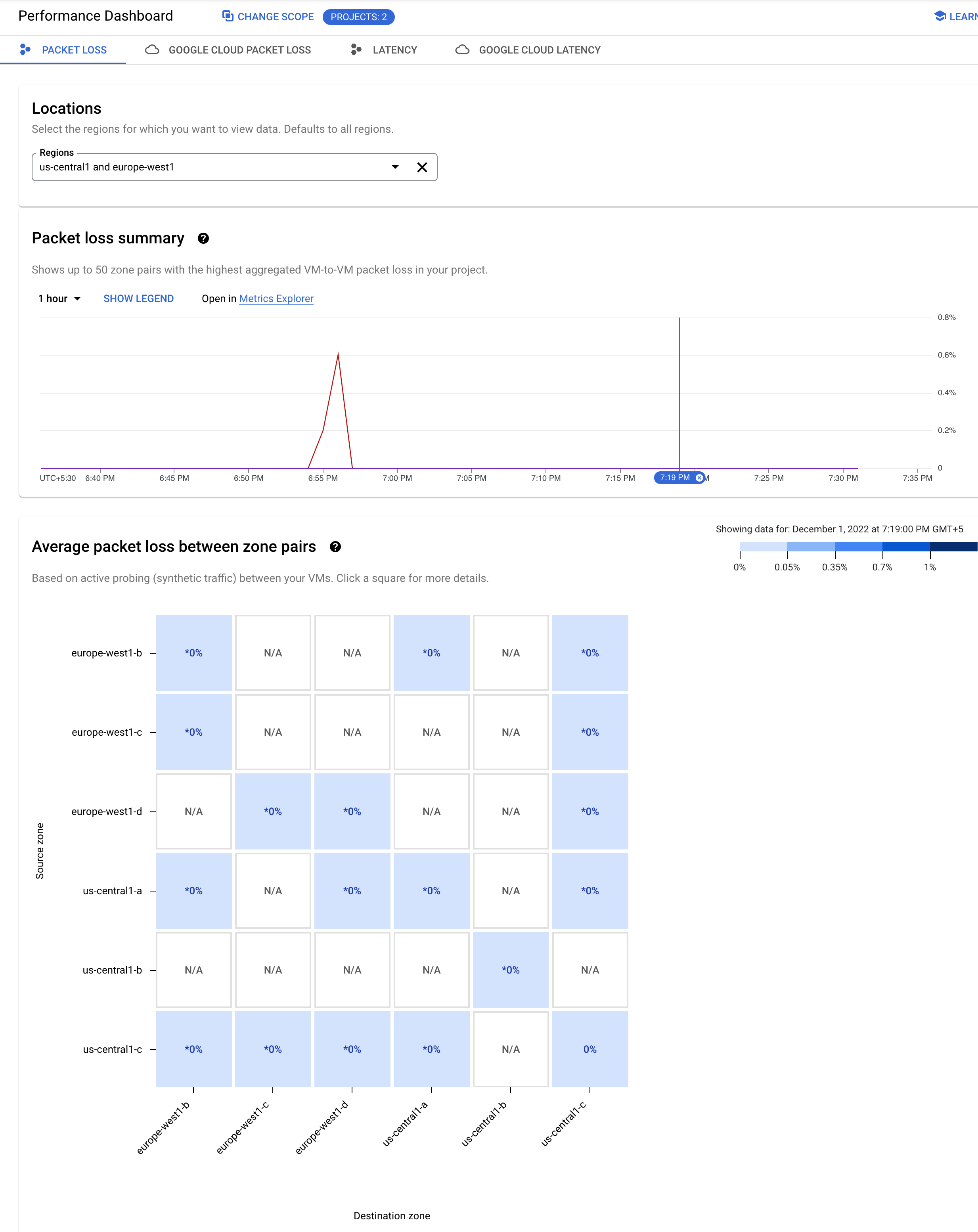
View the data for the selected time
To investigate further, you click the time that the spike took place. Doing so opens a heatmap specific to the selected time.
You can adjust your selection by dragging your cursor on the time axis of the summary chart.

The heatmap that is displayed shows you data for the time that you selected. The heatmap squares are color-coded. As summarized in the legend to the left of the heatmap, each color reflects a different percentage of packet loss.
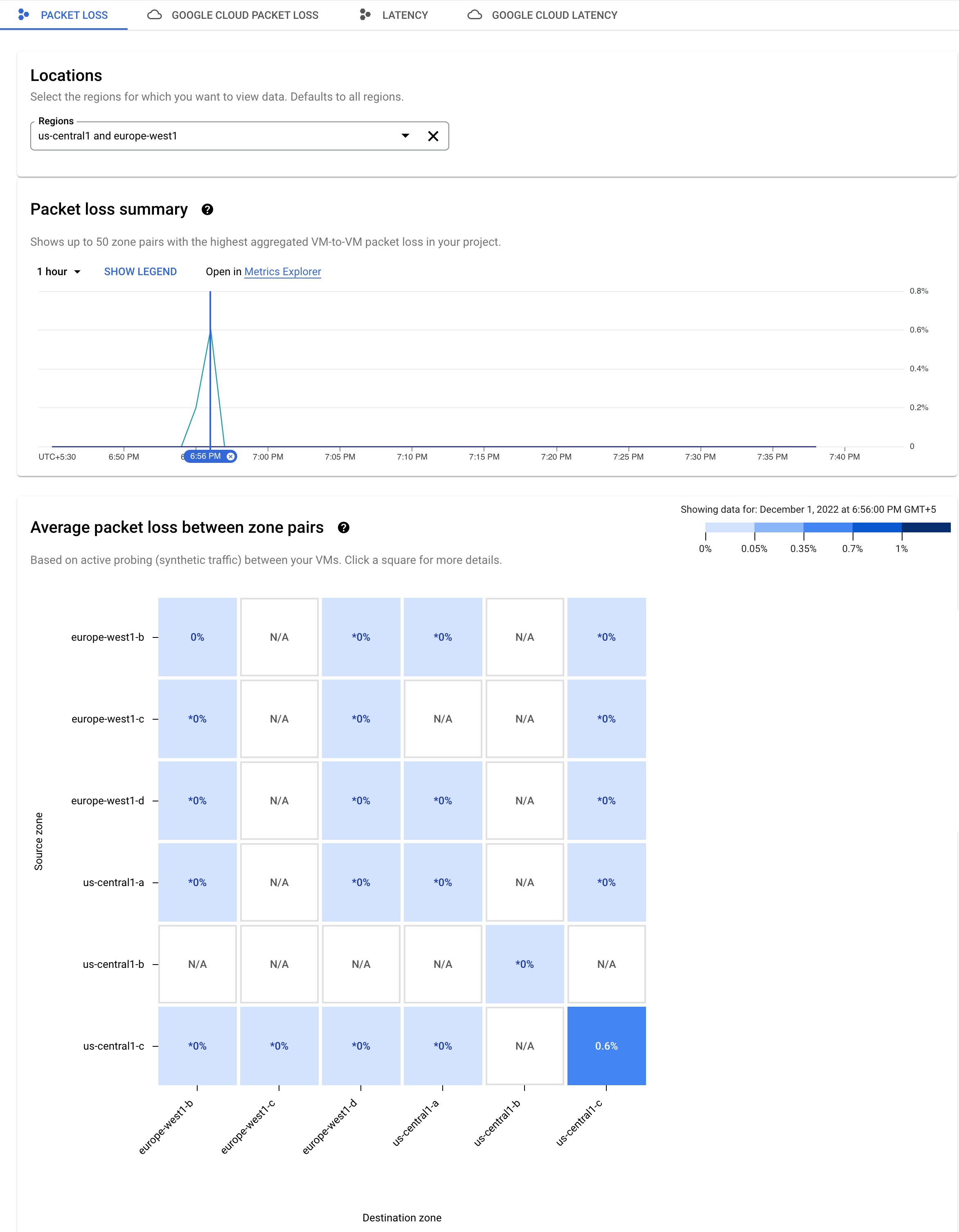
Packet loss is measured in one direction only. A square showing packet loss indicates packet loss from the zone indicated in the source axis to the zone indicated in the destination axis.
To see a chart specifically for a zone pair, you click the blue square for
source zone us-central1-c. The details
chart keeps your time selection from the previous page.

You see two lines on the chart, one for each direction of data flow. In this
example, the purple line shows packet loss for traffic from source zone
us-central1-c.
View further details
The chart shows that this spike in packet loss is an outlier. You can change the time window of data displayed for this zone pair by clicking the time selector on the top right. You can view up to six weeks of data. In this example, you click 7 days to see the packet loss trend for the selected zone pair.

Historical performance diagnostics
Performance Dashboard lets you view the network performance within your project over a specific period of time in the past. You can view up to six weeks worth of historical data.
Scenario: Investigate an issue that happened in the recent past
You are investigating an issue with latency that happened earlier this week.
Identify the zone with latency issues
You can use the historical performance data in the Performance Dashboard to examine the zone in question.
To change the view, you click the Latency tab.
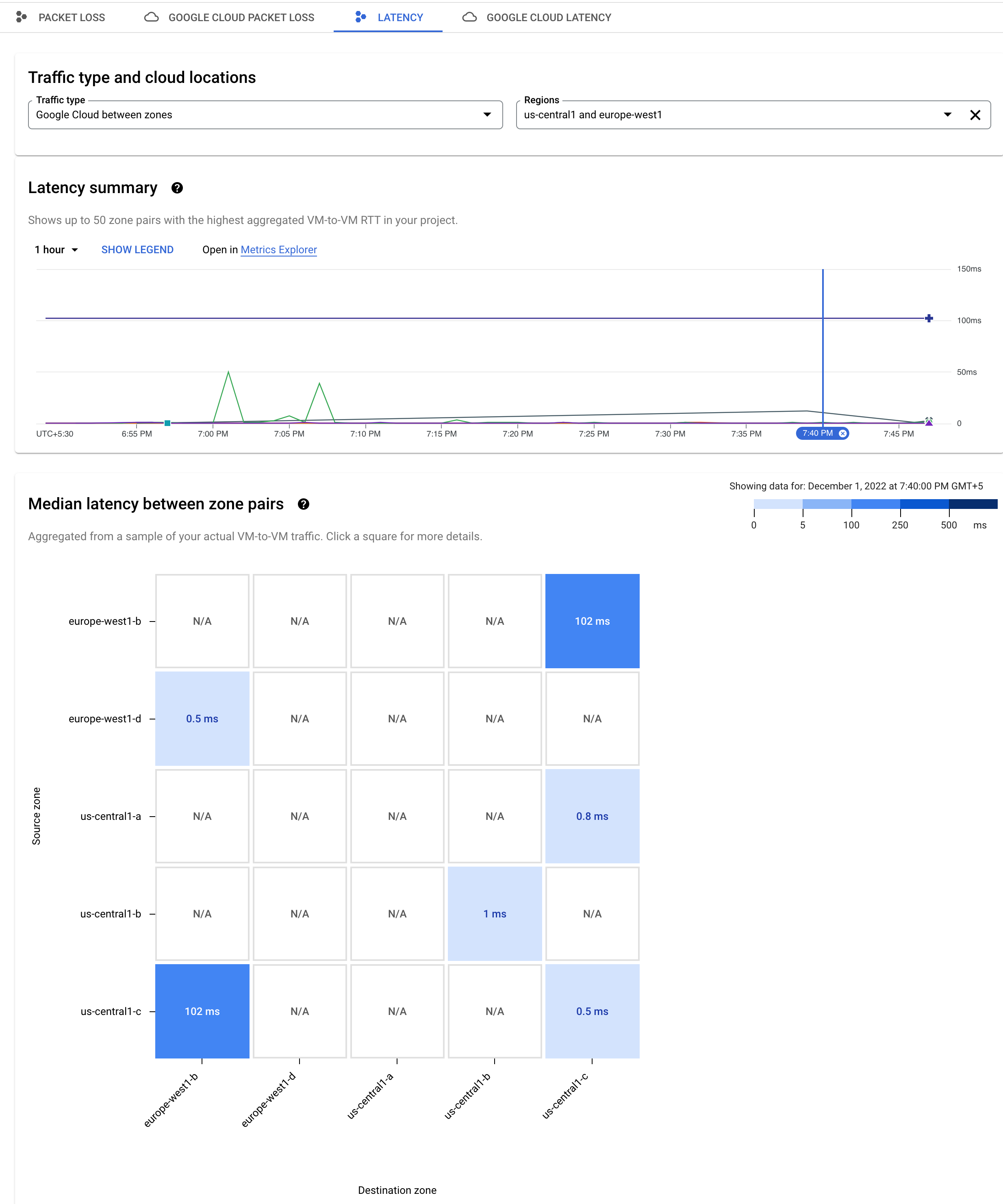
View the latency data for the selected time
To adjust the time window of the Latency summary chart, you use the time selector on the top right. In this example, it is set to 1 hour. To see the heatmap for latency at a certain time, you click that time on the chart's time axis.

Because there are consistently higher values on the left of the chart, you click the time axis to see the heatmap for latency at that time.
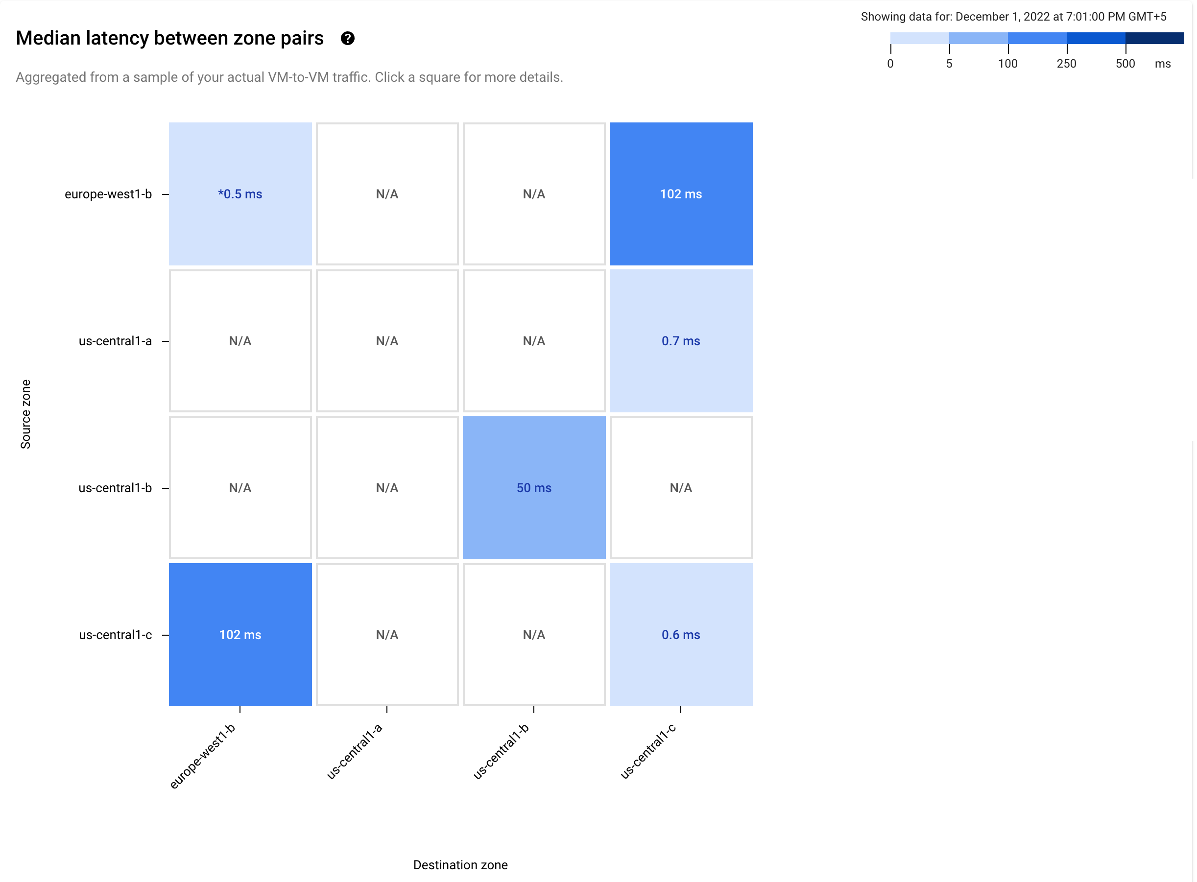
The dark blue squares in the heatmap show that the latency was 102
milliseconds (ms) between zones us-central-1c and europe-west1-b. To
investigate further, you click a dark blue square. The latency details chart
that opens keeps your time selection from the previous page showing the blue
pin.
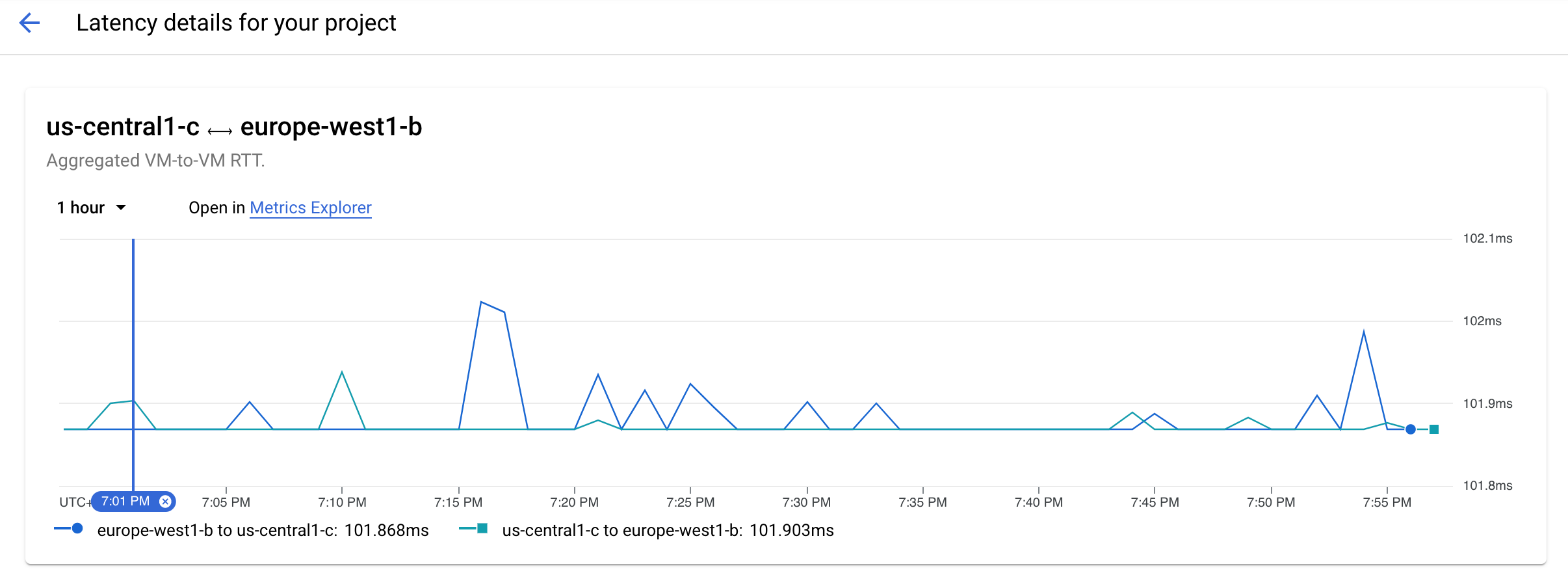
The blue line shows a spike in latency for traffic traveling from
us-central-1c to europe-west1-b.
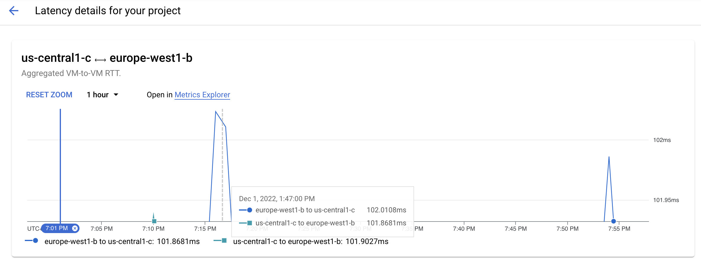
To zoom in on the spike, you drag your mouse.
You can now see that the spike lasted for two to three minutes, reaching a peak at 7:18 PM.
View further details
You can also see the details for the VMs, their projects, and the aggregate hourly latency in the Latency between VMs and zones table. Thus, you can identify exactly which VMs are contributing to the spike and reconsider your existing configuration or deploy new resources to address this issue.

What's next
- Google Cloud performance use cases
- Planning for performance across geographies use cases
- Planning for performance use cases
- Troubleshoot Performance Dashboard
