This document describes how to chart your Log Analytics query results, which lets you identify patterns and trends in your log data. Log Analytics lets you search and aggregate logs to generate useful insights by using SQL queries.
After you run a query, the query results can be viewed in a table, or converted
into a chart, and the query and its visualization can be saved to a dashboard.
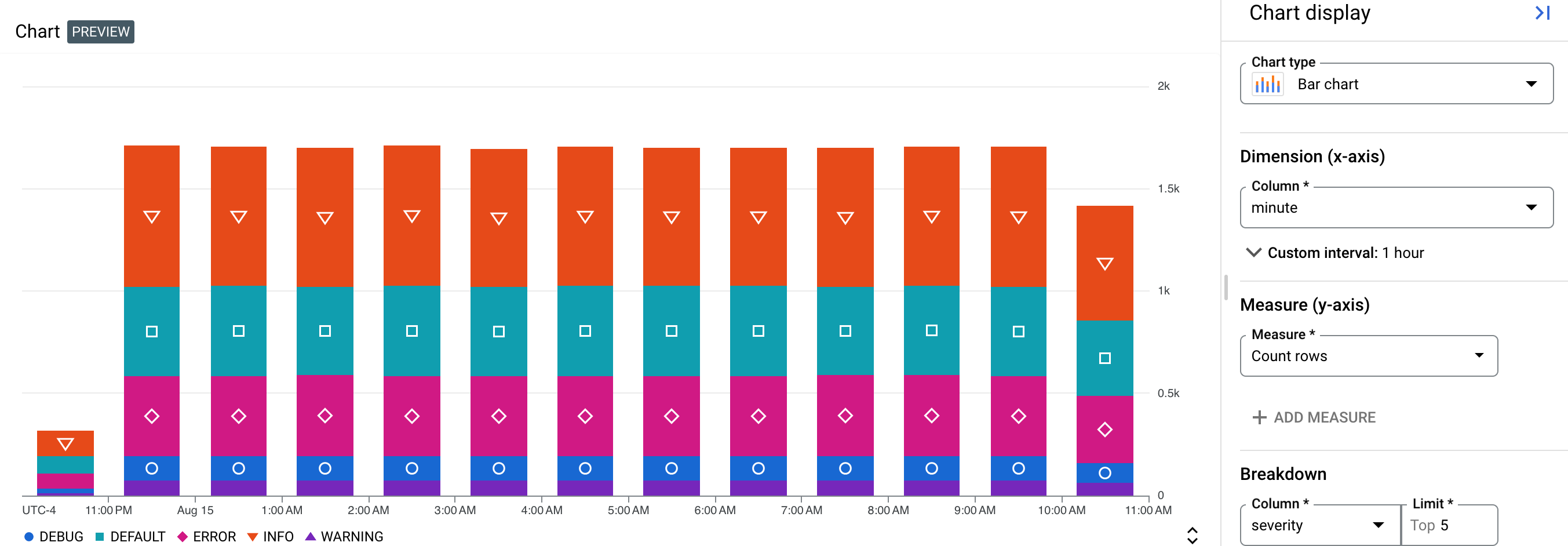
For example, to see which severity types your logs are
generating, create a chart that displays the counts of logs generated over
the past 12 hours and break down the logs by severity. The following
screenshot illustrates data points broken down into different severity types:
Before you begin
This section describes steps that you must complete before you can use Log Analytics.
Configure log buckets
Ensure that your log buckets have been upgraded to use Log Analytics:
-
In the Google Cloud console, go to the Logs Storage page:
If you use the search bar to find this page, then select the result whose subheading is Logging.
- For each log bucket that has a log view that you want to query, ensure that the Log Analytics available column displays Open. If Upgrade is shown, then click Upgrade and complete the dialog.
Configure IAM roles and permissions
This section describes the IAM roles or permissions that are required to use Log Analytics:
-
To get the permissions that you need to use Log Analytics and query log views, ask your administrator to grant you the following IAM roles on your project:
-
To query the
_Requiredand_Defaultlog buckets: Logs Viewer (roles/logging.viewer) -
To query all log views in a project:
Logs View Accessor (
roles/logging.viewAccessor)
You can restrict a principal to a specific log view either by adding an IAM condition to the Logs View Accessor role grant made at the project level, or by adding an IAM binding to the policy file of the log view. For more information, see Control access to a log view.
These are the same permissions that you need to view log entries on the Logs Explorer page. For information about additional roles that you need to query views on user-defined buckets or to query the
_AllLogsview of the_Defaultlog bucket, see Cloud Logging roles. -
To query the
-
To get the permissions that you need to query analytics views, ask your administrator to grant you the Observability Analytics User (
roles/observability.analyticsUser) IAM role on your project. -
To get the permissions that you need to create charts, ask your administrator to grant you the Monitoring Editor (
roles/monitoring.editor) IAM role on your project.
Select the data to chart
To configure what data to display on a chart, build a query by using SQL. When you select the Chart tab, a chart displays your query results. After the query has been run and a chart has been generated, you can customize the chart configuration by changing the chart type, and selecting columns to view different data.
To view your query results as a chart, run a query by doing the following:
-
In the Google Cloud console, go to the Log Analytics page:
If you use the search bar to find this page, then select the result whose subheading is Logging.
In the Query pane, enter a query and then click Run.
After the query has completed, in the Results tab, select how you want to view your query results:
Table: Tabular format only.
Chart: Chart format only
Both: Chart and tabular format.
After you select how to view your query results, you can configure any fields for the selected visualization, and then save the query and results to a custom dashboard. The saved format is tabular when you've selected the Table option. Otherwise, the format is a chart.
For charts, the visualization options let you select the chart type, and select which rows and columns are charted. For more information about the chart configuration, see Customize chart configuration.
Customize chart configuration
You can customize the chart configuration by changing the chart type, selecting the dimension and measure to chart, and by applying a breakdown. The Dimension is used to group or categorize rows and is the X-axis value. The Measure, or the Y-axis value, is a data series that is plotted against the Y-axis.
Change chart type
You can select from the following chart types, depending on what kind of rows and columns you selected as the dimension and measure, and how you want that data to be visualized.
Bar chart (default) : Bar charts plot data on two axes. If your chart uses a category or string as the dimension, then you can set the chart configuration for a bar chart to horizontal or vertical, where the dimension and measure axes are swapped.
Line chart: Line charts can be used to show data changes over time. When you use a line chart, each time series is shown by a different line that corresponds to the measure(s) you have selected.
If your X-axis is time-based, each data point is placed at the beginning of a time interval. Each data point is connected by linear interpolation.
Stacked area chart: An area chart is based on a line chart, and the area below each line is shaded. In area charts, the data series are stacked. For example, if you have two identical series, the series overlaps in a line chart, but the shaded area is stacked in an area chart.
Pie or donut chart: A pie chart shows how categories in a dataset relate to the whole dataset, by using a circle to represent the whole dataset and wedges in the circle to represent the categories in the dataset. The size of a wedge indicates how much, often as a percentage, the category contributes to the whole.
Table: A table shows one row for each row in the query result. The columns in the table are defined by the
SELECTclause. If you plan to display data in tabular form on a dashboard, then use aLIMITclause to restrict the number of rows in the result be less than a few hundred.Gauge or scorecard: Gauges and scorecards provide you with the most recent value along with a green, amber, or red indication based on how that value compares to a set of thresholds. Unlike gauges, which only shows information about the most recent value, scorecards can also include information about past values.
Gauges and scorecards can only display the query result when the query result contains at least one row, and that row contains a column with a timestamp and a column with numeric data. The query result can contain multiple rows and more than two columns.
If you want to perform the time-based aggregation as part of your query, then do the following:
Configure your query to aggregate data over a time interval, to order the results by descending timestamps, and to limit the number of rows in the results. You can use the
LIMITclause or use the time range selector to limit the number of rows in the query result.For example, the following queries a log view, and it aggregates data by the hour, applies a limit, and sorts the results:
SELECT TIMESTAMP_TRUNC(timestamp, HOUR) AS hour, severity, COUNT(*) AS count
FROM `PROJECT_ID.LOCATION.BUCKET_ID.LOG_VIEW_ID`
WHERE severity IS NOT NULL AND severity = "DEFAULT"
GROUP BY hour,severity
ORDER BY hour DESC
LIMIT 10
The following describes the meaning of the fields in the previous expression:
- PROJECT_ID: The identifier of the project.
- LOCATION: The location of the log view or the analytics view.
- BUCKET_ID: The name or ID of the log bucket.
- LOG_VIEW_ID: The identifier of the log view, which is limited to 100 characters and can include only letters, digits, underscores, and hyphens.
Set the Dimension to match the column that reports the time-unit. For example, if your query aggregates data by one hour and creates a column named
hour, then set the Dimension menu tohour.Select Disable interval because your query already specifies the aggregation interval. In the example, this interval is one hour.
Set the Measure to the numeric column, and set the function to none.
If you want to rely on Log Analytics to perform the time-based aggregation for you, then do the following:
- Configure the time-range selector, which affects the number of rows in the query result.
- Set the Dimension to match the column that reports the time-unit.
For example, you might set this menu to
timestamp. - Set the Interval menu to the aggregation interval to a specific
interval. For example, set the value of this field to
1 hour. Don't select Automatic interval. - Set the Measure to the numeric column, and select a function such as sum.
Change dimension and measure
You can choose which rows and columns are charted by selecting the dimension and measure fields.
Dimension
The dimension must be a timestamp, numeric, or string column. By default, the dimension is set to the first timestamp-based column in the schema. If no timestamp is present in the query, then the first string column is selected as the dimension. You can also customize what the dimension is in the Chart display panel. When a timestamp column is selected as the dimension, then the chart shows how data changes over time. When a string column is selected as the dimension for a bar chart, you can sort the data by ascending or descending, which sorts the dimension by lexical order. You can also keep the `default` sort order, which sorts the dimension based on the values of the corresponding measure in descending order.
By default, the interval for timestamps is automatically set, but you can also select a custom interval. Automatic intervals change values based on the time-range selector to maintain similar sized groups.
You can also disable the interval, which lets you specify your own aggregations and time ranges within the query for more complex analysis. Disabling the interval sets the aggregation function of the measures to
none. Only numeric measures are permitted when the dimension interval is disabled.Measure
You can select multiple measures in the Chart display panel. When you select a measure, you must also select the aggregation function to perform on its grouped values, such as
count,sum,average, andpercentile-99. For example,count-distinctreturns the number of unique values in a given column.If you select the Disable interval checkbox for the dimension, then the
noneaggregation function option is available. If the dimension is a string value, the Disable interval checkbox is not shown. However, setting a measure's aggregation functions tononealso disables the interval.
Add a breakdown
To split a single data series into multiple data series based on another column, add a breakdown.
When you select a breakdown, choose columns that contain a small
number of short and meaningful labels, like region_name, instead of fields
that might contain a large number of strings or long strings, like
textPayload.
For example, see the following chart configuration, where the Dimension field is set to type, the Measure field is set to Count rows, and the Breakdown field is set to severity:
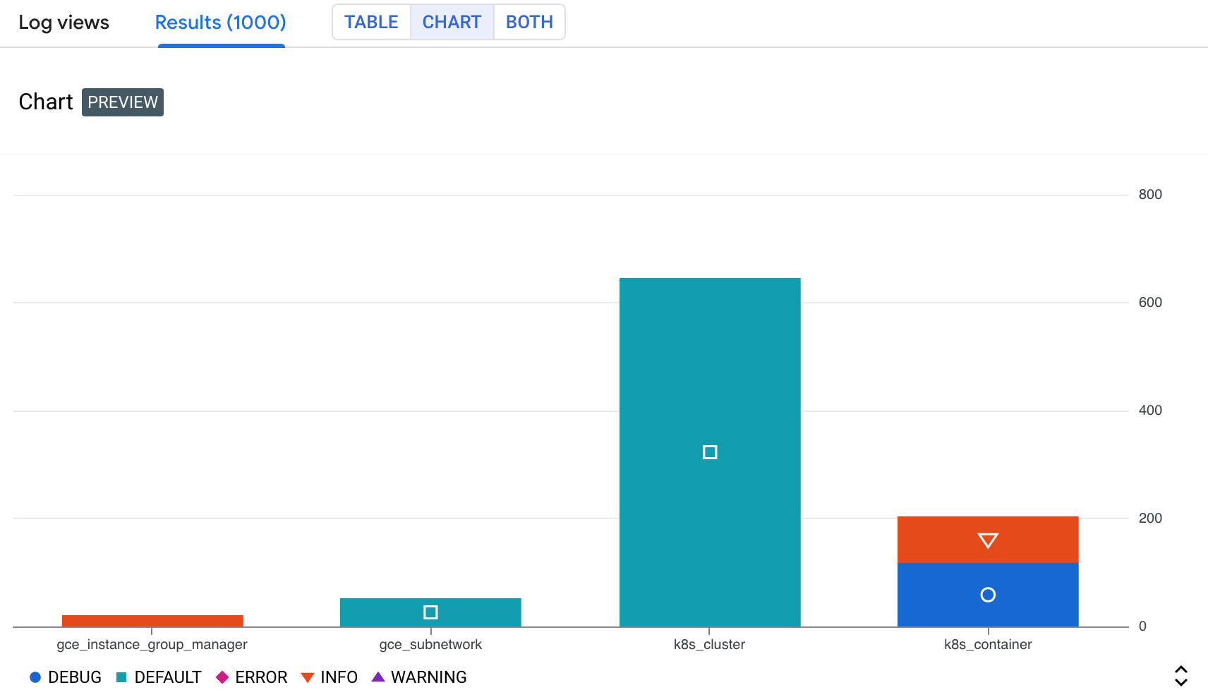
In the previous screenshot, you see a stacked data series, where the resource
type k8s_container is split into different severity types. This lets you
identify how many logs of each severity type were generated by a certain
resource.
Save a chart to a custom dashboard
After a chart is generated from your query, you can save that chart to a custom dashboard. Custom dashboards let you display and organize information that is useful to you by using a variety of widget types. These dashboards also let you define variables, which are dashboard-level filters that apply only to specific widgets. To apply a variable to a widget, you must modify the query. For more information, see Apply a variable to a widget.
To save your chart to a dashboard, do the following:
-
In the Google Cloud console, go to the Log Analytics page:
If you use the search bar to find this page, then select the result whose subheading is Logging.
Run a query to generate a chart, then click
 Save chart in the Chart tab.
In the Save to dashboard dialog, enter a title for your chart and select the dashboard where you want to save the chart to.
Optional: To view the custom dashboard, in the toast, click View dashboard.
To view a list of custom dashboards that contain charts generated by SQL queries, go to the Save Chart button and click arrow_drop_down Menu.
Edit a chart saved to a custom dashboard
You can modify a chart after it has been saved to a dashboard. For more information, see Modify a widget's configuration. In the Configure widget dialog, you can do the following:
- Change the data you query.
- Edit the query that is used to generate a chart.
- Customize the chart configuration to visualize different data.
Limitations
If your Google Cloud project is in a folder that uses Assured Workloads, then the charts that you generate can't be displayed on a custom dashboard.
Dashboard-level filters don't apply to charts generated from a SQL query.
Selected columns must have at least one row with a non-null value.
If you save a query and customize the chart configuration, then the custom chart configuration is not saved.
If your query already contains aggregations, then the generated chart might be different due to additional aggregation that is automatically applied by Log Analytics.
JSON paths must be cast to strings or numbers in order to be charted.
Sample queries
This section provides sample SQL queries for charting your query results. To gain more useful insights from your logs, customize the chart configuration. To use the sample queries, do the following:
-
In the Google Cloud console, go to the Log Analytics page:
If you use the search bar to find this page, then select the result whose subheading is Logging.
Identify the table name for the log view that you want to query.
To identify this name, go to the Log views list, locate the log view, and then select Query. The Query pane is populated with a default query, which includes the table name of the log view that is queried. The table name has the format
project_ID.region.bucket_ID.view_ID.For more information about how to access the default query, see Query a log view.
Replace VIEW with the table name for the log view that you want to query, then copy the query.
Paste the query in the Query pane, then click Run query.
Chart log entries by location and severity
The following query selects the location and severity, with the location
cast as a string:
SELECT
  CAST(JSON_VALUE(resource.labels.location) AS STRING) AS location,
  severity,
FROM
  `VIEW`
WHERE resource.labels.location IS NOT NULL
A sample chart and chart configuration looks like the following:
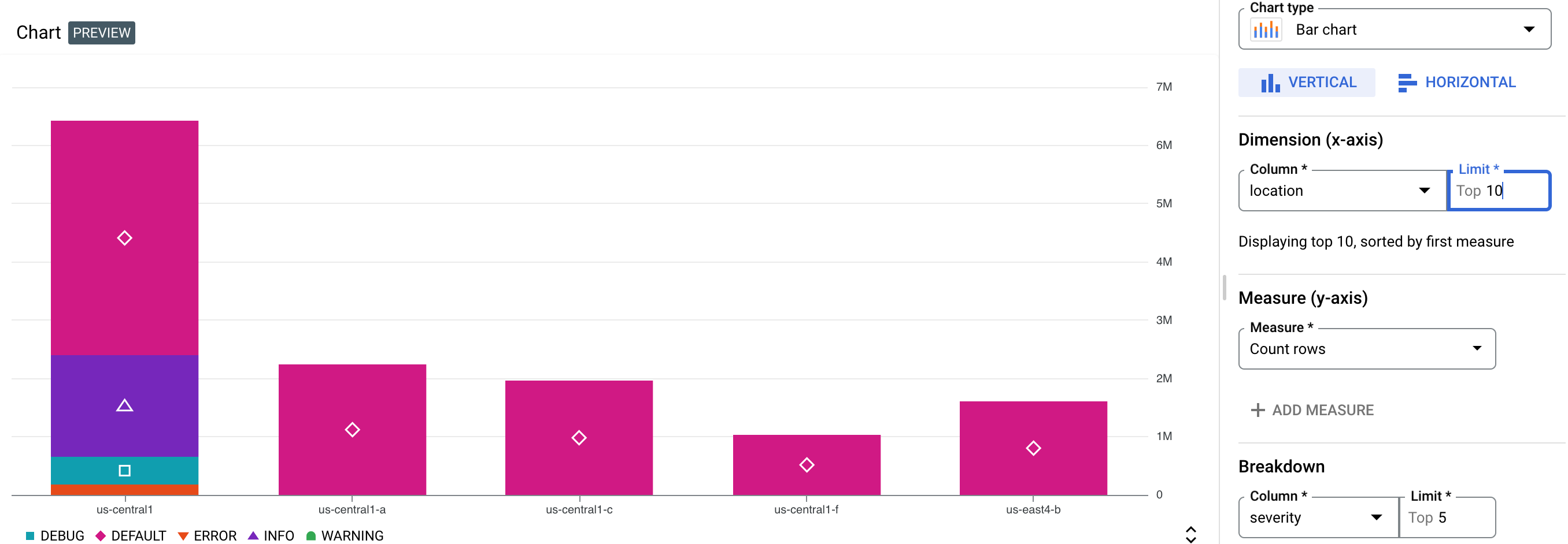
In the previous screenshot, the chart configuration has the following chart configuration:
- Chart type: Bar chart, horizontal
- Dimension:
location, with a limit of 10 - Measure: Count rows
- Breakdown:
severity, with a limit of five
Chart BigQuery Data Access audit logs
The following query filters for BigQuery data_access audit
logs, and selects certain fields, such as user_email, ip, auth_permission,
and job_execution_project. For example, you can create a chart that visualizes
the frequency of each principal's BigQuery API usage over time.
SELECT
  timestamp,
  proto_payload.audit_log.authentication_info.principal_email as user_email,
  proto_payload.audit_log.request_metadata.caller_ip as ip,
  auth.permission as auth_permission,
  auth.granted as auth_granted,
  JSON_VALUE(data_access.resource.labels.project_id) AS job_execution_project,
  SPLIT(proto_payload.audit_log.resource_name, '/')[SAFE_OFFSET(1)] AS referenced_project,
  SPLIT(proto_payload.audit_log.resource_name, '/')[SAFE_OFFSET(3)] AS referenced_dataset,
  SPLIT(proto_payload.audit_log.resource_name, '/')[SAFE_OFFSET(5)] AS referenced_table
FROM `VIEW` as data_access,
  UNNEST(proto_payload.audit_log.authorization_info) AS auth
WHERE
  log_id="cloudaudit.googleapis.com/data_access"
  AND data_access.resource.type = 'bigquery_dataset'
A sample chart and chart configuration looks like the following:
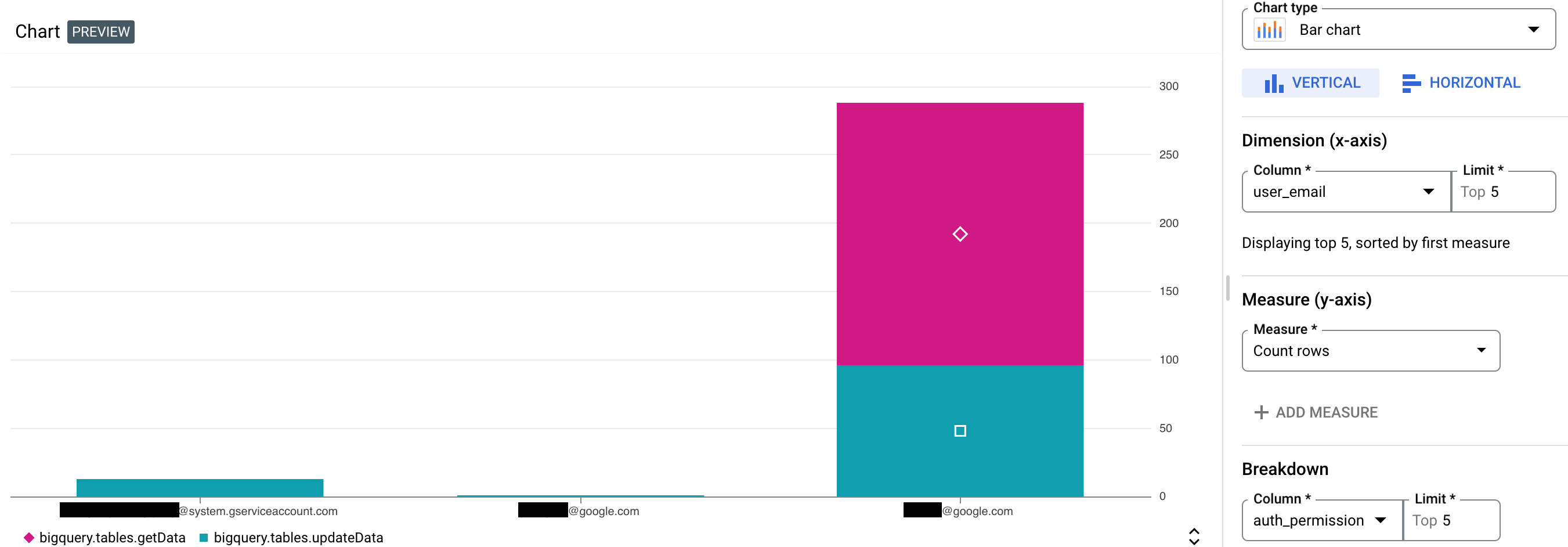
In the previous screenshot, the chart configuration has the following chart configuration:
- Chart type: Bar chart, vertical
- Dimension:
user_email, with a limit of five - Measure: Count rows
- Breakdown:
auth_permission, with a limit of five
What's next
For an overview of Log Analytics, see Query and analyze logs overview.
For sample queries, see Sample SQL queries.
To learn about how to analyze with audit logs by using Log Analytics, see SQL queries for security insights.