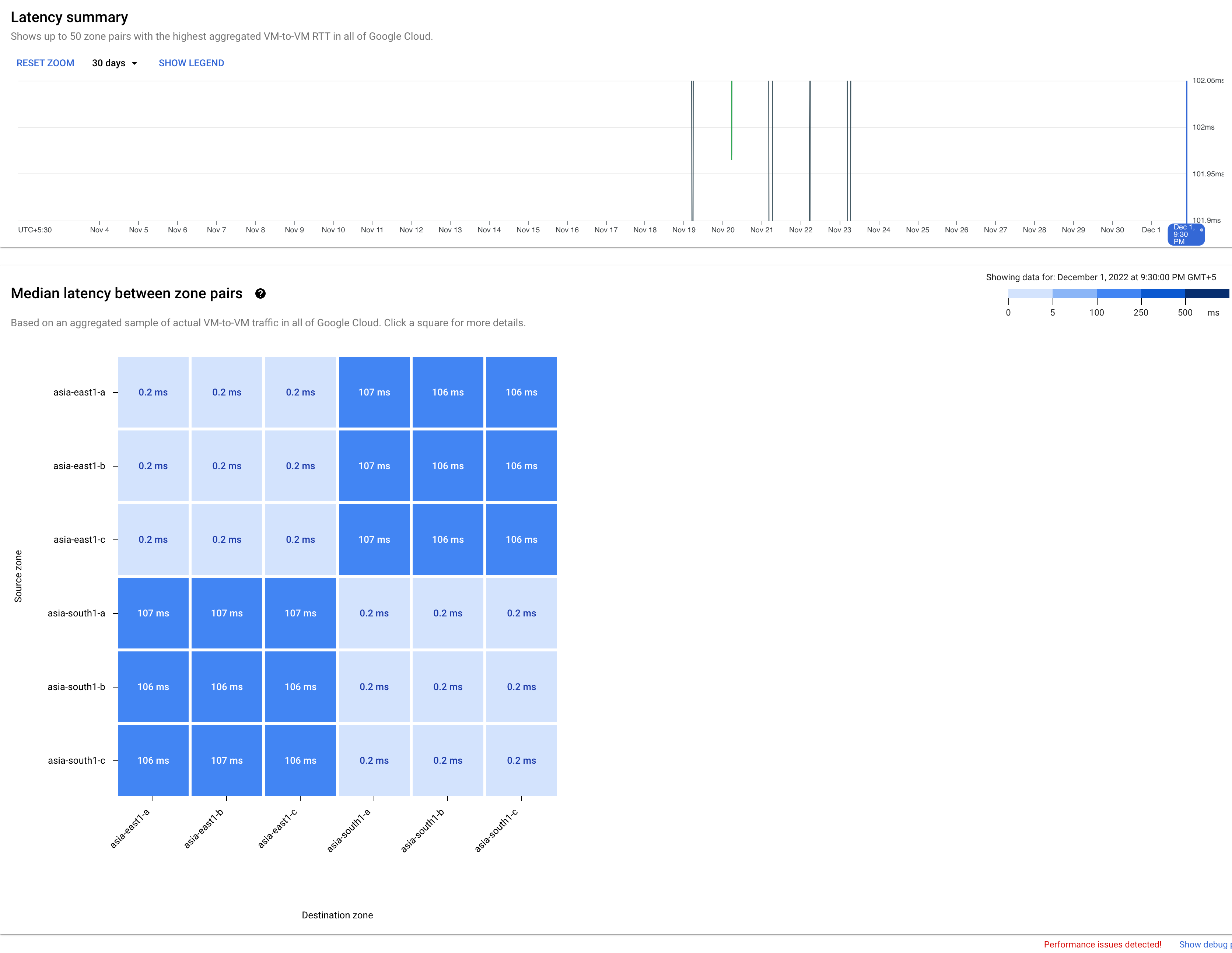
Google Cloud 「成效」檢視畫面會針對所選區域或可用區配對,提供平均成效檢視畫面。您可以使用 Google Cloud 控制台 Network Intelligence Center 中的 Google Cloud效能檢視畫面,規劃應用程式的效能管理。 Google Cloud 「成效」檢視畫面有助您找出最佳區域和區域,以便部署新資源或最佳化現有工作負載。舉例來說,您目前在特定區域和區域中執行作業,但您知道這些區域會受到其他區域的使用者或其他工作負載存取。
[[["容易理解","easyToUnderstand","thumb-up"],["確實解決了我的問題","solvedMyProblem","thumb-up"],["其他","otherUp","thumb-up"]],[["難以理解","hardToUnderstand","thumb-down"],["資訊或程式碼範例有誤","incorrectInformationOrSampleCode","thumb-down"],["缺少我需要的資訊/範例","missingTheInformationSamplesINeed","thumb-down"],["翻譯問題","translationIssue","thumb-down"],["其他","otherDown","thumb-down"]],["上次更新時間:2025-09-04 (世界標準時間)。"],[],[],null,["# Planning for performance use cases\n\nThe Google Cloud performance view provides an average performance\nview for selected region or zone pairs. You can use the Google Cloud\nperformance view in the Network Intelligence Center in the Google Cloud console to plan the\nperformance management of your applications. The Google Cloud performance\nview helps you to identify the best regions and zones to deploy new resources or\nto optimize your existing workloads. For example, you are currently running in\nspecific zones and regions, but you know they are accessed by users or other\nworkloads from other regions.\n\n### Scenario: Understand performance in new zones and regions\n\nYou want to add workloads to a region, and you want to know which zone best\nserves your requirements.\n\nYou use the source and destination region selection menu to select\nsource-destination pairs where you want to see the global average metrics for\nlatency or packet loss.\n\nTo view the zones within a region pair, you select the region pair from the heatmap.\nIn this example, you clicked the heatmap square for the region pair\n`asia-east1` and `asia-south1` and adjusted the time selector to 30 days.\n[](/static/network-intelligence-center/docs/performance-dashboard/images/gcpd-pl-sum-hm-blue.png) Packet loss region pair heatmap (click to enlarge)\n\n### Scenario: View historical data for regions or zone pairs\n\nUse the time series chart capability to display historical data for selected\nzone pairs. In this example, you can see the heatmap square for the zone pair\n`asia-east1-a` and `asia-northeast3-a` and the time selector adjusted to 30\ndays.\n[](/static/network-intelligence-center/docs/performance-dashboard/images/gpd-pl-dets-zonepairs.png) Zone pairs historical data (click to enlarge)\n\nWhat's next\n-----------\n\n- [Project performance use cases](/network-intelligence-center/docs/performance-dashboard/concepts/use-cases-project)\n- [Planning for performance across geographies use cases](/network-intelligence-center/docs/performance-dashboard/concepts/use-cases-performance-across-geographies)\n- [View project-specific packet loss dashboard](/network-intelligence-center/docs/performance-dashboard/how-to/view-project-specific-packet-loss)\n- [View Google Cloud packet loss dashboard](/network-intelligence-center/docs/performance-dashboard/how-to/view-google-cloud-packet-loss)\n- [Troubleshoot Performance Dashboard](/network-intelligence-center/docs/performance-dashboard/support/troubleshooting)"]]