이 페이지에서는 성능 대시보드를 사용하여 Google Cloud 프로젝트의 성능 문제를 진단하는 방법을 설명합니다. 다음 섹션에서는 일반적으로 관찰되는 성능 문제와 근본 원인을 설명합니다.
성능 진단: 프로젝트인가요 아니면 Google Cloud인가요?
프로젝트의 지연 시간 값이나 패킷 손실 값을 관찰하고 프로젝트 외부의 참조 데이터를 검증 및 비교하려고 합니다. 성능 대시보드의 모든 Google Cloud에 대한 성능 뷰를 사용하면 VM 간 패킷 손실 또는 지연 시간과 같은 프로젝트별 네트워크 성능을 모든Google Cloud성능에 연결하여 모든 관련Google Cloud 인프라의 패킷 손실과 지연 시간을 표시할 수 있습니다.
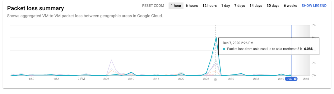
다음 예시에서 Google Cloud 트래픽이 최근 패킷 손실을 경험한 것을 확인할 수 있습니다. 차트에 포인터를 올려놓으면 오후 2시 26분에 asia-east1-a 및 asia-northeast3-b 사이에서 최고 손실이 발생했음을 확인할 수 있습니다.
프로젝트 문제가 이 시간과 위치에 해당하는 경우 문제가 모든 Google Cloud에 영향을 주므로 문제 해결 시간이 절약됩니다.
패킷 손실 요약(확대하려면 클릭)
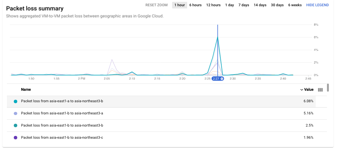
시계열에 포인터를 올려놓으면 소스와 대상 데이터가 표시됩니다.
차트 범례를 표시하려면 시계열 차트에서 범례 표시 버튼을 클릭합니다. 범례의 영역 쌍에 포인터를 올려놓으면 해당 쌍의 시계열 데이터가 강조표시됩니다.
패킷 손실 시계열 강조표시(확대하려면 클릭)
오후 2시 26분에 패킷 손실 문제가 발생한 모든 영역을 확인하려면 시계열 차트에서 시간 선택기를 이동하여 히트맵을 업데이트합니다.
시나리오: 프로젝트 성능이 Google Cloud와 다른지 검증
Network Intelligence Center의 프로젝트별 성능 대시보드를 사용하여 지연 시간이나 패킷 손실이 높은 리전 또는 영역 쌍을 식별했습니다.
Google Cloud 평균과 큰 차이가 있는지 확인하려고 합니다.
유효성을 검사할 리전이나 영역 쌍에 포인터를 올려놓습니다. 프로젝트의 지연 시간이나 패킷 손실 값과 동일한 쌍의Google Cloud 평균 값을 확인할 수 있습니다. 유사한 경우 이는 프로젝트에서 관찰된 성능이 동일한 리전이나 영역 쌍 내의 모든 프로젝트 평균과 유사함을 나타냅니다.
시나리오: 현재 높은 지연 시간이나 패킷 손실 문제 조사
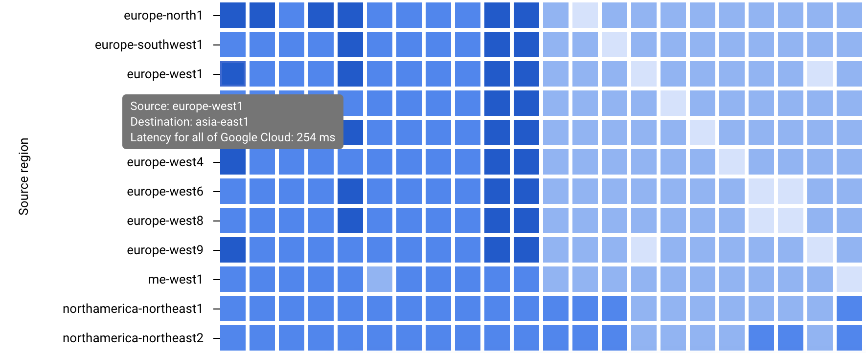
패킷 손실이나 지연 시간이 높은 리전 또는 영역 쌍을 식별했으며 전체 Google Cloud 값과 비교하려고 합니다. 소스 및 대상 리전 선택 기능을 사용하여 성능 대시보드의 Google Cloud 성능 뷰를 세분화할 수 있습니다. 다음 두 가지 방법으로 Google Cloud 성능 뷰를 세분화할 수 있습니다.
특정 리전의 데이터를 보려면 위치 메뉴에서 리전을 선택합니다. 리전을 최대 5개까지 선택할 수 있습니다.
리전 쌍의 영역 간 데이터를 보려면 리전 쌍에 해당하는 리전 히트맵에서 정사각형을 클릭합니다.
리전 히트맵(확대하려면 클릭)
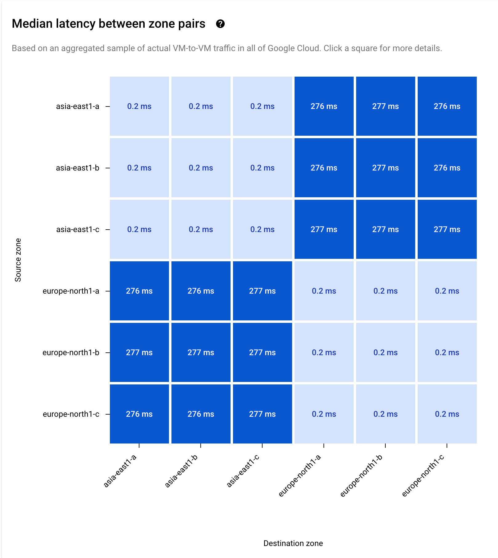
두 가지 선택 방법 모두에서 선택한 쌍의 시계열 데이터와 히트맵이 표시됩니다. 다음 예시에서는 asia-east1 및 europe-north1을 선택했습니다.
선택한 쌍의 시계열 및 히트맵(확대하려면 클릭)
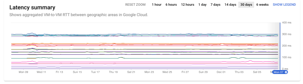
시나리오: 이전의 높은 지연 시간이나 패킷 손실 문제 조사
비정상적인 지연 시간 또는 패킷 손실 값을 관찰한 특정 시간대를 조사하려면 시계열의 시간 확대/축소를 사용하면 됩니다. 이 예시에서는 30일을 선택했습니다.
지연 시간 요약(확대하려면 클릭)
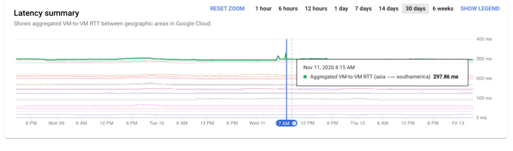
시계열 차트를 클릭하고 드래그하여 조사와 관련된 요일 또는 시간을 선택하면 시간 선택을 더욱 세분화할 수 있습니다.
이 차트에는 9번째 월요일부터 13번째 금요일까지의 데이터가 표시됩니다. 11월 11일 오전 8시 15분에 크게 급증한 지연 시간을 가리킬 수 있습니다.
[[["이해하기 쉬움","easyToUnderstand","thumb-up"],["문제가 해결됨","solvedMyProblem","thumb-up"],["기타","otherUp","thumb-up"]],[["이해하기 어려움","hardToUnderstand","thumb-down"],["잘못된 정보 또는 샘플 코드","incorrectInformationOrSampleCode","thumb-down"],["필요한 정보/샘플이 없음","missingTheInformationSamplesINeed","thumb-down"],["번역 문제","translationIssue","thumb-down"],["기타","otherDown","thumb-down"]],["최종 업데이트: 2025-09-04(UTC)"],[],[],null,["# Performance diagnostics use cases\n\nThis page describes how Performance Dashboard can help you diagnose\nperformance issues in a Google Cloud project. The following sections\ndescribe commonly observed performance issues and their root causes.\n\nPerformance diagnostics: Is it the project or Google Cloud?\n-----------------------------------------------------------\n\nYou observe latency or packet loss values in your project, and you want to\nvalidate and compare against reference data outside of your projects. The\n**Performance for all of Google Cloud** view in Performance Dashboard\nlets you correlate per-project network\nperformance, such as VM-to-VM packet loss or latency, to performance over all of\nGoogle Cloud, to show packet loss and latency across all relevant\nGoogle Cloud infrastructure.\n\nIn the following example, you can see that Google Cloud traffic experienced\npacket loss recently. By holding the pointer over the chart, you can see that\nthe peak loss occurred between `asia-east1-a` and `asia-northeast3-b` at 2:26 PM.\nIf your project's issues correspond to this time and location, you save\ntroubleshooting time because the issues impact all of Google Cloud.\n[](/static/network-intelligence-center/docs/performance-dashboard/images/gcpd-pl-summary.png) Packet loss summary (click to enlarge)\n\nHolding the pointer over a time series shows data for the source and destination.\nTo show the chart legend, you click the **Show Legend** button on the time series\nchart. Holding the pointer over a zone pair in the legend highlights the time series\ndata for that pair.\n[](/static/network-intelligence-center/docs/performance-dashboard/images/gcpd-pl-ts-highlights.png) Packet loss time series highlights (click to enlarge)\n\nTo see all the areas where the packet loss issue occurred at 2:26 PM, you update the\nheatmap by moving the time selector on the time series chart.\n\n### Scenario: Validate if the project performance differs from Google Cloud\n\nUsing the per-project Performance Dashboard in the Network Intelligence Center, you\nidentified a region or zone pair with high latency or packet loss.\nYou want to see if they differ significantly from the Google Cloud average.\n\nHold the pointer over the region or zone pair that you want to validate. You can see\nthe value of latency or packet loss for your project and the value of the\nGoogle Cloud average for the same pair underneath. If they are similar,\nit indicates that the performance observed in your projects is similar to the\naverage across all projects within the same region or zone pair.\n\n### Scenario: Investigate current high latency or packet loss issue\n\nYou identified the region or zone pairs with high packet loss or latency,\nand you want to compare those with the overall Google Cloud values. You can\nrefine the Google Cloud performance view of Performance Dashboard by\nusing the source and destination region selection capability. There are two ways\nin which you can refine the Google Cloud performance view:\n\n- To view data for specific regions, you select the regions from the **Locations**\n menu. You can select up to five regions.\n\n- To view zone-to-zone data for a region pair, you click the square in the\n regional heatmap that corresponds to the region pair.\n\n [](/static/network-intelligence-center/docs/performance-dashboard/images/gpd-lat-loca-heatmap-blue.png) Regional heatmap (click to enlarge)\n\nWith both selection methods, the time series data and heatmap for the\nselected pairs are displayed. In the following example, you selected\n`asia-east1` and `europe-north1`.\n[](/static/network-intelligence-center/docs/performance-dashboard/images/gcpd-lat-ts-hm-blue.png) Timeseries and heatmap for selected pairs (click to enlarge)\n\n### Scenario: Investigate historic high latency or packet loss issue\n\nIf you want to investigate a specific time slot in which you observed abnormal\nlatency or packet loss values, you can use the time zoom in the time series. In\nthis example, you have selected 30 days.\n[](/static/network-intelligence-center/docs/performance-dashboard/images/gcpd-lat-summary.png) Latency summary (click to enlarge)\n\nYou can further refine the time selection by clicking and dragging on the time\nseries chart to select the days or hours related to your investigation.\n\nThe chart displays the data for Monday the 9th through Friday the 13th. You can\npinpoint a modest spike in latency on November 11 at 8:15 AM.\n[](/static/network-intelligence-center/docs/performance-dashboard/images/gcpd-lat-summary-zoom.png) Latency summary time zoom (click to enlarge)\n\nWhat's next\n-----------\n\n- [Project performance use cases](/network-intelligence-center/docs/performance-dashboard/concepts/use-cases-project)\n- [Planning for performance across geographies use cases](/network-intelligence-center/docs/performance-dashboard/concepts/use-cases-performance-across-geographies)\n- [Planning for performance use cases](/network-intelligence-center/docs/performance-dashboard/concepts/use-cases-workload-optimization)\n- [View project-specific packet loss dashboard](/network-intelligence-center/docs/performance-dashboard/how-to/view-project-specific-packet-loss)\n- [Troubleshoot Performance Dashboard](/network-intelligence-center/docs/performance-dashboard/support/troubleshooting)"]]