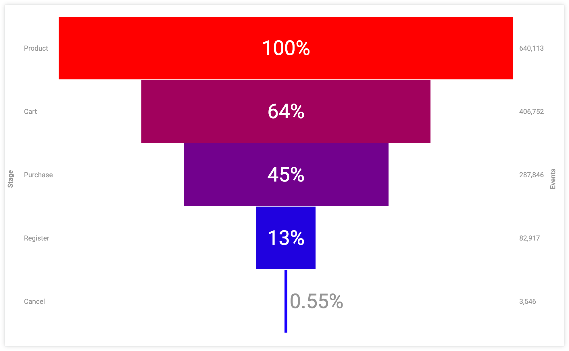
Funnel charts are useful to understand events in a sequential process, like prospect stages in a sales pipeline, engagement with a marketing campaign, or visitor movement through a website.
Funnel charts are often most effective when the first stage in the process is the biggest (such as 100%) and each progressive stage decreases from there. Funnel charts display the value of each category by varying the height of each bar; larger values have taller bars while smaller values have shorter bars.

Building a funnel chart
A funnel chart comprises a single set of numbers and a single set of labels which can be oriented:
- Vertically, using one or more dimensions (labels) and one measure (numbers)
- Horizontally, using a single row with multiple measures (numbers) and column headers (labels)
The chart can work with both pivoted and non-pivoted data.
If you use multiple measure columns (multiple measures or a pivoted measure) with multiple rows of data, the funnel chart checks the first row and the first column, then displays the one that produces more data points. However, you can use the Orientation setting to change the way the funnel reads the data table and flip the axes.
Funnel charts can plot 50 bars at most. If your data contains more than 50 rows or 50 columns, use the Row Limit or Column Limit option to limit your rows to 50 or fewer.
To use a funnel visualization, select the ellipsis (...) in an Explore Visualization bar and choose Funnel. Next, select the Edit option on the visualization bar to edit your chart.
Options may be grayed out or hidden in situations where they conflict with other settings that you have chosen.
Data bar options
Several options on the Data bar can affect both your visualization and the data table.
Subtotals
If your data table contains at least two dimensions, a Subtotals checkbox appears on the Data bar. Subtotals are currently enabled for only table visualizations; the checkbox is non-functional for other visualization types.
Row Totals
If your chart contains pivots, you can add row totals to your chart by selecting the Row Totals checkbox in the Data bar. See the Exploring data in Looker documentation page for more information, including information on when totals aren't available and things to consider with totals.
The arrow to the right of the Row Totals checkbox lets you toggle the placement of the totals column between the far right default placement and a placement further to the left, after dimensions and dimension table calculations.

Totals
You can add column totals for measures and table calculations by selecting Totals in the Data bar. See the Exploring data in Looker documentation page for more information, including information on when totals aren't available and things to consider with totals.

Column Limit
If your data table contains pivots, you can add a column limit to your chart by entering any number between 1 and 200 in the Column Limit box. Dimensions, dimension table calculations, row total columns, and measure table calculations outside of pivots are not counted toward the column limit. Pivoted groups each count as one column toward the column limit. See the Filtering and limiting data documentation page for more information.

Row Limit
You can add a row limit to your chart by entering any number between 1 and 5,000 into the Row Limit box on the Data tab. If your query exceeds the row limit you have set, you cannot sort row total or table calculation columns.

Calculations
If you have the appropriate permissions, you can add table calculations to your chart by clicking the Add calculation button on the Data tab. See the Using table calculations documentation page for more information.

You can also use the Custom Fields section of the field picker.
Axes menu options
Label Left Axis
Turn on Label Left Axis to apply a label to the left axis. Looker displays a box to enter the label text.
Label Right Axis
Turn on Label Right Axis to apply a label to the right axis. Looker displays a box to enter the label text.
Edit Chart Config

The Edit Chart Config button at the bottom of the visualization menu opens the Chart Config Editor. This editor lets you modify HighCharts visualizations by exposing certain JSON parameters of the visualization, enabling deep customization. These customizations will not dynamically interact with data.
The Edit Chart Config button is available if you have either the Looker Admin role or the can_override_vis_config permission.
See the Examples section of the Chart Config Editor article for examples of some common use cases, including the following examples:
- Changing the background color and axis text color
- Conditional formatting of values within a series
- Customizing tooltip color
- Adding vertical reference bands and captions
- Adding chart annotations
Bars menu options
Bar Colors
You can define the color palette for a chart.
Selecting a color collection and palette
A collection lets you create themed visualizations and dashboards that look good together. All of Looker's built-in color collections appear on the Color collections documentation page. Your Looker admin may also create a custom color collection for your organization.
You can choose a color collection from the Collection drop-down menu. The Palette section will update with a palette from your chosen color collection. To change to a different palette in the color collection, click the color palette, which opens the palette picker. From there, you can view and select from all palettes in the collection.

Choosing the type of palettes
If you use a sequential or diverging palette, each bar is colored on a scale along the palette. If you change to a categorical palette (a palette composed of multiple individual colors), colors are assigned to each bar in order. The first bar is assigned the first color, and so on. If there are more bars than colors listed, the colors repeat from the beginning of the palette.

Creating a custom color palette
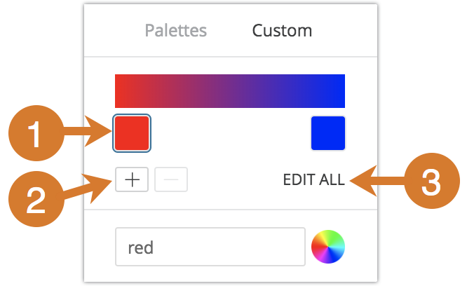
To create a custom color palette, first select the Custom tab on the palette picker. You can edit your palette in several ways:

- Click on one of the colors present to edit it.
- Click the + or - buttons to add a color to the end of the palette or to remove a selected color. When you add a color to the end of a sequential or diverging palette, Looker automatically creates a scale between that color and the previous one.
- Click EDIT ALL at the bottom right of the menu to use a comma-separated list of color values.
To change a selected color, or edit all colors at once, you can input hex strings, such as #2ca6cd, or CSS color names, such as mediumblue, into the color value box at the bottom of the menu.

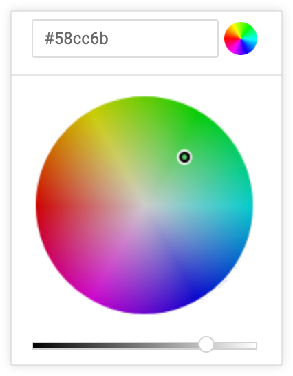
You can also click the color wheel to the right of the color value box to bring up a color picker, which you can use to select a color. The corresponding hex value for that color appears in the color value box.

If you click EDIT ALL, the color value box populates with all hex codes of the color palette you've chosen or customized. Copying and pasting this list is the best way to copy custom color palettes from one chart to another.
Reverse Colors
You can reverse the colors used on a palette. For a sequential or diverging palette, each bar is colored on a scale along the palette in reverse order, starting with the color at the right end of the palette and moving to the left. For a categorical palette, this would apply the colors in the palette to each bar in reverse order, starting with the last color in the palette.
Smoothed Bars
For a stepped funnel chart, Smoothed Bars toggles whether to connect the outer edge of each bar in the funnel chart with the bars above and below it. With Smoothed Bars off, bars have a rectangular shape. With Smoothed Bars on, the edges of the bars are smoothed to connect with one another.

For a funnel chart, the Smoothed Bars option has no effect.
Stepped Funnel
When enabled, the Stepped Funnel option displays funnels in a stepped funnel style, where the width of each bar varies depending on its value. Larger values have wider bars, and smaller values have thinner bars.

Orientation
You can specify whether the data for the funnel chart is drawn from the table rows or columns. If you choose Automatic, the funnel chart chooses data based on where there are the most data points.
Label Scale
You can specify the size of labels that are positioned both on top of the chart bars and on the sides of the chart. Labels have a minimum size and a maximum size which varies depending on the size of the chart. Enter a 0 to specify that the labels will be the minimum size. Enter a 1 to specify that the labels will be the maximum size. Enter a number between 0 and 1 to indicate a percentage, and the label size will be set to that percentage between the minimum and maximum size.
Labels menu options
Label Position
You can specify where data labels appear:
- Left: data labels are on the left side of the chart
- Inline: data labels are in the center of the chart, inside the chart bars
- Right: data labels are on the right side of the chart
- Hidden: data labels are not shown
Percent Type
Each bar in the chart is assigned a percentage value. Percent Type determines whether each bar is assigned a percentage by comparing the bar's value to the largest value in the chart, or by comparing the bar's value to the previous bar in the chart.
Percent Position
You can specify where bar percentages appear:
- Left: percentages are on the left side of the chart
- Inline: percentages labels are in the center of the chart, inside the chart bars
- Right: percentages labels are on the right side of the chart
- Hidden: percentages labels are not shown
Value Position
You can specify where data values appear:
- Left: data values are on the left side of the chart
- Inline: data values are in the center of the chart, inside the chart bars
- Right: data values are on the right side of the chart
- Hidden: data values are not shown
Color Label
You can toggle whether to set a custom color for labels and percentages in the chart. If you toggle on Color Label, a color box appears. Click on the box to display the color picker and choose a custom color for the label and percentages. Inline labels will appear in the color chosen, and labels on either side of the chart will appear about 40% darker than the chosen color.
