This page is about standard dashboard filters. To learn about dashboard cross-filters, visit the Cross-filtering dashboards documentation page.
Understanding dashboard filters
Dashboard filters let a viewer narrow a dashboard's results to only the data the viewer is interested in. Dashboard filters can apply to all tiles on a dashboard, or to only one dashboard tile.
When viewing a dashboard, a user can temporarily update dashboard filter values, which doesn't affect any other users. This differs from filters that are part of a query underlying a dashboard tile; viewers can't change these filters unless they have permission to edit the tile or to Explore from Here.
To make permanent changes to filters that all users will see, or to add or delete filters, you must have the Manage Access, Edit access level for the dashboard and be in edit mode.
Dashboard filters and LookML
If a model, an Explore, or a field uses the label (model), label (Explore), or label (field) parameter, respectively, to change its name in the Explore menu or field picker, the name given in the label parameter is used in the Add Filter window.
If you are a LookML developer and are in Development Mode, you can create a dashboard filter on a field that appears only in your Development Mode version of a model, but the filter won't function as expected when you exit Development Mode or when the filter is used by other users. Similarly, if a filter field is deleted or renamed after the filter is created, the filter won't function as expected.
Adding dashboard filters
To get started, make sure the dashboard is in edit mode and that you have at least one query tile or Look-linked tile. Select Filters in the top toolbar, and then select Add Filter.
An Add Filter window appears next.
The Add Filter window
The Add Filter window appears pre-populated with fields (dimensions or measures) from any Explores that were used in the creation of this dashboard's tiles.
For example, the following Add Filter window shows the Explores that are presently used in the dashboard's tiles: the Flights Explore from the E Faa model and the Order Items Explore from the MB ecommerce_demo model.

Select the arrow to the left of an Explore to show the Explore's views. Each view can then be expanded to reveal the view's fields.
To filter on a field from one of these Explores, you can use the Filter by dialog to search for fields or manually enter a field name. You can also click a field name, such as Order ID, to add it to the Filter by dialog.
If you select a field that is already being used by another filter, Looker will alert you. While you can still create the filter, you cannot apply multiple filters that use the same field to the same dashboard tile.
If you want to create a filter on a field from an Explore that is not used in the dashboard, see the Advanced filters section on this page.
Once you've selected the field you want to filter by, select Add.
Advanced filters
Advanced filters let you create dashboard filters using fields that are outside of the Explores used to create tiles on the dashboard. In the Add Filter window, enable the Advanced switch to use advanced filters. This updates the Add Filter window with options to select a model, an Explore, and a field with which to create the filter:
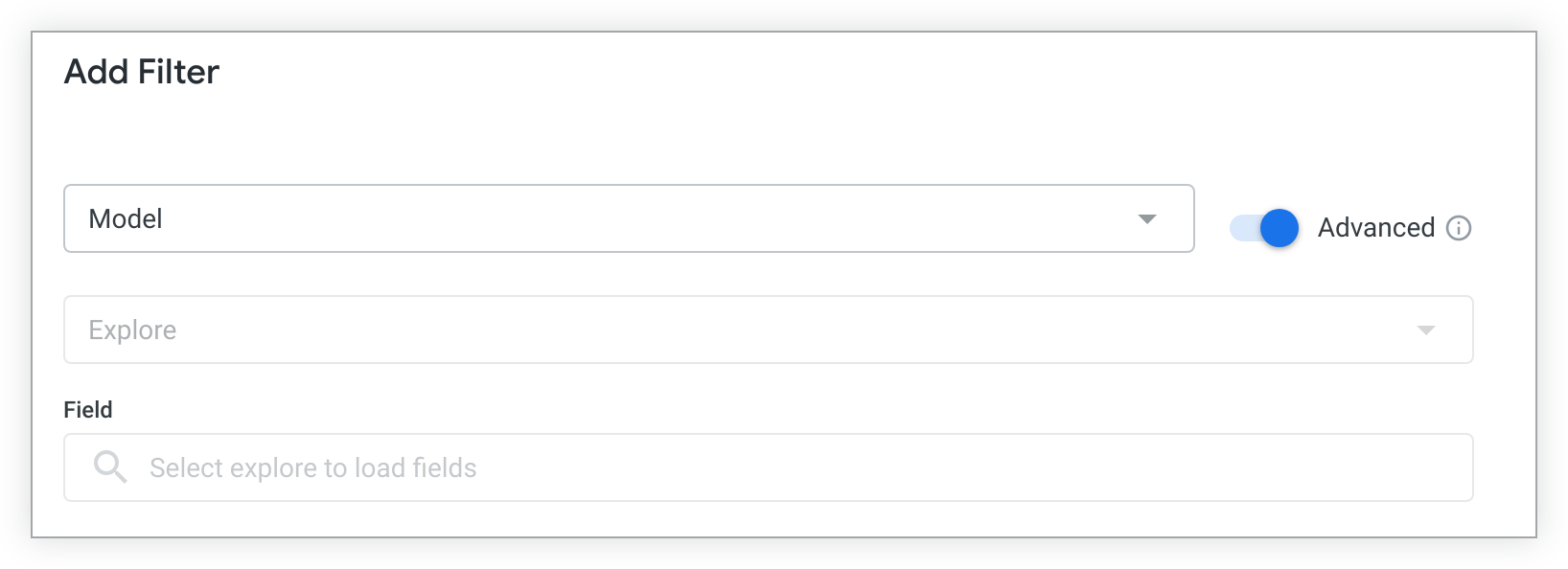
First, select a model name from the drop-down Model menu. The drop-down menu contains all LookML models that you have access to.
Once a model is selected, the Explore dialog populates with a drop-down menu of all the Explores that are present in the selected model.
Once the model and the Explore are selected, the fields that are available in that Explore will populate the Add Filter window. You can use the search bar to find the field that you want to filter by, or you can select a field name.
Once you've selected the field you want to filter by, select Add.
Customizing filter configuration
Once you select a filter field and select Add, the Add Filter window shows a variety of customizable settings on the Settings and Tiles To Update tabs.
The Settings tab
- Title: Enter the title of the filter as you want it to appear on the dashboard. The title option pre-populates with the name of the filter-by field.
- Control: Select from a list of control types, which vary depending on the type of data you are filtering. See the Dashboard filter controls section on this page to learn more about the different types of controls.
- Display: For controls that can be displayed as either inline or popover, select how the filter will be displayed. See the Displaying dashboard filters section on this page to learn more about the different ways to display filters. If a control can be displayed only in one way, this option won't appear.
- Values: To set specific value options for the filter, choose from the drop-down or enter the value options in this field. Leave blank to allow value options from the database to be surfaced, up to the maximum number of values available for that control. For numeric data, this field is replaced by the Min and Max fields.
- Configure Default Value: Optionally, set the default value for the filter.
- Require a filter value: Select the checkbox to require a value for the filter. See the Requiring a filter value section on this page to learn more about requiring filter values.
- Select filters to update when this filter changes: Select the checkbox to link other filters to this filter. See the Setting up linked filters section on this page to learn more about linked filters. If there are no other filters on the dashboard, this option will be disabled.
- Add and Cancel: Select one of these buttons to save or cancel the new filter.
The Tiles To Update tab lets you determine which tiles listen to the filter.
Default behavior of the Tiles To Update tab
Looker defaults to automatically applying the filter to any tiles that were created from the same Explore as the filter and sets the value of Field to Filter to the same field as the field chosen for the filter.
If any new tiles are added to the dashboard after the filter is created, if they were created from the same Explore as the filter, the dashboard filter is automatically applied to that tile.
Making edits to the Tiles To Update tab
If you want to adjust which tiles listen to which filter, or which fields are affected by filters, the following settings are available.
- Select All or None to turn the filter on or off for all tiles.
- In the Field to Filter section, for each tile, choose which field will be affected by the filter, or choose not to apply the filter to an individual tile. If a new filter's field is already used by a pre-existing filter, any tiles filtered by the pre-existing filter are unavailable to the new filter.
- Select Add or Cancel to save or cancel the new filter settings.
Dashboard filter controls
Dashboard filter controls let you customize the appearance of filters for dashboard viewers. The filter control types available in the Control drop-down as you create a dashboard filter depend on the LookML data type assigned to the field you're filtering on.
To see the data type for a field you are filtering on, you must have the
see_lookmlpermission. You can see the field's LookML by selecting Go to LookML from the gear menu to the right of the field in the field picker.
| Control | Description | Appearance | Data Types |
|---|---|---|---|
| Multiple Selection | |||
| Button Group | This type of filter is useful for giving viewers a curated set of limited options. Up to 30 options can be curated in the Values setting. For string, tier, and zipcode data types, if the Values setting is left blank, the first 30 values from the database are shown.A button is colored once it's selected. | 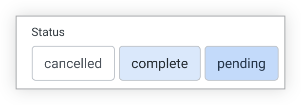 | S N T ZC YN DI DU |
| Checkboxes | Like a button group but with a slightly different design, this type of filter is useful for giving viewers a curated set of limited options. Up to 50 options can be curated in the Values setting. For string, tier, and zipcode data types, if the Values setting is left blank, the first 50 values from the database are shown. |  | S N T ZC YN DI DU |
| Tag List | A combination of drop-down and checkbox filters. The drop-down options can be curated in the Values setting. For string, tier, and zipcode data types, all values can be surfaced from the database if the Values setting is left blank.Viewers can expand the drop-down by selecting the chevron.Taglist controls can appear only in the popover orientation or behind the More button. | 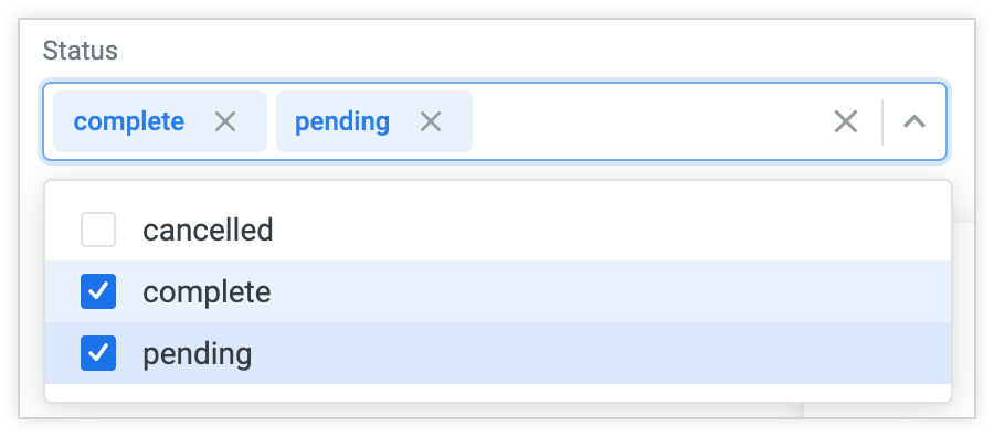 | S N T ZC DI DU |
| Range Slider | Range slider minimum and maximum can be set in the Settings tab of the filter configuration window.Viewers can set the filter value range by adjusting both ends of the slider. | 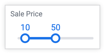 | N DI DU |
| Single Selection | |||
| Button Toggles | This type of filter is useful for giving viewers a curated set of limited options. Up to 30 options can be curated in the Values setting. For string, tier, and zipcode data types, if the Values setting is left blank, the first 30 values from the database are shown.A button is colored once it's selected. | 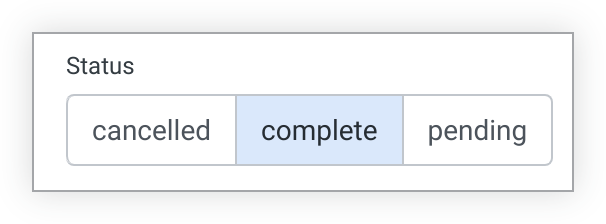 | S N T ZC YN DI DU P |
| Radio Buttons | Like a button toggle but with a slightly different design, this type of filter is useful for giving viewers a curated set of limited options. Up to 50 options can be curated in the Values setting. For string, tier, and zipcode data types, if the Values setting is left blank, the first 50 values from the database are shown. |  | S N T ZC YN DI DU P |
| Drop-down Menu | The drop-down options can be curated in the Values setting. For string, tier, and zipcode data types, all values can be surfaced from the database if the Values setting is left blank.Viewers can expand the drop-down by selecting the chevron and then either selecting an option from the drop-down or typing in the box to narrow the drop-down options. Viewers can also select Any value.Drop-down menu controls can appear only in the inline orientation or behind the More button. | 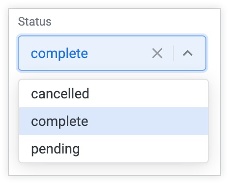 | S N T ZC YN DI DU P |
| Slider | Slider minimum and maximum can be set in the Settings tab of the filter configuration window.Viewers can set the filter value by adjusting the right end of the slider. | 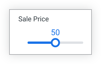 | N DI DU |
| Dates and Times | |||
| Single Day | Viewers can select the date to expand the calendar and select a new day.Single day menu controls can appear only in the inline orientation or behind the More button. | 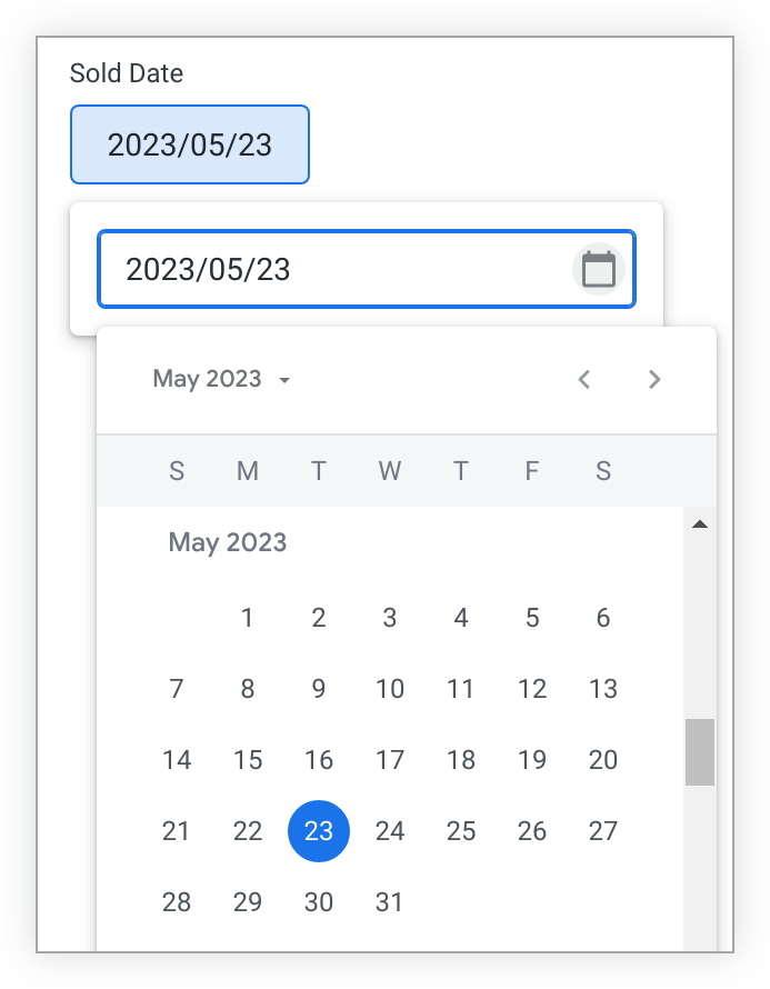 | DT *The single day control can be used with most timeframesand time-based types, but viewers can only select single dates with this typeof control. |
| Date Range | Viewers can select the date range to expand the calendar and select a new date range.Date range menu controls can appear only in the inline orientation or behind the More button. | 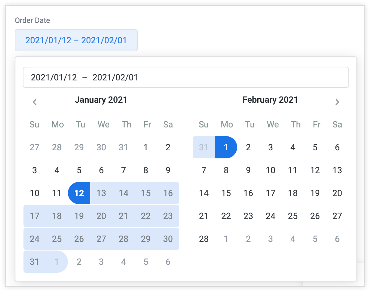 | DT * The date range control can be used with most timeframes and time-based types, but viewers can only select date ranges with this type of control. |
| Timeframes | Viewers can either select from a set of timeframes built into Looker or create their own custom timeframes by selecting the Custom tab. See the Viewing dashboards documentation page to see the full range of timeframes options for a Timeframes filter.Timeframes options such as Last 7 Days include the current day. For a timeframe that excludes the current day, select Advanced from the control drop-down and configure the value using complete days.Year to Date includes the beginning of the year through to the current second.Viewers can select the timeframe to see the timeframes options.Timeframes menu controls can appear only in the inline orientation or behind the More button. | 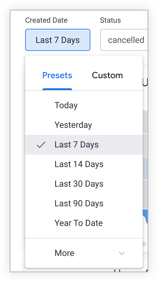 | DT * The timeframe control can be used with most timeframes and time-based types, but viewers cannot select time options with this type of control. |
| Other | |||
| Advanced | See the Using advanced controls section on this page to learn more about advanced controls.Advanced controls can appear only in the popover orientation or behind the More button. | 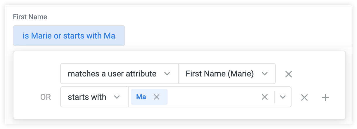 | S N T ZC YN DT DI DU L P |
* Note about date and time data: Some timeframes and time-based types are interpreted as different data types when Looker is selecting control options for them. Two examples are the yesno timeframe, which is interpreted as a yesno data type and therefore has the control options available to the yesno type; and the hour_of_day timeframe, which is interpreted as a number data type and therefore has the control options available to the number type. | |||
Using advanced controls
An advanced control can be applied to all types of data and provides some additional flexibility in the filter conditions you can set up. To create an advanced control, expand the Control drop-down in the filter configuration window and select Advanced.
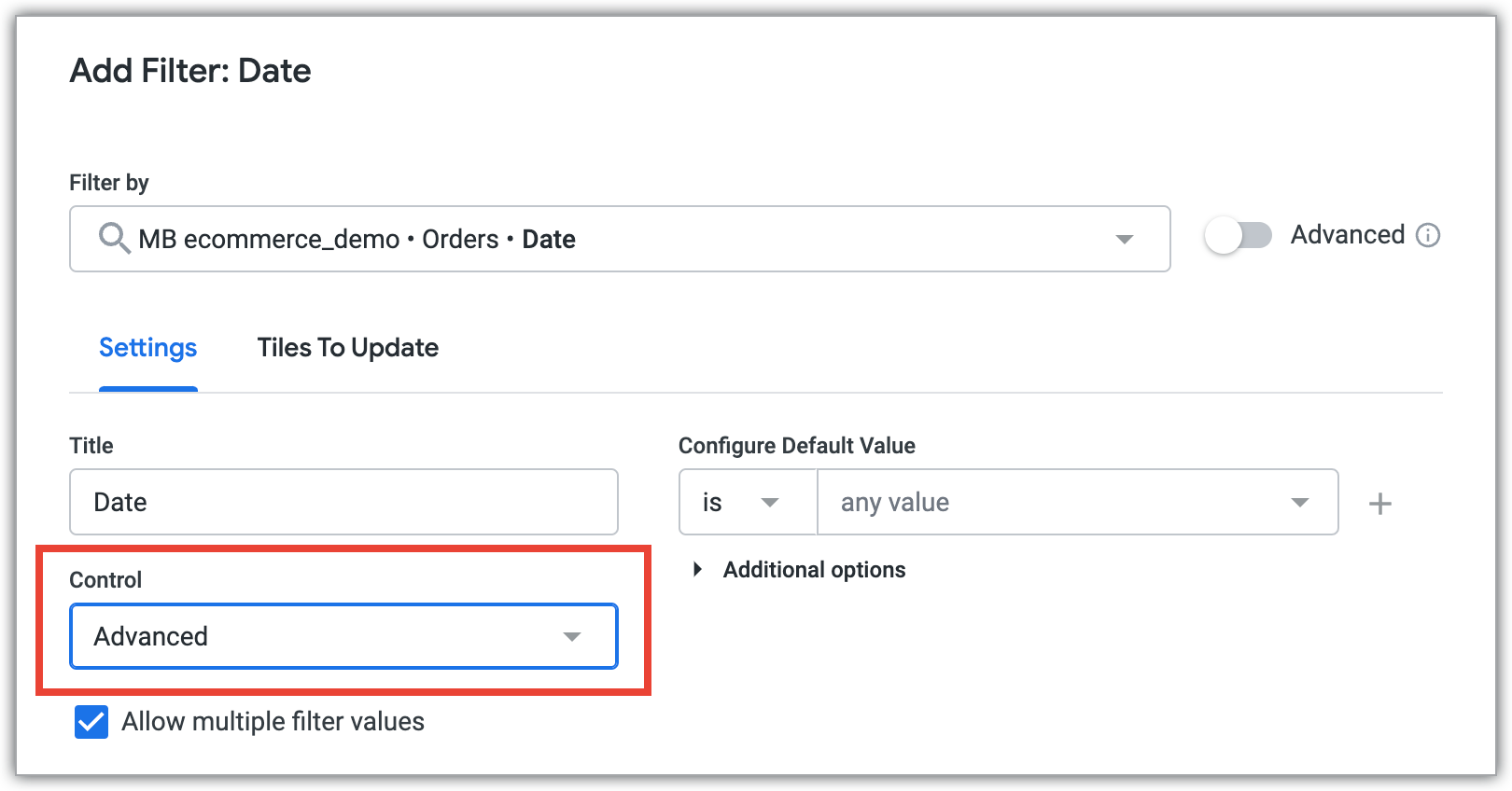
Once you select Advanced, the Configure Default Value field populates with appropriate filter condition options for the type of data you're filtering. For example, if you created a filter for a field with a string data type, the filter condition options such as is, contains, starts with. Filters on other types of data, such as number or date types, will display different condition options.
The Allow multiple filter values option lets users select more than one value for the filter. It defaults to enabled. When enabled, a + symbol appears to the right of the Configure Default Value field. Select the + symbol to add an additional filter value. To restrict users so that they can select only one value, disable this option. The Allow multiple filter values option is not available for filters based on the location data type or based on the parameter parameter.
Once you select your filter condition option, you can select a value from the drop-down value menu, which is populated with values from your database. Or, you can enter a value to receive a suggestion.
You can also enter a value yourself and select Enter to create a value.
You can select the + next to your filter value to add new conditions to the filter, which will be added as either OR conditions or AND conditions, depending on the types of conditions and values.
To remove a condition, select the X next to that condition.
Advanced controls, dates, and times
While there are several filter controls that allow filtering on dates, you can also use advanced controls with dates. Among other things, using advanced controls lets users select "complete" ranges that don't include the current time period, by selecting ranges such as complete days or complete weeks in the condition options. This is unlike the timeframe filter control, which includes the current time period.
Advanced controls also let users select time values, such as hours, minutes, and seconds.
Matches a user attribute
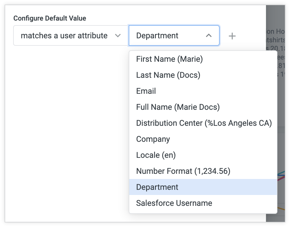
Advanced controls also give you the option to select matches a user attribute. This lets you set filters that change dynamically based on dashboard viewers' user attributes. See the Filtering and limiting data documentation page for more information.
Matches advanced
The final option in the Configure Default Value option drop-down is matches advanced. With this option selected, you can enter a Looker filter expression to customize a filter beyond the options provided in the options drop-down.
You can also reference user attributes in matches advanced filters by using the following syntax:
{{ _user_attributes['name_of_your_attribute'] }}
Displaying dashboard filters
You have several options for altering the way dashboard filters are displayed. You can adjust the appearance of individual filter controls or of the entire filter bar.
Appearance of individual filters
To set the way a filter appears, first make sure your dashboard is in edit mode and then select the style of display in the Display field of the filter configuration window that appears when you select Edit from the filter menu. Most dashboard filters can be displayed in the following ways:
Inline: The filter is displayed directly in the top bar of the dashboard.

Popover: A summary value appears in the top bar of the dashboard; select the value to see the full filter.

Filters can also be placed behind a More button: A More button will appear in the filter bar with an indicator that shows the number of filters the bar contains; viewers can select the button to see the filters and their values.

Some filter controls can be displayed only in inline orientation; when you edit a dashboard with these filter controls, you won't see a Display field in the filter configuration window. These filter controls can be displayed only in inline orientation:
- Drop-down Menu
- Single Day
- Timeframes
- Date Range
Additionally, some filter controls can be displayed only in popover orientation; when you edit a dashboard with these filter controls, you won't see a Display field in the filter configuration window. These filter controls can be displayed only in popover orientation:
- Tag List
- Advanced
Generally, we recommend that important or frequently used filters be displayed as inline or popover, and less frequently used filters be displayed as overflow.
Appearance of the filter bar
To set the way a filter bar appears, follow these steps:
- Make sure your dashboard is in edit mode.
- Open the dashboard's Settings window.
- Select the Filters tab of the Settings window.
- You can set the Default filters view option to Expanded or Collapsed. (The default is Expanded.)
- The Filters location option allows you to place the filter bar at the top or the right of the dashboard. (The default is at the top.)
Requiring a filter value
By default, filters don't require values. If a filter that does not require a value is left blank, the data simply isn't restricted by the filter field. For example, if you have a filter on a State field on a dashboard and that filter was not given a value, the dashboard returns data for all states.
If a filter does require a value, the dashboard won't run until you select a filter value. A required filter with no value selected displays warnings below the filter and when holding the pointer over the reload icon until a value is chosen.
Additionally, you cannot create a dashboard schedule without selecting a value for a required filter or clear cache and refresh a tile that is linked to a required filter that does not have a value.
To require that a user enter a value in a filter before they can run the dashboard:
- Make sure the dashboard is in edit mode.
- Open the filter configuration window for the filter, either by adding a new dashboard filter, or by editing an existing dashboard filter.
- Select the arrow to the left of the Additional options heading to reveal the additional options.
- Select the Require a filter value checkbox.
- Select Update to save your change.
The Require a filter value checkbox simply requires that viewers select any value. To restrict the values a viewer is able to select, set the allowed values in the Values field of the filter configuration window.
Required filters are helpful in limiting the sizes of queries sent to your database. To limit dashboard viewers' data access, use the access_filter LookML parameter instead.
Setting up linked filters
Dashboard filters can be linked so that the filter value options for one filter are narrowed based on the filter value or values selected for a different filter on the same dashboard.
For example, you can link a dashboard filter for City to a separate filter for State. The filter value options for City will change based on the state or states selected in the State filter.
Once you select a filter value for State, a link icon appears with the City filter. If you hold the pointer over the link icon, a box appears that states that the value options for that filter have been narrowed by the State filter.
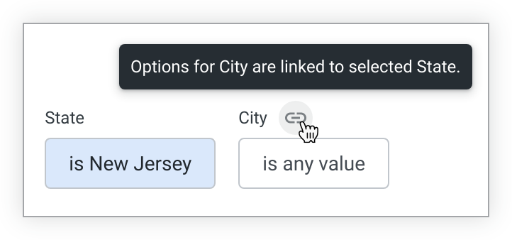
You can go further and link a Zip filter to the City and State filters, narrowing the value options for Zip depending on the city and state selected. For example, if the State filter is New Jersey and the City filter is Asbury Park, the Zip filter drop-down only displays the value for the zip code within Asbury Park.
If you link filters and your data contains no values for a "child" filter (the filter to be narrowed), given the values selected in the "parent" filter (the filter that narrows the child filter's options), viewers will see a No matches found message for the child filter.
Linked filters work in one direction, from parent to child. If you make a selection in a child filter, it will not affect the filter value options presented to you for the parent filter.
How to link filters
When you are linking filters, any filter can be used as the "parent" filter (the filter that narrows another filter's options), but the "child" filter (the filter to be narrowed) can only use a field of type string, commonly used for words or phrases, or type zipcode, commonly used for zip codes.
If there is only one filter on the dashboard, the ability to link filters is disabled.
To link one filter to another:
- Make sure the dashboard is in edit mode.
- Open the filter configuration window for the "parent" filter, either by adding a new dashboard filter, or by editing an existing dashboard filter.
- Select the arrow to the left of the Additional options heading to reveal the additional options.
- Select the Select filters to update when this filter changes checkbox.
- Select the field box to reveal a drop-down with the other
stringandzipcodefilters present on the dashboard. - Select the
stringorzipcodefilter or filters you would like to link to this filter. - Select Update to save your change.
Moving and repositioning dashboard filters
Once filters are placed on a dashboard, you can move or reposition them by:
- Entering edit mode on the dashboard.
- Hovering over the filter to display the filter's six-dot icon. The six-dot icon appears at the top left of the filter.
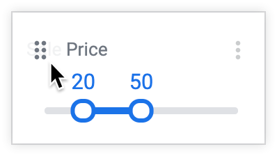
Selecting and holding the six-dot icon, and dragging the filter to the position you want.
This drag and drop method can be used to reposition inline and popover filters, reconfigure which filters are placed behind a More button, and reposition filters within the More button drop-down.
If no filters are currently behind the More button, an empty More button temporarily appears while you are dragging a filter. You can move the filter over the More button to move it into the More button. If you do not place the filter in the More button, it disappears once you stop holding the filter.
If cross-filtering is enabled on a dashboard, you cannot reposition cross-filters using drag and drop, and entering edit mode clears any cross-filters currently on the dashboard.
Hiding dashboard filters
You can hide dashboard filters by altering a dashboard's URL to include a hide_filter parameter for each filter that you want to hide. Any time users access the dashboard with that URL, they will see a version of the dashboard with those filters hidden. However, if users navigate to the dashboard in other ways, or access the dashboard with a URL that does not contain the hide_filter parameter, filters will not be hidden.
For example, following is the URL for a dashboard with two filters that are not hidden: User State, which has a filter value set to New Jersey, and Date, which does not have a set filter value.
https://mycompany.looker.com/dashboards/390?User+State=New+Jersey&Date=
To hide a filter, you add a hide_filter parameter to the URL, preceded by an ampersand (&) and followed by an equal sign (=), and give the parameter the value of the filter name, with any spaces in the name replaced with plus symbols (+). You do not need to include the filter value (if any) in the hide_filter parameter.
To hide only the User State filter, alter the URL to the following:
https://mycompany.looker.com/dashboards/390?User+State=New+Jersey&Date=&hide_filter=User+State
To hide both the User State and the Date filters, add another hide_filter parameter for the Date filter:
https://mycompany.looker.com/dashboards/390?User+State=New+Jersey&Date=&hide_filter=User+State&hide_filter=Date
For filter names with special characters, such as the parentheses and forward slash in First Purchase (Yes / No), the URL encodes the special characters:
https://mycompany.looker.com/dashboards/390?First+Purchase+%28Yes+%2F+No%29=
To hide that filter, you can copy the encoded filter name that already exists in the URL (First+Purchase+%28Yes+%2F+No%29) and use it as the value of the hide_filter parameter.
There are a few additional things to understand about hiding dashboard filters:
- Any user with View access to a dashboard can hide dashboard filters with the URL. The user does not need to have edit access to the dashboard.
- Hidden dashboard filters still apply to dashboard results, even though the filter controls are not visible on the dashboard.
- The values of the hidden filters can still be changed and applied to the dashboard by changing the values in the URL.
- Hidden filters can be revealed by removing the
hide_filterparameters from the URL. - You will not see hidden filters in edit mode.
- Hiding a required filter without a value causes the dashboard tiles to produce Invalid filters errors. To address one of these errors, assign a value to the required filter.
- If dashboards are being scheduled or sent, dashboard links that are included in the delivery do not include the
hide_filterparameter. - If dashboards contain alerts, dashboard links that are included in the alert delivery do not include the
hide_filterparameter.
Applying dashboard filters to alerts
The Filters menu also lets you apply filter edits to the alerts present on a dashboard's tiles. See the Effect of dashboard edits on alerts documentation page for more information.
Editing dashboard filters
In edit mode, a three-dot Filter Menu icon appears next to every filter. To edit a filter, select the icon. This opens the filter menu, which displays options to edit or delete a filter.
Select the Edit menu option to open a filter configuration window, similar to the one used to add a filter, populated with the existing configuration for the filter. From there, you can update the filter-by field, the filter's settings, or the tiles to update. Select Update or Cancel in the filter configuration window to save or cancel your changes.
Once you've edited filters, select the dashboard's Update button to apply the new filter settings to the tiles.
Select Save in the blue toolbar to save your changes and exit edit mode.
Deleting dashboard filters
In edit mode, three-dot Filter Menu icon appears next to every filter.
To delete a filter:
- Select the three-dot Filter Menu icon.
- The filter menu opens. This menu displays options to edit or delete a filter.
- Select the Delete menu option to delete the filter.
- Select Save in the blue toolbar to save your changes and exit edit mode.
- Once you've deleted the filters, select the dashboard's Update button to apply the new filter settings to the tiles.
Alternatively, you can select the Edit menu option, which opens the filter configuration window. Select the Delete button within the filter configuration window to delete your filter.
Deleting a filter cannot be undone.
