This tutorial is intended for experienced JavaScript developers and assumes some familiarity with functional programming techniques.
In this example, we begin with a query that is related to hypothetical quarterly sales information for some brands. First we will filter the query for specific brands and then pivot the results by sales quarter. See the following table for an example.
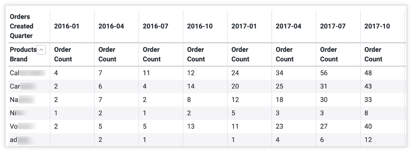
Then, we will use visualization components to build a custom visualization that shows how each brand's products have been trending over the past quarter. The result will be a new kind of visualization that is composed of a series of sparklines nested within a table, which looks like this example:
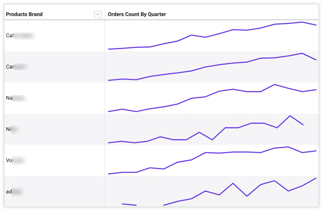
Along with showing you how to create a custom visualization, this example demonstrates some best practices for working with the Looker API within a React application.
To build a customized visualization with Looker components, make sure your setup meets the requirements, and then perform the following steps:
- Build a query in an Explore and copy the
qidvalue - Pass the data to a custom visualization component
- Build out the
CustomViscomponent - Transform the normalized data
- Insert the transformed data into
CustomVis - Generate the custom visualization
Using visualization components to build a custom visualization is appropriate when the custom visualization is intended for an embedded application or extension. If you want to make the custom visualization available to Looker users across a Looker instance, follow the instructions on the
visualizationdocumentation page. If you want to develop a custom visualization and upload it to the Looker Marketplace, follow the instructions on the Developing a custom visualization for the Looker Marketplace documentation page.
Requirements
Before you start, a few elements are needed:
- You must have access to a Looker instance.
- Whether you're building in the extension framework or your own stand-alone React application, it is important to authenticate with Looker's API and have access to the Looker SDK object. Read about Looker API authentication or our extension framework for more information.
- Make sure you have installed the Looker Visualization Components NPM package and the
@looker/components-dataNPM package. Information on installing and using the visualization components package can be found in the README document, available in GitHub and NPM.
Step 1: Build a query in an Explore and copy the query ID
In this example, we use hypothetical quarterly sales information for brands we are tracking over time.
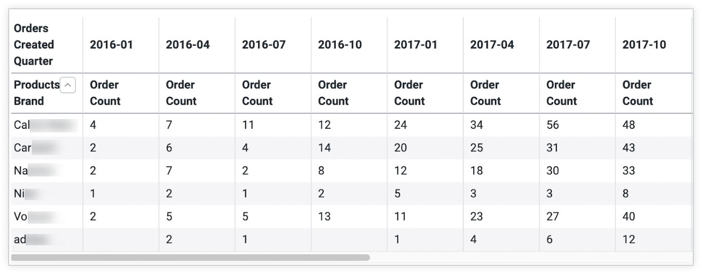
We will pivot this data, as pivoting is Looker's built-in way to group the query results. In an Explore, we can run a query and create a chart of the data using one of Looker's native visualization types. The chart provides a lot of information, but it is hard to parse at a glance how each brand's products are trending:
As with the example of rendering a simple visualization, the next step is to copy the qid value from the URL bar of the Explore. For the purposes of this example, the qid value will be Uijcav7pCA4MZY2MompsPZ, but that value is specific to our test instance; your value will differ.
Step 2: Pass the data to a custom visualization component
To begin, pass the qid value taken from the Explore's URL into the Query component, and the authenticated SDK object to DataProvider.
import React, { useContext } from 'react'
import { ExtensionContext } from '@looker/extension-sdk-react'
import { DataProvider } from '@looker/components-data'
import { Query } from '@looker/visualizations'

export const MyReactApp = () => {
  const { core40SDK } = useContext(ExtensionContext)

  return (
    <DataProvider sdk={core40SDK}>
      <Query query='Uijcav7pCA4MZY2MompsPZ'></Query>
    </DataProvider>
  )
}
Next, rather than rendering a native Looker visualization through the Visualization component, we will build our own custom component called CustomVis.
The Query component can accept any React element as a child, and will simply pass down the config, data, fields, and totals values as properties to render your own visualization components. We will render CustomVis as a child of Query, so it can receive all relevant data as properties.
import React, { useContext } from 'react'
import { ExtensionContext } from '@looker/extension-sdk-react'
import { DataProvider } from '@looker/components-data'
import { Query } from '@looker/visualizations'
import { CustomVis } from '../path/to/MyCustomVis'

export const MyReactApp = () => {
  const { core40SDK } = useContext(ExtensionContext)

  return (
    <DataProvider sdk={core40SDK}>
      <Query query='Uijcav7pCA4MZY2MompsPZ'>
        <CustomVis />
      </Query>
    </DataProvider>
  )
}
Step 3: Build out the CustomVis component
Next, let's build the CustomVis component. The properties that are inherited from the Query component are config, fields, data, pivots, and totals:
configdescribes all the ways the data should be rendered in a chart, such as the thickness of the line in a sparkline or the size and shape of the points of a scatterplot.fieldsstores additional metadata about the measure and dimension values returned from the query, such as how the values should be formatted or what to label each axis.datais the key/value response that was returned from the query.pivotsdescribes the dimension by which the query is pivoted.totalsreferences Looker's row totals for use in table-based visualizations.
We can pass these unmodified properties onto a table visualization by inserting a Table component.
import React from 'react'
import { Table } from '@looker/visualizations'

export const CustomVis = ({ config, fields, data, pivots }) => {
  return <Table config={config} data={data} fields={fields} pivots={pivots} />
}
This gives us a sense of the data as it is returned directly from the SDK. In the rendered response, there is a row for every brand with results grouped, or pivoted, by quarter.
Step 4: Transform the normalized data
To convert this pivoted data to be rendered with nested sparklines, we isolate all the measure values and pass them to the subcharts. In the following chart, the relevant data for a single row is highlighted to illustrate the data we will be collapsing and rendering with a child visualization:
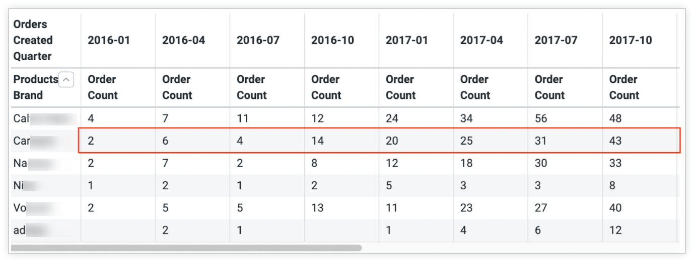
We will create a custom transformation for this. The following is an example that is specific to this scenario; you will need to parse your own data accordingly.
import React from 'react'
import { Table, Sparkline } from '@looker/visualizations'

// we assign this value to a constant to ensure that fields and data
// objects remain in sync.
const NESTED_DATA_KEY = 'orderCount'

const nestSparklines = (data) => {
  return data.reduce((acc, d) => {
    // the first entry is the dimension (brand name), and the rest of the rows are the
    // quarterly sales information we want to pass to the Sparkline.
    const [parentDimension, ...measurePairs] = Object.entries(d)

    // `nonPivotedData` represents a single data row.
    // e.g. [{entry: 1, orderCount: 10}, {entry: 2, orderCount: 15}, ...etc]
    const nonPivotedData: SDKRecord[] = measurePairs.map(([_, value], i) => {
      return { entry: i, [NESTED_DATA_KEY]: value }
    })

    // now for each row in the table we render a Sparkline using the `nonPivotedData`
    // that we built.
    // E.G. [{products.brand: 'adidas', orderCount: <Sparkline />}]
    return [
      ...acc,
      {
        [parentDimension[0]]: parentDimension[1],
        [NESTED_DATA_KEY]: () => (
          <Sparkline
            height={75}
            data={nonPivotedData}
            fields={{
              measures: [{ name: NESTED_DATA_KEY }],
              dimensions: [],
            }}
          />
        ),
      },
    ]
  }, [])
}
The function is created using the following steps:
- Reduce over the data set to isolate the brand name from the quarterly order data for each row.
- Update each row to include the dimension and a rendered React component that can represent the values for each row in the table.
Step 5: Insert the transformed data into CustomVis
Now transform the data using our new function, and assign the output to a new variable called nestedData:
export const CustomVis =({
  fields,
  data,
  config,
  pivots,
}) => {
  const nestedData = nestSparklines(data)

  return (
    <Table
      fields={{
        measures: [{ name: NESTED_DATA_KEY, label: 'Orders Count By Quarter' }],
        dimensions: fields.dimensions,
        pivots: [],
      }}
      config={config}
      data={nestedData}
      pivots={pivots}
    />
  )
}
Step 6: Generate the custom visualization
After you have inserted the transformed data and configured the chart, the visualization will look like this example of a table with individual sparkline charts for each row:

The entirety of the code necessary to render this visualization is as follows:
import React, { useContext } from 'react'
import { ExtensionContext } from '@looker/extension-sdk-react'
import { DataProvider } from '@looker/components-data'
import { Query, Sparkline, Table } from '@looker/visualizations'

// we assign this value to a constant to ensure that fields and data
// objects remain in sync.
const NESTED_DATA_KEY = 'orderCount'
const ROW_HEIGHT = 75

const nestSparklines = data => {
  return data.reduce((acc, d) => {
    // the first entry is the dimension (brand name), and the rest of the rows are the
    // quarterly sales information we want to pass to the Sparkline.
    const [parentDimension, ...measurePairs] = Object.entries(d)

    // `nonPivotedData` represents a single data row.
    // e.g. [{entry: 1, orderCount: 10}, {entry: 2, orderCount: 15}, ...etc]
    const nonPivotedData = measurePairs.map(([_, value], i) => {
      return { entry: i, [NESTED_DATA_KEY]: value }
    })

    // now for each row in the table we render a Sparkline using the `nonPivotedData`
    // that we built.
    // E.G. [{products.brand: 'adidas', orderCount: <Sparkline />}]
    return [
      ...acc,
      {
        [parentDimension[0]]: parentDimension[1],
        [NESTED_DATA_KEY]: () => (
          <Sparkline
            height={ROW_HEIGHT}
            data={nonPivotedData}
            fields={{
              measures: [{ name: NESTED_DATA_KEY }],
              dimensions: [],
            }}
          />
        ),
      },
    ]
  }, [])
}

const CustomVis = ({ fields, data, pivots, config }) => {
  const nestedData = nestSparklines(data)

  return (
    <Table
      config={config}
      height={500}
      fields={{
        measures: [{ name: NESTED_DATA_KEY, label: 'Orders Count By Quarter' }],
        dimensions: fields.dimensions,
        pivots: [],
      }}
      data={nestedData}
      pivots={pivots}
      defaultRowHeight={ROW_HEIGHT}
    />
  )
}

export const MyReactApp = () => {
  const { core40SDK } = useContext(ExtensionContext)

  return (
    <DataProvider sdk={core40SDK}>
      <Query query='Uijcav7pCA4MZY2MompsPZ'>
        <CustomVis />
      </Query>
    </DataProvider>
  )
}
Next steps
- Using visualization components and the
dashboardproperty to render a simple visualization - Using visualization components and the
queryproperty to render a simple visualization - Using visualization components to render custom visualizations
- Visualization and Query property tables
