Word cloud visualizations can be used to highlight popular values or show the frequency of text data using font size and color.
Word cloud charts require exactly one dimension and one measure. More dimensions or measures prevent the visualization from rendering.
To create a word cloud visualization, click the ellipsis (...) in the Visualization bar and choose Word Cloud. Click Edit in the upper right corner of the visualization tab to format your visualization.
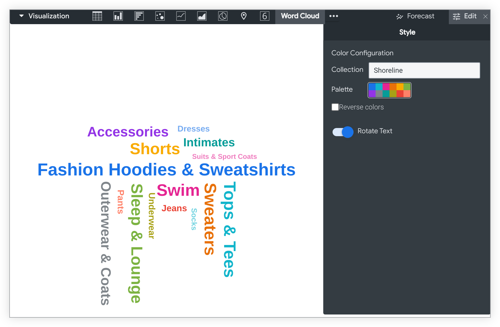
This example shows the popularity of clothing categories based on the amount of clothing sold in each category, using the Category dimension and the Order Count measure from the Order Items Explore:
The Fashion Hoodies & Sweatshirts category is the most popular value; it is assigned the first color in the palette and displays with a larger font size than the other values in the chart. The Tops & Tees and Swim categories are the second and third most popular categories; they take on the second and third colors in the palette and display with larger font sizes than less popular values.
Style menu options
Colors
You can define the color palette for a chart in the Color Configuration section.
Collection
A collection lets you create themed visualizations and dashboards that look good together. All of Looker's built-in color collections appear on the Color collections documentation page. Your Looker admin may also create a custom color collection for your organization.
You can choose a color collection from the Collection drop-down menu. The Palette section will update with a palette from your chosen color collection.
Palette
Once you've selected a color collection, you can choose a different palette from the collection, or customize your palette, by clicking the color palette itself. This opens the palette picker and displays all of the palettes from the collection.
Colors are assigned to each series in order. For a categorical palette, the first color in the palette is assigned to the first series, and so on. For a sequential or diverging palette, the color at the left end of the palette is assigned to the first series and the colors for each remaining series move to the right on the palette. If your query returns more data series than colors listed, the colors repeat from the beginning of the palette, first as a lighter version of each color, then as a darker version of each color.
Creating a custom color palette
To create a custom color palette, select the Custom tab on the palette picker. You can edit your palette in several ways:
- Click on one of the colors present to edit it.
- Click the + or - buttons below the color palette to add a color to the end of the palette or remove a selected color.
- Click EDIT ALL at the bottom right of the menu to use a comma-separated list of color values.
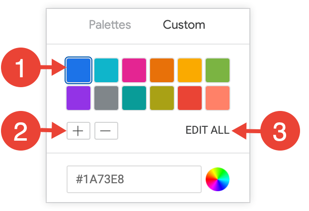
To change a selected color, or edit all colors at once, input hex strings, such as #2ca6cd, or CSS color names, such as mediumblue, into the color value box at the bottom of the picker.
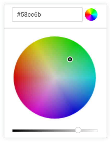
To bring up a color picker to select a color, click the color wheel to the right of the color value box. The corresponding hex value for that color appears in the color value box.
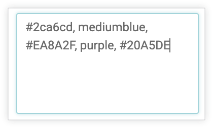
If you click EDIT ALL, the color value box populates with the hex codes of the color palette you've chosen or customized. Copying and pasting this list is the best way to copy custom color palettes from one chart to another.
Reverse colors
You can reverse the colors used on a palette. For a categorical palette, this applies the last color in the palette to the first series, the second-to-last color in the palette to the second series, and so on. For a sequential or diverging palette, this applies the color at the right end of the palette to the first series and move left on the palette for the remaining series.
Rotate Text
By default, the words in a word cloud visualization display both horizontally and vertically (see the introductory section for an example). To display all text horizontally, disable the Rotate Text option in the Style menu for the visualization.
Edit Chart Config
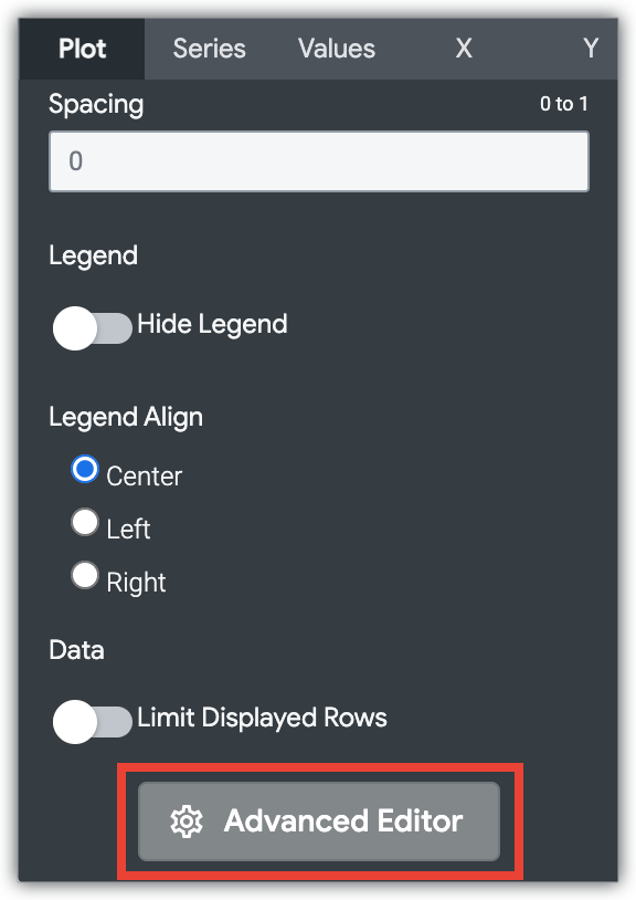
The Edit Chart Config button at the bottom of the visualization menu opens the Chart Config Editor. This editor lets you modify HighCharts visualizations by exposing certain JSON parameters of the visualization, enabling deep customization. These customizations will not dynamically interact with data.
The Edit Chart Config button is available if you have either the Looker Admin role or the can_override_vis_config permission.
See the Examples section of the Chart Config Editor article for examples of some common use cases, including the following examples:
- Changing the background color and axis text color
- Conditional formatting of values within a series
- Customizing tooltip color
- Adding vertical reference bands and captions
- Adding chart annotations
