To view an aggregate representation of your trace data, or to find and explore individual traces or traces that contain specific labels, use the Trace Explorer page.
This feature is supported only for Google Cloud projects. For App Hub configurations, select the App Hub host project or the app-enabled folder's management project.
About the Trace Explorer page
To help you identify trends and patterns in your trace data, the latency data is aggregated and displayed in charts. The heatmap, which is the default visualization, uses color to represent the number of spans in a cell. A cell with many spans is shown with a darker color than a cell with few spans. You can select a cell or activate a cell's tooltip to get more information. The other visualizations let you view latency as a percentile and span rate information. For all visualizations, you can use your pointer to expand the x-axis. For the line charts, you can expand the x- and y-axes.
When you are investigating an issue, you might want to view a specific trace or only spans with certain properties:
When you know the ID of a trace, in the toolbar, click pageview Search for trace, and then enter the trace ID in the dialog. Next, you can search the spans and attributes in the trace for keywords .
When viewing the aggregate data, you can search for specific spans by applying filters. For example, you might filter the data to display only those spans for a specific service. Next, you might add a second filter that limits the display to spans for a specific service that reports an error.
The tabular data lets you view details of individual spans and it helps you identify outliers. For example, to find the span with the highest latency value, select the Spans tab and then sort the data by latency. To find the services that are generating errors, filter the data by span status, and then select the Grouped tab, which shows data that has been aggregated by span and service name. Each row in the table contains a link to detailed information.
The trace data shown by the Trace Explorer page depends on the following:
- The projects searched for trace data. By default, only the project selected by the project picker is searched for trace data. However, you can configure the page to search the list of projects in a trace scope.
- Your Identity and Access Management (IAM) permissions on the searched projects. If you don't have the permission to view trace data for a project, then the Google Cloud console displays a warning message and the data from that project isn't displayed.
- The time-range setting.
- The filters you apply.
The remainder of this page provides more information about how to find and explore your trace data.
Before you begin
To get the permissions that
you need to view trace data by using the Google Cloud console and to or select a trace scope,
ask your administrator to grant you the
Cloud Trace User (roles/cloudtrace.user)
IAM role on your project.
For more information about granting roles, see Manage access to projects, folders, and organizations.
This predefined role contains the permissions required to view trace data by using the Google Cloud console and to or select a trace scope. To see the exact permissions that are required, expand the Required permissions section:
Required permissions
The following permissions are required to view trace data by using the Google Cloud console and to or select a trace scope:
-
To select a trace scope:
cloudtrace.traceScopes.[get, list] -
To read the default trace scope:
observability.scopes.get
You might also be able to get these permissions with custom roles or other predefined roles.
For more information about roles, see Control access with Identity and Access Management.
View aggregated trace data
To view the aggregated information about your trace data, do the following:
-
In the Google Cloud console, go to the Trace explorer page:
You can also find this page by using the search bar.
It might take several minutes after the first trace data is written to a Google Cloud project before that data is available to view. If you don't see any trace data displayed after waiting a few minutes, then your project might not have any data to display or there might be a configuration issue. For information about how to resolve these issues, see Troubleshoot: No data in the Trace interface.
In the toolbar of the Google Cloud console, select your Google Cloud project. For App Hub configurations, select the App Hub host project or the app-enabled folder's management project.
Optional: Configure which projects are searched for trace data by using the Scope element:
To show the trace data that is stored in your project, set the first menu of the Scope element to
 Project or to
  _Default.
These two settings are equivalent.
_Default.
These two settings are equivalent.To show the trace data that is stored in multiple projects, expand the first menu of the Scope element, select Trace scope, and then select the trace scope that lists those projects. After you make your selection, the Scope menu displays a trace scope icon,
, and the name of the
selected trace scope.
The data that is returned depends on your IAM roles on the searched projects. For example, the searched projects include a Google Cloud project that you don't have access to, then no trace data for that project is returned.
For more information, see Create and manage trace scopes.
Optional: Update the time range by using the time-range selector or by using your pointer to highlight a range on the x-axis.
For example, you might set this selector to Last 2 weeks when you want to see whether there are any trends in the latency data.
Go to the toolbar and set the time-range selector to at least two weeks. Span data stored for 30 days.
Explore the charts, which show patterns and trends in your trace data:
To get information about span latency data, set the Chart view menu to Span duration (heatmap). The color intensity is proportional to the number of spans. For information about a cell, use your pointer. The tooltip displays the number of spans, date and time, and the time interval of the cell.
To view latency trends, set the Chart view menu to Span duration (percentile). The duration chart displays the 50th, 90th, 95th, and 99th percentiles.
To view the response status as a function of time, set the Chart view menu to Span rate. The chart displays the rate of spans being sent to your project.
Explore the tabular data which lists individual spans on Spans tab and spans grouped by their service and name on the Grouped tab.
Each row in the tables displays a span or grouping, along with a link to detailed information and some metrics. For example, on the Grouped tab, the metrics include the error rate and the number of spans in the group.
To find outliers, select a column header to sort the table.
Add filters to restrict which spans are shown. To learn more about filtering your trace data, see the next section.
Filter your trace data
To display only information that is of interest to you, apply filters. Filters restrict what data is shown. For example, you might filter by service name and by status. Or, if you've deployed applications to App Hub, you might want to view the trace data only for the application, or for a specific service or workload that is part of the application.
When you add or remove a filter, the data displayed by the Trace Explorer page is refreshed and only shows those spans that match all applied filters.
To change your filter settings, you can use the Span filters pane or the Filter bar.
Apply span filters
The Span filters pane lists the most common filters. You can select multiple entries from any subcategory. As you add or remove filters, the Filter bar is also updated.
The values for all menus are derived from your trace data. When a menu includes an option without any text, that option refers to spans that don't include the corresponding attribute.
The following Span filters are typically available:
- OpenTelemetry service: Filters by the
service.nameattribute. - Span name: Name of the span.
- Span status: The request status. For information about the values, see the OpenTelemetry SpanStatus documentation.
- Duration: The duration of the span.
- Span kind: Describes the relationships between spans. For information about the values, see the OpenTelemetry SpanKind documentation.
- App Hub application: Filters by the
gcp.apphub.application.idresource attribute. - App Hub service: Filters by the
gcp.apphub.service.idresource attribute. - App Hub workload: Filters by the
gcp.apphub.workload.idresource attribute.
If you want to filter by an attribute that isn't listed in the Span filters pane, then use the Filter bar.
Use the filter bar
The Filter bar lets you apply a filter with a predefined filter key and a value that you select, or you can enter both the key and value.
To add a filter, select Add filter, and then do one of the following:
- Select a defined key, like Span name, and then select a value from the secondary menu.
Select Add attribute filter, and then add your custom key and value. If you enter your own filter key, then use the same syntax as a key for an attribute on a span.
For example, to filter by the host identifier, set the key to
host.id. Similarly, to filter by status code, set the key to/http/status_code. In this scenario, you might set the value to200, which results in the filter/http/status_code: 200. To let the filter match any value, select Any value.
Filter by application
Trace spans generated by instrumentation you added to your applications can include the following resource attributes:
gcp.apphub.application.{container,id,location}gcp.apphub.{workload,service}.{criticality_type,environment_type,id}
To find the trace data for your application, in the Trace Explorer, go to the Span filters pane and add filters for your App Hub application:
- To filter by the application ID, (
gcp.apphub.application.id), use the App Hub application menu. - To filter by an application's service, (
gcp.apphub.service.id), use the App Hub service menu. - To filter by an application's workload, (
gcp.apphub.workload.id), use the App Hub workload menu.
Find a trace by ID
When you are troubleshooting an incident or failure, you might know the trace ID. To explore that trace, do the following:
-
In the Google Cloud console, go to the Trace explorer page:
You can also find this page by using the search bar.
- In the toolbar of the Google Cloud console, select your Google Cloud project. For App Hub configurations, select the App Hub host project or the app-enabled folder's management project.
Go to the toolbar, click pageview Search for trace, and enter the trace ID.
When you enter a valid ID, the Details flyout opens and displays information about the trace and its spans. You can use the options in that pane to explore the trace. For example, you might search the spans for keywords.
Explore a trace
To view a trace or span, do the following:
-
In the Google Cloud console, go to the Trace explorer page:
You can also find this page by using the search bar.
It might take several minutes after the first trace data is written to a Google Cloud project before that data is available to view. If you don't see any trace data displayed after waiting a few minutes, then your project might not have any data to display or there might be a configuration issue. For information about how to resolve these issues, see Troubleshoot: No data in the Trace interface.
In the toolbar of the Google Cloud console, select your Google Cloud project. For App Hub configurations, select the App Hub host project or the app-enabled folder's management project.
Do one of the following:
Go to the table section of the Trace Explorer page and select an entry from the table that lists spans or lists summary information after grouping the data by service and span name.
Go to the toolbar of the Trace Explorer page, click pageview Search for trace, and enter the trace ID.
The Details flyout opens and displays a trace and its spans:
- The Name column displays the call hierarchy and the first entry includes the trace ID.
- The Service column is extracted from the
OpenTelemetry attribute
service.name, when that attribute is set. If that attribute isn't set and if the service is running on App Engine, then the App Engine service name is displayed. Otherwise, no service is specified. - The length of the latency bar is representative of the latency value.
- The color of the latency bar indicates status. A blue latency bar indicates a successful completion while a red latency bar indicates an error occurred.
- A circle on a latency bar indicates a log entry or event is associated with the span. To change this behavior, use the Logs & events menu.
Optional: Search the span name, service name, and attributes in a trace by using the Find in Trace field.
For example, if you enter
GET, then text in the span name, service name, or in the Attributes pane that displaysGET, ignoring case, is highlighted.You can't search by using a regular expression, and you can't search logs, events, or metadata.
To view the details of a specific span, select the span, and view its attributes and events. See the next section for more information.
View attributes and events
This section describes how to view labels, logs, and events.
View labels
To view the labels that are attached to the span, go to the Attributes tab. For information about labels, see Trace labels.
View logs and events
To view the logs and events that are related to the span, go to the Logs & Events tab.
To view a log entry, click keyboard_arrow_down Show more.
You can also select the View logs button, which opens the Logs Explorer page with the query set to filter to a specific trace, span, and time range. This query might not return any log entries.
View generative AI events
To view events related to generative AI agents, use the GenAI tab.
This tab is available when the spans sent to Trace follow the
OpenTelemetry Semantic Conventions for Generative AI systems,
which results in messages whose names begin with gen_ai.
The following screenshot illustrates how the Trace Explorer page renders generative AI events:
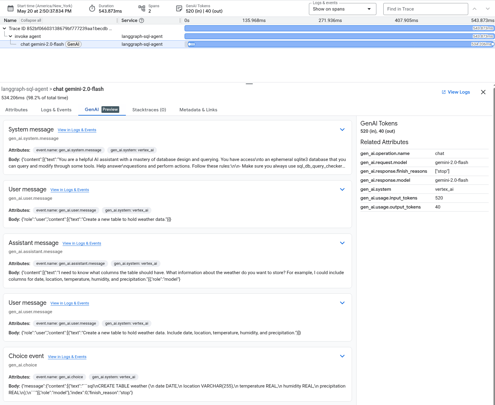
To learn about the sample application that generated the previous screenshot, see Instrument a LangGraph ReAct Agent with OpenTelemetry.
Attributes are key-value pairs that describe some characteristic. The following are examples of attributes from a generative AI system:
gen_ai.system: Identifies the system that provides the generative AI capabilities.gen_ai.request.model: Identifies the model to which the request is sent.
Events whose name begins with "gen_ai" typically describe individual inputs or outputs of a generative AI system. These inputs and outputs include system and user prompts, tool inputs and outputs, and model responses. The following are examples of events from a generative AI system:
gen_ai.system.message: An event recording the system prompt sent to a generative AI model. The system prompt provides instructions to the model that are typically not seen by the end user and which guide the model's interpretation of the user's prompt.gen_ai.user.message: An event recording the user-supplied prompt which was sent to the model.gen_ai.assistant.message: An event recording the output of the model, which can include the record of a tool invocation or which might contain a textual response output. A message might include candidate responses that aren't used by the application.gen_ai.choice: An event used to report which candidate outputs are used by the application.
View stacktraces
To view stacktraces, use the Stacktraces tab.
View general information and other metadata
To find general information about the span and a table of links to other spans, view the Metadata & Links tab. This information includes the following:
- Span ID: The span ID is a 64-bit integer other than 0. For details, see
TraceSpan. - Parent span ID
- Project ID
- Start time and end time
- Table that lists links to other spans
Each row in the table named Links lists a link between the current span
and another span. The Attributes field lists the key-value pairs for
the linked-to span. The Trace field links to the trace for the
linked-to span. When this field contains Current trace, the
linked-to span is in the same trace as the current span. Otherwise,
the field contains a trace ID. For information about links, see the
Links API reference page.
View trends
After you deploy an update to an application, you might want to determine whether the update affected the response latency. You can view trends in the latency data by setting the time-range selector such that latency data is show both before, and after, the upgrade.
To view trends in your trace data, do the following:
-
In the Google Cloud console, go to the Trace explorer page:
You can also find this page by using the search bar.
- In the toolbar of the Google Cloud console, select your Google Cloud project. For App Hub configurations, select the App Hub host project or the app-enabled folder's management project.
- Optional: Add filters to configure which spans are shown.
- Go to the toolbar and set the time-range selector to at least two weeks. Span data is stored for 30 days.
- Optional: Change the selection for the Chart view menu.