Analysis reports in Cloud Trace show you an overall view of the latency for all requests, or for a subset of requests, to your application.
This feature is supported only for Google Cloud projects.
Daily reports
Trace automatically creates a daily report that compares the previous day's performance with the performance from the same day of the previous week for the top three endpoints.
For details on viewing the daily analysis report, see View a report.
Custom analysis reports
The daily analysis report is created automatically and doesn't let you choose the content of the report. However, you can create a custom analysis report and select which traces are included in the report.
Custom reports include:
- A histogram of latency data.
- A table that list the latency by percentile along with links to sample traces.
- (Optional) Latency data from a different time range that you use for comparison.
- A bottleneck pane that lists the RPC calls that are significant contributors to latency.
You can create a new report by entering your report parameters manually, or you can duplicate an existing report and edit the parameters. Both of these approaches are described in the following sections.
Create a new report
To create a new analysis report:
-
In the Google Cloud console, go to the Analysis Reports page:
If you use the search bar to find this page, then select the result whose subheading is Trace.
In the toolbar of the Google Cloud console, select your Google Cloud project.
Click New Report.
Enter or select the following parameters in the form that appears:
Request filter: The full URI, the URI prefix, or trace filter terms.
For example, when a project root span isRecv, to include all requests, enter the root span name,Recv, or a prefix of the root span name. To restrict the report to traces with a URI prefixed byRecv/cart, enter that prefix into the filter.
You can also filter traces by span attributes. For example, when you add/http/status_code:5, the report includes only those traces that have a span with the attribute key/http/status_codeand attribute values prefixed by5.HTTP method: HTTP method for the request. Default is All.HTTP Status: HTTP status returned by the request. Default is All.Report Name: Human-readable name for the report. When no name is specified for this optional field, Trace creates a name based on the specified request filter and the time at which the report was created.Module: App Engine module (Java, Python, Go or PHP) that handled the request. Default is All.Version: Version of the App Engine application that handled the request. Default is All.Time Range: Time range during which the requests occurred. You can select Last Hour, Last 24 Hours, Last Week or Custom Range. When you select Custom, you must specify the start and end times for the range. Default is Custom.
(Optional) To compare two sets of latency data, select Compare to baseline and enter the time range for the comparison data.
Click Submit.
Duplicate a report
In Trace, you can duplicate the filter parameters of an existing report:
-
In the Google Cloud console, go to the Analysis Reports page:
If you use the search bar to find this page, then select the result whose subheading is Trace.
In the toolbar of the Google Cloud console, select your Google Cloud project.
Click the name of the report whose structure you want to duplicate.
Click Create similar report.
In the New report request page, edit one or more report parameters, including the name of the report.
Click Submit.
View a report
To view an analysis report:
-
In the Google Cloud console, go to the Analysis Reports page:
If you use the search bar to find this page, then select the result whose subheading is Trace.
In the toolbar of the Google Cloud console, select your Google Cloud project.
To view a report, click the report name.
View by density distribution
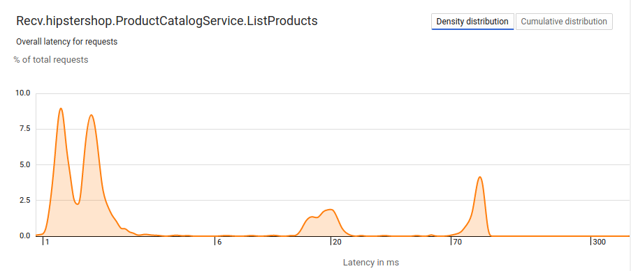
By default, the Density distribution button is enabled. With this setting, the x-axis is the trace latency on a logarithmic scale while the y-axis is the percent of total requests with that latency:

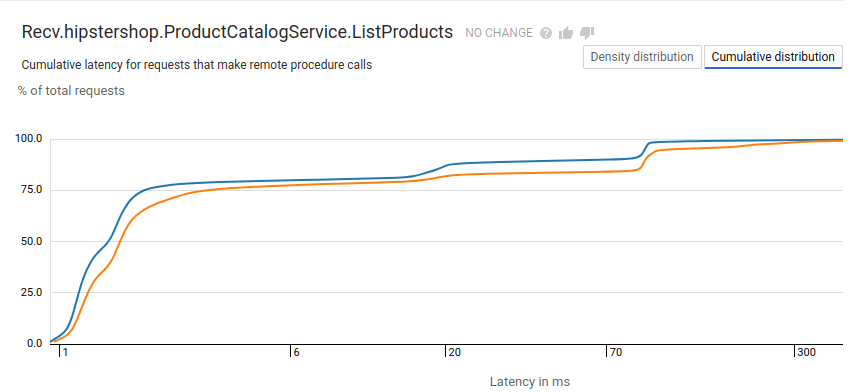
When you create a comparison report, Trace overlays the data from the two data sets so that you can compare them and analyze any changes:

In the comparison report, the legend on the report identifies the time range for the orange and blue graphs. These have been omitted in the screenshot.
View by cumulative distribution
To view the total number of requests whose latency is less than or equal to the latency value on the x-axis, click Cumulative distribution:

Understand the latency pane
The Latency pane shows latency percentiles, and it includes links to traces for representative sample requests. To view details about a specific trace, select one of the four sample traces. When you select one of the sample traces, the Trace Explorer page opens and displays detailed information about the root span of that trace. For more detail, see Find and explore traces.
The following image shows a latency pane for an analysis report. In this
case, there is only one dataset which is indicated by the letter A:

When you create a comparison report, the latency data pane contains information for both data sets. The legend for the pane identifies the entries that belong to each of the data sets.
Understand the bottlenecks pane
A Bottleneck indicates that the latency value for a span in a specific trace falls outside the expected range of latency values. Cloud Trace determines the expected range of latency values by using statistical techniques that rely on computing and comparing empirical latency distributions for subsets of traces.
The Bottlenecks pane, when present, lists RPC calls that are significant contributors to latency in the requests. This pane displays the RPC calls by percentile with representative sample requests. You can click a number under Sample traces to view the details of a specific trace.
The following image shows a Bottlenecks pane for an analysis report.
In this case, there is only one dataset which is indicated by the letter A:

In a comparison report, the bottlenecks highlights the RPC calls that caused latency distribution changes between the two sets. The legend on this pane identifies the entries that belong to each of the data sets.
