You can use the Chart Config Editor to customize formatting options on Looker visualizations that use the HighCharts API. This includes most Cartesian charts, such as the column chart, bar chart, and line chart, among others.
Prerequisites
To access the Chart Config Editor, you must have the can_override_vis_config permission.
Customizing a visualization
To customize a visualization with the Chart Config Editor, follow these steps:
- View a visualization in an Explore, or edit a visualization in a Look or dashboard.
- Open the Edit menu in the visualization.
Click the Edit Chart Config button in the Plot tab. Looker displays the Edit Chart Config dialog.
The Chart Config (Source) pane contains the original JSON of your visualization and cannot be edited.
The Chart Config (Override) pane contains the JSON that should override the source JSON. When you first open the Edit Chart Config dialog, Looker populates the pane with some default JSON. You can start with this JSON, or you can delete this JSON and enter any valid HighCharts JSON.
Select the Chart Config (Override) section and enter some valid HighCharts JSON. The new values will override any values in the Chart Config (Source) section.
- See the Examples section of this article for examples of valid HighCharts JSON.
- Looker accepts any valid JSON values. Looker does not accept functions, dates, or undefined values.
Click <> (Format code) to allow Looker to properly format your JSON.
Click Preview to test your changes.
Click Apply to apply your changes. The visualization will be displayed using the custom JSON values.
Once you've customized your visualization, you can save the visualization. If you viewed the visualization in an explore, save the Explore. If you edited a Look or a dashboard, click Save.
If you'd like edit the default visualization options, first remove any changes you've made in the Chart Config Editor, then replace them later. Specifically, follow these steps:
- Click the Edit Chart Config button in the Plot tab. Looker displays the Edit Chart Config dialog.
- Copy the text in the Chart Config (Override) pane.
- Click the Clear Chart Overrides button to delete all changes.
- Click Apply.
- Edit your visualization using the default visualization options.
- Click the Edit Chart Config button in the Plot tab. Looker displays the Edit Chart Config dialog.
- Enter some valid HighCharts JSON in the Chart Config (Override) pane. You can use the text that you copied in step 2 as a template, but be sure to test your changes using the Preview button to ensure there are no conflicts.
- Click Apply.
Examples
The following sections provide examples of some common use cases for the Chart Config Editor. For a complete list of the attributes that you can edit, see the HighCharts API documentation.
- Change the background color and axis text color
- Conditional formatting of values within a series
- Customize tooltip color
- Add chart annotations and captions
- Add vertical reference bands
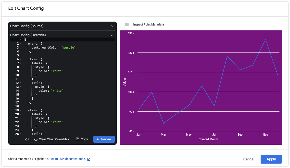
Change the background color and axis text color
To change the background color of a visualization, use the chart.backgroundColor attribute.
Similarly, to change the text color of the axes in a visualization, use the following attributes:
The following HighCharts JSON changes the background color of the visualization to purple, and the text of the axis titles and labels to white.
{
  chart: {
    backgroundColor: "purple"
  },

  xAxis: {
    labels: {
      style: {
        color: "white"
      }
    },
    title: {
      style: {
        color: "white"
      }
    }
  },

  yAxis: {
    labels: {
      style: {
        color: "white"
      }
    },
    title: {
      style: {
        color: "white"
      }
    }
  }
}
Conditional formatting of values within a series
To conditionally format each value in a series, use the series.formatters attribute. (The series.formatters attribute is a Looker implementation, so no HighCharts documentation is available.)
This attribute can apply conditional formatting to values that meet specific criteria, such as the following:
- The value is greater than, less than, or equal to a specified value.
- For example, to apply conditional formatting to numeric values above 100, use
select: 'value > 100'.
- For example, to apply conditional formatting to numeric values above 100, use
- The value is the minimum or maximum value in the series.
- For example, to apply conditional formatting to the maximum value, use
select: 'max'.
- For example, to apply conditional formatting to the maximum value, use
- The value is within a specified percentile rank.
- For example, to apply conditional formatting to values in the top 10th percentile, use
select: 'percent_rank >= 0.9'.
- For example, to apply conditional formatting to values in the top 10th percentile, use
- The x-axis value matches a specified value.
- For example, to apply conditional formatting to series where the x-axis value is "Columbia", use
select: name = Columbia.
- For example, to apply conditional formatting to series where the x-axis value is "Columbia", use
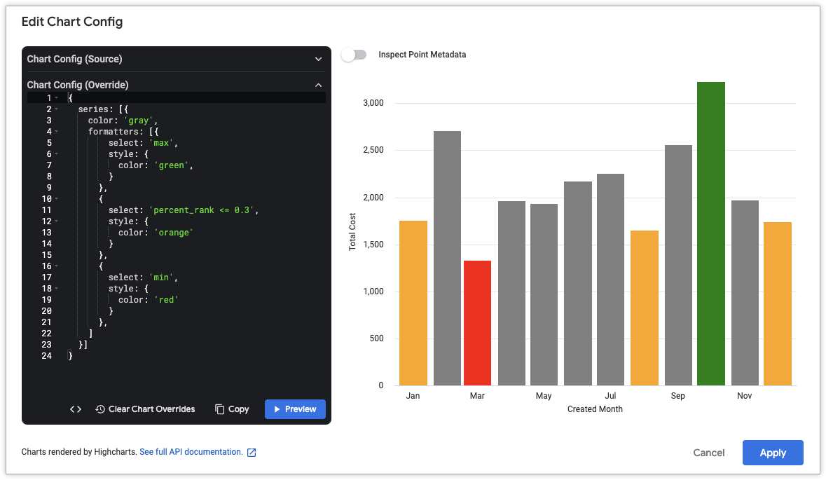
The following HighCharts JSON sets the color of all columns in the "Total Cost" series according to the following conditional formatting rules:
- The column with the minimum value will be red.
- The column with the maximum value will be green.
- Any columns in the bottom 30th percentile will be orange.
- All other columns will be gray.
{
  series: [{
    color: 'gray',
    formatters: [{
        select: 'max',
        style: {
          color: 'green',
        }
      },
      {
        select: 'percent_rank <= 0.3',
        style: {
          color: 'orange'
        }
      },
      {
        select: 'min',
        style: {
          color: 'red'
        }
      },
    ]
  }]
}
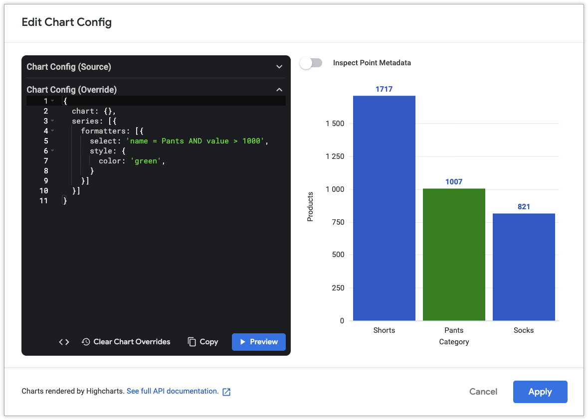
The following HighCharts JSON sets the series column color to green if the x-axis value is "Pants" and if the value is greater than 1000.
{
  chart: {},
  series: [{
    formatters: [{
      select: 'name = Pants AND value > 1000',
      style: {
        color: 'green',
      }
    }]
  }]
}
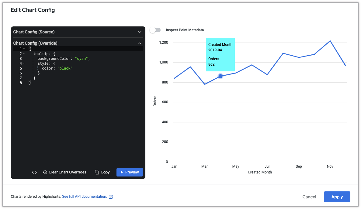
Customize tooltip color
To customize the color of the tooltip, use the following attributes:
The following HighCharts JSON changes the background color of the tooltip to cyan, and changes the color of the tooltip text to black.
{
  tooltip: {
    backgroundColor: "cyan",
    style: {
      color: "black"
    }
  }
}
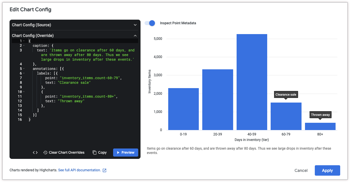
Add chart annotations and captions
To add an annotation, use the annotations attribute. To add a caption to the chart, use the caption attribute.
To get the coordinates for a point, click Inspect Point Metadata at the top of the Edit Chart Config dialog. Then, hover over the data point that you'd like to annotate. Looker displays a point ID, which you can use in the annotations.labels.point attribute.
The following HighCharts JSON adds two annotations to the chart to explain a decrease in inventory items after certain periods of time. It also adds a caption to the bottom of the chart to explain the annotations in more detail.
{
  caption: {
    text: 'Items go on clearance after 60 days, and are thrown away after 80 days. Thus we see large drops in inventory after these events.'
  },
  annotations: [{
    labels: [{
        point: "inventory_items.count-60-79",
        text: "Clearance sale"
      },
      {
        point: "inventory_items.count-80+",
        text: "Thrown away"
      },
    ]
  }]
}
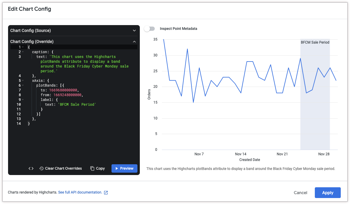
Add vertical reference bands
To add a vertical reference band, use the xAxis.plotBands attribute.
The following HighCharts JSON adds a vertical reference band between November 24, 2022 and November 29, 2022 to denote a sale period. It also adds a caption to the bottom of the chart to explain the significance of the band.
Note that the to and from attributes of xAxis.plotBands must correspond to data values in the chart. In this example, since the data is time-based, the attributes accept Unix timestamp values (1669680000000 for November 29, 2022 and 1669248000000 for November 24, 2022). String-based date formats like MM/DD/YYYY and DD-MM-YY are not supported in the to and from HighCharts attributes.
{
  caption: {
    text: 'This chart uses the HighCharts plotBands attribute to display a band around the Black Friday Cyber Monday sale period.'
  },
  xAxis: {
    plotBands: [{
      to: 1669680000000,
      from: 1669248000000,
      label: {
        text: 'BFCM Sale Period'
      }
    }]
  },
}