Google Cloud Platform for Data Scientists: Using R with Google BigQuery
Gus Class
Developer Programs Engineer, Google Cloud
Learn how to connect to a public BigQuery dataset and analyze that data using R.
In my previous blog post covering R-language topics for Google Cloud, I provided a short introduction to R in the context of Google Cloud and discussed accessing Google Cloud SQL for MySQL from R. Cloud SQL is convenient for sharing access between engineering and analytic teams but it's far from the only tool at the disposal of data scientists and engineering teams working on Google Cloud. For very large data sets, you may experience performance and filesystem limits from SQL that require significant work to scale to the size of your data. In other cases, you may have data warehoused in another data source that's not a native SQL database. For this scale of data or approach to warehousing, Google BigQuery is an ideal choice.
BigQuery allows you to query and manipulate even very large (petabyte-scale) sets of data using a SQL-like syntax. Queries to BigQuery are run against data warehoused on Google as BigQuery storage or external datasets stored in formats such as CSV, JSON, or Google Sheets. For additional background on BigQuery, check out the excellent developer documentation.
In this post, I’ll describe an example of connecting to a public BigQuery dataset and analyzing that data using R.
Prerequisites
For the purposes of this post, we'll be using bigrquery, an open source library for R created by Hadley Wickham. To install the library, run the following command from R:Note that we'll be using a feature, useLegacySql, that's currently only in the development version of the library, so you should instead install with the following command.
You'll also need to have set up a Cloud platform project, enabled billing, and ensured the BigQuery API is enabled as described in the Cloud BigQuery documentation. For the purposes of this exercise, you'll need to make note of your project ID from the Google Cloud Console.
Basic example using the GitHub public dataset
Let's start with a simple example using the public dataset for GitHub.The pattern for performing a query is:
- Import the library.
- Specify a project ID from the Google Cloud Console.
- Form your query string.
- Call
query_execwith your project ID and query string.
The following example selects the count of copies for files containing the string TODO.
Next, let's select the count of copies for files and draw a pie chart showing the ratio of files containing TODO strings:
The output plot will look something like the following illustration:
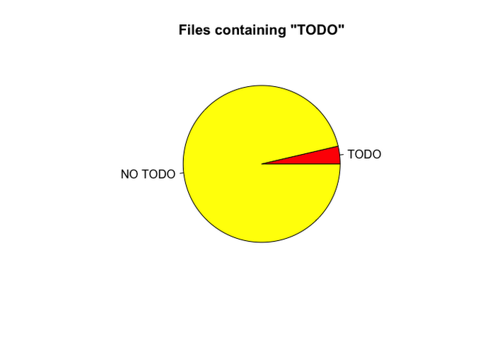
Aside from looking like PacMan, this isn't the most interesting graphic, just a tiny slice of text files within GitHub contain a TODO string. The low frequency of files containing TODO comments indicates we should look at the frequency relative to a mean so that relative observed differences are made more significant.
Next, let's join our query to the language table so we can break down this data by programming language.
Now you can see a plot showing the relative frequency of file copies containing "TODO" split out by language.
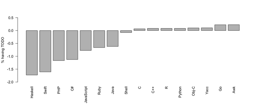
At a glance, it appears that project file copies with Awk, Go and Yacc language labels are more likely to contain TODO comments than file copies with C#, Swift, PHP or Haskell labels and R contains similar percentages of files with TODO blocks to C and C++. The data doesn't really tell a very compelling story yet but I'll leave diving deeper into observations of language label to the reader.
Now that you've seen the basics, let's take a deeper dive with a more complex example.
More complex example using NOAA data
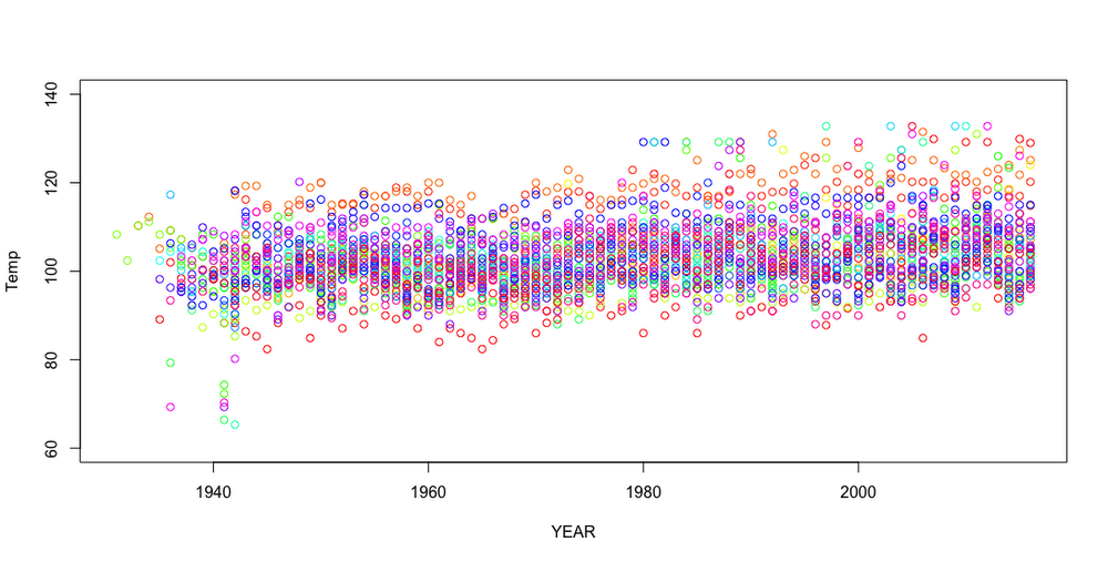
Let's take a look at a more complex example using the National Oceanic and Atmospheric Administration (NOAA) Global Surface Summary of the Day (GSOD) database (one of BigQuery’s public datasets). This database contains weather measurements over time as captured by NOAA. The data is stored with separate BigQuery tables, so you must dynamically select data from each table and annotate it with the year in order to group the data historically.Let's query for all of the historical max temperatures by state across the US and plot the data using consistent plot colors for each state. First, you'll need to retrieve and aggregate the data for each year's table. (Note: The program will run for a few minutes due to the number of queries and volume of queried data.)
The following graph shows the plot with thousands of aggregate data frames showing temperature over time. The outliers in the resulting plot show maximum observed temperature outliers moving from below the clustered temperatures to above them.
Adjusting the plot parameters allows you to slice the plot to various time frames and temperature ranges. For example, the following plot shows the changes between 1980 and the last recorded data in 2015.
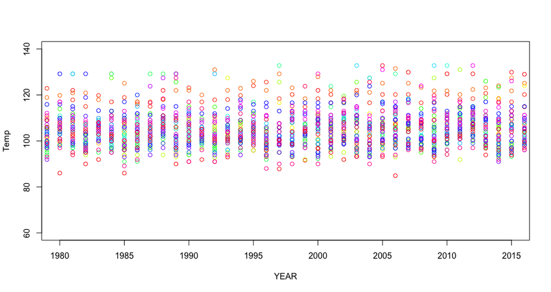
In this plot, the maximum observed temperature clustering follows a rising and lowering cycle of maximum observed temperatures. Let's look one more time at the last 10 years of observations.
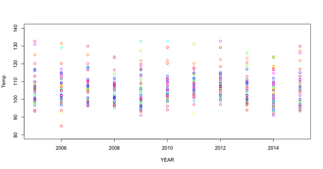
In the observed data, the cyclical clustering of the maximum temperature is made more prominent. The year 2013 shows tighter clustering of data points, with 2015 and 2005 showing a larger spread. As with previous examples, conclusions should not be reached just from this small framing of the data, but instead should be scrutinized with other correlations between variables.
Next steps
In this post, you learned how to connect BigQuery to R in order to analyze large sets of data. In practice, data scientists and researchers can use these tools to gather insights on large corpuses of enterprise data for predictions and analytics. When your data set is too large for SQL or you're already warehousing your data in a way that Google can access it, BigQuery can be a powerful tool for complementing your current data warehousing approach.To learn more:
- Experiment with Google BigQuery public datasets for your own observations.
- Better yet, load your own data and query from your R projects using the legacy SQL or standard SQL syntaxes.
- Check out the language reference for R on the CRAN site.