This page documents the LookML parameters to apply a reference line to a LookML dashboard tile. They work for all charts, except bar charts, and those where swap_axes has been set to true.
Reference lines allow you to place lines and regions on any of Looker's cartesian charts. You can use static values, or certain statistical functions computed from the chart's data.
Configuration
Reference lines are specified as an option in the dashboard configuration for Looker's scatter, area, line, column, and bar charts.
Reference lines are currently only supported on the first series of these charts.
You can have an unlimited number of reference lines on any chart.
The reference_lines configuration option takes an array of reference lines, each item of which is a hash of options.
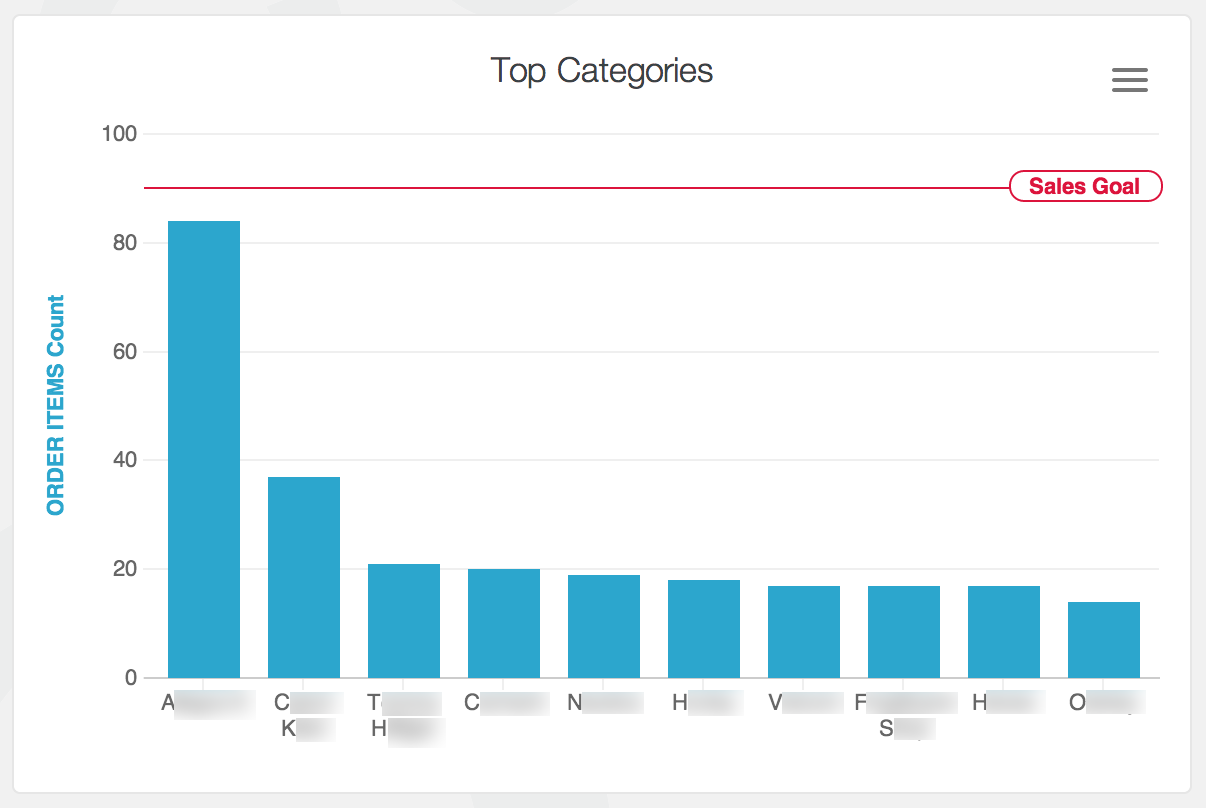
For example, the following configuration creates a crimson reference line labelled "Sales Goal" at the y-axis value 90:
reference_lines:
  - value: 90
    label: Sales Goal
    color: crimson

Drawing a constant line
value is the only required field for a reference line. It specifies where to draw the reference.
To draw a single line at the "50" mark on the chart, specify your configuration like this:
reference_lines:
  - value: 50
Value calculations
Instead of specifying a number for your reference line value, you can specify a calculation name.
All value calculations are based on the dataset returned from the query, not your entire dataset.
median- The median value of the dataset.mean- The average value of the dataset.max- The maximum value of the dataset.min- The minimum value of the dataset.deviation- The standard deviation of the dataset.variance- The statistical variance of the dataset.
To draw a line at the median value of your dataset, you specify this.
reference_lines:
  - value: median
To draw three lines, one at the median, one at a constant value, and one at the maxiumum you specify your configuration like this:
reference_lines:
  - value: median
  - value: 25
  - value: max
Drawing an area
Instead of specifying a single number or calculation name for your reference line, you can provide an array.
If the provided array has exactly two values, it's treated as the bounds of a range.
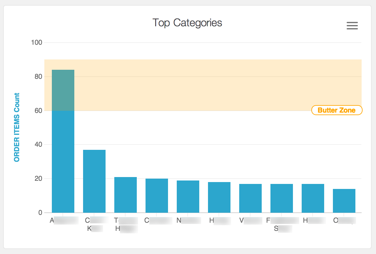
reference_lines:
  - value: [60, 90]
    label: Butter Zone
    color: orange

The following configuration shades an area that represents an area where data points are above the average.
reference_lines:
  - value: [max, mean]
    label: Above Average

Lines and errors
You can provide an array of three numbers or calculation names to the value parameter.
In this configuration, the first value is treated as the error "below" the reference line, the middle value is considered the value for the line itself, and the third value is treated as the error "above" the reference line.
error below, reference line value, error above
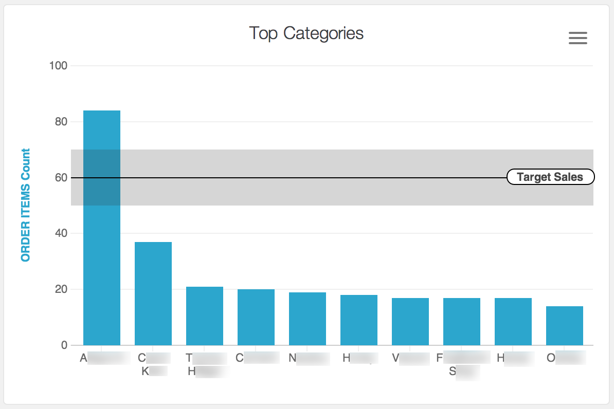
Let's say your sales goal is 60 units, but +/- 5 units is in the acceptable range. You could illustrate this on a graph like this:
reference_lines:
  - value: [5, 60, 5]
    label: Target Sales

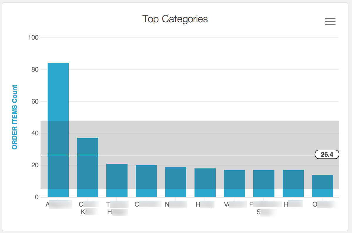
Here's how you could specify the average showing the standard deviation:
reference_lines:
  - value: [deviation, mean, deviation]

Labels
You can include a label attribute to label the line with text of your choice.
reference_lines:
  - value: 90
    label: Sales Goal
You can choose to include calculated values in your label, whether or not you use them on your chart.
Place the calculation name inside double curly braces: {{median}}. You need to place quotation marks around your label string if you do this.
reference_lines:
  - value: 50
    label: "Target (Average: {{mean}})"

Colors
You can include a color attribute to color the line and text.
Color values can each be a hex string like #2ca6cd or a CSS named color string.
