Let the queries begin: How we built our analytics pipeline for NCAA March Madness

Eric Schmidt
Product Manager
It’s hard to believe, but a whole year has passed since last year’s epic March Madness®. As a result of our first year of partnership with the NCAA®, we used data analytics on Google Cloud to produce six live predictive television ads during the Men’s Final Four® and Championship games (all proven true, for the record), as well as a slew of additional game and data analysis throughout the tournament. And while we were waiting for March to return, we also built a basketball court to better understand the finer mechanics of solid jump shot.
This year we’re back with even more gametime analysis, with the help of 30 or so new friends (more on that later). Now that Selection Sunday™ 2019 is upon us, we wanted to share a technical view of what we’ve been up to as we head into the tournament, the architectural flow that powers aspects of the NCAA’s data pipelining, and what you can look forward to from Google Cloud as we follow the road to Minneapolis in April. We’ve also put together online Google Cloud training focused on analyzing basketball and whipped up a few Data Studio dashboards to get a feel for the data (Q: Since 2003, what year has had the highest average margin of victory in the Men’s Sweet 16®? A: 2009).

ETL for basketball
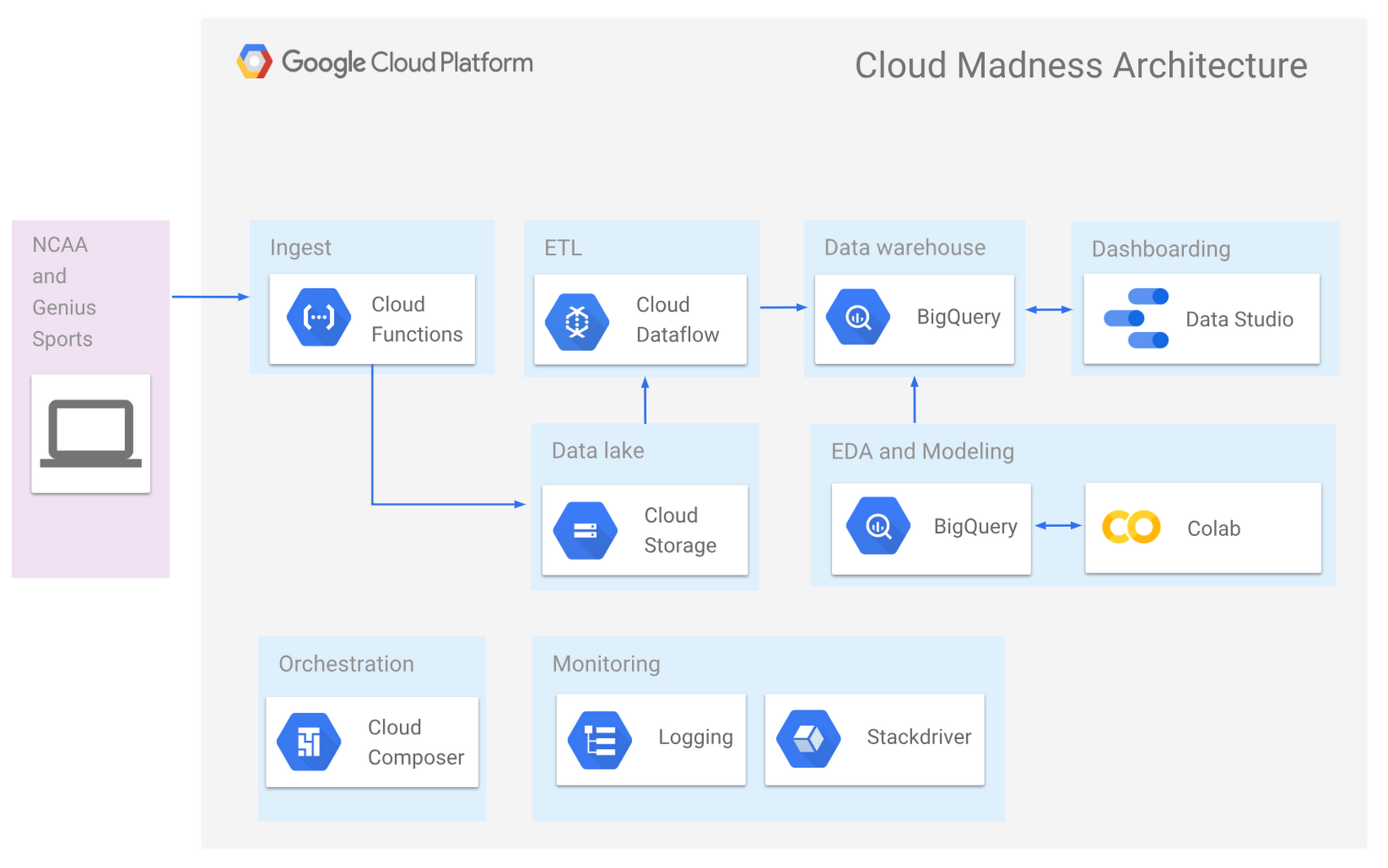
Our architecture is similar to last year’s, with a few new players in the mix: Cloud Composer, Cloud Scheduler, Cloud Functions, and Deep Learning VMs. Collectively, the tools used and the resulting architecture is very similar to traditional enterprise ETL and data warehousing, except that this is all running on fully managed and serverless infrastructure.
The first step was to get new game data into our historical dataset. We’re using Cloud Scheduler to automate a Cloud Function to ingest raw game log data from Genius Sports every night. This fetches all of the latest game results and stores them in our data lake of decades of boxscore and play-by-play data sitting in Google Cloud Storage. The historical data corpus contains tens of thousands of files with varying formats and schema. The files are the source of truth for any auditing.
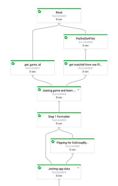
As new data is ingested into Cloud Storage, an automated Cloud Composer orchestration renders several state check queries to identify changes in data, then executes a collection of Cloud Dataflow templates of Python-based Apache Beam graphs. These Apache Beam graphs then do the heavy lifting of extracting, transforming, and loading the raw NCAA and Genius Sports data into BigQuery. The beauty here is that we can run these jobs for one game for testing, or every game for complete re-load, or a slice of games (e.g. mens/2017/post_season) for targeted backfill. Cloud Dataflow can scale from one event to millions.

Data warehousing with BigQuery
With BigQuery as the center of gravity of our data, we can take advantage of views, which are virtual tables built with SQL. We’ve aggregated all of the team, game, player, and play-by-play data into various views, and have nested the majority of them into uber-views.
Note: You can now hack on your data (or any of our public datasets) for free with BigQuery providing 10GB of free storage and 1TB of analysis per month. Additionally, you can always take advantage of the Google Cloud Platform free tier if you want to build out beyond BigQuery.
Below is a snippet of a sample SQL view that builds a team’s averaged incoming metrics over their previous seven games. We’ve applied BigQuery’s analytical functions to partitioning, which lets our analysis team create thousands of features inline in SQL instead of having to build the aggregations downstream in Python or R. And, as data is ingested via the ETL processes outlined above, the view data is immediately up-to-date.
We use layered views to build complex aggregations, like this one below. This query comes in about 182 lines of SQL. Here, we are looking at scoring time durations between every event in the play-by-play table in order to answer questions such as, how long has it been since the last score? How many shots were attempted within that window? Was a time-out called? Granted, 1.7GB is not ‘big data’ by any means; however, performing windowed-row scans can be very time- or memory-intensive.
Not in BigQuery.
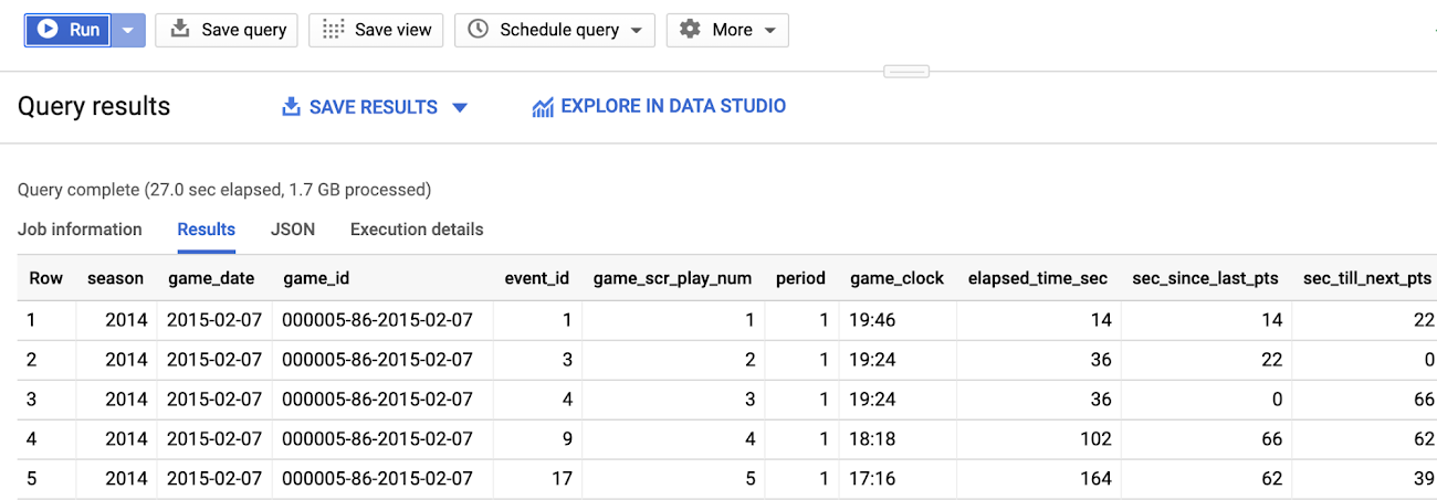

If you were to run this on your laptop, you’d burn 2GB of memory in the process. In BigQuery, you can simply run a query that is not only always up to date, but can also scale without any additional operational investment as your dataset grows (say, from one season to five). Plus, as team members finish new views, everyone in your project benefits.
Data visualization with Data Studio
BigQuery is powerful for rapid interactive analysis and honing SQL, but it can be a lonely place if you want to visualize data. With BigQuery’s Data Studio integration however, you can create visualizations straight from BigQuery with a few clicks. The following visualization is based on the view above which calculates in-game metrics such as percentage of time tied, percentage of time leading, percentage of time up by 10 or more. This helps answer questions around how much a team is controlling the score of a game.
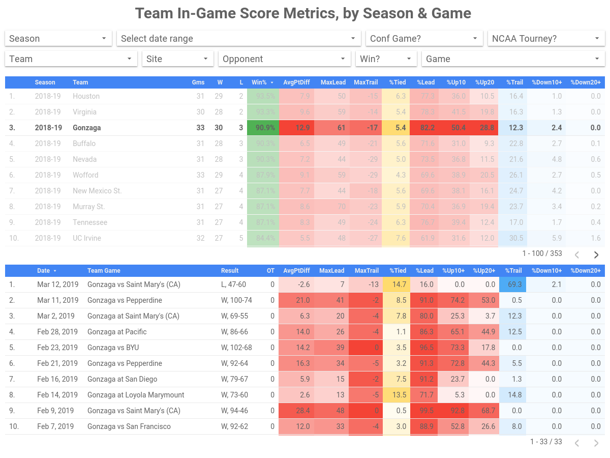

It doesn’t take a data scientist (or basketball expert) to find win-loss records for NCAA basketball teams or notice Gonzaga is having a great year (Tuesday’s loss notwithstanding). But with Data Studio, it’s easy to see more detail— that Gonzaga on average spent 28.8% of their minutes played being up by at least 20 points, and 50.4% of the time up by at least 10. (To be fair, Gonzaga’s scoring dominance is in part a function of their conference and resulting schedule, but still.) Once we get into the tournament, you could imagine that these numbers might move a bit. If we only had a view for schedule-adjusted metrics. (Spoiler alert: we will!)
This is the kind of data you can’t glean from a box score. It requires deeper analysis, which BigQuery lets you perform easily, and Data Studio lets you bring to life without charge. Check out the Data Studio dashboard collection for more details.
Exploratory data analysis and feature engineering
Beyond our ETL processes with Cloud Dataflow, interactive analysis with BigQuery and dashboarding with Data Studio, we also have tools for exploratory data analysis (EDA). For our EDA, we use two Google Cloud optimized data science environments: Colab and Deep Learning VM images.
Colab is a free Jupyter environment that is optimized for Google Cloud and also provides GPU support. It also has versioning, in-line collaborative editing, and a fully configured Python environment. It’s like Google Docs for data nerds!
We use Colab to drive analysis that requires processing logic or processing primitives that can’t be easily accomplished in SQL. One use case is the development of schedule adjusted metrics for every team for every calendar date for every season.
Below is a snippet of our schedule-adjusted metrics notebook. We’re approaching each game-level metric as a function of three things: the team's ability, the opponent's ability, and home-court advantage. To get the game-level data we need to do schedule adjustment, we rely on views in BigQuery.
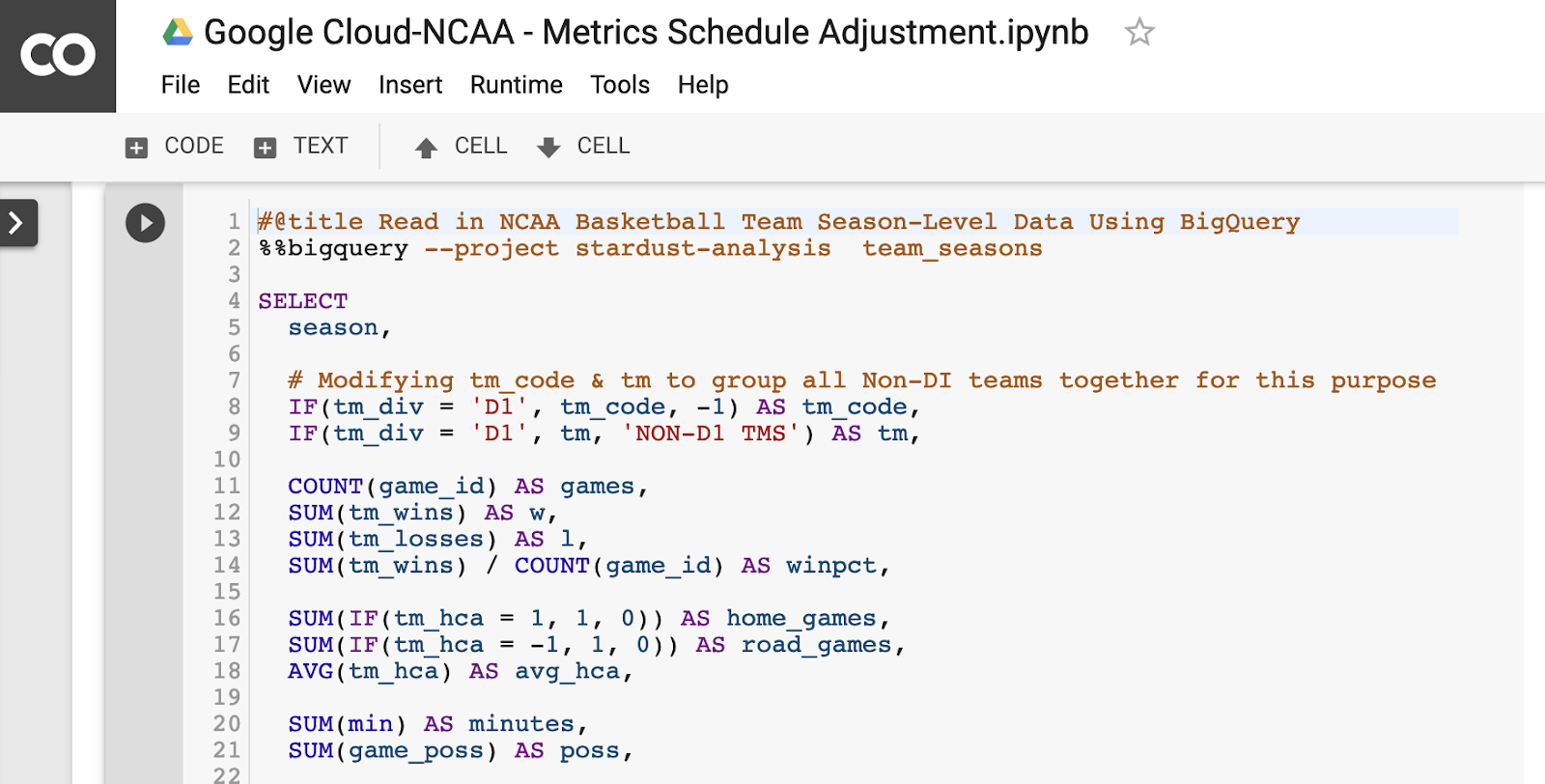

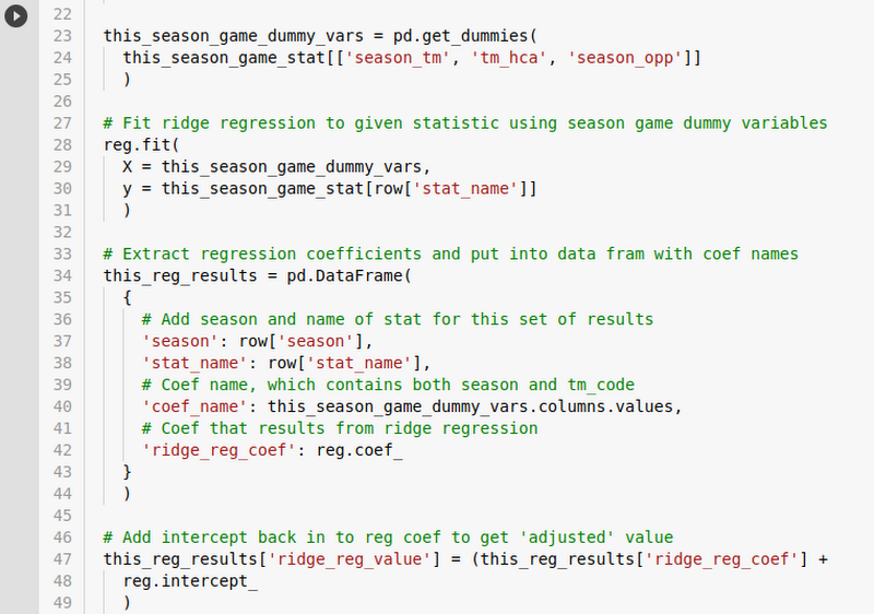
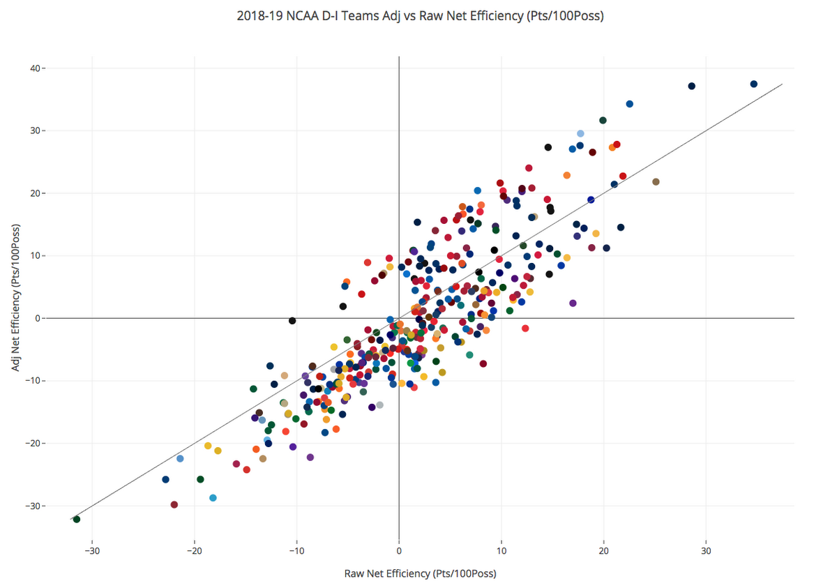
The %%bigquery magic cell provides the ability to insert a query in-line and pump the results to a Pandas DataFrame. From there, we can flow this data through Pandas transformations, normalization, and then to scikit-learn to use ridge regression (with team season dummy variables) to get schedule-adjusted versions of our metrics.

After a bit more Pandas wrangling, we can then create this informative scatter plot mapping raw and adjusted efficiency for all 353 Division I teams during the 2018-2019 season.

We end this particular journey with one last step: by using the Pandas function pandas_gbq.to_gbq(adjusted_metrics, “adjusted_metrics” if_exists = “replace” ) to pump this data back into BigQuery for use for model development and visualization.
You can read more about how we built schedule adjusted metrics on our Medium collection, as well as additional Colabs we’ll be publishing during the tournament (or better yet, publish your own!)
More predictions, More BigQuery, More madness
With our ETL pipeline in place and a solid workflow for data and feature engineering, we can get to the fun and maddening part—predictions. In addition to revamping some of our predictions from last year, such as three-point shooting, turnover rates, and rebound estimations, we’re looking at some new targets to the mix, including dunks, scoring runs, and player contribution.
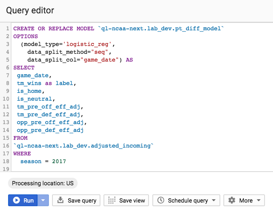
We’re using a bit of scikit-learn, but we’re mainly relying on BigQuery ML to train, evaluate, and serve our primary models. BigQueryML enables you to train models in-line, and hands the training and serving off to underlying managed infrastructure. Consider the simple model below. In our friendly BigQuery editor, we can control model type, data splitting, regularization, learning rate, and override class weights—in a nutshell, machine learning.

There are lots of great tools for machine learning, and there are lots of ways to solve a machine learning problem. The key is using the right tool for the right situation. While Scikit-learn, TensorFlow, Keras, and PyTorch all have their merits, for this case, BigQuery ML’s ease and speed can't be beat.
Not convinced? Try this Qwiklab designed for basketball analysis and you’ll see what we mean!
The team
Since we didn’t have to design our architecture from scratch, we wanted to expand and collaborate with more basketball enthusiasts. College students were a natural fit. We started by hosting the first-ever Google Cloud and NCAA Hackathon at MIT this past January, and after seeing some impressive work, we recruited about 30 students from across the country to join our data analyst ranks.
The students have split into two teams, looking at the concepts of ‘explosiveness’ and ‘competitiveness,’ each hoping to build a viable metric to evaluate college basketball teams. By iterating over Google Docs, BigQuery, and Colab, the students have been homing in on ways to use data and quantitative analysis to create definition around previously qualitative ideas.
For example, sportscasters often mention how ‘explosive’ a team is at various points in a game. But aside from watching endless hours of basketball footage, how might you go about determining if a team was, in fact, playing explosively? Our student analysts considered the various factors that come into explosive play, like dunks and scoring runs. By pulling up play-by-play data in BigQuery, they could easily find boxscore data with timestamps of all historical games, yielding a score differential. Using %%bigquery magic, they pivoted to Colab, and explored the pace of play of games, creating time boundaries that isolated when teams went on a run in a game. From there, they created an expression of explosiveness, which will be used for game analysis during the tournament. You can read more about their analysis and insight at g.co/marchmadness.


Still not enough March Madness and data analytics for you? We understand. While we wait for the first round of the tournament to begin, check in with the 2019 Kaggle competition, and keep an eye on g.co/marchmadness for gametime insights and predictions about key matchups (three-pointers, rebounds, close games, and more)—we’ll be covering both the men’s and women’s tournaments this year.
See you on the court, and let the queries begin.
