How to connect BigQuery to Microsoft Excel and other apps with our new ODBC driver
Tim Swast
Developer Programs Engineer, Google Cloud
Google BigQuery enables standard SQL queries to petabytes of data, but what if software you depend on doesn't support the BigQuery API? With the release of BigQuery ODBC drivers, it’s now easier than ever to connect an enterprise application to BigQuery — simply use the drivers to connect BigQuery to the tools that analysts and data scientists already use.
As an example, I'll show you how to use the ODBC drivers to connect BigQuery to Microsoft Excel® 2016 on Windows® and visualize data. Note that the ODBC drivers are not compatible with Excel on macOS.
First, install the BigQuery ODBC driver. The installer writes a user guide to the installation directory (in my case: C:/Program Files/Simba ODBC Driver for Google BigQuery). Follow the instructions in the user guide or quickstart guide to configure the driver. You'll need to provide credentials, either with a service account key or user authentication.
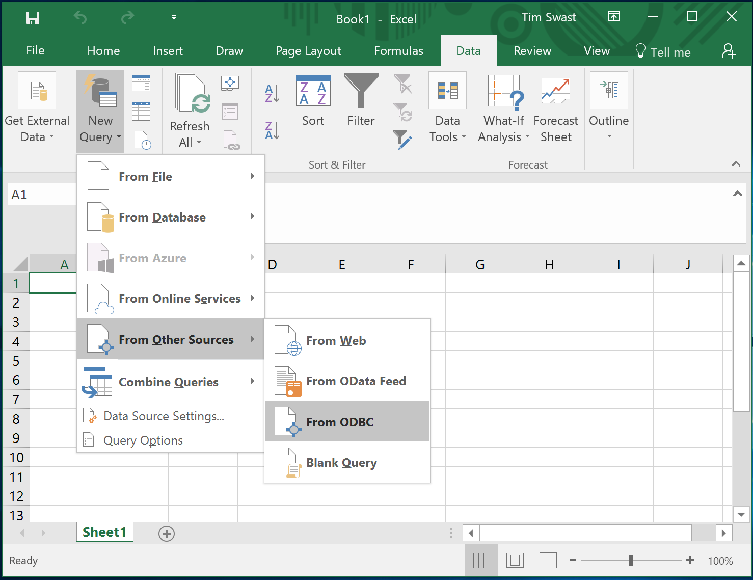
Once the ODBC driver is configured, open Excel. Go to the Data tab, and select "New Query -> From Other Sources -> From ODBC."

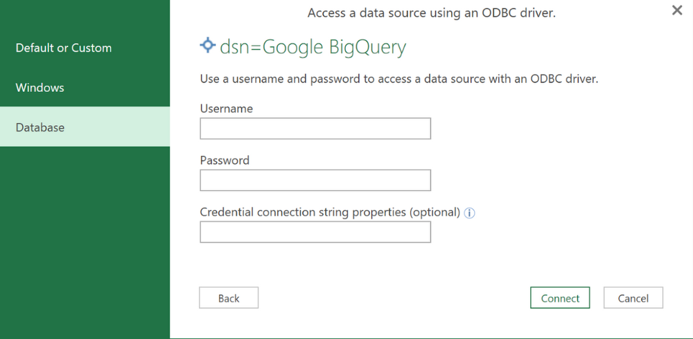
Choose "Google BigQuery" as the data source. Don't supply a username or password. Instead, select the connection type tab for "Default or Custom."

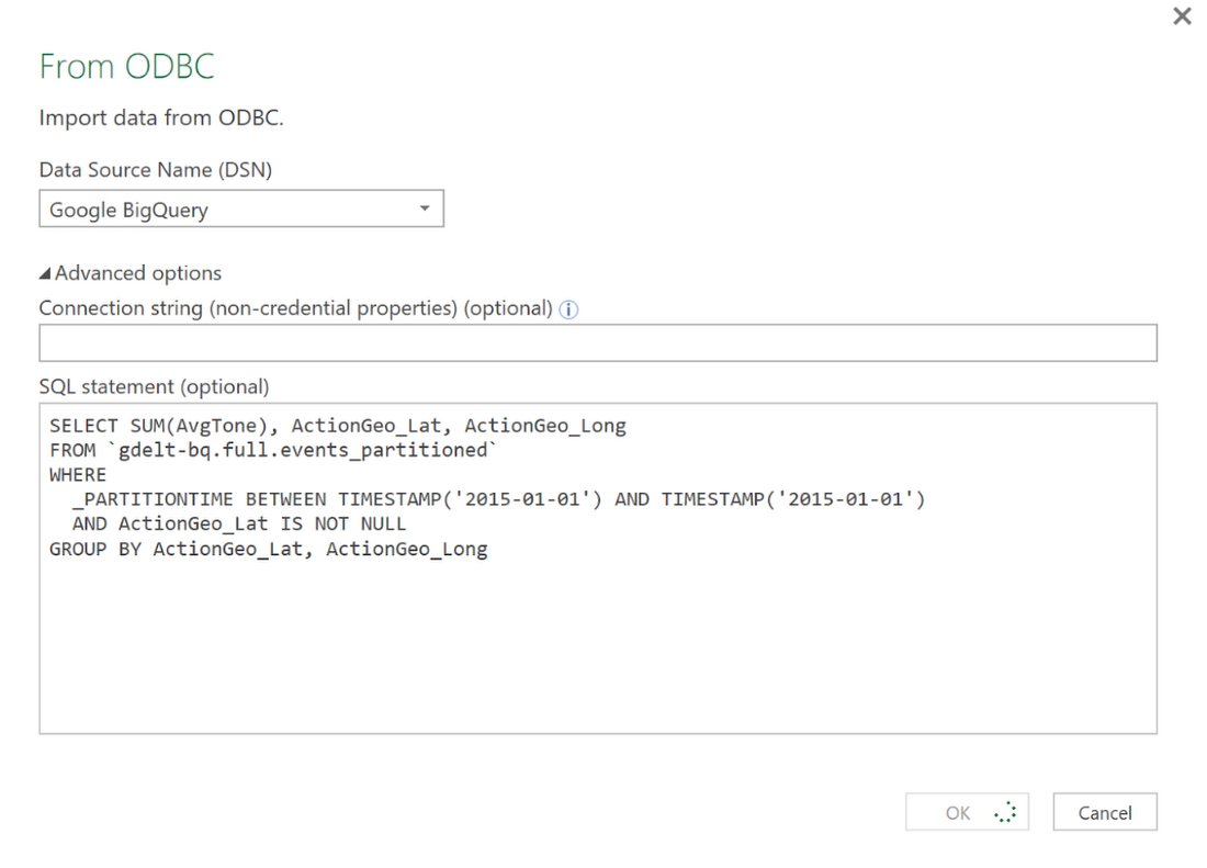
To enter a query, select "Advanced Options."

BigQuery ODBC drivers in action
As an example, I decided to aggregate the average tone of news stories from 2015 in the GDELT project BigQuery public dataset. GDELT is just one of many other public datasets that are available to explore on BigQuery.This is also available as a public shared query at this link. Running the query yields 144,649 rows.
Click OK. This runs the query and inserts data into a new sheet.
Once the data is in Excel, you can visualize the data using any of its tools. For example, here's the average tone plotted in 3D Maps.
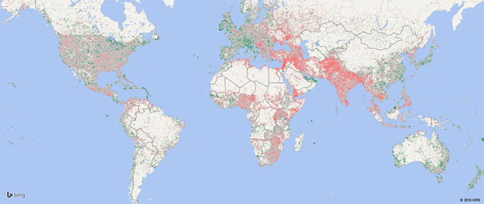

Green indicates an average positive tone, and red indicates a negative tone in the GDELT news events dataset. GDELT aggregates news articles that describe a distinct event into a single row in this table. One event may correspond to multiple news articles. It's clear that events in areas of conflict, such as the Middle East, are more likely to generate news articles with a negative average tone.
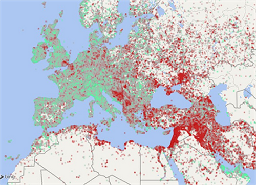

Zooming in, the pattern is repeated. On average, I observe a lower proportion of negative events in western Europe compared to the areas further east, including a narrow band of events stretching from Turkey through Germany, following the path of Syrian refugees.
With the data in Excel it's also easy to create other visualizations. I also created a pivot chart of the average tone for events from March 2015 to February 2016. (The GDELT Project changed how it calculates average tone in February 2015, so I offset the query by two months from the one above.)
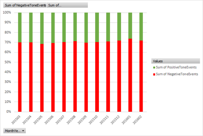

The percentage of events with average negative tone is consistently around 70% each month.
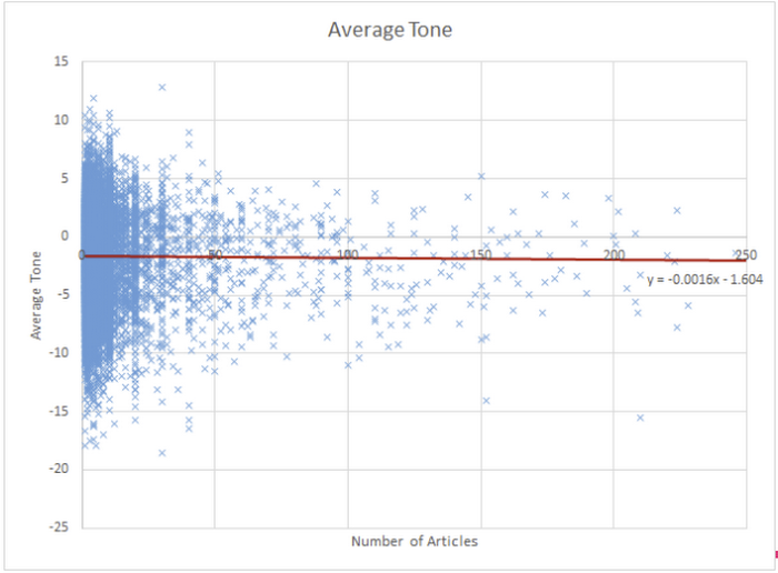
The GDELT dataset also includes a column for the number of articles that reference an event. I was curious how the number of articles relates to the average tone of an event.
I then plotted the data in a scatter plot and fit a trendline. For every additional article referencing an event, its tone decreases by 0.0016 on average. An event referenced in many news articles is more likely to be negative.

Next Steps
These visualizations show how powerful this new ODBC driver is. I was able to run a query with over one hundred thousand rows and easily import the results into an app that doesn't have native BigQuery support. Download the BigQuery ODBC drivers and connect BigQuery to your favorite enterprise apps today.Microsoft, Excel, and Windows are either registered trademarks or trademarks of Microsoft Corporation in the United States and/or other countries.
