Exploring heatmaps
This page describes how to analyze the heatmap in a Key Visualizer scan so you can identify the source of a Firestore performance issue.
Before you read this page, you should be familiar with the overview of Key Visualizer. You may also want to:
- Learn how to open a Key Visualizer scan.
- See examples of common document key patterns or index key patterns.
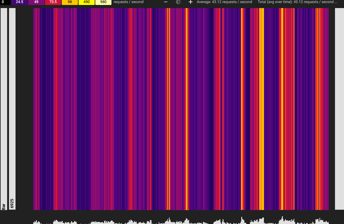
Adjusting brightness
Key Visualizer heatmaps use dark colors to indicate normal or low values, and bright colors to indicate high values. You can adjust the color scale to help you see patterns in the heat map.
Keep in mind that for most metrics, Key Visualizer identifies which values are "high" and "low" based entirely on your database's usage. For example, if you perform 20 reads per second in a specific key range and 1 read per second in other key ranges, Key Visualizer uses a bright color for that specific key range. Note that bright colors do not necessarily indicate a problem.
To adjust the colors that are used for different values, use the + / - buttons on either side of the Adjust Brightness brightness_6 icon. When you increase the brightness, you lower the range of values that each color represents; when you lower the brightness, you increase the range of values.
To reset the brightness to the default setting, click the Adjust Brightnessbrightness_6 icon .
Zooming in on time periods and key ranges
When you open a heatmap, it displays values for the time period included in the scan and the range of active keys in your database. If you notice an issue during a specific time period, or in a specific range of keys, you can zoom in to examine the issue more closely.
There are several ways to zoom in or out:
- Scroll up or down within the heatmap.
- Click the Rectangular Zoom crop button, then click and drag to select an area to enlarge.
- Press and hold the
Shiftkey, then click and drag to select an area to enlarge. - Return to the previous area of the heatmap by pressing the
BackspaceorDeletekey. - Zoom out to view the entire table by clicking the Reset Zoom
zoom_out_map button or pressing the
Rkey.
Drilling down by key prefix
The following section describes how to drill down using a document key scan as an example. In case of index keys, the prefix changes to group of index keys.
On the left side of a heatmap, Key Visualizer organizes keys by the hierarchy of your database. You can use this to drill down into the data for specific ranges of keys.
To drill down into the heatmap's data for a group of keys that share a common prefix:
Move the cursor over one of the levels in the key hierarchy that appears to the left of the heatmap.
Key Visualizer highlights the area of the heatmap that shows this level of the hierarchy. It also shows the key prefix for all of the keys at this level.

Click the level of the key hierarchy that you want to examine.
Key Visualizer zooms in on this level of the hierarchy.
Click another level of the key hierarchy to zoom in further, or press the
BackspaceorDeletekey to return to the previous area.
Pinning details about a metric
As you move your cursor over a heatmap, Key Visualizer displays a tooltip that contains details about the metric that is under the cursor. You can pin this tooltip in place by clicking on the heatmap. Pinned tooltips show more detail about the metric. Pinning a tooltip also makes it easier to take a screenshot of the tooltip or copy information from the tooltip.
Switching metrics
By default, when you open a Key Visualizer scan, it displays the Ops/s metric for document keys, which gives you an overview of your usage pattern. To switch to a different metric, click the Metric drop-down list above the heatmap, then click the metric you want to view.
In case of index keys, it displays the Index Write Ops/s metric that gives an overview of index key usage.
For descriptions of each metric, see Key Visualizer Metrics.
Finding connections between different metrics for document keys
You can view multiple metrics at the same time in Key Visualizer when you want to compare metrics or find correlations between metrics. For example, you might want to see if hotspots on your Ops/s heatmap correlate with high latency in your Average write latency heatmap.
To view multiple metrics and their values at the same time, click Show Info Panel near the top right corner. A list of metrics appears in a pane to the right of the scan.
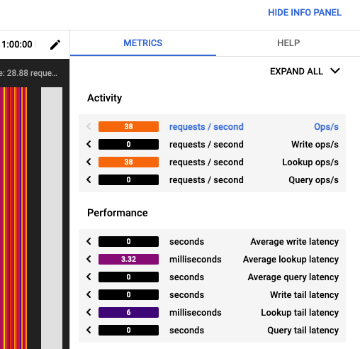
To examine several metrics at once, use the following tools in the multimetric pane:
To show or hide miniature heatmaps for all metrics, click
Expand AllorCollapse Allat the top right.To show an individual metric's heatmap, click the metric name.
To hide an individual metric's heatmap, click the metric name again.
To display a metric's heatmap in the main window, click the solid arrow at the left edge of the metric's title bar.
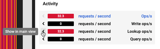
Hover over a miniature heatmap to see corresponding activity in the main view.
To compare different metrics for a key bucket at the same point in time, you can pin a value in a scan, then switch to a different metric at the same point in time:
- Point to a position of interest on the large heatmap in the main window.
- Click to pin the tooltip. The values in the side pane stay fixed to the key bucket and point in time you've pinned.
- To display a metric in the large heatmap, click the solid arrow on the left for that metric. The tooltip in the main window shows you the full details for that metric.
What's next
- Learn to recognize document key patterns or index key patterns.
- Read about the metrics you can view in a heatmap.