This page explains how to create a visualization.
Add a visualization on an Explore
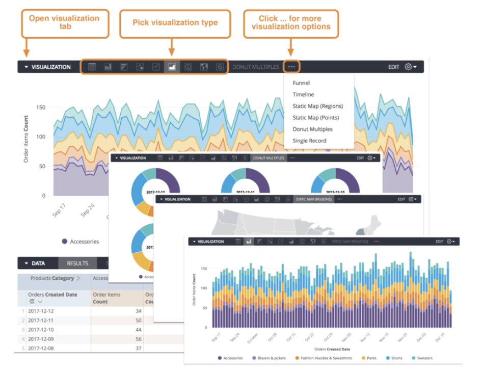
- In the Explore view, select the Visualization tab to expand the visualization options.
Select the type of visualization that best displays your data. See below sections for selecting the type.
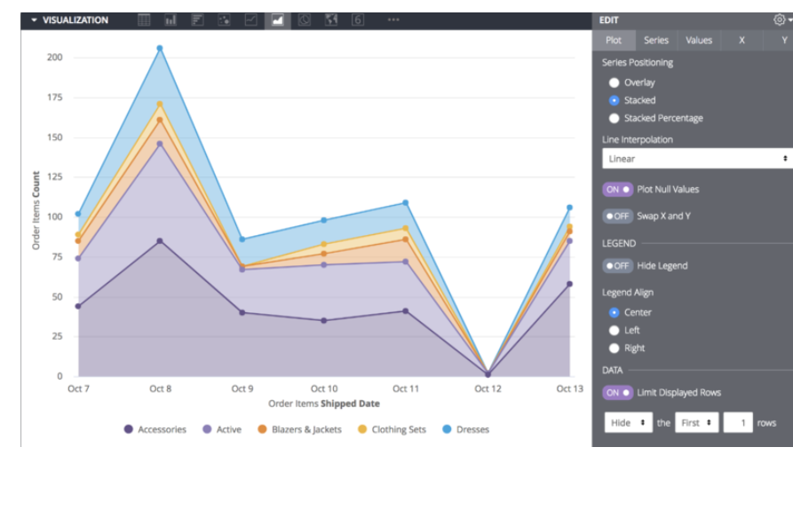
Select Edit to configure the visualization option settings, such as naming and arranging chart axes, choosing the position and type of each data series, or modifying the chart color palette.
You can further customize your visualization by specifying which dimensions and measures to include in the visualization. If your data is missing key values, you can tell the advanced reporting platofrm to fill in those values on the appropriate part of your visualization.
Choosing a visualization type
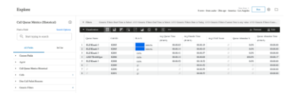
After you create and run your query, select the Visualization tab in the Explore to configure your visualization options. Use the chart buttons to pick a visualization type.
The visualization type that you select determines how the data series is represented in your chart. A data series is a set of related data points plotted on a chart. For example, the number of orders placed each day for a set of dates is a series. In a column chart, a series is represented by columns of the same color; in a line chart, a series is represented by a single line. You can see a list of the series for your chart in the series menu, and on the chart legend.
Customizing visualizations with chart settings
You can customize a visualization to make your data more readable and to add visual styling. Select Edit to see the visualization options, then change the settings to get a result that suits you.
To see the visualization options available for a particular visualization type, select that type on the Visualization types documentation page.
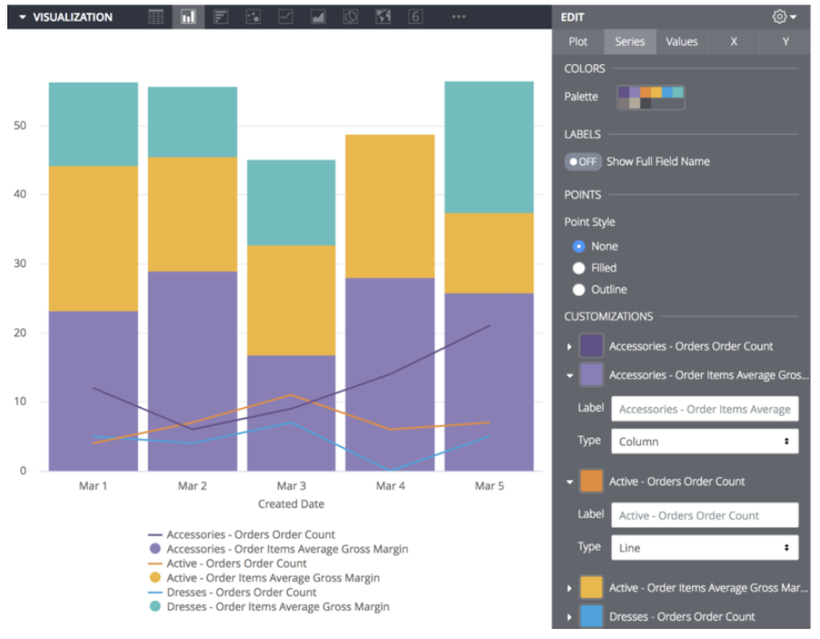
Including multiple visualization types on a single chart
To create a chart that includes more than one visualization type:
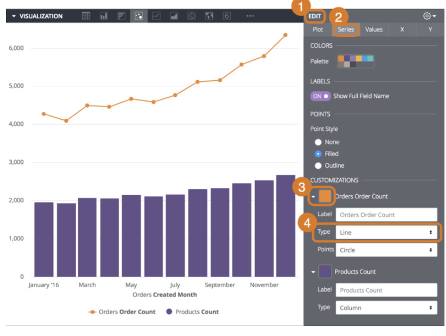
Select the Edit button to show the customization options.
Select the Series tab.
In the Customizations section, an entry appears for each series in the chart. Select the arrow next to the series to display its customization options.
In the Type box, select the type of visualization to use for that series.
Charts with multiple series types always layer line series and scatter series in front of area, column, and bar series.
To alter the layering order of column, bar, and area series, change the series' positions in the data table and select the Run button. The leftmost series layers on top and the rightmost series layers on bottom.
Creating stacked charts with multiple visualization types
You can include stacked series in a chart with multiple visualization types. All series of the same type as the chart overall will stack together; series of other types will not stack. For example, in a column chart, column series will stack, but line series will not stack.
[create dashboards-stacked-series.png]
By default, series are added to the Left Axes section of the Y menu. To create a stacked chart that uses multiple y-axes, drag any series to a different axis in the Y menu. The stacked series will appear together. All other series can be moved independently, including individual series within a pivot.