Stackdriver tips and tricks: Understanding metrics and building charts
Joy Wang
Senior Product Manager
Eric Jordan
Software Engineer
[Editor’s note: This is the first in a series from the Stackdriver monitoring team on tips and tricks you can use to get the most out of your data and build more visible, resilient infrastructure.]
Seeing what’s going on with your IT infrastructure, applications and services has always been critical to the success of modern businesses’ day-to-day operations. Google Stackdriver monitoring provides out-of-the-box visualizations and insights for Google Cloud Platform (GCP) users so you can easily understand your systems.
Our users frequently ask us how they can most easily build their own visualizations and troubleshoot incidents effectively with Stackdriver. Whether you’re running a small test project with a few GCP services or a large-scale system with hundreds of instances, visualizations are helpful. But it can be intimidating to see hundreds of lines of monitoring data displayed on a chart when you’re getting started.
In this post, you’ll find some tips and tricks for using Stackdriver monitoring, including detailed explanations on how to effectively use the metrics model, how to build the right chart for a metric, how to aggregate and align metrics, how to create meaningful charts, and much more.
These are the key concepts to know when you’re getting started with Stackdriver.
Understanding the Google Stackdriver metrics model
In order to build useful charts, it's important to have an understanding of how the Stackdriver metrics model works under the hood. This model helps you configure charts in Stackdriver Metrics Explorer and custom dashboards.
All metrics are made up of two things:
A metric descriptor that defines what the metric is and what resource it applies to; i.e., a "CPU usage" metric that applies to the "Compute Engine instance" resource type. The metric descriptor also defines a set of labels that are used as identifiers or metadata for the system writing the metric. For example, our disk write operations metric has a label called "device_name" that identifies which disk a data point was associated with.
A time series that includes a set of points that are a combination of [time, value, labels/resource] and written against the metric descriptor.
Stackdriver metrics are one of three kinds: gauge, delta, and cumulative.
A gauge metric measures a value at a particular point in time; i.e., “CPU utilization” for a Compute Engine instance, or “Instance count” for an App Engine app. A chart of CPU utilization will have points showing, as expected, the CPU utilization at that moment in time.
A delta metric measures the change in a value over a sample period, often one minute. An example is the “Backend request count” for a load balancer. A chart of the backend request count will have one point for each minute, showing how many requests hit the load balancer in that minute.
A cumulative metric measures a value that constantly increases, such as “sent bytes count” for Firebase. Cumulative metrics are never drawn directly in practice; you always use aligners (discussed below) to turn them into gauge or delta metrics first. If you could draw the raw data for “sent bytes count,” you would see an ever-increasing line going up as the total number of sent bytes grows without bound.
Finally, there are two types of metrics value types: numeric or distribution.
A numeric metric consists of streams that have numeric values for specific points in time. All of the examples in the previous section are numeric-valued metrics.
A distribution metric consists of (usually one) stream that has an array of “buckets” at each point in time that are used to draw a heatmap. Examples are “Backend latency” for a load balancer or “Execution times” for BigQuery.
Using time series point aggregation
The next key Stackdriver monitoring concept to understand is how individual points turn into time series, or lines on a chart. Time series start as raw data represented by points that go through two stages of aggregation (alignment and reduction), and that you can optionally group by labels. When you’re creating a chart, it’s always a good idea to aggregate the data when you want to know the high-level healthiness of a metric.
The process to get from individual data point to time series charts is outlined in more detail in this diagram:
Raw data comes in to the Stackdriver system at unpredictable intervals and at a high volume. This data is never used directly, but will be processed in some way before you use it in a chart.
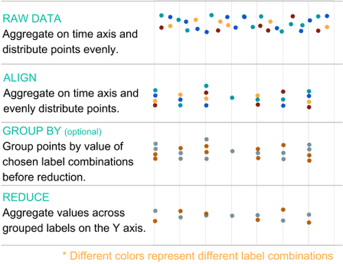

The first step in aggregating data is called alignment. This is an aggregation on the time axis that separates the data into even time intervals defined by an alignment window (i.e., one point per hour), using an alignment method such as mean. An aligner describes how to bring the data points in a single time series into temporal alignment. Examples of aligners are minimum, maximum, mean, sum and much more.
The second step in aggregation is called reduction, and is an aggregation on the value axis with an optional grouping (i.e., “group by”) on selected labels. This step combines multiple points with different label values down to one point per time interval (so a single line.) If you set these “group by” labels, the reduction aggregation will instead result in one point per time interval for each combination of values for the chosen labels. For example, if you group by the region label, you will get one set of points (represented by a single line) per region that contain points.
Aggregation limits the amount of data sent to your browser, and it limits the number of points that need to be drawn in a chart. To put this in perspective, if you write one data point every 10 seconds across 1,000 resources, that is 360,000 points/hour. In order to show a week's worth of data, you’d have to transfer 60,480,000 points across the wire and render them. That’s far more data than can actually be shown on a single chart, since there aren't enough pixels in a display to render them. By applying an aligner with an alignment window of one hour, we can drop the number of points to 1,000 per hour (that’s one per resource), which is a 360x reduction in points for a total of 168,000 points per week. That’s still too many. Once you apply a reducer, you can aggregate those 1,000 points per hour down to one per hour, for a total reduction in size of 360,000x and a total data point count of 168.
Understanding metric cardinality
The final key concept to understand about metrics is cardinality. Cardinality represents the number of distinct label value combinations, or number of potential lines, that exist within the raw data for a metric descriptor.
For example, if you have a metric descriptor with labels zone and color, and have written points with two distinct values for zone and three distinct values for color, that metric has a cardinality of six, as there are six possible unique combinations of the label values, as shown in this diagram: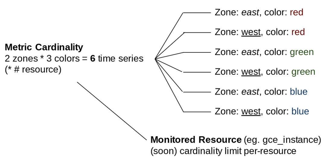

Metric cardinality is the primary factor in performance when you are requesting metrics. The higher the cardinality of a metric, the slower the response will be. This means that in order to get the best performance for metrics and charts, especially when you are troubleshooting and displaying charts on a screen, you need to control the label value in any metrics you write.
Putting the Stackdriver metrics model into practice
Once you understand the metrics model, you can use this knowledge to build a chart that helps you identify anomalies quickly, even with more than 50 lines on your chart, as shown in this example.
This chart shows CPU utilization metrics with one line per instance, when you have dozens or even hundreds of instances. The chart will be too cluttered to allow you to identify and diagnose issues, especially under the pressure of an outage.
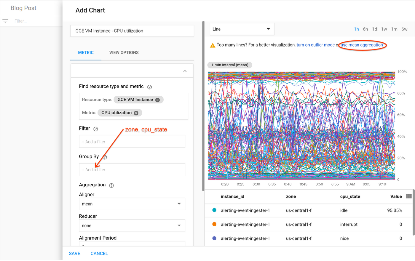

It is possible to narrow down your data view to avoid overcrowded charts like this one. We’ll take you through a workflow that can help identify an anomaly even when you’re dealing with an overabundance of raw data. Here’s what to do:
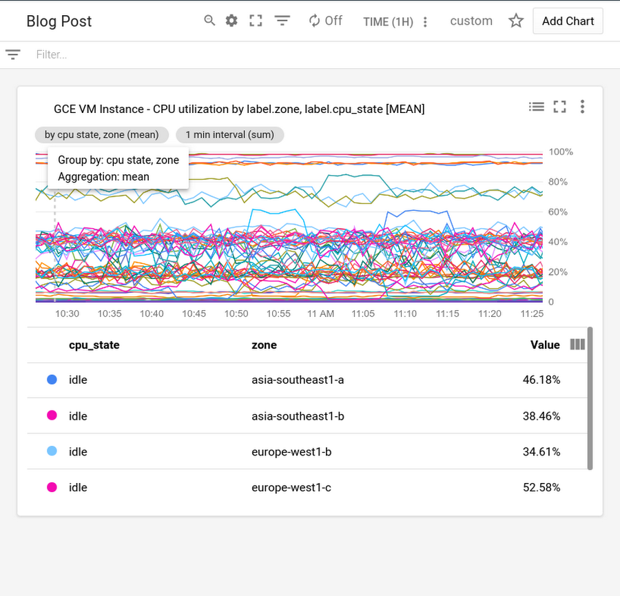
1. Perform reduction on the data. DevOps engineer Mary is setting up a dashboard for her IT team operators. She plots CPU utilization, but discovers, with one line per instance, that there are too many lines for the chart to be useful. She gets a suggestion in Metrics Explorer that lets her quickly apply a mean reducer, resulting in a single line aggregating CPU utilization data across all instances in her project. She then adds “zone” and “cpu-state” as labels to the group-by to get one line for each zone and CPU state. Each line shows the mean of the CPU utilizations for the instances in one specific zone for a given CPU state. Mary saves the chart, shown here, and puts it on the dashboard the operators use.

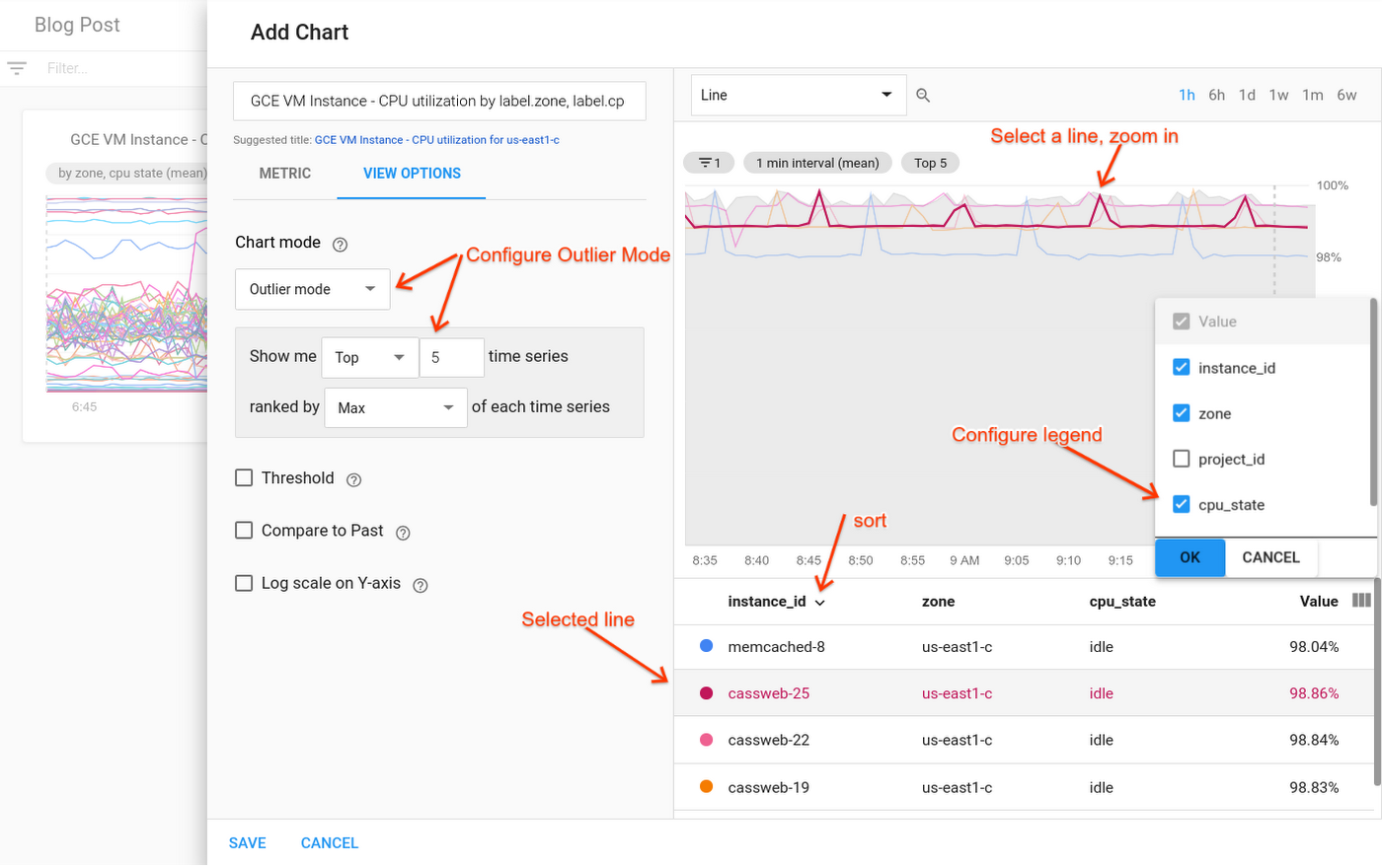
2. Filter the data. David, an operator, is looking at the dashboard Mary set up, and notices high utilizations on one of the lines on the CPU chart. He needs to see the CPU utilization for the instances that make up that zone. Hovering over the line, he discovers that the zone in question is us-east1-c. Going into Metrics Explorer, he removes the “group-by for” zone (and CPU state and the reducer), and adds a filter for “zone = us-east1-c.” Now, the chart shows him one line for each CPU state for each instance in the us-east1-c zone—which unfortunately is dozens of lines, not a useful chart! But Metrics Explorer is suggesting a solution: David clicks on the suggestion, and puts the chart into outlier mode. He configures outlier mode to show just the top five lines (ranked by “max”), along with a min-max band. Zooming in on the peak in the visualization, it’s clear that there is one line in particular that has an especially high CPU utilization. When he clicks on that line, he sees the corresponding information highlighted in the legend. David sees the instance name, “cassweb-25,” highlighted in the legend. He uses the view-columns icon to add a column for CPU state to the legend, and sees that the instance is idle.

3. Filter to the specific instance. David goes back to Mary’s dashboard, and filters the whole page down to just cassweb-25. Now, he sees charts for memory, disk usage, and other metrics—each one specifically filtered down to just the problematic instance. He’s seeing only the details necessary to solve this particular issue.
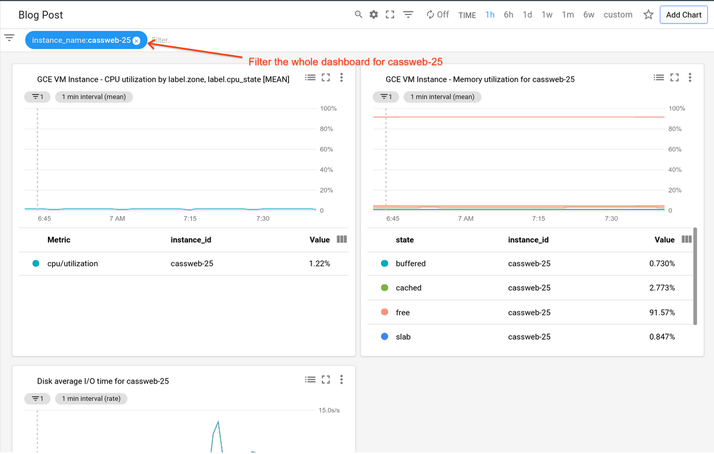

Use this type of process whenever you need to create an effective chart to visualize your monitoring data.
And stay tuned: next in the series, we’ll discuss tips and tricks on creating a workspace in Stackdriver and how to exclude/include AWS resources, as well as explore different chart types and groups and effective grouping and filtering. In the meantime, check out our Stackdriver resources here.
Thanks to additional contributors to this post: Eric Clayberg, Syed Ashrafulla and Andrew Emil.
