Cloud Storage requests create data art and usage insights
Chris Talbott
Cloud Sustainability
Logan Williams
Stamen Design
The basic expectation of storage technology is that you put bytes in and you get bytes back. But storage is more insightful than you might think. At the scale of Google Cloud Platform (GCP), storage gives us a glimpse into how the world is interacting with trillions of pieces of content. When we look at storage attributes, we see the trajectory, velocity, and density of data moving around the globe. The request for a stored object gives us a piece of data about a point in time, and the origin and destination of the request at that point in time. We thought that could be thought-provoking information about a time period and a place.
We on the GCP storage team wondered what the world map of those requests would look like. By exploring the planetary-level picture of our service, could we see patterns that would help us better serve our customers in the future? And, somewhat jokingly, we wondered if we could make boring old storage beautiful.
So we worked with Stamen Design to take a week’s worth of our storage traffic data (aggregated and anonymized) and build a visualization that explores the interactions between users and the content stored in Google Cloud Storage. Here’s the process we used.
Looking at Cloud Storage data
Cloud Storage is our object storage service for storing large amounts of unstructured content. It’s a foundational element to building on GCP, and because it integrates with the majority of GCP products, it’s used for everything from audio streaming services to genomic sequencing. The service handles billions of requests a day to store or serve content from or to people and applications.
The data associated with each request made through our network tells us the direction from a country of origin to a Google Cloud region, or vice versa. This is what we call ingress (from user to Google Cloud region) and egress (from Google Cloud region to user). The associated data also tells us the size of the request in GBs and a timestamp. Since the data is anonymized, we don’t know which user is making the request, whose data is being requested or what the content is.

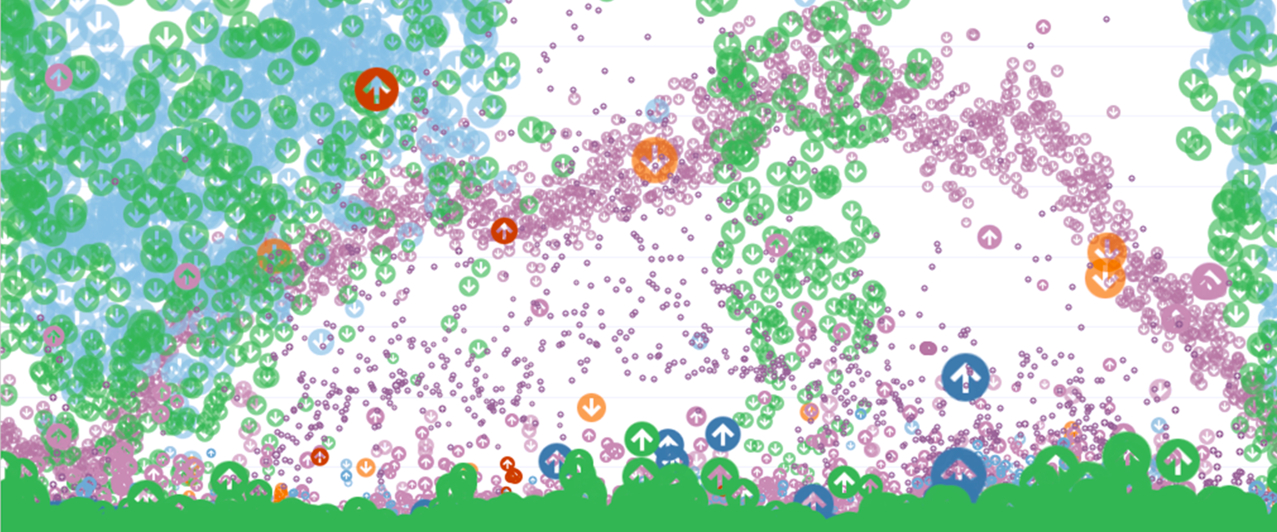
Before we get ahead of ourselves, we should clarify candidly that we were unsure this would unveil anything interesting. Given the size and simplicity of the data set, it could easily be a wash. But quick explorations using Tableau revealed a wealth of texture, with differences and similarities, and momentum for the various vectors we measured. As you can see from these initial “sketches,” movement over time was going to be key to a successful visualization, so the variable of time was our first exploration.
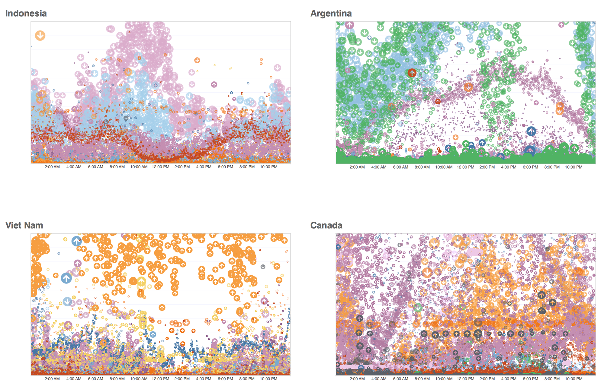

Mapping time data
The visualization below shows a snippet of the Cloud Storage data request volume over the course of a week as a series of 24-hour clocks. Each color shows data movement to a different Google Cloud region from users in the U.S., with egress flaring outwards like a coronal mass ejection, and ingress punching through towards the center of the ring—and during especially dramatic periods of ingress, even emerging out the other side.


This activity generally mapped to active hours of the day for a country, with the number of requests growing toward the midday peaks. But the pattern changes day to day. We saw that spikes of ingress were far less regular than spikes of egress, and that spikes in either direction were volatile.
When you think of customers who are using GCP to serve content to users, it’s easy to see why cloud elasticity is so beneficial for handling unpredictable user behavior. Behavior can be erratic. Our customers who serve global users have their own individual hourly usage patterns, and getting smarter about predicting this user behavior helps optimize for load and user experience. A pattern of consistently high requests from a country to a faraway GCP region could be better served by replicating data closer to that country, or incorporating a CDN to make the local user experience faster. The storage team is exploring how we can take insights like these and surface them to customers who would benefit.
We overlaid two countries in order to visualize their similarity in behavior, but the motion made it difficult to clearly view the differences. A radial stacked area chart simplified the data into a single, static form that still reflects the individual nature of each country and each country’s relationship with its associated GCP regions.
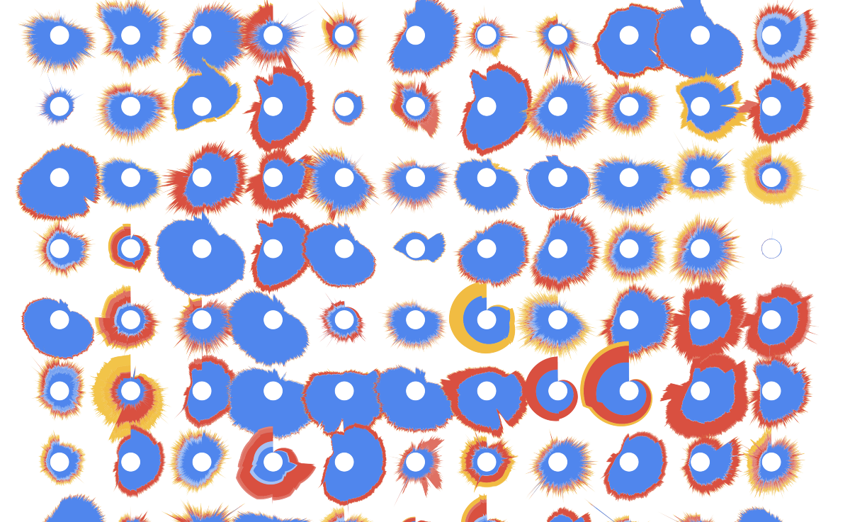

These glyphs also revealed regional patterns of request volume and destination around the globe. When displayed geographically, below, you can see that continents with similar Cloud Storage traffic patterns stand out. The closer the circles are to each other in shape and color, the higher the correlation in traffic patterns.
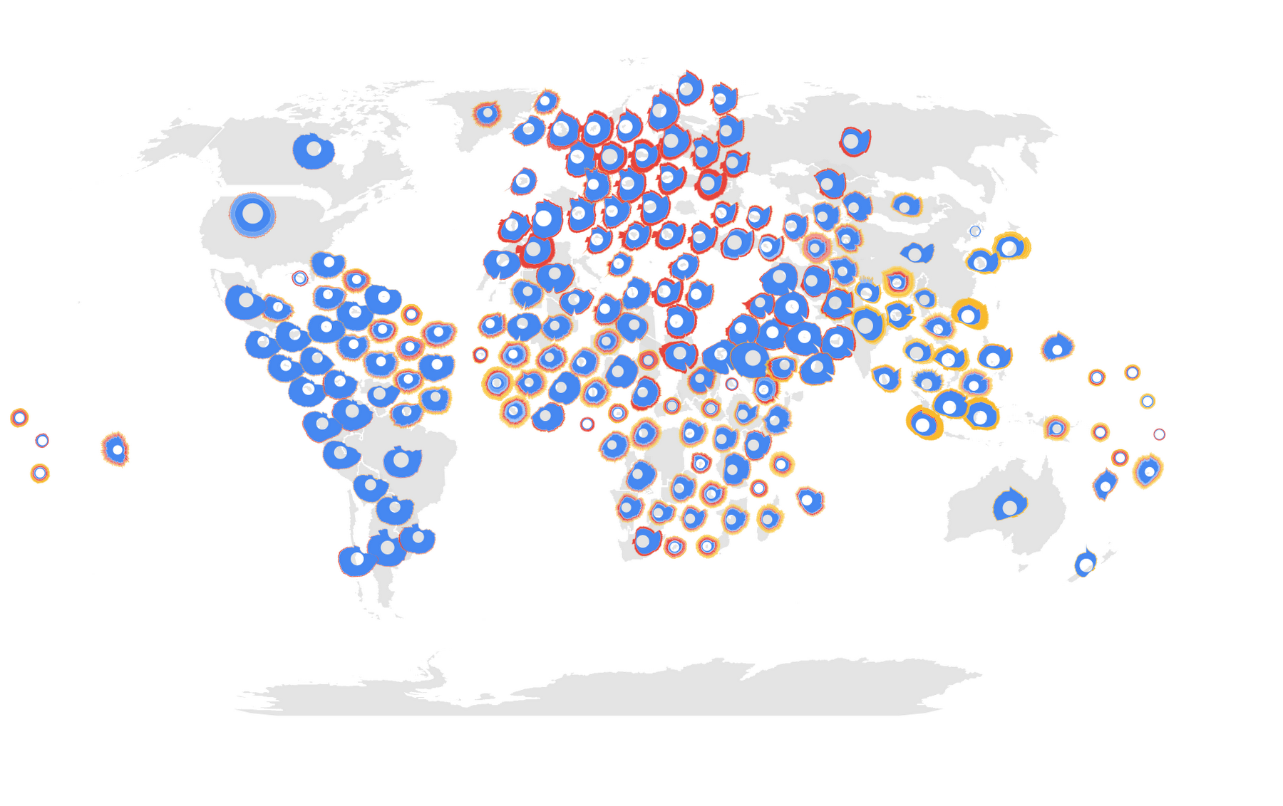

The next step was to explore whether we could visualize the expected and unexpected similarities between different sides of the world more quantitatively.
Correlating time series data
By measuring the cross-correlation of a time series, we can tell how related two time series are. If traffic in Colombia spikes, is traffic in nearby Ecuador likely to as well? What about on the other side of the world in Algeria?
A cross-correlation matrix, shown below, shows this association between every pair of countries, based on Cloud Storage’s request traffic. Each country is represented on both axes of the matrix, and will meet every other at some point in the matrix. Yellow means the request pattern of the country is correlated to the country on the other axis. Blue means it’s different. The bright yellow diagonal is where a country meets itself on the other axis and the pattern is matched 100%.
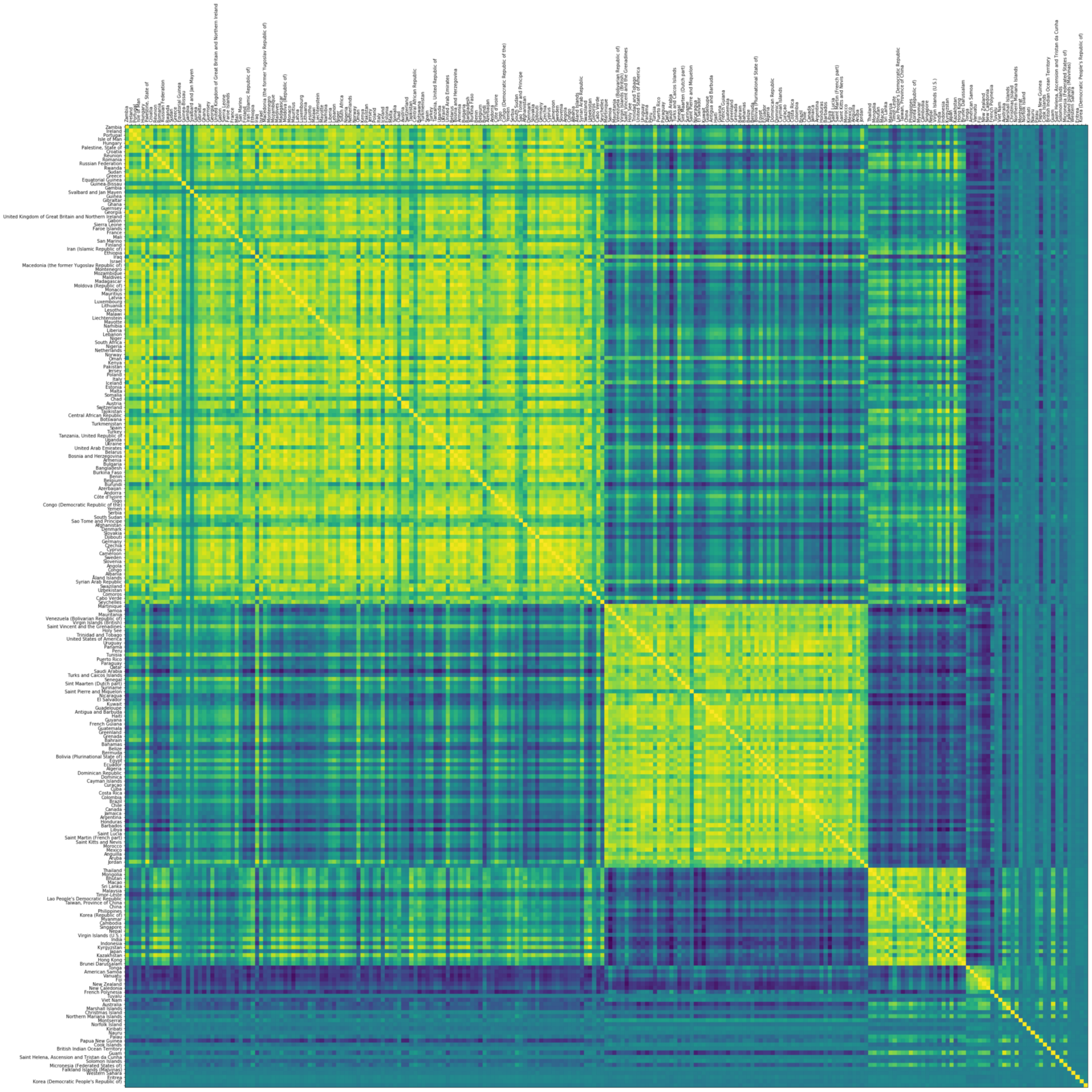

We can see a rich structure in this diagram. We saw correlation among continents with economic affinity, cultural cooperation, and technological collaboration across the globe. We also saw correlations between countries in proximity to each other, with users awake at the same time or using the same local GCP region.
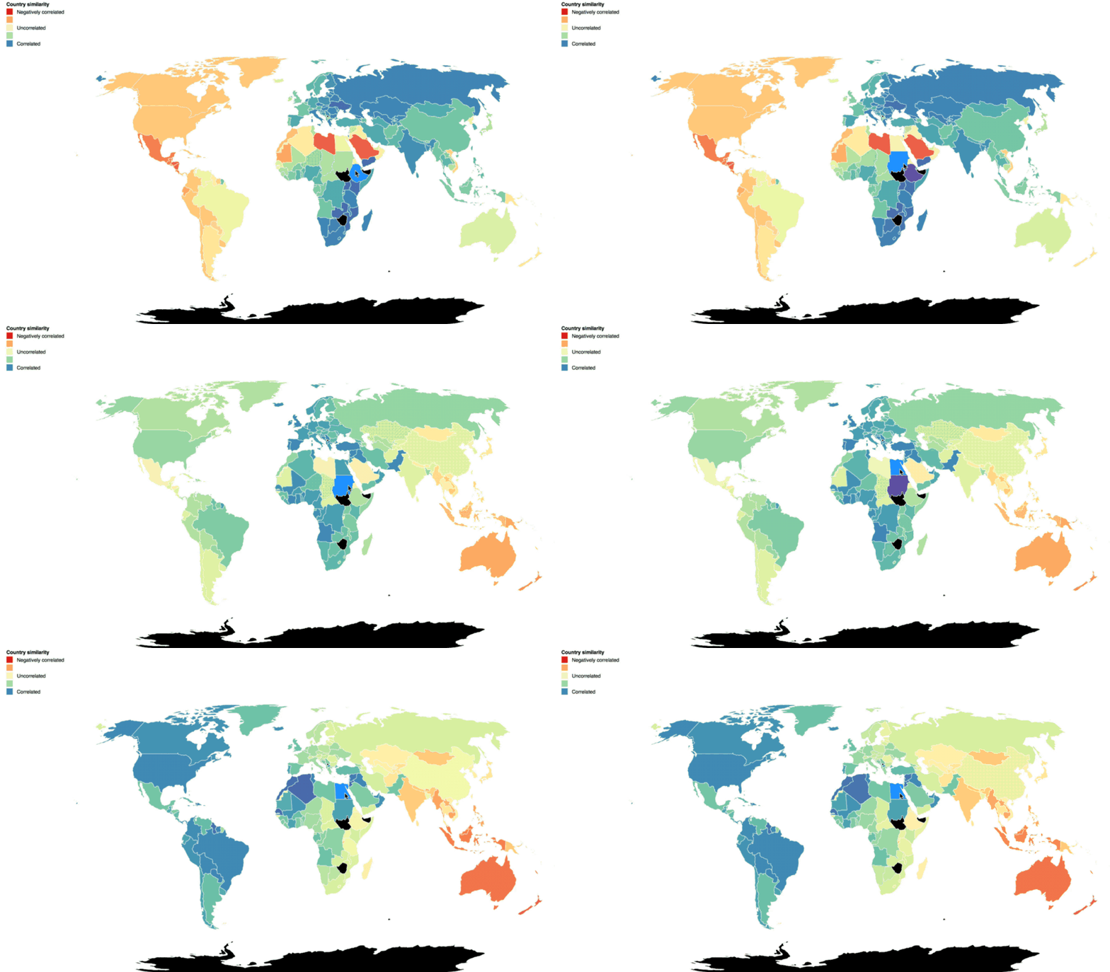

This made us think about how to optimize storage for both content serving and high-performance compute or analytics. Customers with very distinct global pockets of activity could architect or replicate their storage to better serve that content to users in a geographic area. If they have operations in separate areas of the globe running high-performance compute or analytics jobs, it’s a definite benefit if the job doesn’t need to traverse more distance than necessary. The closer compute is to your data, the faster you can crunch it.
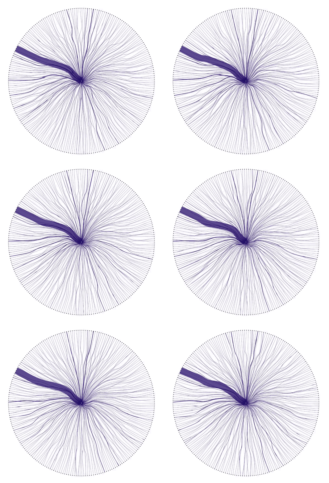
At this point, it was clear that correlations between countries had an interesting story to tell. Showing the characteristic pattern of each country revealed individuality in the data. Showing correlations between countries revealed connection. We laid out every country in the dataset, and drew connections between them and GCP in the circular diagram below. It’s super cool to see surges in data as they pulse between users and GCP.

Pulling the pieces together
Looking at Cloud Storage requests over time showed us a distinct pattern, the pattern gave us a way to correlate countries, and each correlation gave us an insight into connections around the globe. So we put it all together in a video that gave every country a turn in the spotlight. We included a snippet below. It jumps from country to correlated country, showing unexpected connections and prompting conversation and discussion.
If you joined us at Google Cloud Next ‘18 in San Francisco, Tokyo or London, you may have seen the above as it ran in the storage and database showcase. Since it’s multiple hours long, attendees experienced a different picture or global insight each time they walked by the video.
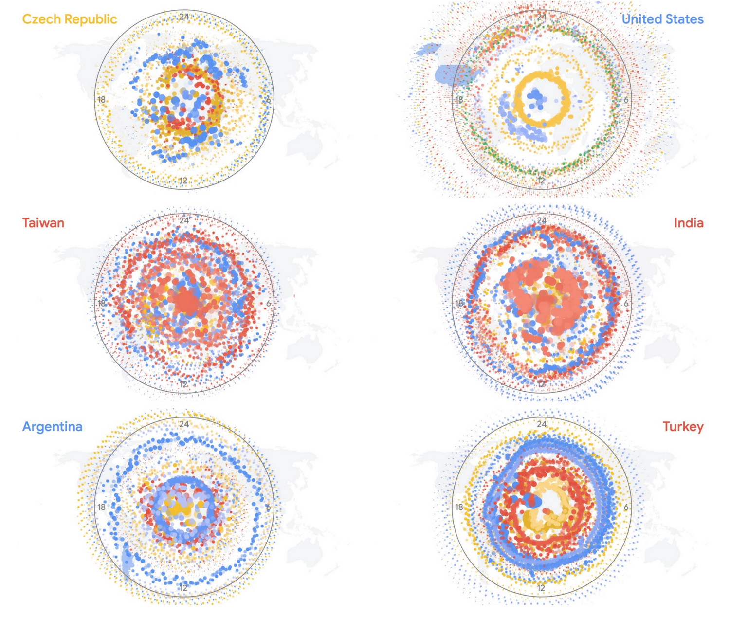
As each country is featured, you can see the textural complexity that intrigued us at the beginning of the project. Here are a few examples:

How we created these Cloud Storage visualizations
This project was mainly developed using Javascript and HTML5 Canvas. Many of the transitions and visualizations pushed the ability of Canvas to render in real time, with tens of thousands of arc segments, not to mention points, complex polygons, and text being drawn on the same frame. To deploy the final video on a Google Chromebox, we used CCapture.js, a clever library that monkey-patches Javascript’s Date function to effectively slow down time. Using some WebWorker magic, it saves each Canvas frame as an image and writes them to disk, letting us render an animation at slower than real time.
If you are a Cloud Storage customer and curious about the picture your request pattern would paint, you can export the logs data for your own environment. Give the tools above a shot, or try your own. We’d love to see what you create.
Learn more about Stamen Design’s work here and Cloud Storage here.
