Unsiloing data to work toward solving food waste and food insecurity
Joe Intrakamhang
Cloud Architect and X Alumnus
Mike Ryckman
Data Scientist
While working on the Project Delta team, an early stage moonshot at X that was exploring new technologies to solve the pervasive problems of food waste and food insecurity, we worked closely with Kroger and Feeding America to transform and analyze datasets using Google Cloud.
In this blog, we’ll talk about the technical effort of data un-siloing. (Check out this post for more on the overall project.) Before data can tell powerful stories, it needs to be made accessible, transformed and formatted so data sets can be joined, then reviewed with industry experts to surface underlying industry-specific relationships.
Getting to the data: Automating flows into a shared data archipelago
Much of the food system in the U.S. still operates on paper printouts and spreadsheets. While these ways of capturing, analyzing and communicating data have increased the pace and scale of business over time, they do bring limits. As disparate organizations look to work together and share vast amounts of data in real time, emailing spreadsheets back and forth no longer suffices.
Kroger is a longtime historic partner of Feeding America—the two organizations have worked together for four decades. As part of a nationwide retail donation program, Kroger stores regularly set aside food to be donated and Feeding America member food banks coordinate pickups and distribute the food in their communities through pantries.
As part of their company-wide Zero Hunger, Zero Waste initiative, Kroger sought to make more of their vast donation and waste database. Leading the industry, in 2017 Kroger publicly committed to donating 3 billion meals by 2025 and were keen to find as many donation opportunities as possible across their network of 2,700-plus stores nationwide. To do so, they wanted to find deeper patterns in their own store data and also in the food charity data of their food banking partners pertaining to Kroger’s donation patterns.
As the first retail organization in this data-unsiloing partnership, Kroger offered to share their shrink data on a daily basis. Shrink is the loss of grocery store inventory due to imperfection, spoilage, and other factors. Any item not sold to a customer is denoted as shrink and earmarked for donation, animal feed, compost, or landfill. Scan loss data represents the subset of shrink that is formally logged. While Kroger uses this information extensively across divisions internally, this was the first time they worked with two external partners.
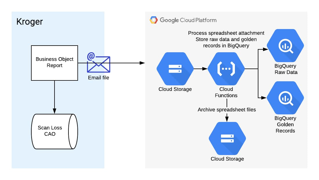
Collaborating closely with Kroger’s business intelligence and IT teams, the Kroger Zero Hunger, Zero Waste leadership team navigated Kroger’s hybrid multi-cloud system. The path of least organizational and technical resistance to get the X team a daily data snapshot was to send an automated nightly email with an attached data file from each of their 20 operating store divisions.
Processing incoming data
With all those emails containing data files coming in, the team needed a way to process and load the data for shaping and analysis. The X team chose BigQuery, Google Cloud’s enterprise data warehouse, for its scalability and speed.
To hold and process incoming emails automatically, the team set up a Cloud Storage bucket. When a new file is added to the bucket, a Pub/Sub notification triggers a Cloud Function to load the data into BigQuery automatically. Processed files in the root bucket are then archived into a “completed” folder if successfully loaded into BigQuery or into an “error” folder if incomplete for any reason.

The team did this in two steps:
1. Set up triggers and notifications: Pub/Sub notifications can be set up directly from the Pub/Sub section of the cloud console. An appropriate topic was created. Then, the team configured the Cloud Storage bucket to call the Pub/Sub topic when a new data file is added to the bucket. This can be done via the command line in Cloud Shell.
2. Set up Cloud Function: The Pub/Sub will trigger the Cloud Function to be invoked and move the data to BigQuery. The function’s code is stored in Cloud Source Repositories and was written in Python with accompanying SQL templates. The code processes spreadsheet files into a dataframe using Pandas, then writes the dataframe into BigQuery using the BigQuery Python Client library.
Making data consistent: Getting to a common language
The food system lacks a common standardized language, an ontological and semantic infrastructure that everyone can baseline to and build from. Professor Matt Lange of UC Davis, who’s leading efforts toward an “Internet of Food,” often references the healthcare system, where conditions and diseases are clearly classified and coded, with a structure that drives, informs and supports all financial and operational activity in the sector. Nothing close to that exists for food.
After building data pipelines to Feeding America and Kroger, the X team’s first task was to confront disparities in food descriptors head on. How does one name a tomato, describe it, quantify it, and locate it? How do we represent a clamshell container of tomatoes consistently across all datasets from all parties?
Even within one organization, there were dialects and different ways of talking about and representing the same thing. Feeding America is a nationwide network of 200 independent food banks, all with their own origin stories, practices, and non-corresponding IT systems. The X team, as humans, could understand what a data record from a food bank represented, but accurately linking those records across food banks was very difficult. As an example, even something as simple as the name of the state of Texas was logged in 27 different ways! This was common throughout the data: for storage facilities, for example, one food bank may refer to their refrigerators as REFR, while another might use REFER.
Pinpointing food locations
With a vision of matching excess food supplies to where they are most needed, the partnership prioritized standardizing the geolocation of all data records. Where a particular quantity of food originated directly impacted the recommendation of where it could go, since transporting perishable food requires time, money and in certain cases, temperature control.
Many records from Feeding America member food banks were filled with descriptive titles for their staff and useful for manual operations, but that was difficult for a computer to understand. For example, a retail donation from “Kroger on Main St.” makes sense to a tenured driver who has been picking up from that store for a decade, but this descriptor needed to be decoded and matched with Kroger’s description in its own donation data record that lists the same store as Store #123.
Using Google Maps Platform, the first step was to identify the Place ID for each of Kroger’s approximately 2,700 stores, given a list of addresses. Google Maps Platform includes Place IDs, which uniquely identify a location, for more than 200 million places around the world. In parallel, food bank location descriptors like “Kroger on Main St. Frisco, AZ” were also converted into Place IDs using the Maps API search-based querying function.
Beyond this, the food banks participating in the initial phase of this data effort serve over 18,000 pantries collectively. The partnership was keen to fully explore geospatial opportunities in the entire system, and agreed to include these locations as well. This enabled the team to not only map the flow of food from a Kroger store to the local food bank and then to the pantry, but also explore network route optimization opportunities broadly. Using these Place IDs helped give us a common language.
When working with the food bank data, however, normalizing places was not always as straightforward as querying Maps API. While different food banks might get food from the same suppliers, these suppliers were often represented in each food bank’s database differently. Because of typos or incomplete addresses, the Maps API could return the wrong place or not be able to find a result. To reconcile these entries, the team built an algorithm to determine the confidence that two places were the same before assigning a unique ID to the location. This extensive effort resulted in a comprehensive picture of suppliers and pantries in the charitable food network.

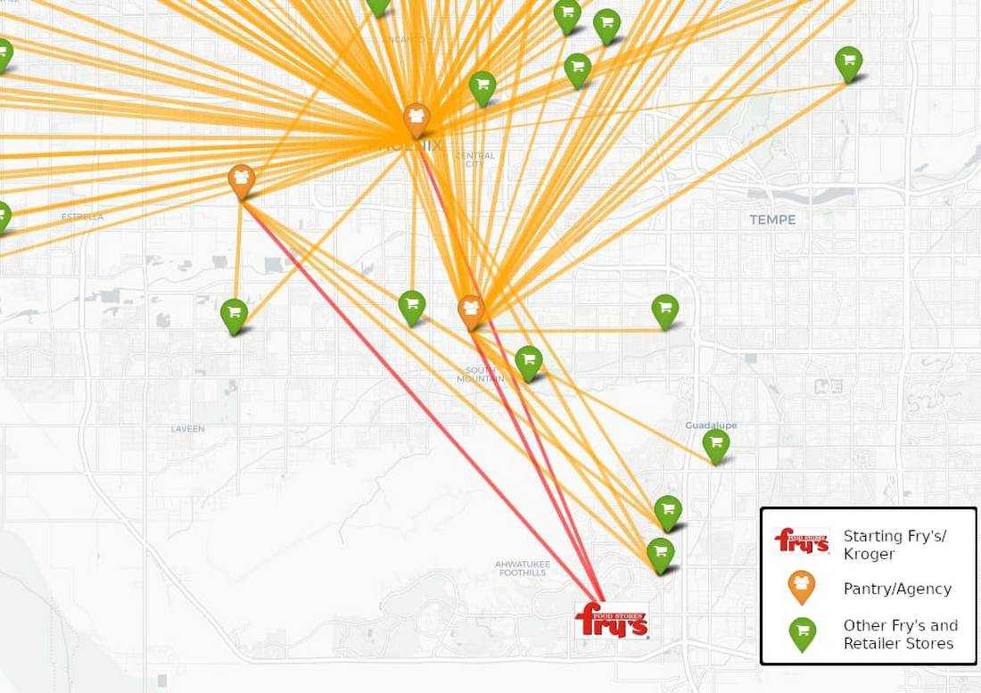

Finally, the partnership recognized that food insecurity is shaped by poverty, employment, and various demographic variables and sought to include this in the analysis. To bring in these variables, the team used the US Census API to find the block groups, statistical divisions of census tracts containing about 600 to 3,000 people, for each food bank and pantry location. This opened the door to easily bring in thousands of state and federal datasets, helping tell a richer story to stakeholders about the needs of specific communities.
Shared maps bring humans and things together in the right place. In the case of mapping in the food system, they enable the more effective use of food and the associated transportation and labor resources. Mapping all the nodes in our food system has never been more important in these pandemic times, where there is still an abundance of food—just unevenly distributed. Knowing where that food is located is step number one.
Visualizing data: Show and tell the story
As part of a network of 200 independent food banks, each with its own network of hundreds of pantries, each Feeding America member food bank can speak to their work, but there is no way yet to see real-time food flows in the network nationwide. This is a common theme for industry groups and organizational networks; focusing closely on specific trees can make it easy to lose sight of the forest as a whole.
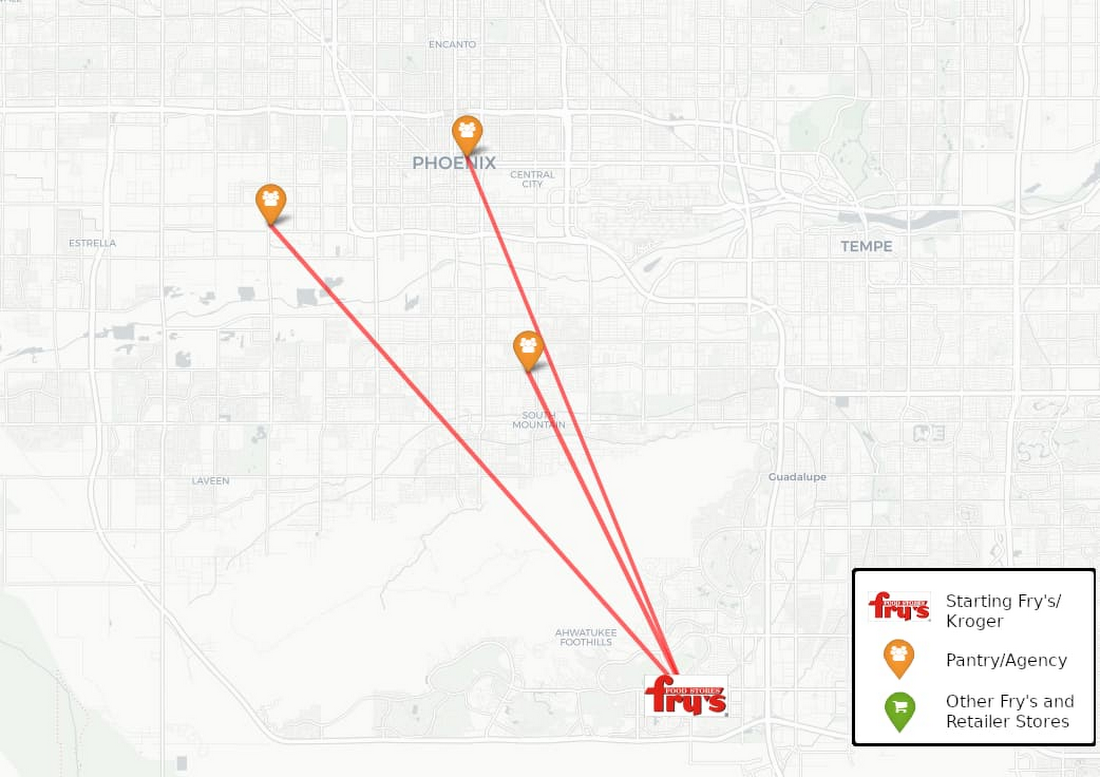
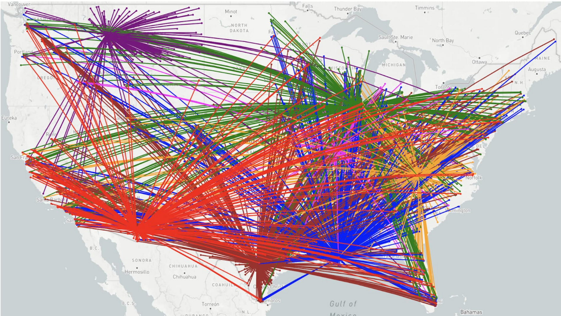
One of the team’s first visuals was simply to show where food banks were getting their food from on a map. Food banks can find donated food anywhere and they do sometimes purchase food to supplement what they have received. This can mean that, if the right opportunity comes, they can acquire food from far away. There has been talk among food banks for many years about how routing might be made more efficient, but each can only see their part of the story; none is equipped to optimize a national logistics network.
After moving the data from multiple food banks out of their silos, the Feeding America and X team worked together to plot the flows in Looker. The network is quite complex even with just a few food banks (see below). While this visual is easy to create and shows data that each food bank already had, the impact is in seeing the forest.
There are tremendous opportunities to make more of every food bank dollar by pooling purchasing and optimizing routing. This visual is messy and not necessarily immediately actionable, but it was a powerful tool for gaining buy-in for building a national data warehouse at Feeding America. Leaders at the national office and food banking executives saw this visualization and immediately understood the purpose and potential benefits.

Tracking physical flows over time
While Kroger and Feeding America have partnered for more than 40 years, Kroger does not see where their donated food goes after it is picked up from a store. The store may receive confirmation from their food bank partner that 100 pounds was picked up a few weeks later, but Kroger did not have a way to track individual food items all the way through the food chain.
To visualize these flows, the team first reconciled all of Kroger’s stores with the food bank representation of these stores. This made it possible to track inventory records in Store 123 from Kroger’s data and compare them to donation records the food bank recorded from Store 123.
Next, the food received into the food banks was traced as it moved through their inventory. Food banks, particularly in grocery rescue and food drive programs, will verify food is safe to eat and then likely aggregate it to make more useful shipments. For example, 20 different cans of mixed vegetables that came in from different stores may be combined into a case of food for a local pantry.
From this work, Kroger was able to see for the first time the ways that their donations help touch entire communities. When volunteers picked up food at Kroger stores, they broke the donation up, recombined it with others, and then sent it out to hundreds of small pantries. Even fairly small donations were coming together with others from across the community to make a huge impact, reaching hundreds of pantries and distribution points.


Solving enormous, large-scale problems like hunger starts with exploring data in new ways and visualizing for stakeholders the current state of flows geospatially and with respect to time. No single Kroger store was going to solve hunger in its community; no single organization was going to solve hunger across the country. Each contribution comes together to make a collective positive impact. Data, visualized well, tells the story of the work already underway, and invites others to join the mission, inspiring action in the right time and place.
Putting data siloing into practice
When starting on a large multi-stakeholder data un-siloing initiative, be prepared for a journey with unexpected twists and turns. It is rarely straightforward to go from raw, disparate, datasets to integrated and impactful analytics. As you persist through obstacles—getting data out of silos, making it consistent, and visualizing it to tell stories—remember that this effort can fundamentally reshape your business and industry in positive ways.
If you’d like to learn more and donate to these efforts, check out:
The X and Google team would like to thank Kroger, Feeding America, its member food banks, and St. Mary's Food Bank for their contributions to this article.

