Bring 20/20 vision to your pipelines with enhanced monitoring
Mehran Nazir
Product Manager, Google Cloud
Stream analytics is bringing data to life in a way that was previously unimaginable, unlocking new use cases, from connected medical devices in healthcare to predictive maintenance on the factory floor. But with new uses comes new challenges that, if left unaddressed, can lead to unintended behaviors for end-user applications.
Before the days of modern stream analytics, you could guarantee the reliability of your batch data processing by re-executing your data workflows. Plus, since batch processing latency was a lesser concern, ensuring that your data was delivered within your SLOs was a manageable task.
Stream processing is a different beast, however. Stream analytics shrinks the time horizon between a user event and an application action, which means it is more important than ever to quickly respond to performance degradations in your data pipelines. To that end, Dataflow, Google Cloud’s fully managed batch and stream data processing service, now includes new observability features that will allow you to identify, diagnose, and remediate your pipelines faster than ever. With better observability, you can spend less time fixing problems and more time getting value out of your data.
Introducing Dataflow observability
With this launch, we are introducing new charts into the Dataflow monitoring UI and streamlined workflows with the Cloud Monitoring interface. You will find these charts in the new “Job metrics” tab located at the top of the screen when you navigate to the job details page within Dataflow.
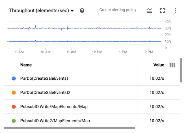
In addition to the data freshness, system latency, and autoscaling graphs that have historically been a part of the Dataflow monitoring experience, you’ll now also see throughput and CPU utilization charts. Throughput charts, shown below, show how many elements (or bytes) are flowing through your pipeline. The time-series graph contains a line for each step of your pipeline, which can quickly illustrate which step(s) of your pipeline could be slowing down the overall processing of your job. Our new time selector tool allows you to drag your cursor over interesting points in the graph to zoom in for higher fidelity.


CPU utilization charts the utilization of your workers over time. These charts can indicate whether you have allocated the appropriate amount of cores for your workers or if you have selected the appropriate amount of workers for your job (assuming you have disabled autoscaling). You can toggle between multiple views, including an all-worker view, stats view, four top-utilized machines, and four least-utilized machines, as shown here:


Developers can create alerts with just a few clicks by using the “Create alerting policy” link in the top right corner of the chart card. You can find job and worker logs in an expandable panel at the bottom of your screen, giving you all of the tools to debug your stuck pipelines.
Dataflow observability in the real world
We’ve heard from customers about how useful this new feature has been already.
“We are loving the new UI! In the last day we've already been using it to track throughput of our pipelines and diagnose issues,” said Vinay Mayar, senior software engineer at Expanse.
It’s been helpful for Ocado too. “The killer feature of the page is the ability to see the throughput for each processing step,” says Mateusz Juraszek, software engineer at Ocado Technology. “It’s great that all the statistics are gathered in one place on the JOB METRICS page. Displaying data freshness and system latency enables us to quickly and preemptively detect anything that might affect reliability, and then use other charts or logs to investigate and address what we discover."
What’s next for pipeline observability
The general availability of these observability charts is our first step toward making Dataflow monitoring the best in class for data engineers. Over the coming months, we plan to add new features including memory and disk usage charts, I/O metrics such as response latencies and error rates for Pub/Sub calls, and visualizers that will significantly enhance the explainability of Dataflow jobs. By spending less time managing reliability and performance and more time extracting value from your data, you can spend your time laying the foundation for tomorrow’s cutting-edge streaming analytics applications.
Learn more about these new Dataflow features.
