Use SRE principles to monitor pipelines with Cloud Monitoring dashboards
Charles Baer
Product Manager, Google Cloud
Data pipelines provide the ability to operate on streams of real-time data and process large data volumes. Monitoring data pipelines can present a challenge because many of the important metrics are unique. For example, with data pipelines, you need to understand the throughput of the pipeline, how long it takes data to flow through it and whether your data pipeline is resource-constrained. These considerations are essential to keeping your cloud infrastructure up and running—and staying ahead of business needs.
Monitoring complex systems that include real-time data is an important part of smooth operations management. There are some tips and tricks you can use to measure your systems and spot potential problems. Luckily, we have excellent guidance from the Google site reliability engineering (SRE) team via Chapter 6 of the Monitoring Distributed Systems book. You’ll find details about the Four Golden Signals, recommended as you’re planning how and what to monitor in your system.
The Four Golden Signals are:
Latency—The time it takes for your service to fulfill a request
Traffic—How much demand is directed at your service
Errors—The rate at which your service fails
Saturation—A measure of how close to fully utilized the service’s resources are
You can use these monitoring categories when considering what to monitor in your system or in a specific data processing pipeline.
Cloud Monitoring (previously known as Stackdriver) provides an integrated set of metrics that are automatically collected for Google Cloud services. Using Cloud Monitoring, you can build dashboards to visualize the metrics for your data pipelines. Additionally, some services, including Dataflow, Kubernetes Engine and Compute Engine, have metrics that are surfaced directly in their respective UIs as well as in the Monitoring UI. Here, we’ll describe the metrics needed to build a Cloud Monitoring dashboard for a sample data pipeline.
Choosing metrics to monitor a data processing pipeline
Consider this sample event-driven data pipeline based on Pub/Sub events, a Dataflow pipeline, and BigQuery as the final destination for the data.
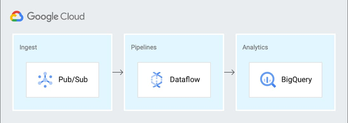
You can generalize this pipeline to the following steps:
Send metric data to a Pub/Sub topic
Receive data from a Pub/Sub subscription in a Dataflow streaming job
Write the results to BigQuery for analytics and Cloud Storage for archival
Cloud Monitoring provides powerful logging and diagnostics for Dataflow jobs in two places: in the Job Details page of Dataflow, and in the Cloud Monitoring UI itself.
Dataflow integration with Cloud Monitoring lets you access Dataflow job metrics such as job status, element counts, system lag (for streaming jobs), and user counters directly in the Job Details page of Dataflow (we call this integration observability-in-context, because metrics are displayed and observed in the context of the job that generates them).
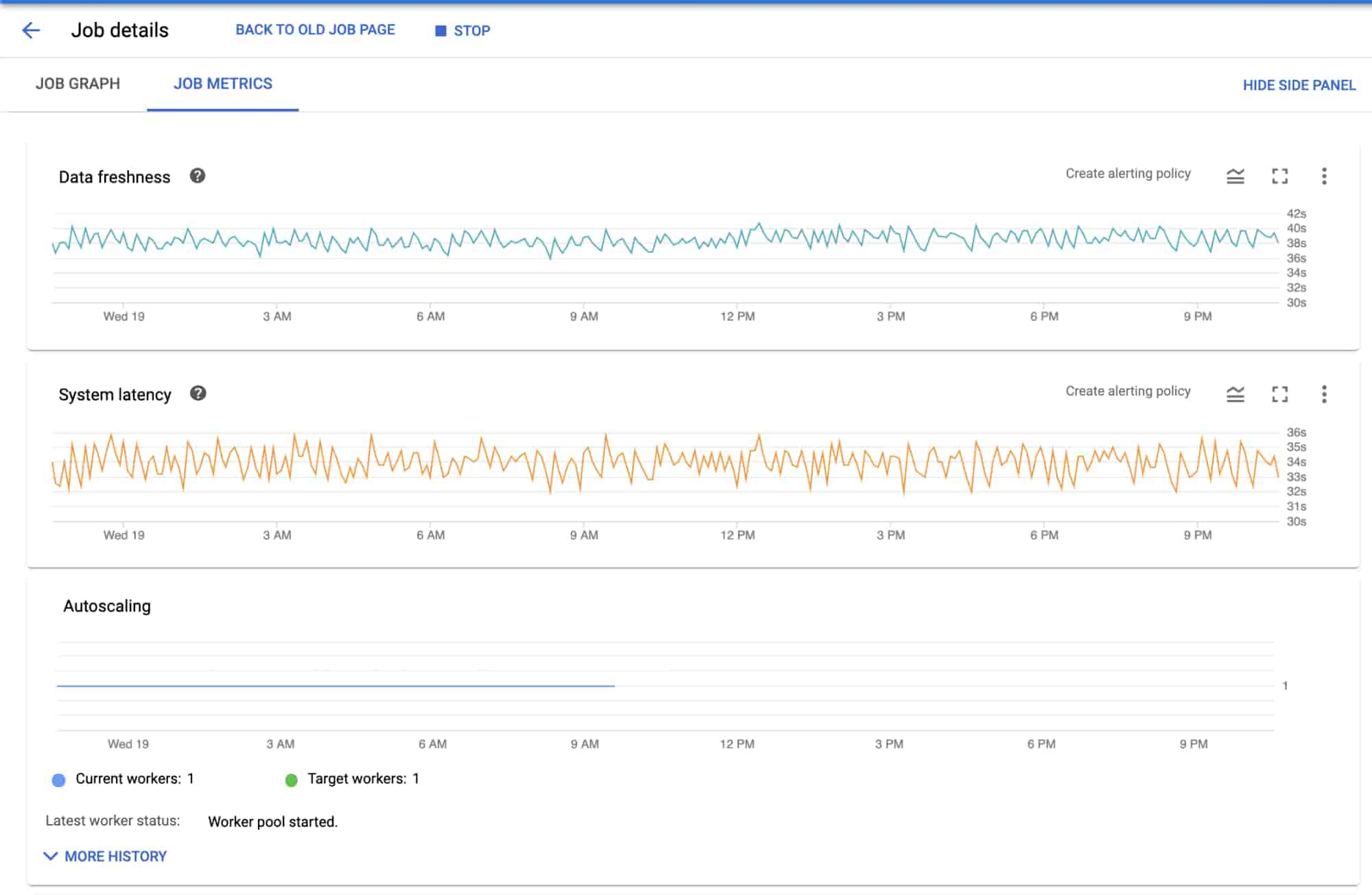
If your task is to monitor a Dataflow job, the metrics surfaced in the Job Details page of Dataflow itself should provide great coverage. If you need to monitor other components in the architecture, you can combine the Dataflow metrics with metrics from the other services such as BigQuery and Pub/Sub on a dashboard within Cloud Monitoring.
Since Monitoring also surfaces the same Dataflow metrics in the Cloud Monitoring UI, you can use the metrics to build dashboards for the data pipeline by applying the “Four Golden Signals” monitoring framework. For the purposes of monitoring, you can treat the entire pipeline as the “service” to be monitored. Here, we’ll look at each of the Golden Signals:
Latency
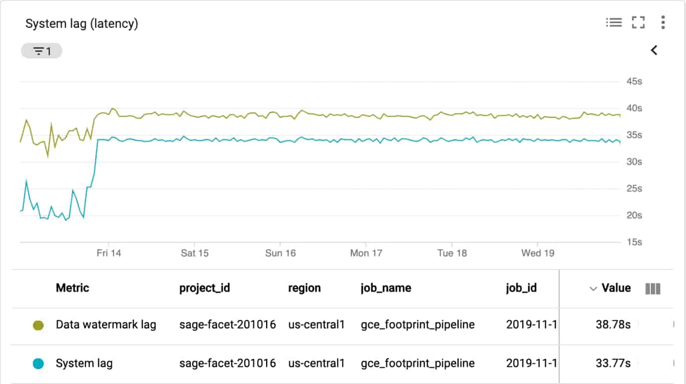
Latency represents how long it takes to service a request over a given time. A common way to measure latency is time required to service a request in seconds. In the sample architecture we’re using, the metric that may be useful to understand latency is how long data takes to go through Dataflow or the individual steps in the Dataflow pipeline.
System lag chart
Using the metrics related to processing time and lag area is a reasonable choice, since they represent the amount of time that it takes to service requests. The job/data_watermark_age, which represents the age (time since event timestamp) of the most recent item of data that has been fully processed by the pipeline and the job/system_lag, which represents the current maximum duration that an item of data has been awaiting processing, in seconds, align well with measuring the time taken to be processed through the Dataflow pipeline, as shown here:
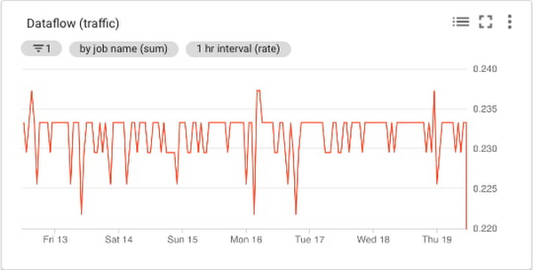
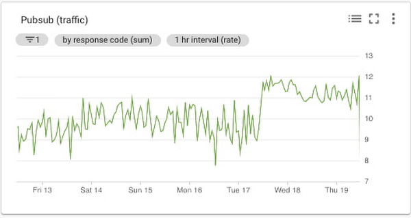
Traffic
Generally, traffic represents how many user requests are being received over a given time. A common way to measure traffic is requests/second. In the sample data pipeline, there are three main services that can provide insight into the traffic being received. In this example, you’ll see we built three different charts for the three technologies in the data processing pipeline architecture (Pub/Sub, Dataflow, and BigQuery) to make it easier to read, because the Y axis scales are orders of magnitude different for each metric. You can include them on a single chart for simplicity.
Dataflow traffic chart
Cloud Monitoring provides many different metrics for Cloud Dataflow, which you can find in the metrics documentation. The metrics are categorized into overall Dataflow job metrics like job/status or job/total_vcpu_time and processing metrics like job/element_count and job/estimated_byte_count.
In order to monitor the traffic through Dataflow, the job/element_count, which represents the number of elements added to the pcollection so far, aligns well with measuring the amount of traffic. Importantly, the metric will increase with an increase in the volume of traffic. So it’s a reasonable metric to use to understand the traffic coming into a pipeline.
Pub/Sub traffic chart
Cloud Monitoring metrics for Pub/Sub are categorized into topic, subscription, and snapshot metrics. Using the metrics for the inbound topics that receive the data is a reasonable choice, since the metrics represent the amount of incoming traffic. The topic/send_request_count, which represents the cumulative count of publish requests, grouped by result, aligns well with measuring the amount of traffic, as shown here:
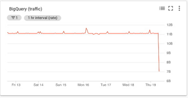
BigQuery traffic chart
Cloud Monitoring metrics for BigQuery are categorized into bigquery_project, bigquery_dataset, and query metrics. The metrics related to uploaded data are a reasonable choice, since the metrics represent the amount of incoming traffic. The storage/uploaded_bytes aligns well with measuring incoming traffic to BigQuery, like this:
Errors
Errors represent application errors, infrastructure errors, or failure rates. You may want to monitor for an increased error rate to understand whether errors reported in the logs for the pipeline may be related to saturation or other error conditions.
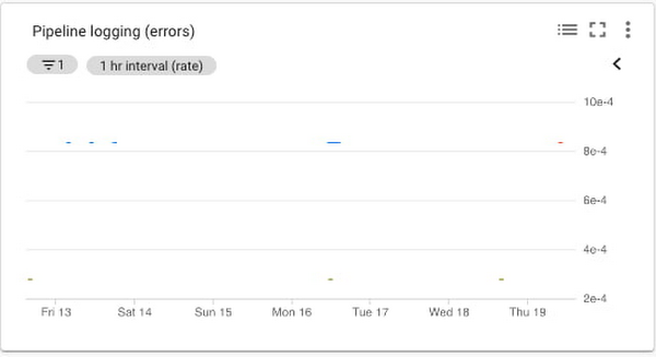
Data processing pipeline errors chart
Cloud Monitoring provides metrics that report the errors that are reported in the logs for the services. You can filter the metrics to limit them to the specific services that you are using. Specifically, you can monitor the number of errors and the error rate. The log_entry_count, which represents the number of log entries for each of the three services, aligns well with measuring the increases in the number of errors, as shown in this chart:
Saturation
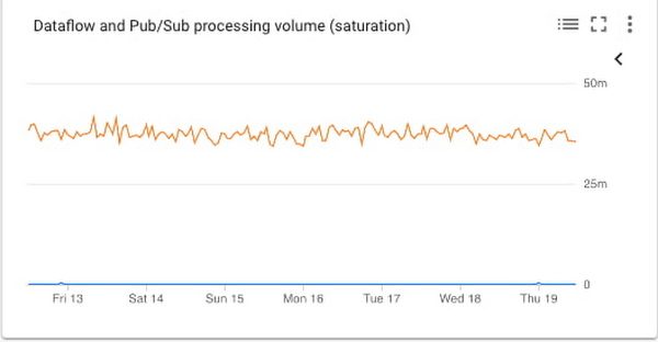
Saturation represents how utilized the resources are that run your service. You want to monitor saturation to know when the system may become resource-constrained. In this sample pipeline, the metrics that may be useful to understand saturation are the oldest unacknowledged messages (if processing slows down, then the messages will remain in Pub/Sub longer); and in Dataflow, the watermark age of the data (if processing slows down, then messages will take longer to get through the pipeline).
Saturation chart
If a system becomes saturated, the time to process a given message will decrease as the system approaches fully utilizing its resources. The metrics job/data_watermark_age, which we used above, and the topic/oldest_unacked_message_age_by_region, which represents age (in seconds) of the oldest unacknowledged message in a topic, align well with measuring the increases in Dataflow processing time and time for the pipeline to receive/acknowledge input messages from Pub/Sub, like so:
Building the dashboard
Putting all these different charts together in a single dashboard provides a single view for the data processing pipeline metrics, like this:
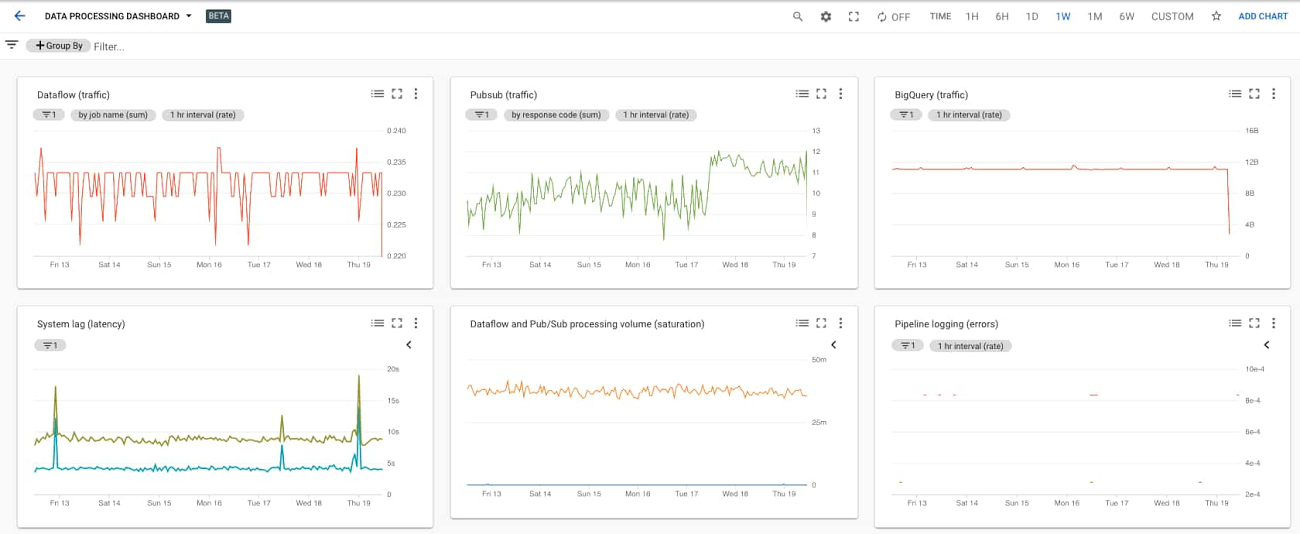
You can easily build this dashboard with these six charts by hand in the Dashboards section of the Cloud Monitoring console using the metrics described above. Building the dashboards for multiple different Workspaces such as DEV, QA, and PROD means a lot of repeated manual work, which the SRE team calls toil. A better approach is to use a dashboard template and create the dashboard programmatically. You can also try the Stackdriver Cloud Monitoring Dashboards API to deploy the sample dashboard from a template.
Learn more about SRE and CRE
For more about SRE, learn about the fundamentals or explore the full SRE book. Read about real-world experiences from our Customer Reliability Engineers (CRE) by reading our CRE Life Lessons blog series.