Decoding the micro-moments of baseball: can you hear the game through data?
Eric Schmidt
Developer Advocate
When the World Series starts tonight, I'll be watching the game as a fan and also through the lens of a Google Cloud Platform developer advocate. As a data wrangler, I want to see if I can get a bit closer to the micro-moments of the game in near real-time.
Baseball is one of the most statistically driven sports. But fans, announcers, coaches and players also talk about “letting the game talk to them” to get insights beyond stats like Batting Averages, ERAs, and WHIPs. What does this really mean? The “talk” can feel like 30 conversations happening all at once —
lots of noise and lots of signal.
To try and decode it, I’ll be using Google Cloud Dataflow to transform data, Google BigQuery to store and query data and Google Cloud Datalab to slice, dice and visualize it. Baseball data, in particular fine grained play-by-play data, presents many challenges around ETL and interactive analysis — areas that GCP tools are particularly well suited to address for data of any size.
To get there I'm publishing a new public data set in BigQuery that contains every pitch from every at bat from all Major League Baseball 2016 regular season and postseason games. This data is a derivate of raw game logs from Sportradar, which graciously allowed me to denormalize and enrich for this exercise. This open data set provides detailed pitch (type, location, speed) and situational factors like runners on base, players in the field, etc. In essence, this dataset lets you replay each game as it happened at the pitch level.
The Harry Doyle Method
During the World Series games, I'll run an analysis that calculates a score for situational pressure facing a pitcher for each pitch and a score for each pitch based on count management, location control and outcome. This analysis is inspired by the movie Major League and called the Harry Doyle Method. I chose it mainly because I wanted to have some fun, and because no one is more fun than Mr. Baseball, aka Bob Uecker, aka Harry Doyle.Interpretation of the Harry Doyle Method is based on two numbers —
the Vaughn Score and the Haywood Score. The Vaughn Score is a pragmatic indication of how well a pitcher is performing. The Haywood Score is an indication of how much pressure the pitcher is under. The scores are aligned at the pitch and then at-bat levels. We can use these scores and their relationship to look at how pressure impacts performance and then dive into factors within a score to gain deeper insight.
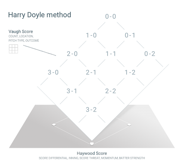

With this data and analysis technique you can do some fun things like compare a pitcher's ability to “control the count” — one factor in the Vaughn Score. For example, below is a comparison of Indians’ pitcher Corey Kluber vs Cubs’ pitcher Jon Lester in their respective last 30 regular season starts. This example of Count Management is based on tracking transitions between counts (not just count-seen) and is then used to calculate the Vaughn Score, which is also impacted by the at-bat outcome of out or on-base and other related outcomes like runs scored.
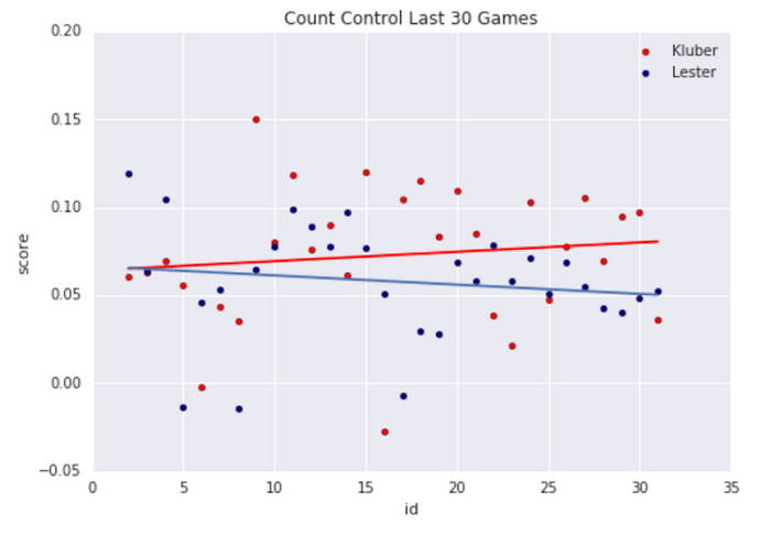

Higher Count Management scores mean that the pitcher is keeping the count to his advantage, for instance, 0 balls and 2 strikes rather than 3 balls and 1 strike. Over the course of a game, a pitcher who stays ahead of the count is more likely to prevent runs due to potentially fewer walks and reduced hits. This is a directional indicator, but it quickly helps pick out performance anomalies like games 9 and 16 for Kluber. And with a simple fit line you can see the overall difference and trend.
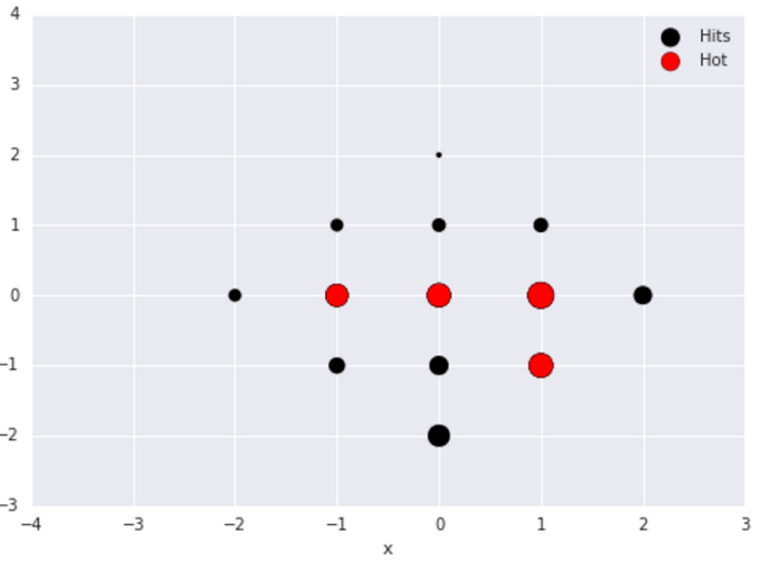
Another approach is to analyze the zone(s) where a batter is “hot” (has a high likelihood of getting a hit) by building odds ratios based on each pitch from each at bat. This is then fed back into the pitcher’s situational pressure calculation — the Haywood score. If a pitcher is feeling “weak” he may not want to throw in that zone.
The graphic below is the vertical plane over home plate and 0,0 is dead down the middle of the strike zone. The bigger the dot, the higher the probability (based on previous performance) the hitter will hit the ball if thrown there. The batter in the graphic below is right handed, so throwing to him anywhere in the middle and especially inside at zone 1,0 could be bad news for the pitcher. If the pitcher is behind in the count on a 3-1, he has more pressure to locate outside of the zone, but he also wants to avoid a walk. At the same time, he might be feeling super-confident and throw a 102MPH fastball down the middle and let the batter take a cut.

As each World Series game progresses, we'll look at trends, anomalies and forthcoming risk and give @googlecloud Twitter followers a taste of what we're “hearing" from the game, answering questions like “Is this pitcher performing at his best?” “What was the probability of the triple play?” and “How strong is the Indians’ remaining bullpen?” I’ll also be publishing via Medium during the games, and expand further upon these tweets.
In addition, I’ve written a white paper that details how and why we built our Harry Doyle Method on GCP. It contains code snippets and detailed step-by-step instructions to help you build your own Harry Doyle Method. You can view it here.
If you want more data beyond the 2016 season head over to Sportradar’s API page for a free trial. And there are other amazing sources of baseball data like Retrosheet and MLB’s Baseball Savant to name a few.
Armed with all that data and GCP tools, maybe you too can find some odd nuggets to impress the baseball fans in your life. Or better yet, even predict who’s going to win this series.

