Architecting live NCAA predictions: from archives to insights
Eric Schmidt
Developer Advocate, Google Cloud
Allen Jarvis
Technical Account Manager, Google Cloud


As we shared in this morning’s blog post, the Final Four this weekend signifies more than just the culmination of March Madness 2018. It’s also our opportunity to share our months-long project building a workstream that can analyze more than 80 years of NCAA data.
As Ohio University Athletic Director Jim Schaus recently told us, it’s one thing to look at data year after year, but it’s another thing entirely to actually see it. Our aim with this collaboration is to help the NCAA not just look at, but actually see the value in their data across the 90 championships and 24 sports the NCAA administers.
Background
Using March Madness as our proving ground, we set out to build a data analytics workflow that could uncover new types of stats, insights, and predictive models to elevate the sophistication of the NCAA’s analytics. We also wanted to highlight the importance of proper tooling to enable collaboration across multiple disciplines, including data engineering, data analysis, data science, quantitative analysis, and machine learning. And while basketball is particularly fun to analyze, the architecture and workflow developed here not only serves as a blueprint for other NCAA sports, but can also extend to other industries or domains, such as retail, life sciences, manufacturing, and others. We’ll also be using this workflow to create real-time predictions—not of the final score or game outcome, but of other stats we expect to see in the second half based on the first half—at halftime during each of the Final Four games. You can read more about that in our blog post here.The road to evolved analysis and predictive modeling isn’t entirely unlike the road to the Final Four: lots of training, practice, and teamwork. Our working group (affectionately dubbed “The Wolfpack”) utilized Google Cloud products and integrations to deliver an architecture for predictive data analytics workflow that has the power to transform the way the NCAA thinks about their data.
We’ll drill into the X’s and O’s of the architecture delivered:
- A flexible and scalable data processing workflow to support collaborative data analysis.
- New analytic explorations through collaboratively developed queries and visualizations.
- Real-time predictive insights and analysis related to the games, modeled around NCAA men’s and women’s basketball.
1. A flexible and scalable data processing workflow to support collaborative data analysis
IngestionEffective data analysis starts with a concrete understanding of the data to be analyzed. In this domain, NCAA basketball data is no different from data you’d see in any business vertical. The raw data is a combination of JSON, XML and CSV files ingested via RESTful services and/or pulled from FTP.
Our initial workflow relied on two primary data sources: play-by-play files from the NCAA, and box score and play-by-play files from Sportradar. These two data sources are related, but different. Sportradar, which is the official data provider for NCAA.com, offers higher fidelity real-time play-by-play data, but only for major conference games. The NCAA has play-by-play data for every game, but has greater latency.
Below is an example of a play-by-play file from the NCAA. The last XML element (highlighted) is interpreted as: the play for the visiting team at 19:23 in the 2nd period by player number 12 was a made three-point shot.
There are more than 5,000 NCAA Division I men’s basketball games per year (and about the same amount of women’s games). When you combine team, player and play-by-play data there are more than 200,000 discrete files for a decade of NCAA basketball data.
The files, like the one above, are the “transactions” of college basketball. If you want to perform comprehensive analysis, you need all of the data and you need it in an actionable format.
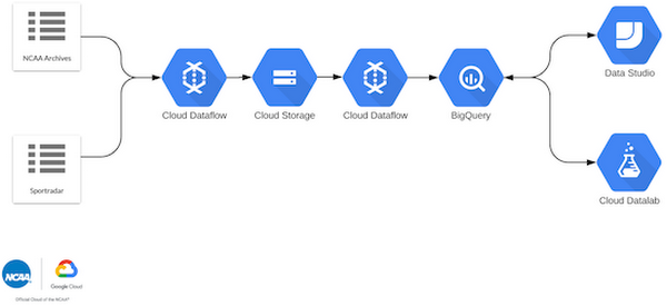
To do this, we used a combination of short-lived tasks on Google Kubernetes Engine, as well as jobs on Cloud Dataflow. We sent all ingested data to Cloud Storage, which became the source of truth for all our raw data.
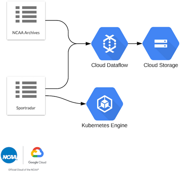

By using Kubernetes Engine and Cloud Dataflow we could rapidly kick off “one-shot” ingestion jobs, e.g., acquire all games within a date range of X to Y. We intentionally configured ingestion this way to stay fast and flexible. (Fun fact: at the beginning of this project, we re-ran jobs almost every day while we dealt with data consistency and schema issues.)
Extract, transform, load (ETL)
To make the raw data actionable, we needed to transform the XML and JSON into structures that could be loaded into BigQuery for analysis or directly with our data science tools.To do this, we turned to Cloud Dataflow to extract the data from Cloud Storage, transform it into those actionable structures, and load them into BigQuery. Whether you have 200,000 files or 200,000,000, the underlying services scale to meet the processing needs of your workflow.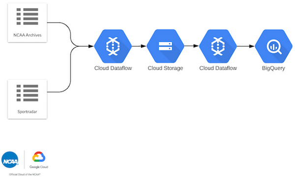

The bulk of our ETL work was done via Apache Beam graphs that were executed by Cloud Dataflow (and we mean bulk: whenever you set out to do predictive modeling and analysis, the vast majority of your work happens before the analysis). We ended up with 10 different graph types written in a mix of Java and Python. Cloud Dataflow enabled us to parallelize the processing of tens of thousands of files in minutes. Like ingestion reprocessing, we re-ran lots of Cloud Dataflow jobs as we caught errors in data formatting, and or got smarter in our BigQuery schema.
The output of these ETL jobs produced a public dataset on BigQuery—a master key that would enable data scientists and analysts around the world to work on this data simultaneously.
2. New analytic explorations through collaboratively developed queries and visualizations.
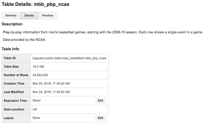
QueriesWith our data loaded into BigQuery, we began analysis. The majority of our analysis revolved around the play-by-play table, which came in at 16.2GB with 24M+ rows. While this is by no means a true ‘big data’ problem, it is big enough to present real challenges for ad hoc analysis, and certainly is more prohibitive for real-time, simultaneous collaboration on the same datasets.
Fortunately, BigQuery is an excellent data warehouse for data both big and small, and allows anyone to express queries in standard SQL without worrying about scaling and index optimization. In turn, this lets anyone share new features to the dataset, and benefit from others as well. All you need to do is write the query and run the query, and BigQuery handles the rest.


You don't build a data warehouse to answer one question. You build it so that you can find the answers to business questions you have now, and questions you haven't even asked yet. We built hundreds of different queries, each focused on a specific analytic goal. We typically built queries that could be layered into views, which gave us room to expand and adapt our lines of inquiry. Our views were layered in the following order:
- Calculate stats from play-by-play (e.g., total three point shots by player by game)
- Calculate cumulative stats over the last 3, 5, and X games. These stats could be min, max, avg, standard deviation (e.g., Loyola (CHI) is averaging Y three-point attempts per game over their last X games as of Z date)
- Rank cumulative stats relative to floor, conference, and all of the NCAA (e.g. Loyola (CHI) is ranked Xth out 351 teams as of date Z for cumulative stat A)
- Denormalize the cumulative stats into a wide game view that showed a team’s stats for a game, their opponent’s stats for the game, the team’s incoming cumulative stats, the team’s opponent’s incoming cumulative stats, and a team’s opponents’ opponents’ cumulative stats.
As we discovered new metrics to add, we simply expanded our queries, updated the views, and let BigQuery do the work. And because the dataset was shared, anyone could pick up a new feature that someone else developed and include it in their model—or visualization.
Visualization
By using BigQuery as our center for queryable data and leveraging the aggregated views, we were able to rapidly build informative and descriptive visuals using two different tools.For development of dashboards and prototyping analysis ideas, we used Google Data Studio. Data Studio enables rapid development of dashboards targeting data sources including Google Sheets, MySQL, Google Analytics, BigQuery, and much more.
For development of more nuanced, data science-focused visualizations, we used Cloud Datalab combined with Seaborn and or Matplotlib. Cloud Datalab provides seamless connectivity to BigQuery through pandas integration.

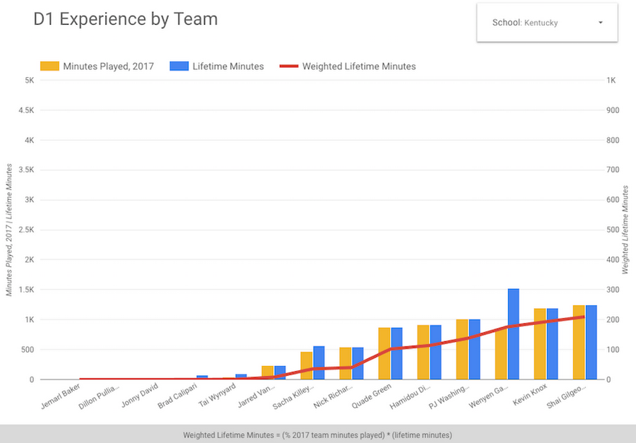
The screenshot below is one example of a Data Studio dashboard we built to contextualize a feature idea. Here we calculate player experience weighted by the number of minutes played. (For the record, Kentucky was the second least experienced team in the tournament.)

For more scientific and domain specific analysis, we turned to Cloud Datalab. Below is a kernel density graph produced by Cloud Datalab showing Kentucky’s three-point make percentage by player relative to their number of three-point attempts in relation to the team’s total attempts.
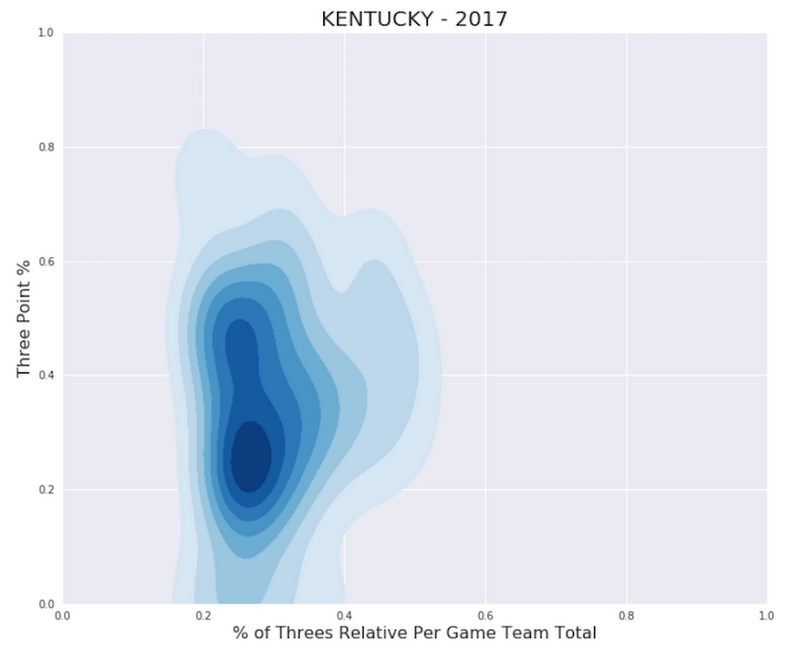

The balance of a team for a specific metric (like this one above) is just one way to illustrate a team’s production, and could be a valuable signal for predictive modeling, as a more balanced team can be more challenging to counteract.
3. Real-time predictive insights and analysis related to the games, modeled around NCAA men’s and women’s basketball.
By now it should be clear that predictive insights don’t emerge in a vacuum—they are the product of rigorous data definition, ingestion, ETL, and exploratory analysis. As a result, our predictions don’t focus on picking winners. Instead of predicting winners or losers (a fairly limited prospect), we wanted to build models that looked at influential features on team performance. These stat-focused predictions surface deeper context about the matchup. After all, it’s not whether you win or lose but how you play the game.As it turns out, if you can accurately predict on key game metrics, you can build a better model to predict outcomes. But we needed to apply an equally rigorous process to our predictive insights development in order to land on the right themes to model. The process unfolded roughly as follows:
Subject matter expertise. For each of our prediction themes, we tapped into numerous basketball subject matter experts. These experts helped us to better understand the interactions between various stats, to suggest what game signals might be predictive in nature, and to ensure we were thinking about college basketball along the right lines. Ultimately, our top predictive themes include combined and team totals for rebounds, assists, and three-point attempts. We also looked at time and score scenarios, specifically in an attempt to predict if a game would become “close and late” (which involved heated debates in defining what a close and late game really is).
Tooling. As we jumped into model development, each team member chose the tools they preferred to use: some used Cloud Datalab, others Anaconda, some R Studio, and a few used Colab. All of the tools integrate with BigQuery, which made it easier to transform signals from queries into features for model training. The majority of the models were built with scikit-learn or TensorFlow and Cloud Machine Learning Engine.
Modeling. We primarily used regression and classification modeling techniques. For “close and late,” we used classification of a binary target and evaluated the models using precision, accuracy, recall, and predicted class distribution. For game stats, we used regression models to estimate a stat total and evaluated the models using root mean squared error. We also used classification techniques to hunt for stats below the 25th percentile and above the 75th percentile. In those cases, we measured the models based on precision and recall.
Features. We engineered well over 800 potential features and then applied variance and univariate statistical tests as well as other preprocessing techniques (e.g., scaling and discretization) to hone our candidate features. Along the way, we populated new views in BigQuery which contained the best features relative to each members’ model performance. Collaborating through BigQuery sped up the feature-vetting process.
Context. The majority of our training data was regular season games. Evaluating model performance on historical regular season data was helpful, but the tournament also brought forth a set of contextual dynamics that you don’t see as much in the regular season (e.g., How does a team perform on a neutral court against a team they may have never seen before?). These deviations motivated us to watch and predict on lots of games and revisit weights for features, and/or to build new features.
Real-time. As we geared up for the Final Four, we implemented some additional workflows that would enable us to make predictions on game context in real time, specifically predicting second half stats as the first half ends. For this, we built a real-time game trailer using Cloud Spanner and Kubernetes. Every two seconds we update the entire game state (including all play-by-play data) in Cloud Spanner, which is great for highly mutating data streams. To make a prediction, we’ll select the latest features prior to the game from BigQuery, add the halftime features derived from Cloud Spanner, and call our trained models.
Finally, our architecture was complete: ingestion, ETL, visualization, models, and real-time tracking all in place. We ended up with the full diagram below in order to make live predictions on the games. Our real-time predictions are then reviewed by an additional team who ultimately pick the most appropriate prediction to feature on the televised broadcast. (Just because we predict something does not mean that it’s always insightful!)
Once approved, we pump our predictions into our rendering system built by Cloneless and Eleven Inc. which then pops out a real-time prediction video, such as, “We expect to see at least 25 three-point attempts combined in the 2nd half with a 78.2% probability.”
And that’s how our Wolfpack gets real-time predictions ready in just a few minutes: with a few months of data ingestion, ETL, analysis, and modeling.


Reviewing the game tape
March Madness provided us an excellent stage for the types of outcomes achievable when deploying cloud architecture at scale. Rather than getting stuck transforming data on a local machine or worrying about updating datasets across systems and teams, we were able to build an entire architecture in a serverless cloud-based environment. Moreover, we were able to demonstrate how much more impact a team can deliver when working collaboratively in the cloud.It was also a great reminder that better data preparation means better data analysis. Many organizations imagine diving in directly to predictive modeling without a critical examination of their data or existing analytic frameworks. If the greatest value is to be found in predictive insights, followed by analysis, supported by clean but raw data, you can imagine the amount of work required to get there as the inverse: a lot of data preparation that paves the way for better analysis, which in turn clears a path for good modeling.
The final output of our real-time prediction ads was made possible by the architecture described here, but they represent only the beginning of what the NCAA can do with its data. To find out more, read our blog post on The Keyword, or tune in to the Final Four this weekend to see the TV spots as they air.

