Explaining model predictions on image data
Sara Robinson
Staff Developer Relations Engineer
Editor's note: This is the second blog post in a series covering how to use AI Explanations with different data types. The first post explained how to use Explainable AI with tabular data.
As machine learning technology continues to improve and models become increasingly accurate, we’re using ML to solve more and more complex problems. As ML technology is improving, it’s also getting more complex. This is one of the reasons that late last year we launched Explainable AI—a set of tools for understanding how your machine learning models make predictions.
In this post, the second in our series on Explainable AI, we’ll dive into how explanations work with image classification models, and how you can use AI Explanations to better understand your image models deployed on Cloud AI Platform. We’ll also show you a new image attribution method we recently launched called XRAI.
XRAI is a new way of displaying attributions that highlights which salient features of an image most impacted the model, instead of just the individual pixels. You can see the effect below, showing which regions contributed to our model’s prediction of this image as a husky. As indicated in the scale, XRAI highlights the most influential regions in yellow, and the least influential in blue, based on the viridis color palette:


You can find more information on XRAI in this paper by Google’s PAIR team. For a broader background on Explainable AI, check out the last post in this series and our whitepaper.
Why use Explainable AI for image models?
When debugging a mistaken classification from a model or deciding whether or not to trust its prediction, it’s helpful to understand why the model made the prediction it did. Explainability can show you which parts of an image caused your model to make a specific classification.
Image explanations are useful for two groups of people: model builders and model stakeholders. For data scientists and ML engineers building models, explanations can help verify that our model is picking up on the right signals in an image. In an apparel classification model, for example, if the highlighted pixels show that the model is looking at unique characteristics of a piece of clothing, we can be more confident that it’s behaving correctly for a particular image. However, if the highlighted pixels are instead in the background of the image, the model might not be learning the right features from our training data. In this case, explanations can help us identify and correct for imbalances in our data.
Let’s walk through an example of using explanations to debug model behavior. Take a look at the attributions for this image, which our model correctly classified as “canoe/kayak”:
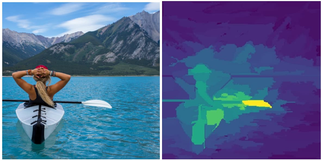

While it classified the picture correctly, the attributions show us that the paddle signaled our model’s prediction most, rather than the boat itself. In fact, if we crop the image to include only the paddle, our model still classifies it as “canoe/kayak” even though it shouldn’t, since there’s no kayak in the picture:


With this knowledge, we can now go back and improve our training data to include more images of kayaks from different angles, both with and without paddles. We’d also want to improve our “paddle” label by adding more images to our training data that feature paddles in the foreground and background.
We also often need to explain our model’s predictions to external stakeholders. For example, if a manufacturing company is using a model to identify defective products, they may not want to take its classification alone at face value before discarding a product labeled as defective by the model. In these cases, it's especially useful to understand the regions in the image that caused the model to make a particular classification.
If you saw our last post, you might wonder how explanations for tabular models relate to those for image models. The methods are actually the same, but we present the results differently. For tabular data, each feature is assigned an attribution value indicating how much that feature impacted the model’s prediction. With image models, you can think of each pixel as an individual feature, and the explanation method assigns an attribution value to every one. To make image attributions more understandable, we also add a layer of post-processing on top to make the insights really pop.
Image explanations on Cloud AI Platform
AI Platform Explanations currently offers two methods for getting attributions on image models based on papers published by Google Research: Integrated Gradients (IG), and XRAI. IG returns the individual pixels that signaled a model’s prediction, whereas XRAI provides a heatmap of region-based attributions. Here’s a comparison of both techniques on the husky image shown above, with IG on the left:
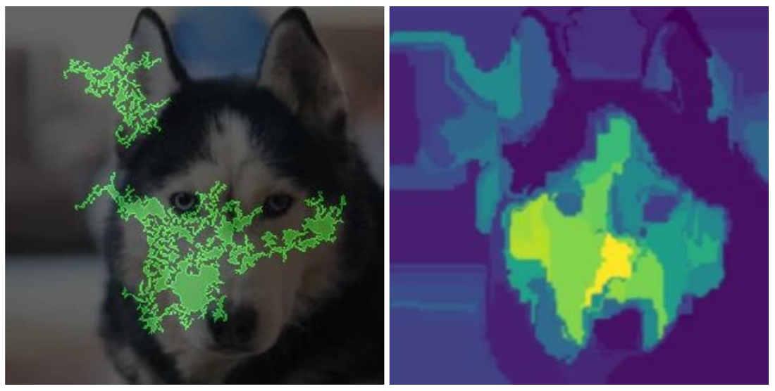

Each approach has specific strengths depending on the type of image data you’re working with. IG is optimal for images taken in non-natural environments like labs. XRAI currently performs best on natural images, like a picture of a house or an animal. IG provides more granularity, since it returns a different attribution value for each pixel in an image. XRAI, on the other hand, joins pixels into regions and shows the relative importance of different areas in an image. This is more effective for natural images, where it's better to get a higher level summary with insights like "the shape of the dog's face" rather than "the pixels on the top left below the dog's eye."
When creating a model version in AI Platform, you can specify the attribution method you’d like to use with just one parameter, so it’s worth trying both IG and XRAI to see which one performs better on your image data. In the next section, we’ll show you how to deploy your image models with explanations.
Preparing your image model for deployment
Once you’ve trained a TensorFlow model for image classification, you need to create an explanation_metadata.json file to deploy it to AI Platform Explanations. This tells our explanations service which inputs in your model’s graph you want to explain, along with the baseline you want to use for your model.
Just like tabular models provide a baseline value for each feature, for image models we’ll provide a baseline image. Typically image models use an uninformative baseline, or a baseline where no additional information is being presented. Common baselines for image models include solid black or white images, or images with random pixel values. To use both solid black and white images as your baseline in AI Explanations, you can pass [0,1] as the value for the input_baselines key in your metadata. To use a random image, pass a list of randomly generated pixel values in the same size that your model expects. For example, if your model accepts 192x192 pixel color images, this is how you’d use a random pixel baseline image in your explanation metadata:
“input_baselines”: [np.random.rand(192,192,3).tolist()]
Here is an example of a complete explanation_metadata.json file for image models. Once your metadata file is ready, upload it to the same Cloud Storage bucket as your SavedModel.
When you deploy TensorFlow image models to AI Platform Explanations, make sure your model serving function is set up to take a string as input (i.e. the client sends a base64-encoded image string), which you’ll then convert to an array of pixels on the server before sending to your model for prediction. This is the approach used in our sample notebook.
Deploying your image model to AI Platform Explanations
You can deploy your model to AI Platform Explanations using either the AI Platform API or gcloud, the Google Cloud CLI. Here we’ll show you an example using gcloud. Changing the explanation method is simply a matter of changing the --explanation-method flag below. In this example we’ll deploy a model with XRAI:
The origin flag above should include the Cloud Storage path of your saved model assets and metadata file. The num-integral-steps flag determines how many steps are used along the gradients path to approximate the integral calculation in your model. You can learn more about this in the XRAI paper.
When you run the command above, your model should deploy within 5-10 minutes. To get explanations, you can either use gcloud or the AI Platform Prediction API. Here’s what the explanation response looks like:
Finally, we can visualize the image explanations that were returned with the following:
Customizing your explanation visualizations
In addition to adding XRAI as a new explanation method, we’ve recently added some additional configuration options to customize how your image explanations are visualized. Visualizations help highlight the predictive pixels or regions in the image, and your preferences may change depending on the type of images you’re working with. Where attributions previously returned images with the top 60% of the most important pixels highlighted, you can now specify the percentage of pixels returned, whether to show positive or negative pixels, the type of overlay, and more.
To demonstrate changing visualization settings, we’ll look at predictions from a model we trained on a visual inspection dataset from Kaggle. This is a binary classification model that identifies defective metal casts used in manufacturing. The image below is an example of a defective cast, indicated by the circular dent on the right:


To customize how your pixel attributions are visualized, the following parameters are available to set in the explanation_metadata.json:
In addition to the pink_green option for color mapping, which is more colorblind friendly, we also offer red_green. More details on visualization config options can be found in the documentation.
To show what’s possible with these customization options, next we’ll experiment with modifying the clip_below_percentile and visualization type parameters. clip_below_percentile dictates how many attributed pixels will be returned on the images you send for prediction. If you set this to 0, leaving clip_above_percentile to the default of 100 your entire image will be highlighted. Whereas if you set clip_below_percentile to 98 as we’ve done in the code snippet above, only the pixels with the top 2% of attribution values will be highlighted.
Below, from left to right, are the IG explanations for the top 2%, 10%, and 30% of positive attributed pixels for this model’s prediction of “defective” on this image:
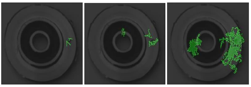

The polarity parameter in the visualization config refers to the sign or directionality of the attribution value. For the images above, we used polarity: positive, which shows the pixels with the highest positive attribution values. Put another way, these were the pixels that were most influential in our model’s prediction of “defective” on this image. If we had instead set polarity to negative, the pixels highlighted would show areas that led our model to not associate the image with the label “defective.” Negative polarity attributions can help you debug images that your model predicted incorrectly by identifying false negative regions in the image.
Low polarity pixels (those with an absolute attribution value close to 0), on the other hand, indicate pixels that were least important to our model for a given prediction. If our model is performing correctly, the least important pixels would be in the background of the image or on a smooth part of the cast.
Sanity checking your image explanations
Image attributions can help you debug your model and ensure it's picking up on the right signals, but it’s still important to do some sanity checks to ensure you can trust the explanations your model returns. To help you determine how accurate each explanation is, we recently added an approx_error field to the JSON response from explanations. In general, the lower the approx_error value, the more confidence you can have in your model’s explanations. When approx_error is higher than 5%, try increasing the number of steps for your explanation method or making sure you’ve chosen a non-informative baseline. For example, if you’ve chosen a solid white image as your baseline but many of your training images have white backgrounds, you may want to choose something different.
You’ll also want to make sure you’re using the right baseline. Besides making sure it reflects the comparison you’re trying to make, you should make sure that it’s generally “non-informative.” This means that your model doesn’t really “see” anything in the baseline image. One simple check for this is to ensure that the score for each predicted class on the baseline is near 1/k, where k is the number of classes.
While looking at approx_error and experimenting with different baselines can help you understand how much to trust your explanations, they should not be used as your only basis for evaluating the accuracy of your explanations. Many other factors affect explanation quality, including your training data and model architecture.
Finally, it’s worthwhile to keep in mind the general caveats of any explanation method. Explanations reflect the patterns the model found in the data, but they don’t reveal any fundamental relationships in your data sample, population, or application.
Next steps
We’ve only scratched the surface on what’s possible with image explanations. Here are some additional resources if you’d like to learn more:
For a full code sample of building and deploying an image model with explanations, check out this notebook
We’d love to hear your thoughts and questions about this post, so please don’t hesitate to reach out. You can find me on Twitter at @SRobTweets. And stay tuned for the next post in this series, which will cover how to summarize and present model explanations to external stakeholders.

