Understanding Cloud Spanner performance metrics at scale with Key Visualizer
Justin Makeig
Senior Product Manager, Google
Hailong Wen
Software Engineer, Cloud Spanner
Cloud Spanner is a distributed relational database that’s designed for consistency and availability at scale. Like Google’s best known products, organizations in financial services, retail, gaming, and many other industries also rely on Spanner for their most demanding “run-the-business” workloads. The development and operations (DevOps) teams running these applications need to understand how Spanner uses compute and storage resources to size their usage and optimize their schemas and queries.
We are happy to announce the launch of Key Visualizer, a new interactive monitoring tool to analyze usage patterns in Spanner. It reveals trends and outliers in important performance and resource metrics for any size database. Designed for performance tuning and instance sizing, you can use Key Visualizer today in the web-based Cloud Console for all Spanner databases at no additional cost. It is available now in public preview.
Partitioning Data for Scalability and Availability
Like most distributed systems, Spanner partitions data and processing across multiple machines in a regional or multi-regional configuration. Unlike typical scale-up databases, though, Spanner manages the partitions automatically, scaling out without brittle manual sharding. By dynamically partitioning tables into smaller ranges of rows, or splits, and replicating those splits across isolated infrastructure, Spanner delivers up to 99.999% availability, the highest of any scale-out relational database.
A row’s primary key determines which split it lives in. Choosing the right keys can help Spanner evenly distribute data and processing to avoid hotspots, where rows contend for the same resources, such as I/O for accessing data or CPU for running queries. Understanding how resources are used across the key space of a database can also reveal patterns in the data and the workloads accessing it, providing insight into sizing and provisioning.
This is where Key Visualizer can help.
Understanding Usage Patterns
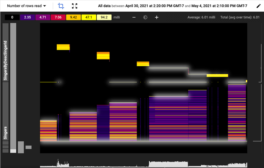
The screenshot below shows Key Visualizer in action.


The visualization displays resource and performance metrics along three dimensions:
Time is represented along the X-axis - in this graphic it is in hours.
Key space is on the Y-axis. All the rows across all tables and indexes in the current database are divided into up to 1,000 ordered row ranges. The ranges are displayed hierarchically by table or index.
For each time and row range intersection, Key Visualizer shows the aggregate value of a metric, such as bytes written. Rather than just showing a number, Key Visualizer represents the range of values for that metric from low to high along a color spectrum: low or “cold” values show up as dark blue and purple and “hot” values as yellow, and white. This spectrum of values and their corresponding colors is shown above the heatmap.
This compact display allows you to quickly spot trends and outliers over tens of thousands of individual measures. For example, in the heatmap above there is a diagonal pattern of high read traffic on the SingerByDescSingerID index. Cross-referencing that with execution plans for high latency queries that show up in the Query Statistics can help triangulate a bottleneck.
You can use the crop tool to focus in on a particular area of the heatmap for more detailed analysis, panning and zooming interactively. Hovering over a measure shows its value and other details.
Available Metrics
Key Visualizer automatically aggregates six different metrics for each row range and time window. These aggregates are normalized by the number of rows in each row range to compare relative values over time and key space. You can select which metric to display from the dropdown in the upper left corner.
CPU seconds: The approximate total time spent reading or writing to a row range.
Logicial bytes stored: The effective total amount of storage used, including multiple versions of updated data that hasn’t yet been cleaned up.
Number of rows read: The number of rows that were accessed by SQL queries or Spanner’s read APIs.
Number of bytes read: The total size of those rows that were read
Number of rows written: The number of rows that were updated using SQL DML or Spanner’s mutation API.
Number of bytes written: The total size of those rows written.
Debugging a Hotspot
One of the…ahem!…key benefits of Key Visualizer is the ability to pinpoint hotspots. A hotspot is when a small number of row ranges use an inordinate amount of resources, starving other activities and creating a bottleneck. Hotspots show up as bright horizontal or diagonal areas in the heatmap. While bright areas in the heatmap may indicate a hotspot, a healthy, active database will typically have a well distributed mix of light and dark, with occasional bright streaks. The product documentation covers hotspots in more detail, but here’s a quick overview of the types of patterns you might encounter with Key Visualizer.
For example, the following shows two distinct row ranges that are persistently hotter than other ranges.


Often a hotspot will show up intermittently. Take the follow example:


This visualization indicates a sudden burst of activity concentrated on two row ranges. This could be the result of an application bug that introduces a rogue query, a schema change that affects how row keys are distributed, or an indicator of a new traffic pattern.
Most common, though, are diagonal or triangular patterns in row ranges over time.


A diagonal line indicates that data is accessed sequentially, by key. This could be the result of bulk export that does the equivalent of a full table scan or inserts that use a numeric sequence to determine the next key. While ubiquitous in typical single instance databases that don’t have to contend with consistency over distributed infrastructure, ordered keys are generally an anti-pattern in Spanner. Because Spanner uses keys to partition the data, inserting or updating rows that have keys in close succession will often lead to resource contention. Best practice is to use a synthetic primary key that is well distributed, such as a UUID, and, if necessary, maintain natural keys, such as an order number or user name, in a separate column. You can index the natural key if your application frequently filters or joins on it.
Next Steps
Key Visualizer is a new tool available to administrators and developers to better understand how their applications interact with Spanner. It complements Spanner’s existing suite of introspection and monitoring capabilities to simplify performance optimization and resource management. Key Visualizer is available today as a public preview. You can enable it from the Cloud Console.


