Giving you better cost analytics capabilities—and a simpler invoice
Amitai Rottem
Product Manager, reCAPTCHA Enterprise
Invoices are an important part of your ability to record and track spending and attribute it back to purchase orders and department budgets. They’re also often required for enterprises by law for financial record keeping and audits.
However, a typical invoice doesn’t offer the level of detail that a financial operations (FinOps) team needs to accurately report out across all your cloud services, your organizational hierarchy, and how you use those services. Our data shows that many companies use dozens of Google Cloud services, across tens to hundreds of projects, and some of our customers’ invoices are over 20 pages long! Nor do invoices let FinOps teams perform data-driven analysis or predict future cloud costs.
At Google Cloud, we enable you to monitor and analyze costs by providing transparency and clarity about your cloud spending. We provide tools that present a timely, consistent, relevant and complete records of all your charges, credits, and payments.
Instead of overloading invoices with all this detail, we’ve been simplifying them—pointing you to the Google Cloud Console for granular details of all your cloud consumption. At the same time, we’re creating more detailed cost analytics tools in the Cloud Console, including new graph and table views, plus ways to export billing data to CSV and BigQuery. With this approach, we think you’ll get easier access to the information you need, according to your role in your company—so you can better analyze costs and predict future expenditures.
Let’s take a look at some of the cost management tools in the Cloud Console, and how to use them.
Cloud Console, reporting for billing duty
There are two main pages in the Cloud Console designed to help you understand your costs: Cloud Billing reports and the Cost Table report.
The Billing Reports page lets you view usage costs at a glance so you can discover and analyze trends. It’s especially useful because it lets you see which products and geographical regions contributed to the most spend in a simple and chart-based format, and analyze costs by your organizational structure, which are often represented as Folders, Projects or Labels.
The Cost Table report, on the other hand, presents a detailed, tabular view of your monthly costs for a given invoice month. The Cost Table matches your statement total, effectively reconciling your invoice. Then, you can dynamically filter, sort and group the various line items, so you can better understand the costs associated with your invoice.
Examples always help, so let’s take a look at a few ways of analyzing your invoice that you can now perform from Cloud Console’s Billing Reports and Cost Table pages. We’ve added many features to these areas in the past year, and plan to continue to invest heavily in these pages going forward.
Understanding costs by SKU
Your invoice today includes a per-SKU breakdown. SKUs, which you can think of as Google’s parts list, are more granular than product families, including information such as product configuration (e.g., VM sizes), and location. Analyzing your costs organized by SKU helps you identify the specific Google Cloud services that make up your monthly bill. Here’s a per-SKU view from the Billing Reports page, which lets you quickly see which SKUs are contributing to your monthly bill.
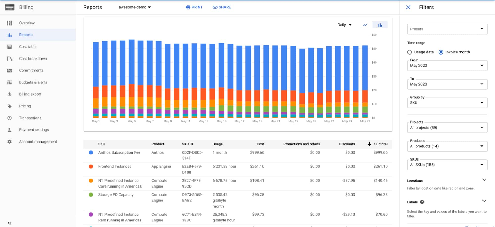

Here, we’ve set our time range to “Invoice month” and chosen the invoice we’re interested in analyzing—May 2020. We’ve chosen to “Group by SKU” and kept all our projects, products and SKUs selected. Below the graph, we're sorting the table by Subtotal, which reflects committed-use and sustained-use discounts, and any credits for which the account is eligible.
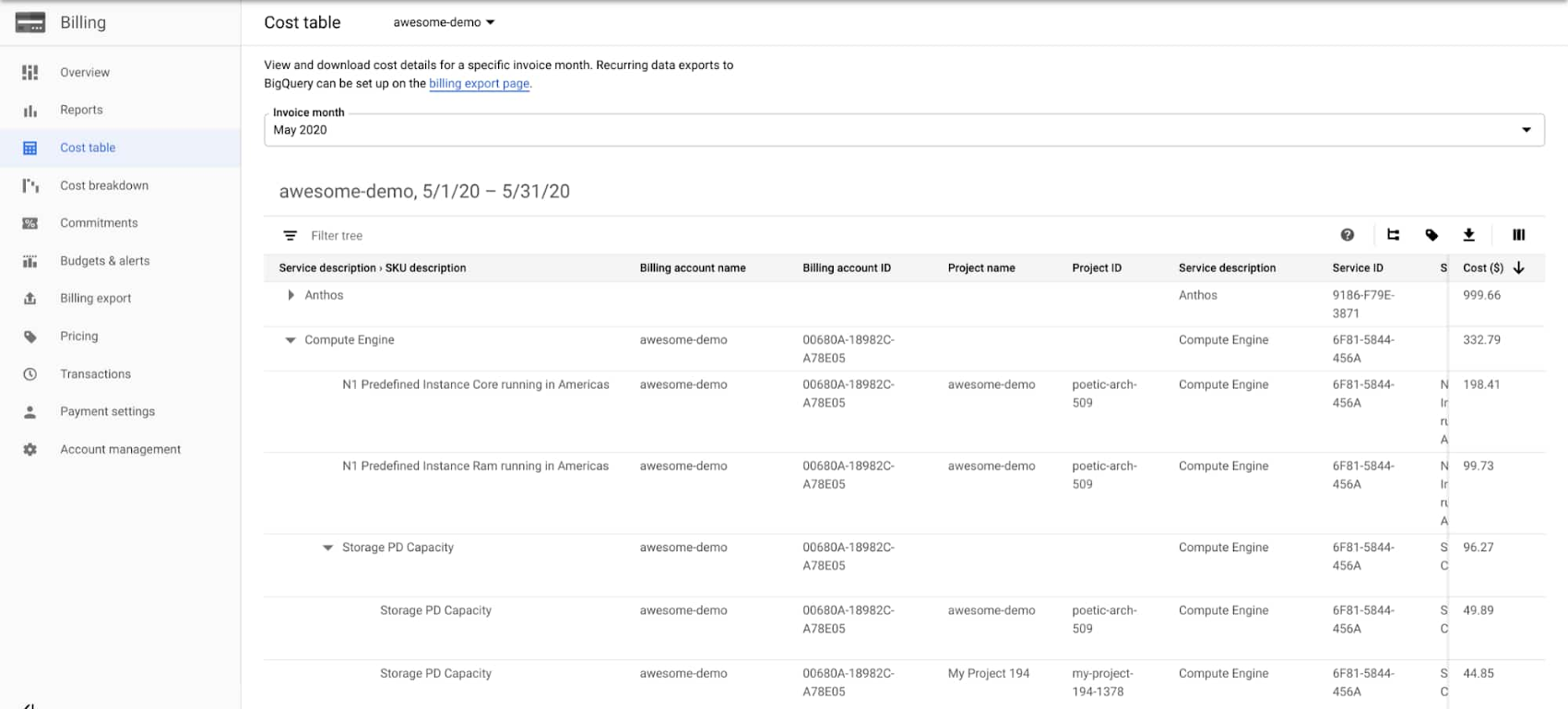
Similarly, you can get SKU-level information from the Cost Table report. One of the benefits of this view is that it highlights the data in a tabular format, which you can export to CSV. Another cool feature is the ability to group the results by multiple fields, using our recently introduced “Table Configuration” option found on the top right of the table.
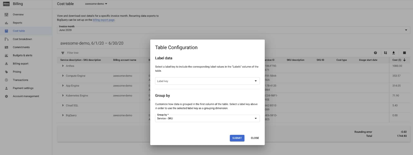

In this example, we’ve used one of the predefined grouping options, “Service > SKU”, which first groups by Service name, and then nests the SKUs.
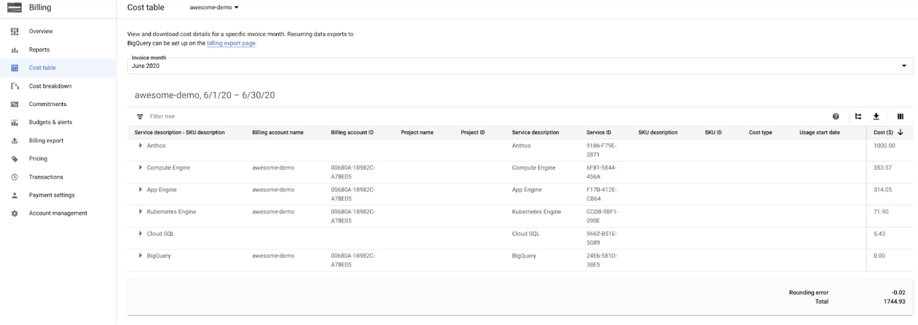

In the previous Billing Reports page example, Compute Engine was split into multiple rows, including instance size and storage. Here, in the Cost Table, we have an aggregated view of all costs incurred to the product for that invoice month cycle, but we can just as easily expand the Compute Engine row and see SKU-level details.

Understanding costs per project
Customers frequently ask how to attribute cloud costs by the projects that incurred them, as projects often relate directly to specific work happening in a company.
Up until last year, a Google Cloud invoice included costs per project, but we removed that as many large companies had hundreds, if not thousands, of projects, which doesn’t scale in a PDF format.
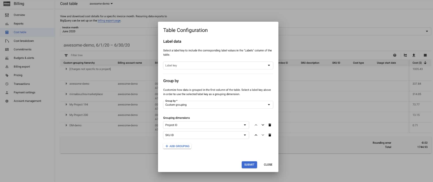
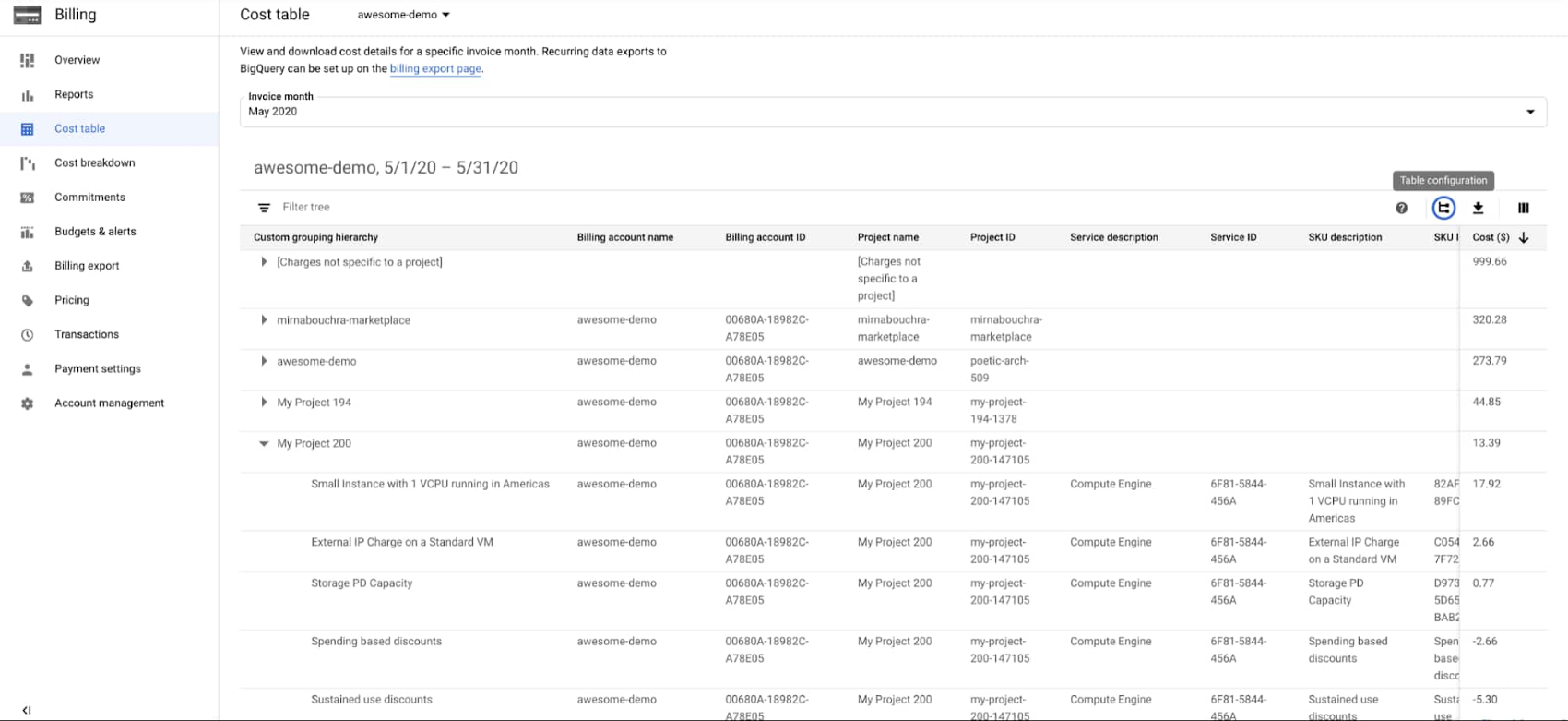
Now, you can find that information in the Cloud Console instead. Let’s see how to do it using the Cost Table report first. Choose the “Table Configuration” option. We won’t choose one of the pre-defined options as we did before. Choose “Custom grouping”, and in dimensions choose “Project ID” and then “SKU ID”. The result will look like this:

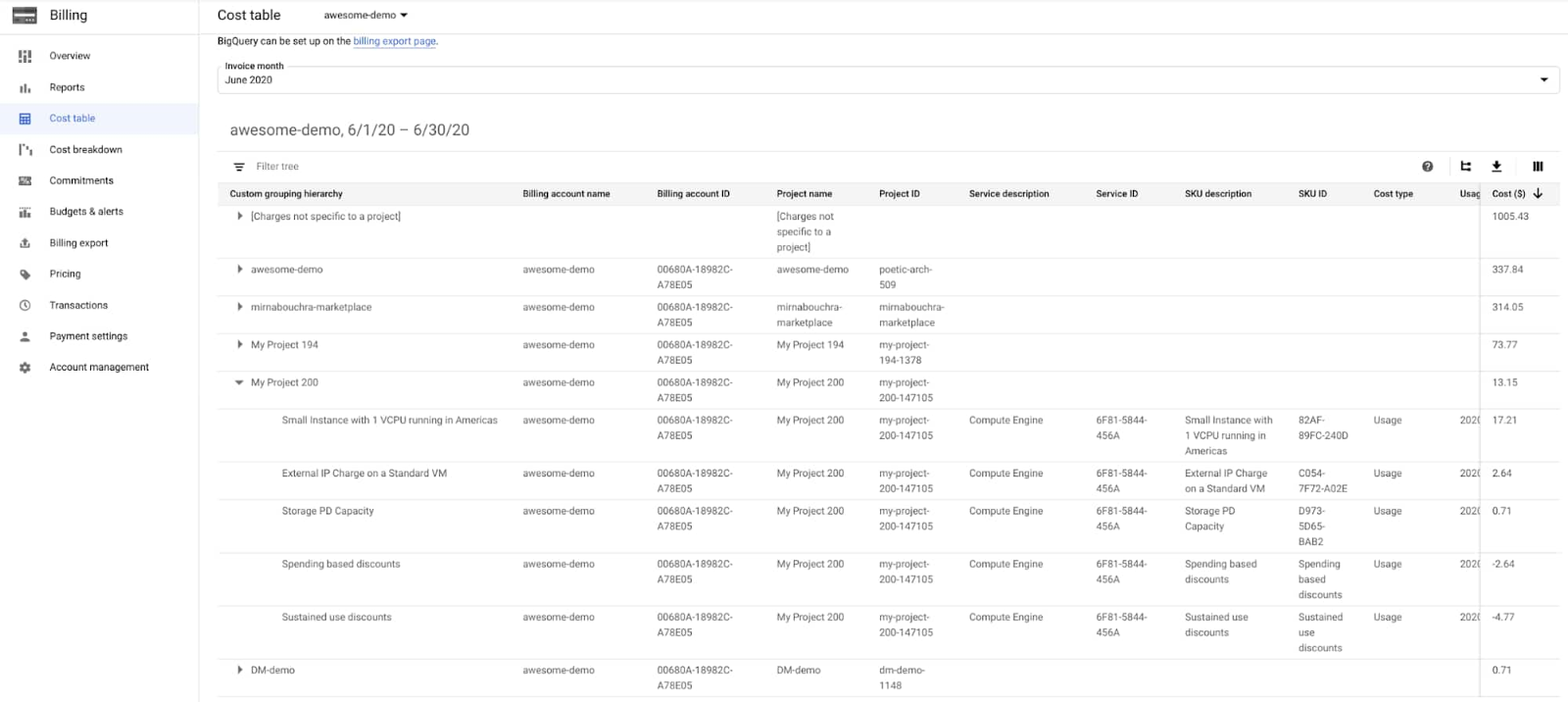

Because we’ve ordered our results according to total cost, we can see projects ordered by their total cost. And then, when we expand “My Project 200”, we see the per-SKU costs ordered by highest to lowest. We recently introduced the ability to allocate spending based and sustained use discounts across multiple projects. In this group-by, we can see how discounts are attributed to a specific project.
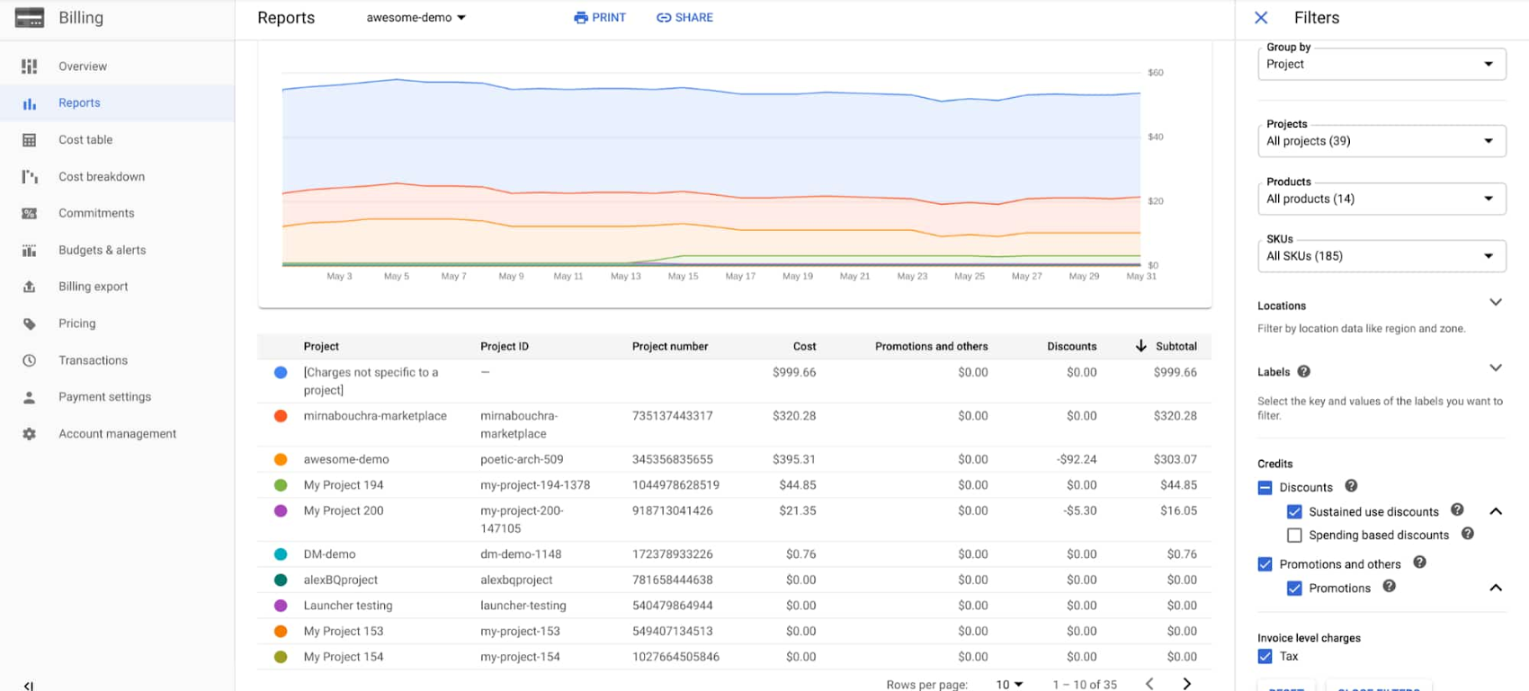
Speaking of discounts, one of the advanced capabilities of the Billing Reports page is filtering by credit type. For example, you might want to see your spend grouped by project, taking into account all types of credits, except the spending-based discounts. This might be useful if you want to hypothesize about what your bill might have been had you not been eligible for these discounts. To do so, group your spending by “Project”, and deselect the “Spending-based discounts'' option, as you can see in the lower right-hand corner.

Filtering by labels
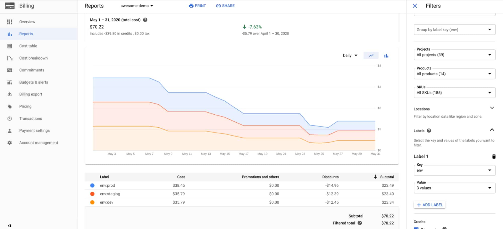
Labels are an important way to add metadata to your resources, so you can understand fine-grained details of your costs. For example, imagine you receive your monthly invoice and want to understand how your development environments contributed to the total. In this example, we’ve tagged resources with a label with the key “env”, and values of “prod”, “staging”, “dev”. We’ll use the Billing Reports page grouped by “label”, and then choose “env” as the key. Then, under the “Label” filter, we choose to only filter charges that have the key “env”, and keep the default selection of all three of the chosen environments. This results in the following report

Understanding credits
What if you want to understand the impact of various credits on specific projects or products?
Credits are SKUs in their own right. From the Cost Table report, you use the new custom group-by feature, and set it to “Project”, then “SKU”. Notice how you can see the spending-based discounts and sustained use discounts attributed to “My Project 200”.

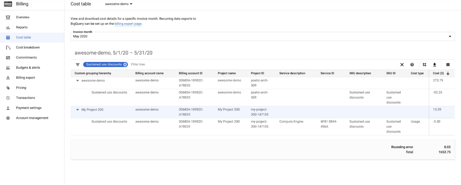
Then, if you want to understand how a specific credit, for example, a sustained use discount, affected your invoice across projects, simply add a filter for “Sustained use discount”. The result will be similar to below, where you can see one row per credit per project.

Using other tools to analyze the data
We understand that no matter how many cost reporting and analysis features we add, there comes a time when you want to use other data analytics tools. That’s why we’ve made all the data presented to you available via CSV export. The CSV export feature takes the flat list of cost list items, together with all the data you can see on screen, into a file that can be easily read by most data processing tools, for example Google Sheets. Alternatively, for more detailed or programmatic data analysis, you can export your cost to BigQuery and analyze it using a tool like Data Studio.
Supercharging cost analysis and reporting
If you’ve read this far, you know that we’ve made a lot of improvements to our cost reporting user interface—with many more to come. Together with data exports to CSV and BigQuery, you can analyze and report on the data as you see fit. While you’ll still want your Google Cloud invoice for accounting purposes, going forward, these are the tools we recommend for building cost analysis workflows. Click here to learn more about our cost management capabilities, and be sure to register for the Google Cloud Next ‘20: OnAir session, What’s New in Google Cloud Cost Management.
