Tune up your SLI metrics: CRE life lessons
Adrian Hilton
Customer Reliability Engineer, SRE
Yaniv Aknin
Site Reliability Engineer
The site reliability engineering (SRE) we practice here at Google comes to life in our customer reliability engineering (CRE) teams and practices. We support customers during their daily processes, as well as during peak events where traffic and customer expectations are high.
CRE comes with some practical metrics to quantify service levels and expectations, namely SLOs, SLIs and SLAs. In previous CRE Life Lessons, we’ve talked about the importance of Service Level Indicators (SLIs) to measure an approximation of your customers’ experience. In this post, we’ll look at how you can tune your existing SLIs to be a better representation of what your customers are experiencing.
If you’re just getting started with your own SRE practice, it’s important to remember that almost any SLI is better than no SLI. Putting numbers and concrete goals out there focuses the conversation between different parts of your org, even if you don't use your fledgling SLIs to do things like page oncallers or freeze releases. Quantifying customer happiness metrics is usually a team journey, pretty much no one gets it right the first time...
SLIs can help you understand and improve customer experience with your site or services. The cleaner your SLIs are, and the better they correlate with end-user problems, the more directly useful they will be to you. The ideal SLI to strive for (and perhaps never reach) is a near-real-time metric expressed as a percentage, which varies from 0%—all your customers are having a terrible time—to 100%, where all your customers feel your site is working perfectly.
Once you have defined an SLI, you need to find the right target level for it. When the SLI is above the target, your customers are generally happy, and when the SLI is below the target, your customers are generally unhappy. This is the level for your Service Level Objective (SLO). As we have discussed in previous CRE Life Lessons, SLOs are the primary mechanism to balance reliability and innovation, and so improving the quality of your SLO lets you judge this balance better, guiding the strategy of your application development and operation.
There’s also a tactical purpose for SLIs: once you have a target level for them, you can start to use it to drive your response to outages. If your measured SLI is too far below your target level for too long, you have to assume that your customers are having a bad time and you need to start doing something about it. If you’re a bit below target, your on-call engineer might start investigating when they get into the office. If you’re critically below target, to the point where you’re in danger of overspending your error budget, then you should send a pager alert and get their immediate attention.
But all this presumes that your SLIs represent customer experience. How do you know whether that’s true in the first place? Perhaps you're wasting effort measuring and optimizing metrics that aren't really that important? Let’s get into the details of how you can tune SLIs to better represent customer experience.
In search of customer happiness
For the purposes of this blog post, let’s assume that you’ve defined—and measured—an initial set of SLIs for your service, but you don’t know yet what your SLO targets should be, or even whether your SLIs really do represent your customers’ experience. Let’s look at how to find out whether your SLIs need a tune-up.
A good SLI will exhibit the following properties:
- It rises when your customers become happier;
- It falls when your customers become less happy;
- It shows materially different measurements during an outage as compared to normal operations;
- It oscillates within a narrow band (i.e., showing a low variance) during normal operations.
The fourth property is fairly easy to observe in isolation, but to calibrate the other properties you need additional insights into your customers’ happiness. The real question is whether they think your service is having an outage.
To get these “happiness” measurements, you might gauge:
- The rate at which customers get what they want from your site, such as commercial transaction completion rates (for an e-commerce application) or stream concurrent/total views (for streaming video);
- Support center complaints;
- Online support forum post rates; and perhaps even
- Twitter mentions.
Compile this information to build a picture of when your customers were experiencing pain. Start simple: you don't need a "system" to do this, start with a spreadsheet lining up your SLIs' data with, say, support center calls. This exercise is invaluable to cross-check your SLIs against "reality". A correlation view might look like the following overlay on your SLI graph, where pink bars denote customer pain events:

This example shows that your SLI is quite good but not perfect; big drops tend to correlate with customer pain, but there is an undetected pain event with no SLI drop and a couple of SLI drops without known pain.
Testing customer SLIs during peak events
One good way to test your SLI against your customers’ experience is with data from a compelling event—a period of a few days when your service comes under unusually heavy scrutiny and load. For retailers, the Black Friday/Cyber Monday weekend at the end of November and Singles' Day on November 11 are examples of this. During these events, customers are more likely to tell you—directly or indirectly—when they’re unhappy. They’re racing to take advantage of all the superb deals your site is offering, and if they can’t do so, they’ll tell you. In addition to those who complain, many more will have left your site in silent displeasure.
Or suppose that your company’s service lets customers stream live sports matches. They care about reliability all the time, but really care about reliability during specific events such as the FIFA World Cup final, because nearly everyone is watching one specific stream and is hanging on every moment of the game. If they miss seeing the critical goal in the World Cup final because your streaming service died, they are going to be quite unhappy and they’re going to let you know about it.
Be aware, however, that this isn’t the whole story; it tells you what “really bad” looks like to your customers, but there is generally not enough data to determine what “annoying” looks like. For the latter, you need to look at a much longer operational period for your service.
Analyzing SLI data
Suppose you had a reasonably successful day, with no customer-perceived outages that you know about. So your customer happiness metric was flat, but your 24-hour SLI view looks like the diagram below.
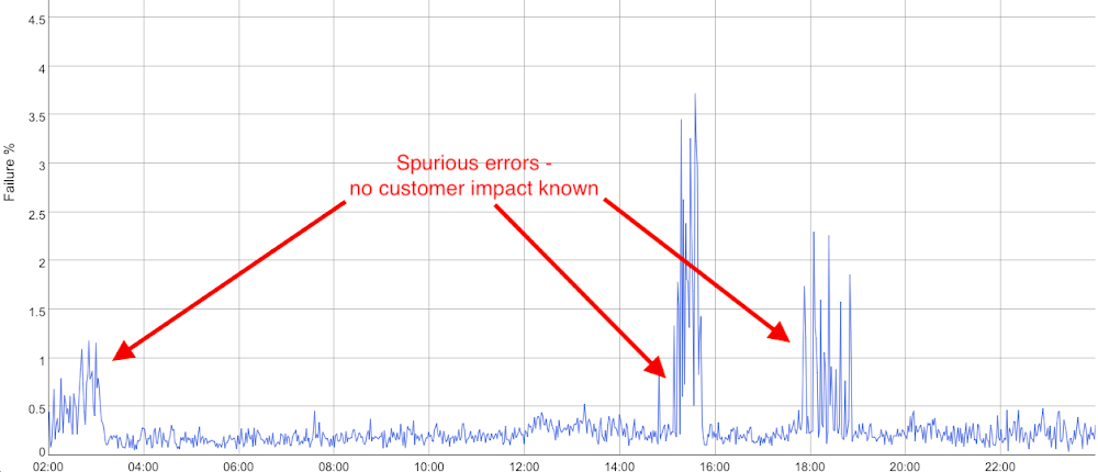
This presents you with a problem. You have three periods in the day where your failure rate is much higher than normal, for a significant amount of time (30-plus minutes). Your customers aren’t complaining, so either you’re not detecting customer complaints, or your SLI is showing errors that customers aren’t seeing. (See below for what to do in this situation.)
On the other hand, if you see the following with the same lack of customer complaint history:
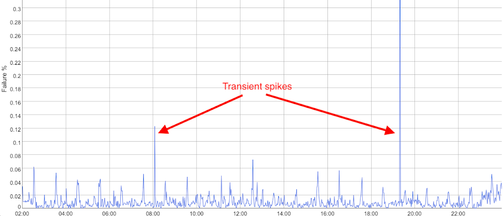
Then this suggests you might have quite a good SLI. There are a couple of transient events that might relate to glitches in monitoring or infrastructure, but overall the SLI is low in volatility.
Now let’s consider a day where you know you had a problem: Early in the day, you know that your users started to get very unhappy because your support call volume went through the roof around 9am, and stayed that way for several hours before tailing off. You look at your SLI for the day and you see the following:
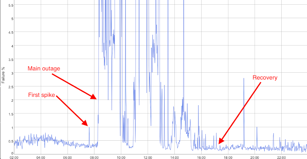
The SLI clearly supports the customer feedback in its general shape. You see a couple of hours when the error rate was more than 10x normal, a very brief recovery, another couple of hours of high error rate, then a gradual recovery. That’s a strong signal that the SLI is correlated with the happiness of your users.
The most interesting point to investigate is the opening of the incident: Your SLI shows you a transient spike in errors (“First spike” in the diagram), followed by a sustained high error rate. How well did this capture when real users started to see problems? For this, you probably need to trawl through your server and client logs for the time in question. Is this when you start to see a dip in indicators such as transactions completed? Remember that support calls or forum posts will inevitably lag user-visible errors by many minutes—though sometimes you will get lucky and people will write things like “about 10 minutes ago I started seeing errors.”
At least as important: Consider is how your failure rate scales compared to the percentage of users who can complete their transactions. Your SLI might be showing a 25% error rate, but that could make your system effectively unusable if users have to complete three actions in a series for a transaction to complete. That would mean the probability of success is 75% x 75% x 75%, i.e., only 42%, and so nearly 60% of transaction attempts would fail. (That is, the failure rate is cumulative because users can’t attempt action two before action one is complete).
My customers are unhappy but my SLIs are fine
If this is your situation, have you considered acquiring customers who are more aligned with your existing SLIs?
We’re kidding, of course—this turns out to be quite challenging, not to mention bad for business, and you may well end up believing that you have a real gap in your SLI monitoring. In this case, you need to go back and do an analysis of the event in question: Are there existing (non-SLI) monitoring signals that show the user impact starting to happen, such as a drop in completed payments on your site? If so, can you derive an additional SLI from them? If not, what else do you have to measure to be able to detect this problem?
At Google, we have a specific tag: “Customer found it first” when we’re carrying out our postmortems. This denotes a situation when the monitoring signals driving engineer response didn’t clearly indicate a problem before the customers noticed, and no engineer could prove that an alert would have fired. Postmortems with this tag, where a critical mass of customers noticed the problem first, should always have action items addressing this gap. That may be either expanding the existing set of SLIs for the service to cover these situations, or tightening the thresholds of existing SLOs so that the violation gets flagged earlier.
But wait: You already have some signals for “customer happiness,” as we’ve noted above. Why don’t you use one of them, such as support center call rates, as one of your SLIs? Well, the principle we recommend is that you should use reports of customers’ dissatisfaction as a signal to calibrate your SLIs, but ultimately you should rely on SLIs rather than customer reports to know how well your product behaves.
Generally, the decision about using these as SLIs comes down to a combination of signal resolution and time lag. Any signal which relies on human action inevitably introduces lag; a human has to notice that there’s a problem, decide that it’s severe enough to act on, then find the right web page to report it. That will add up to tens of minutes before you start getting enough of a signal to alert your on-call. In addition, unless you have a huge user base, the very small fraction of users who care enough about your service to report problems will mean that user reports are an intrinsically noisy signal, and might well come from an unrepresentative subset of your users.
There’s also the option of measuring your SLIs elsewhere. For instance, if you have a mobile application, you might measure your customers’ experience there and push that data back to your service. This can improve the quality of your SLI measurement, which we’d strongly encourage, providing a clearer picture of how bad an incident was - and how much error budget it spent. However, that can cause your data to take longer to arrive in your monitoring system than when you measure your service performance directly, so don’t rely on this as a timely source of alerts.
My SLIs are unhappy but my customers are fine
We often think of this situation as one of “polluted” SLIs. As well as transient spikes of failures that users don’t notice, your SLI might show periodic peaks of errors from when a batch system sends a daily (or hourly) flurry of queries to your service, which do not have the same importance as queries from your customer. They might just be retried later if they fail, or maybe the data is not time-sensitive. Because you aren't distinguishing errors served to your internal systems from errors served to your customers, you can't determine whether the batch traffic is impacting your customer experience; the batch traffic is hiding what could otherwise be a perfectly good signal.
When you later try to define an SLO in this unhappy situation, and set up alerts for when you spend too much of your error budget, you’ll be forced to either spend a significant amount of error budget during each peak, or set the SLO to be so loose that real users will endure a significant amount of pain before the error budget spend starts to show any impact.
So you should figure out a way to exclude these batch queries from your SLI: they don’t deserve the same SLO as queries from real customers. Possible approaches include:
- Configure the batch queries to hit a different endpoint;
- Measure the SLI at a different point in the architecture where the batch queries don’t appear;
- Replace the SLI by measuring something at a higher level of abstraction (such as a complete user transaction);
- Tag each query with “batch,” “interactive,” or another category, and break down SLI reporting by these tags; or
- Post-process the logs to remove the batch queries from your accounting.
In the above example, the problem is that the SLI doesn't really describe user harm from the point of view of the batch system; we don’t know what the consequence of returning 10% errors to the batch queries might be. So we should remove the batch queries from the regular SLI accounting, and investigate if there’s a better high-level SLI to represent the batch user experience, such as “percentage of financial reports published by their due date”.
Everything is awesome (for now)
Congratulations! You’ve reviewed your SLIs and customer happiness, and things seem to match up. No, this is not the end. So far in this blog post we’ve focused on critical events as a driver for improving your service’s SLIs, but really this is an activity that you should be doing periodically for your service.
We’d recommend that at least every few months you conduct a review of user happiness signals against your measured SLIs, and look in particular for times that users were more unhappy than usual but your SLIs didn’t really move. That’s a sign that you need to find a new SLI, or improve the quality of an existing SLI, in order to detect this unhappiness.
Managing multiple SLIs
You might have several SLIs defined for your service, but you know that your users were having a bad time between 10am and 11:30am, and only one of your SLIs was out of bounds during that time. Is that a problem?
It’s not a problem per se; you expect different SLIs to measure different aspects of the customer experience. That’s why you have them. At some point, there will be broad problems with your systems where all your SLIs plummet below their targets. An overloaded backend application might cause elevated levels of your latency SLI, but most transactions are still completing, so your availability SLI might show nearly normal levels despite a significant amount of customers experiencing pain.
Still, you should expect each SLI to correspond to some kind of user-visible outage. If you’ve had several months of operations with several user-facing outages, and there’s one SLI which doesn’t budge from its normal range at all, you have to ask yourself why you’re monitoring it, alerting on it and acting on its variations. You might well have a good reason for hanging on to it—to capture a kind of problem that you haven’t seen yet, for example—but make sure that it’s not an emotional attachment. Every SLI is a tax on your team’s attention. Make sure it’s a tax worth paying.
However, remember that nearly any SLI is better than no SLI. As long as you are aware of the limitations of the SLIs you’re using, they give you valuable information in detecting and evaluating user-facing outages.
In a future post we’ll talk about the next step in complexity—deciding how to combine these SLIs into a useful SLO. (But we’ll save that for Future Us.) In the meantime, you can start learning about SRE SLOs in our Coursera course.
Thanks to Alec Warner, Alex Bramley, Anton Tolchanov, Dave Rensin, David Ferguson, Gustavo Franco, Kristina Bennett, and Myk Taylor, among others, for their contributions to this post.