Shining a light in the dark: Measuring global internet shutdowns
Max Saltonstall
Developer Advocate
Censored Planet Observatory’s goal: Make network censorship data universally accessible and useful
Get original CISO insights in your inbox
The latest on security from Google Cloud's Office of the CISO, twice a month.
SubscribeIt’s hard to imagine (or for some of us, remember) life without the internet. From work, to family, to leisure, the internet has become interwoven in the fabric of our routines. But what if all of that got cut off, suddenly and without warning?
For many people around the world, that's a daily reality. In 2022, 35 countries cut off internet access, across at least 187 instances, with each outage lasting hours, days, or weeks.
Censored Planet Observatory, a team of researchers at the University of Michigan, has been working since 2010 to shine a spotlight on this problem. They measure and track how governments block content on the internet, and then make that data publicly accessible to analyze and explore from a dashboard developed in collaboration with Google's Jigsaw. To help restore unfiltered access to the internet in the face of censorship, Jigsaw also builds open source circumvention tools like Outline.
Fighting internet blackouts around the world requires a variety of scalable, distributed tools to better understand the problem. Jigsaw and Censored Planet turned to the Google Cloud team to help create a data pipeline and dashboards to highlight the global impact of censorship campaigns.
How do we query that?
When the Google teams started working with the Michigan team in 2020, the main data outputs of their daily censorship measurements were large, flat files, some around 5 GB each. Loading all this data (around 10 TB total) required over 100 on-premises high-memory computers to achieve real-time querying capability. Just getting to this stage took heroic efforts: The project gathers censorship measurement data from over 120 countries every few days, and the records go back to 2018, so we're talking about many files, from many sources, across many formats.
It was no small feat to build this consolidated dataset, and even harder to develop it so that researchers could query and analyze its contents. Vast troves of data in hand, the teams at Censored Planet and Google focused on how to make this tool more helpful to the researchers tracking internet censorship.
While open and freely shared, you needed specific technical expertise to manipulate or query the Censored Planet data: It wasn't all in one place, and wasn't set up for SQL-like analysis. The team and its partners needed a better way.
One day's worth of data can be processed in just a few hours overnight.
Sarah Laplante, lead engineer for censorship measurement at Jigsaw, wondered if there was a quick and easy way to load this big dataset into BigQuery, where it could be made easily accessible and queryable.
“Building the dashboard would not have been possible without the cloud tech,” said Laplante. “The pipeline needs to reprocess the entire dataset in 24 hours. Otherwise, there’s suspect data scattered throughout.”
She figured out a sample workflow that led to the first minimum viable product:
- Load the data into Dataprep, a cloud data service to visually explore, clean, and prepare data for analysis and machine learning
- Use Datarep to remove duplicates, fix errors, and fill in missing values
- Export the results to BigQuery
This workflow made analysis much easier, but there was a catch. Every day, the sources tracking censorship created new files, but those JSON files required domain knowledge, and parsing with code, in order to be used in BigQuery. This "minimum viable product” could not be scaled. Different kinds of filtering, restrictions, and network controls led to different outputs.
It was a problem in desperate need of a solution that included automation and standardization. The teams needed more and specific tools.
Creating a true data pipeline
With new data files being created every day, the team needed to develop a process to consolidate, process, and export these from JSON to BigQuery in under 24 hours. That way, researchers would be able to query and report on the day's censorship data along with all historical data.
This is where Apache Beam came in.
Designed to handle a mix of batch and stream data, Apache Beam gave the Censored Planet folks a way to process the dataset each night, making sure the latest data is ready in the morning. On Google Cloud, the team used Dataflow to make managing the Beam pipelines easier.
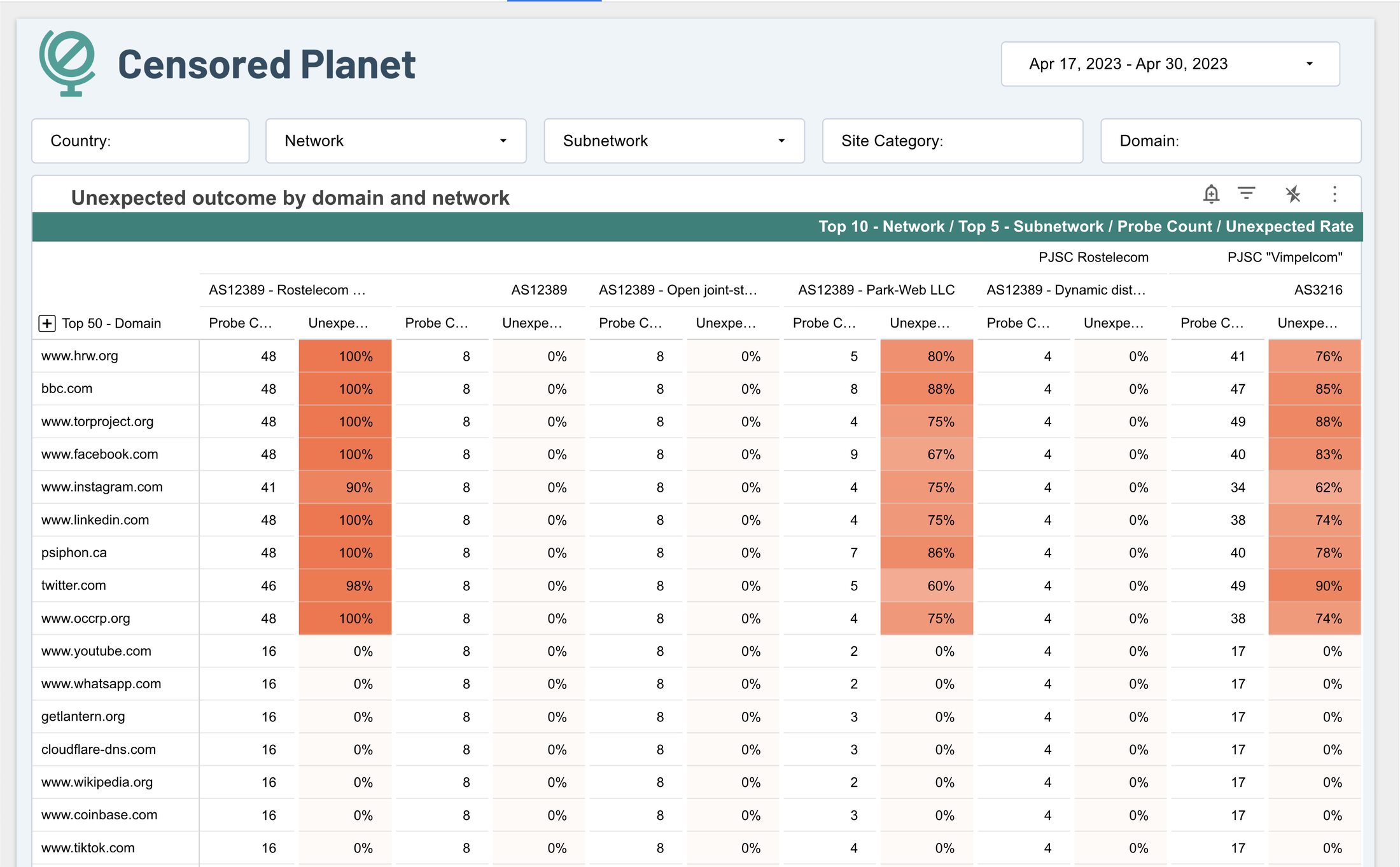

Censored Planet dashboard shows commonly-blocked websites.
There were some snags at first. For example, some data files were so large they slowed down the processing pipeline. Others included metadata that wasn't needed for the visualizations. Sarah and team put in place queries to shrink them down for faster processing and lower overhead, only parsing the data that would be useful for the tables and graphs they were generating. Today, the job can go out to thousands of workers at once, and finish quickly. One day's worth of data can be processed in just a few hours overnight.
Optimizing the dashboards
They solved the problem of how to process the dataset, but to make that dataset useful required good reports and dashboards. To get started quickly the team began with rapid prototyping, testing out options and configurations with Looker Studio and iterating quickly. Using an easy-to-use tool let them answer practical, immediate questions.
Those early versions helped inform what the eventual final dashboard would look like. Reaching a final dashboard design involved some UX studies with researchers, where the Censored Planet team watched them use the dashboard to attempt to answer their questions, and adjust to improve usability, functionality or ease of use.
Researchers using the Censored Planet data wanted to see which governments were censoring the internet and what tools they were using in as close to real-time as possible. To make the dashboards load and render quickly, the team began clustering and partitioning data tables. By cutting out data that they didn’t need to display, they also cut down on Looker Studio costs.
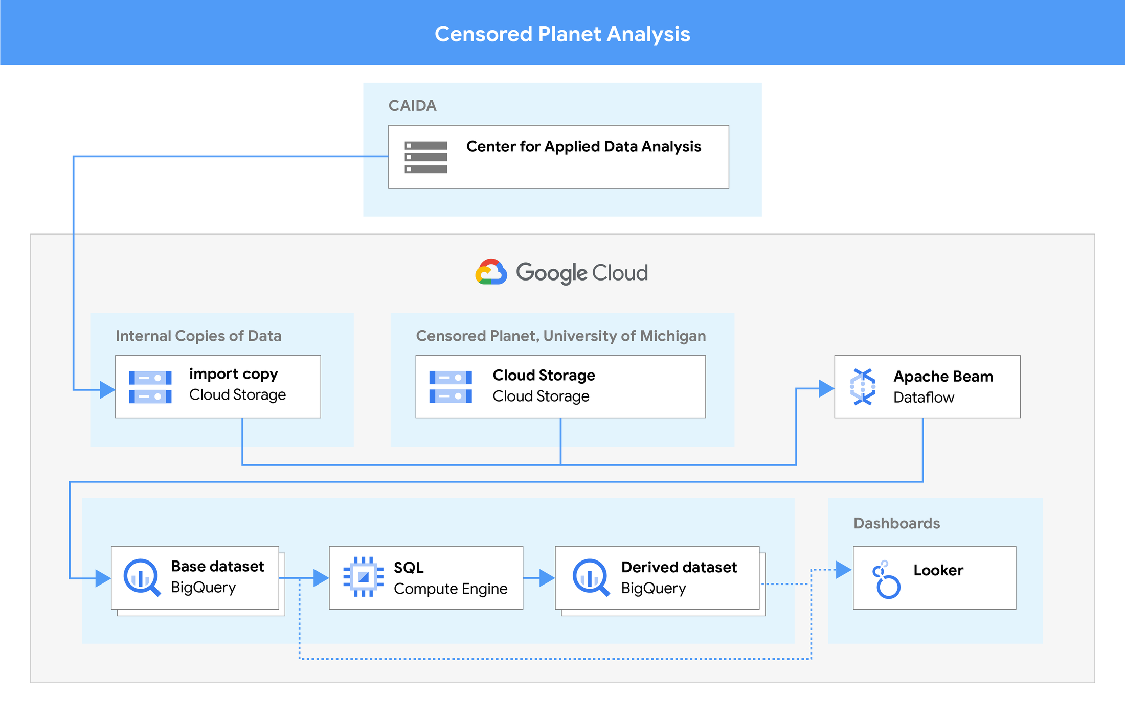

The data pipeline, from original measurements to dashboards.
Within BigQuery, the team partitioned the data by date, so it was easy to exclude historical data that was not needed for most reports. Then they partitioned by data source, country, and network. Since tracking and response often focused on one country at a time, this made queries and loading dashboards smaller, which made them much faster.
Putting the data together
The goal was for all these queries to end up in a Looker Studio dashboard, with filters that let viewers select the data source they want to track. To make this work, the team merged the data sources into one table, then split that table out so that it was easier to filter and view.
There was more to this exercise than indulging internet censorship researchers’ need for speed.
Adding the ability to quickly reprocess the data, and then explore it through a speedy dashboard, meant the team could much more rapidly find and close gaps in their understanding of how the censors operated. They were able to notice where the analysis methodology missed out on certain measurements or data points, and then deploy, test, and validate fixes quickly. On top of creating a new dashboard and new data pipeline, Censored Planet also created a better analysis process. You can dive much deeper into that methodology in their paper published in Free and Open Communications on the Internet.

Building the dashboards in Looker Studio brought operational benefits, too. Because Looker Studio is a Google Cloud hosted offering, the team minimized creation and maintenance overhead and were able to quickly spin up new dashboards. That gave them more time to focus on gathering data, and delivering valuable reports for key use cases.
Looker Studio also lets them iterate quickly on the user experience for researchers, engineers, non-technical stakeholders, and partners. It was also easy to edit, so they could update or modify the dashboard quickly, and even give end users the opportunity to export it, or remix it to make the visualizations more helpful.
Censorship monitoring at cloud scale
Shifting to a cloud-based analysis pipeline has made sharing and filtering all this data much more efficient for the more than 60 global organizations that rely on Censored Planet to monitor internet freedom and advocate for increased internet access. The team used Google Cloud tools to quickly experiment, iterate, and shift their data pipeline, prototyping new tools and services.
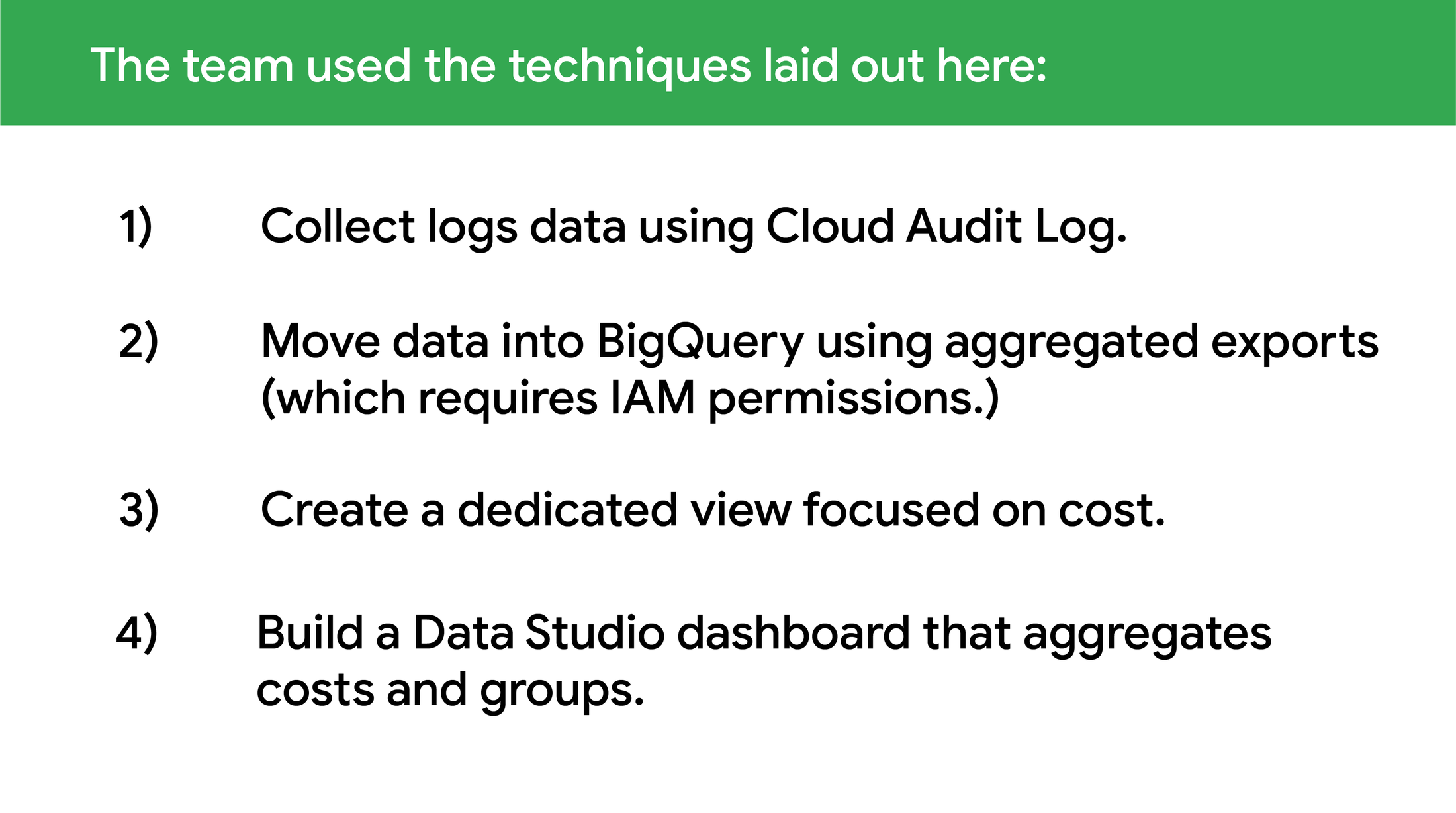
Google's data analysis toolkit also helped to keep costs down for the University of Michigan sponsors. To isolate inefficient queries, they exported all the billing logs into BigQuery and figured out which Looker Studio reports were pulling too much data, so they could filter and streamline.
What's next for Censored Planet
Censored Planet is working on more data sources to add to the dashboard, including DNS censorship data. The organization encourages everybody interested in researching internet censorship to use their data, share screenshots, and publish their analyses. To build a data pipeline with Google Cloud similar to Censored Planet’s, you can start with these three guides:
