5 ways the new Looker dashboards make it easier to explore data
Katie Gillespie
Looker Product Manager, Google Cloud
Elena Rowell
Outbound Product Mgr, Solutions
Two years ago, we decided to rebuild the dashboard experience in Looker to make it faster and more intuitive, and during JOIN 2019 we announced the beta version of these new dashboards. While Looker’s original dashboards were powerful, they lacked the fit-and-finish users were asking for. 11 months and over 1000 active customers later, these dashboards are ready for prime time and are now generally available to all. To mark this milestone, let’s take a look at some of the newest ways to explore data with Looker dashboards and dive deeper into some of the classic Looker dashboard characteristics that our customers have come to love over the years.
New functionalities to fuel more data-driven experiences
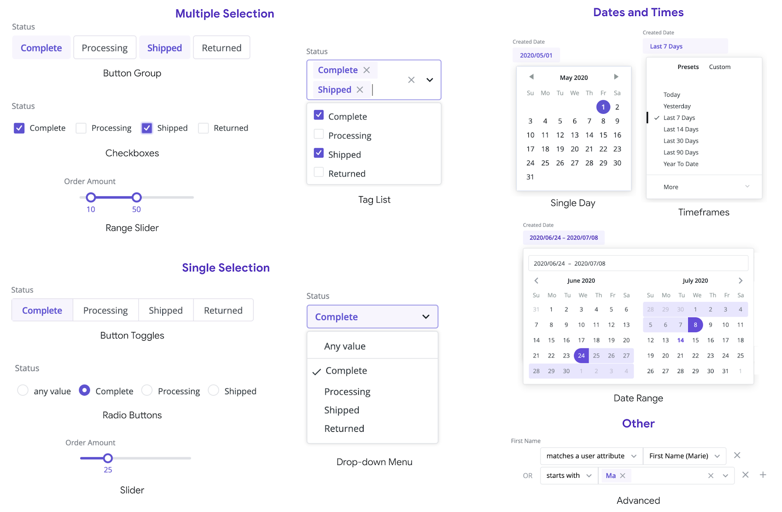
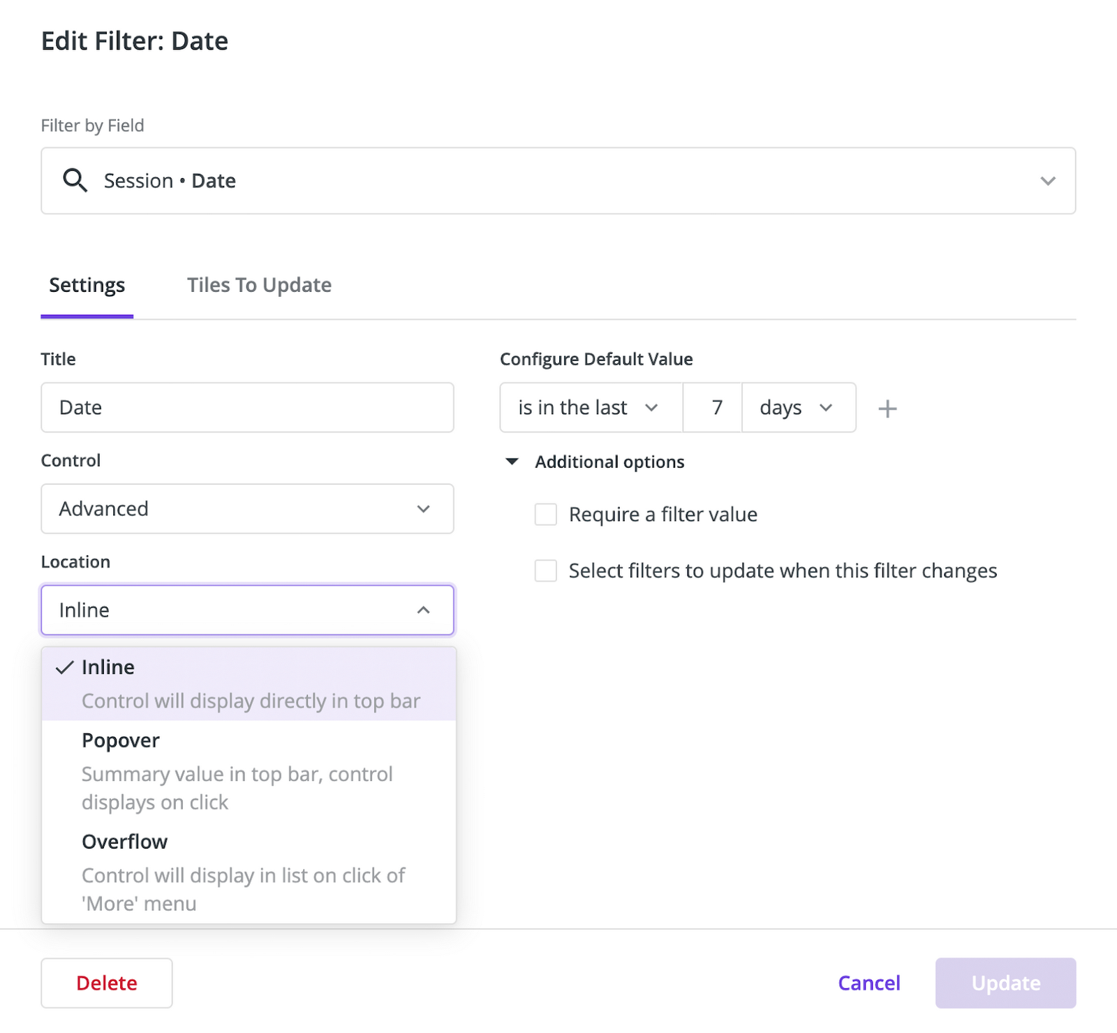
1) Filters galore
Much of the magic of dashboards is wrapped up in a users’ ability to manipulate the data, filtering it for their specific needs. Curate intuitive and powerful environments for them using one (or all) of the 12 types of filters. Making this level of granularity available to users better enables them to find what they need on their own and eliminates hours of ad-hoc requests for analysts.
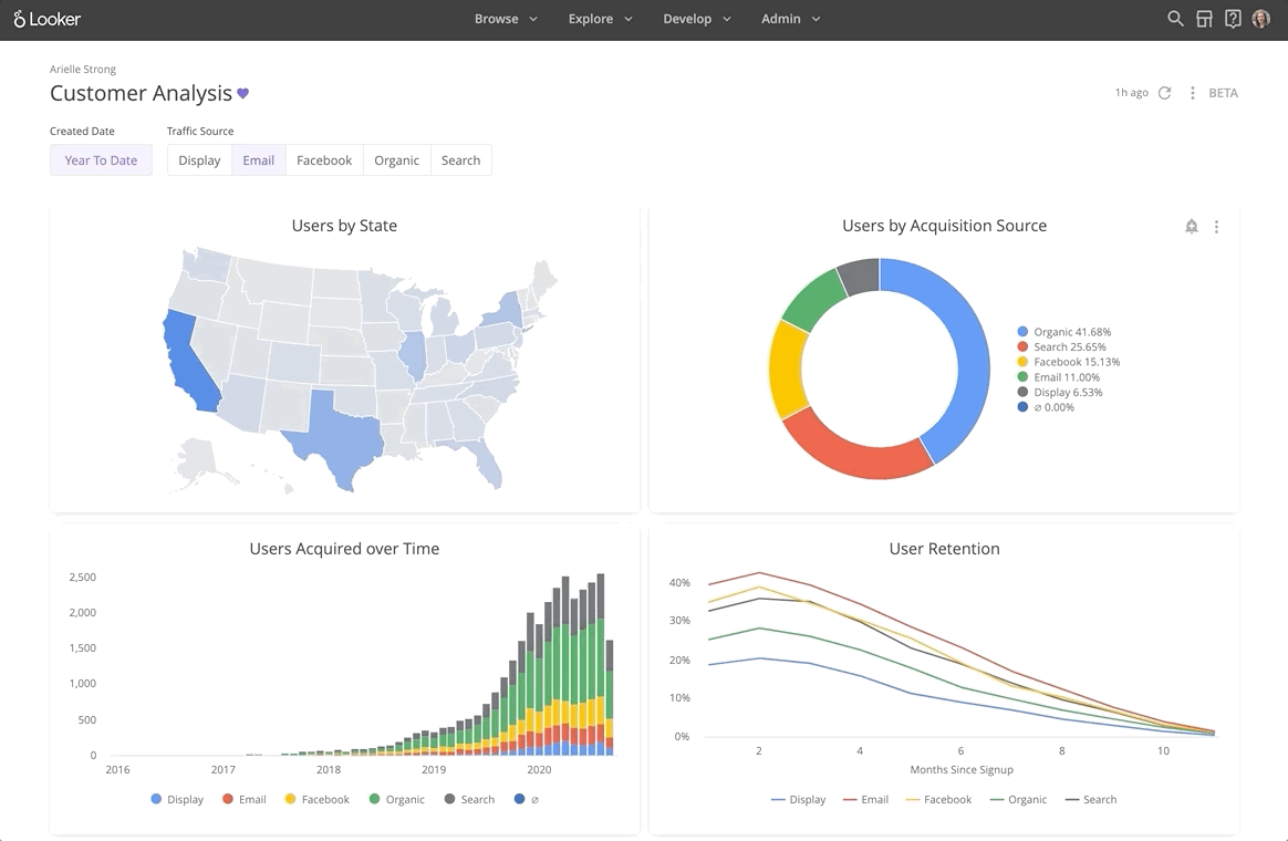
2) Cross-filtering on live data
With cross-filtering, you can click a data point in one dashboard tile to have all tiles automatically filter on that value. This intuitive experience balances filtering with Looker’s existing drill capabilities, enabling a simple “wonder-and-click” experience for users without taking away the ability to dive deeper into the underlying data.
3) Build faster
Not only do the newest dashboard filters make exploring data easier, they also make set up and maintenance easier for admins. The configuration modal intelligently selects the right Explores and fields for each filter. Once the filters are set, admins can easily adjust their placement and priority in the dashboard — promoting the most critical filters while still giving everyone the opportunity to slice the data in the ways that best serve their needs.
4) Build freely with support for HTML and markdown
It’s important to be able to control the look and feel of dashboards. With support for markdown and HTML, dashboard creators can get as creative as their hearts desire! It’s been exciting to already see examples of dashboard customizations be shared by Looker customers and our support team.
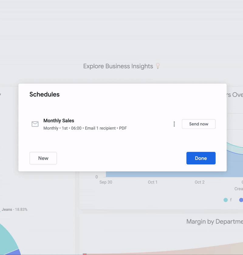
5) Dashboards when and where you need them
The latest streamlined scheduling modal makes it even easier to have dashboards whenever and wherever you need them. This functionality allows anyone to schedule dashboards to the destinations they need, whether that is an inbox, webhooks, or integrated 3rd party applications. Schedule deliveries to go out based on changes in the data or a specific time of day. You can set these schedules for yourself and your users’ behalf.
The “oldies but goodies” of Looker dashboards
More than just a pretty picture
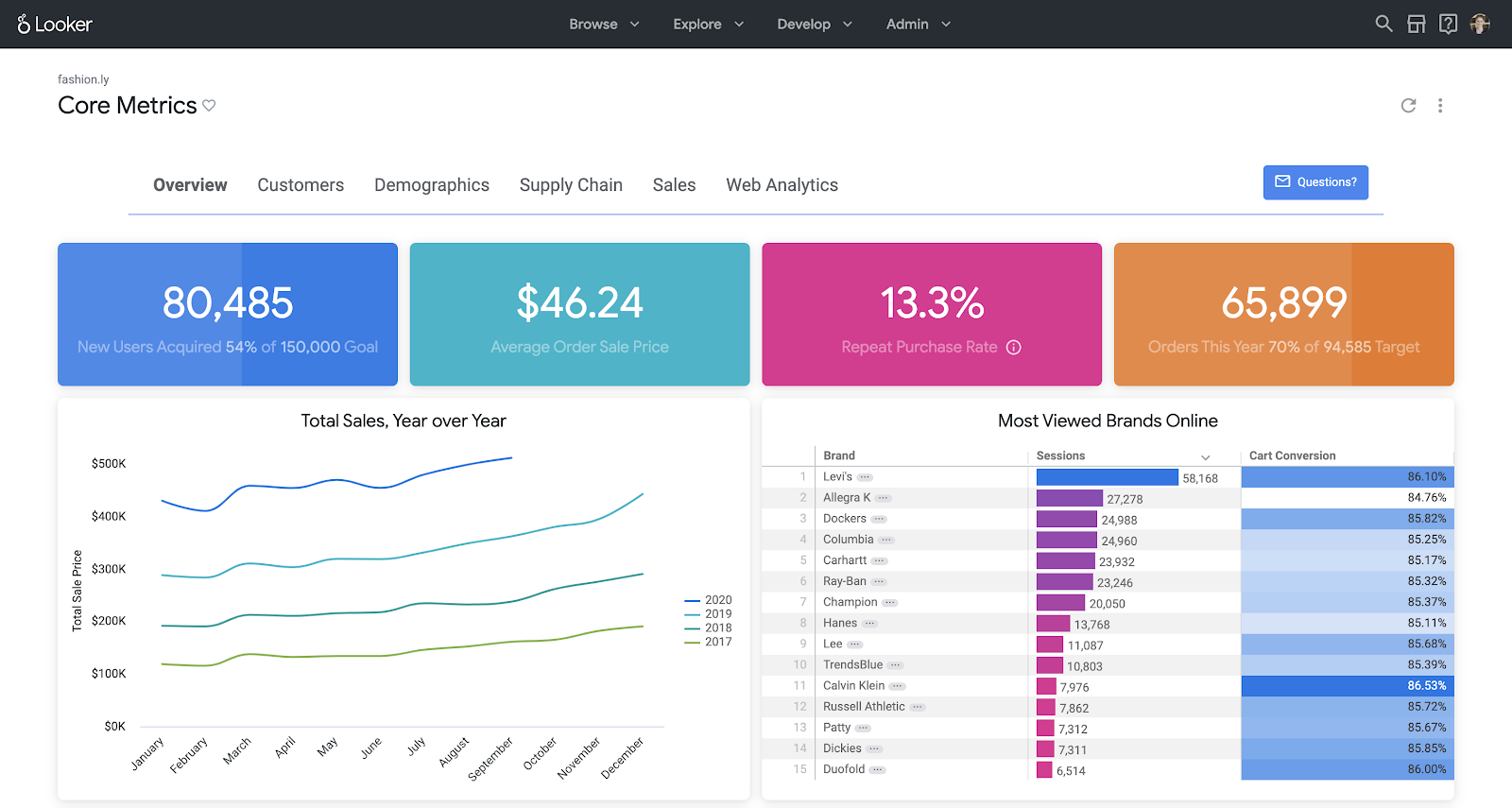
Great dashboarding is table stakes for business intelligence tools because historically, they were the primary deliverable for BI tools. At Looker, we believe dashboards should also be a starting place for getting to know your data on a deeper level. Looker delivers on this by connecting directly to live, row-level data, giving anyone who wants to understand the “why” behind a tile the ability to drill deeper on a metric. This could mean examining the row-level data behind a metric, or drilling into a full data exploration experience to dive in deeper.
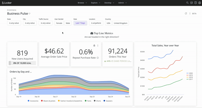
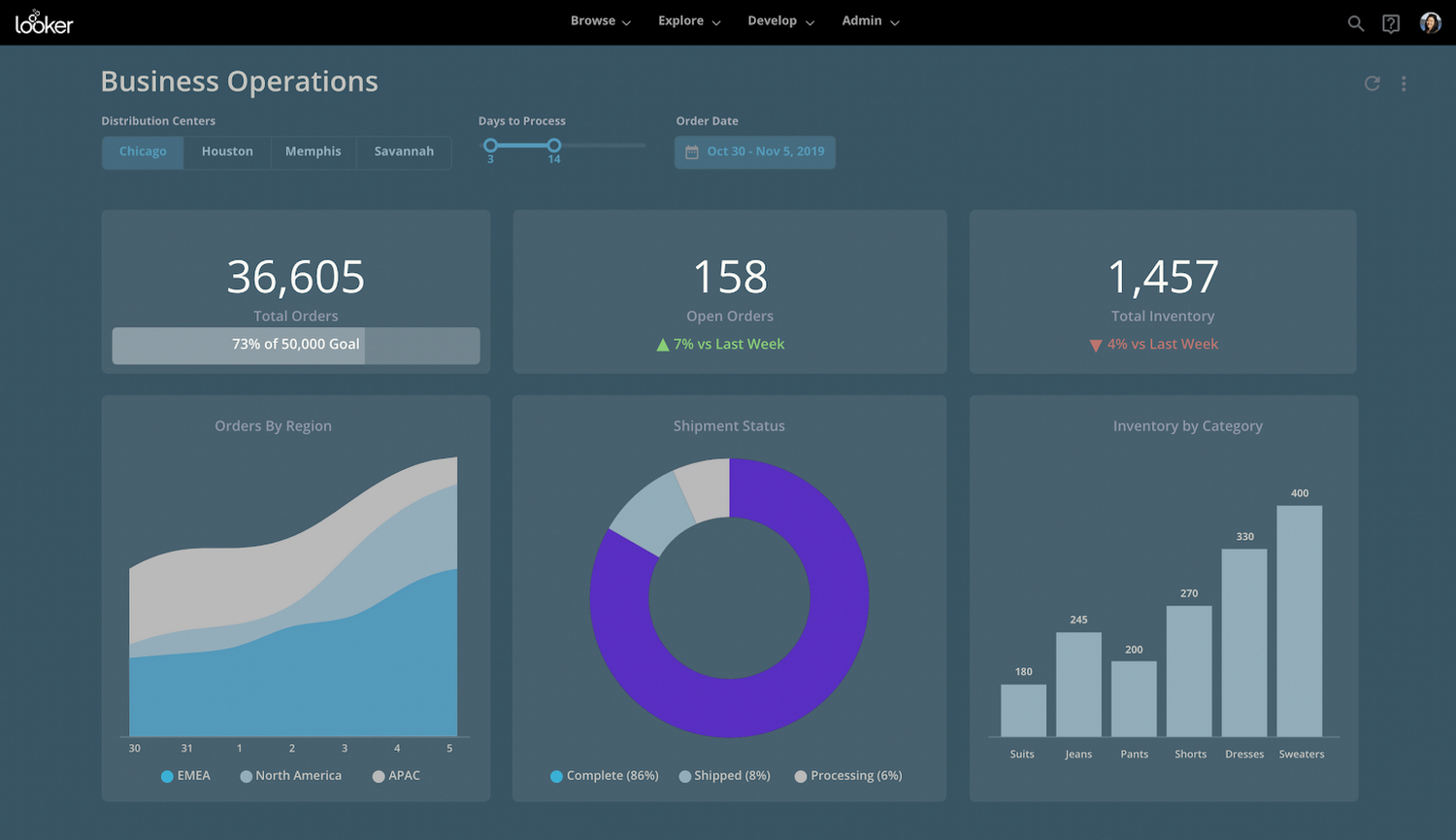
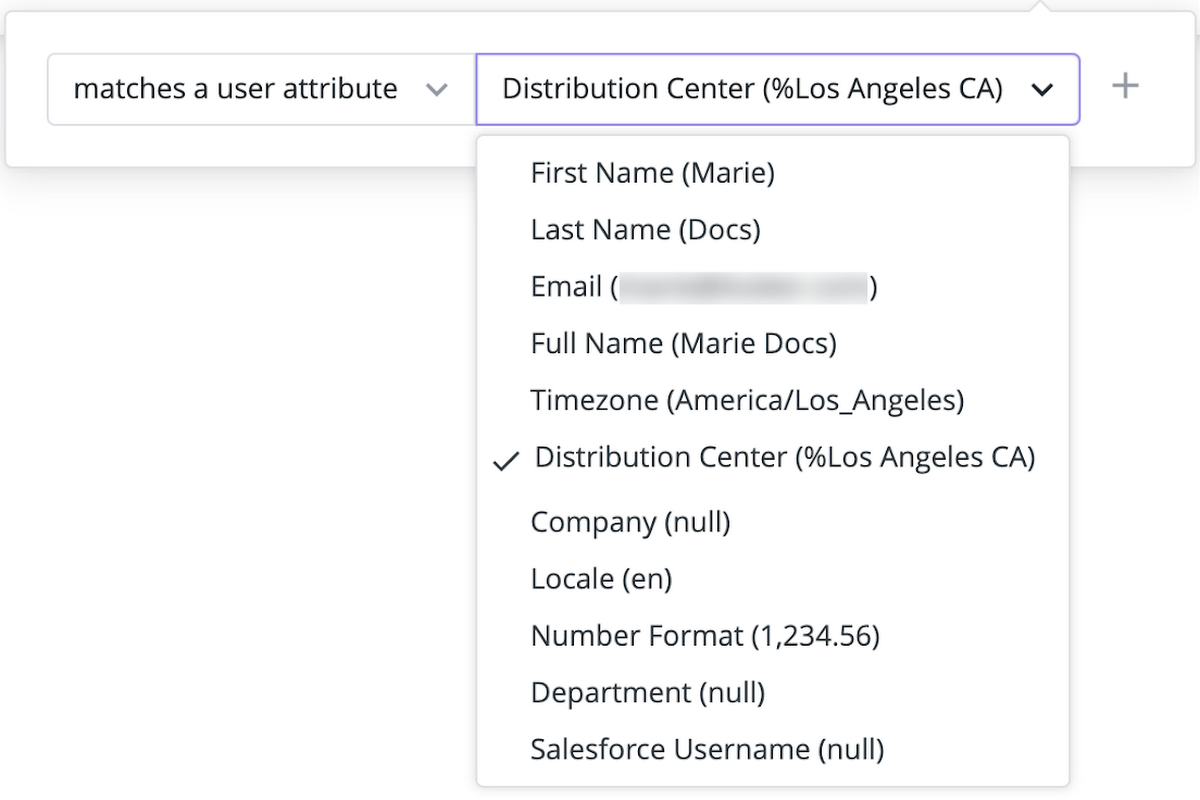
One dashboard, many users
One of the well-loved Looker admin dashboard functionalities is the ability to set dashboards to apply certain filters based on the person viewing them. By automatically applying filters as a dashboard is viewed, admins can scale a single report across individuals, teams, or even customers. For example, the image below shows dashboard filters being applied based on the distribution center of each person who views it.
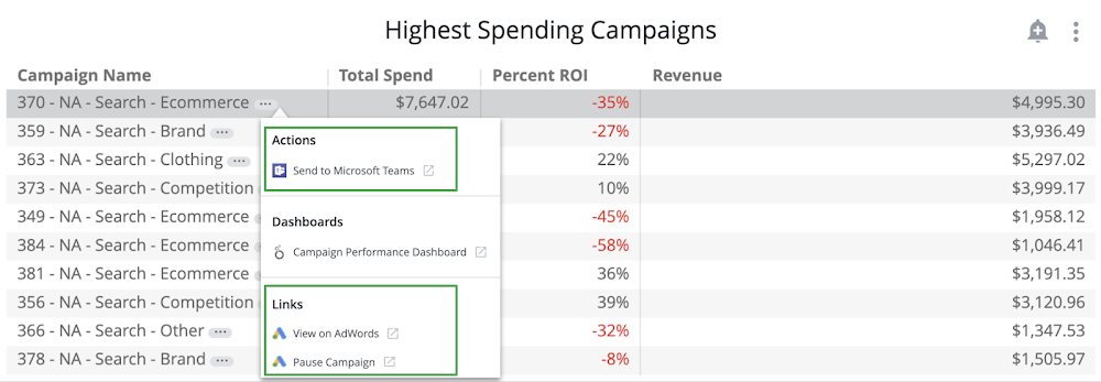
All of the integrations
On a Looker dashboard, insights are not just actionable in theory. Enable people to take action right from their dashboards. Leverage Actions, webhooks and cell-based links to encourage users to perform field-level tasks directly from Looker. For example, an Action can trigger an email to be sent, set values in other applications, or perform other tasks you can configure a receiving server to do.
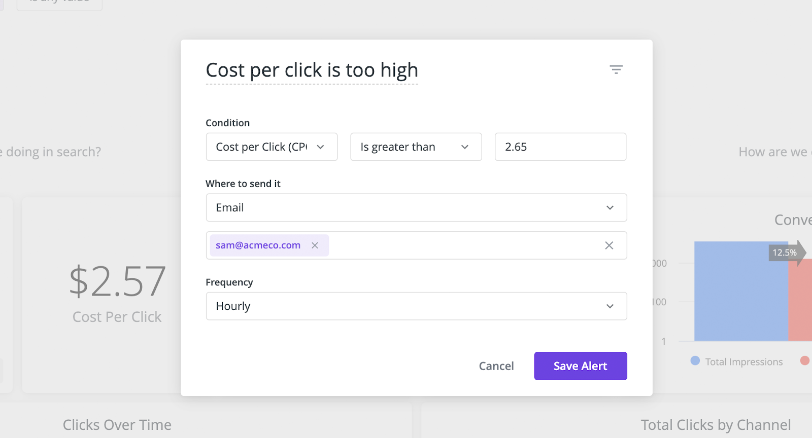
Monitor every tile from afar
The user-friendly alerts available on each tile of a Looker dashboard allow you (and your users) to react to small changes before they become big problems. You can get started with the threshold-based alerts in a few clicks, and can even subscribe to alerts already created by colleagues. Plus, you can set the alerts to reach you by email or in Slack, keeping you up-to-date on important changes in the data without leaving your existing workflow.
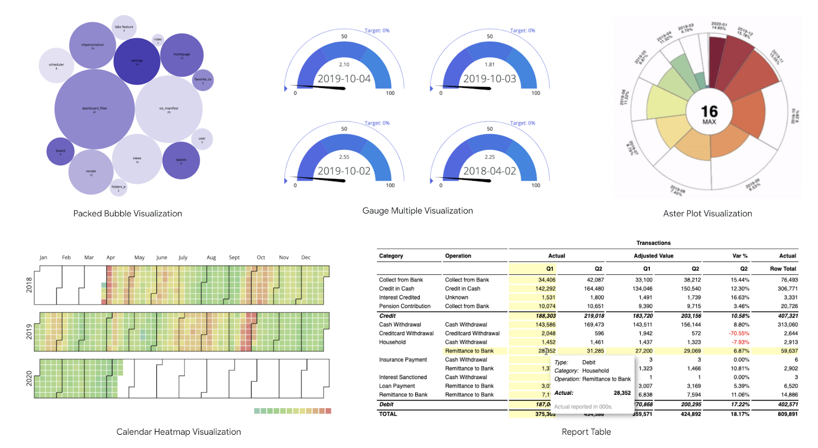
Visualizations as unique as your business
Different businesses require different visualizations. In the Looker Marketplace there are a host of add-on visualizations, built to fit more custom data needs. And if you want something even more bespoke, you can add custom Javascript visualizations for everyone to leverage.
Your dashboard, your brand
Themes are a way to customize the appearance of your embedded Looker dashboards so they better match the environment you embed them in. You can use themes to customize everything from the font family, text color, background color, and tile color. For example, you can create a “dark” theme like the one below.