Unlock geospatial insights with Data Studio and BigQuery GIS
Riccardo Muti
Product Manager, Data Studio
Chad W. Jennings
Product Manager, Data Analytics and Geospatial Lead
Chances are, your data contains information about geographic locations in some form, whether it’s addresses, postal codes, GPS coordinates, or regions that are meaningful to your business. Are you putting this data to work to understand your key metrics from every angle? In the past, you might’ve needed specialized Geographic Information System (GIS) software, but today, these capabilities are built into Google BigQuery. You can store locations, routes, and boundaries with geospatial data types and manipulate them with geospatial functions. Ultimately, helping people explore this data and spot geospatial patterns requires visualizing it on a map. To that end, we’re excited to announce new enhancements to Data Studio, including support for choropleth maps of BigQuery GEOGRAPHY polygons, so you can easily visualize BigQuery GIS data in a Google Maps-based interface.
Google Maps in Data Studio
Data Studio is a no-cost, self-serve reporting and data visualization service from Google Marketing Platform that connects to BigQuery and hundreds of other data sources. With it, you can visually explore your data and design and share beautiful, interactive reports. With the addition in the past year of a Google Maps-based visualization, you can visualize and interact with your geographic data just as you do with Google Maps: pan around, zoom in, even pop into Street View.
Don’t have geographic coordinates in your data? No problem: Data Studio recognizes countries, states/provinces, Designated Market Areas (DMAs), cities, postal codes, addresses, and other supported geographic field types. For example, even if all you have are DMA codes and metrics from Google Ads, you can visualize click-through rate by DMA:
Visualize BigQuery GEOGRAPHY polygons
But what if you want to visualize boundaries beyond the most commonly used ones? What if there are different boundaries that are important in your industry or business? What if you’ve done an analysis that groups locations into clusters and drawn boundaries around them?
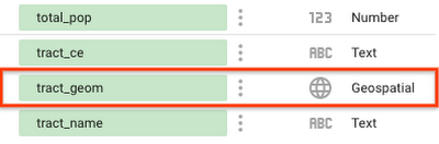
With support for BigQuery GEOGRAPHY polygons in Data Studio, you can now visualize arbitrary polygons in a choropleth map. When you connect to BigQuery data that contains GEOGRAPHY fields, you’ll see them recognized as geospatial data:
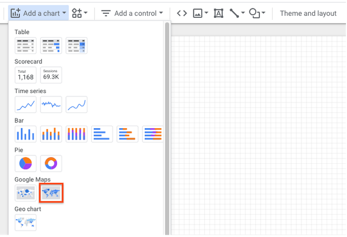
To visualize this data, add a Google Maps “filled map” visualization:
Then, for the Geospatial field, simply choose the field with geospatial data:
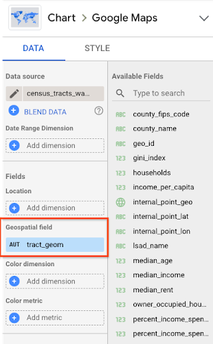
You can group by a location dimension and color by a dimension or metric. To learn more, check out this step-by-step walkthrough.
Let’s take a look at a few examples of this feature in action. We’ll use data from BigQuery Public Datasets, which contain several datasets with geospatial data.
Mapping census tracts
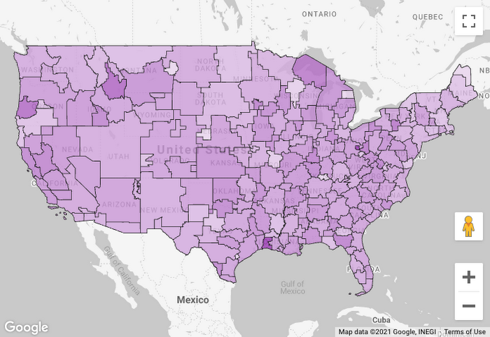
Suppose we want to visualize rent affordability in different areas of the United States. We can get data about the percentage of income spent on rent from the U.S. Census Bureau’s American Community Survey dataset. We could visualize this metric on a map by state, county, metro area, or zip code, but it can vary quite a bit even within the same zip code. To understand it at a more detailed level, we might want to visualize census tracts. Thankfully, census tract boundaries are available in the U.S. Boundaries dataset. By joining these datasets and visualizing in Data Studio, we can understand rent affordability at a deeper level:
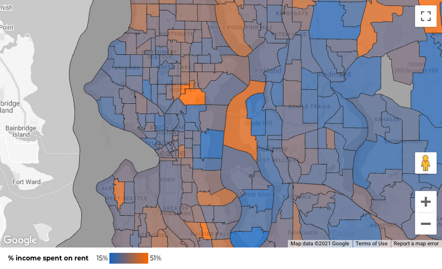
Here, we’re seeing census tracts in the Seattle area, with the least affordable areas in orange. Two areas stand out for very different reasons: the University District (cheaper rent, but many students with low or no income) and Medina (high incomes, but multi-million dollar lakefront houses).
Here’s the query to get this data:
Mapping New York City taxi zones
Next, suppose we’re analyzing New York City taxi trips and want to understand how tipping varies by pickup location. New York City is divided into taxi zones, whose boundaries are available in the dataset. Using Data Studio, we can visualize the median tip percentage by taxi zone in the Brooklyn and Queens boroughs:
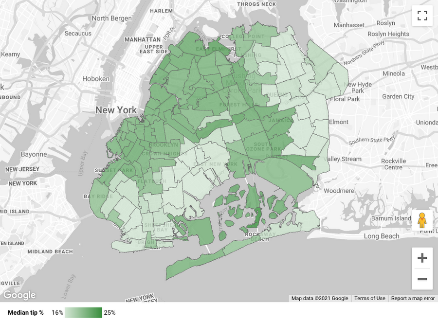
The map helps us see a clear geospatial pattern: passengers picked up in the zones nearer to Manhattan tend to tip more.
Here’s the query to get this data:
While this example involves taxi zones, there are many specialized boundaries that exist across various sectors and businesses: electoral districts, school districts, hospital referral regions, and flood risk zones, for instance.
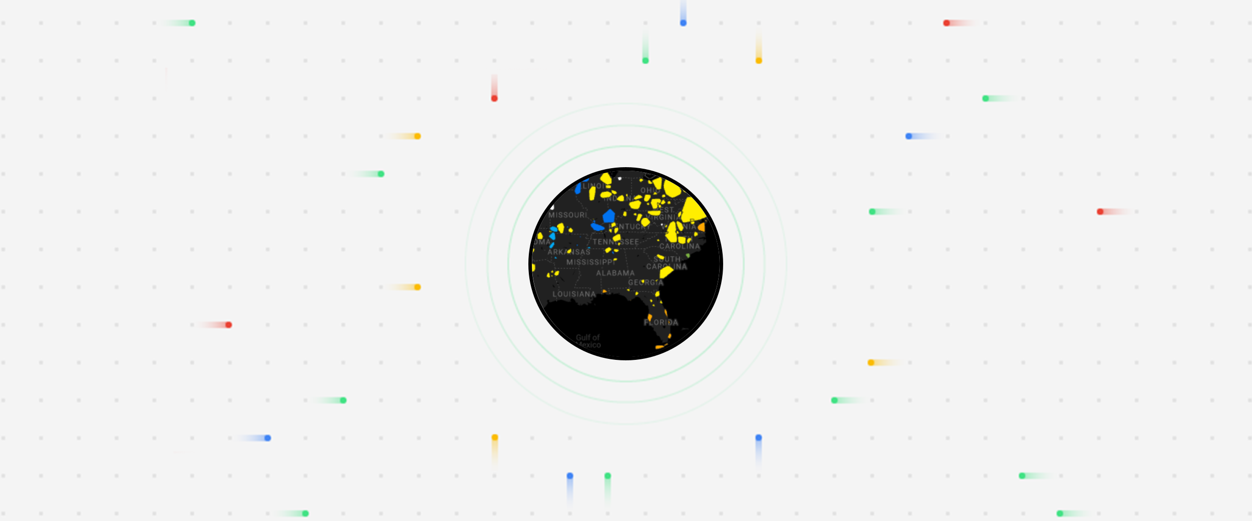
Clustering severe storms
Finally, suppose we want to understand where in the U.S. different types of severe storms tend to occur. Rather than visualize the individual storms, we want to visualize “clusters” of many storms within a given area. BigQuery’s geospatial functions come in handy here: We can assign storms to clusters using the ST_CLUSTERDBSCAN function and draw boundaries around them using the ST_CONVEXHULL function. Then we can visualize these polygons in Data Studio:
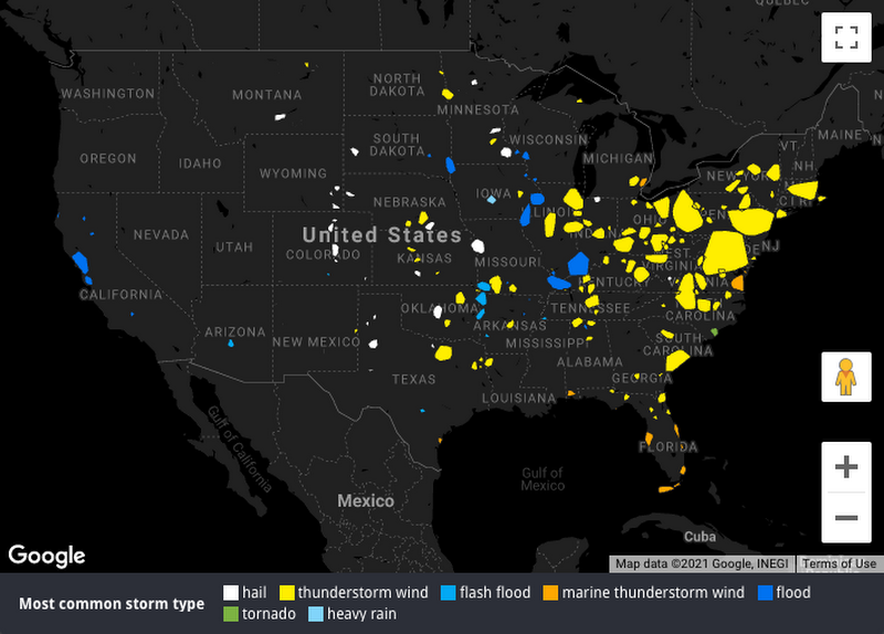
The map helps us see how the frequency and type of severe storms vary from west to east, from flooding in the Bay Area, to hail storms in the Great Plains, to thunderstorms in the Midwest and East Coast. (If you’d prefer to avoid severe storms altogether, you might want to live in the Pacific Northwest, where drizzle is frequent but severe storms are rare.)
Here’s the query to get this data:
Try it out
Ready to try it out for yourself? Check out this step-by-step walkthrough of visualizing BigQuery polygons in Data Studio. Explore the BigQuery Public Datasets or try it with your own data. If your geospatial data isn’t already in BigQuery, you might want to learn more about BigQuery GIS or loading geospatial data into BigQuery using FME.