How to choose the best chart or graph for your data
Jill Hardy
Content Strategist, Customer Education at Looker
The quality of our lives is determined by the choices we make. Sometimes the choices are simple, like which flavor of ice cream to indulge in. Let’s say the choices are vanilla ice cream, chocolate ice cream, and strawberry sorbet. Sweetness is great, but on a hot day, vanilla and chocolate lack that light and fruity feeling I want.
Here’s how I analyzed my ice cream choice:
Question: Which flavor of ice cream should I get?
Goal: I want the flavor to complement this hot summer day, and to me, that means something light and fruity.
Outcome: Strawberry sorbet
Yum. But what about the more serious choices, like deciding how much income to squirrel away for retirement?
The same process still works:
Question: How much of my income should I save?
Goal: I want to enjoy a good life post-retirement. Research suggests that means saving at least 20%.
Outcome: I’ll save at least 20%.
Each choice can be broken down with the framework of “question, goal, outcome.” In this framework, you have a question and a goal that you’re trying to achieve. Your goal motivates how you choose between options to get to the outcome.
Choosing the best chart or graph for your data is similar, in that the outcome depends on your goal. You can even use the same “question, goal, outcome” framework. I’ll provide some examples of choosing a chart with this framework further on.
For now, let’s focus on the “goal” part of the framework as it relates to displaying data. We see most visualizations as fulfilling one of four main objectives:
- Showing how values compare to each other
- Showing how the data is distributed
- Showing how the data is composed
- Showing how values relate to one another
The challenge of choosing the right visualization lies in finding the goal beneath your data question. Once you identify the goal, choosing the right chart becomes easier, particularly when you have a reference like the one below.
Types of Charts & Graphs
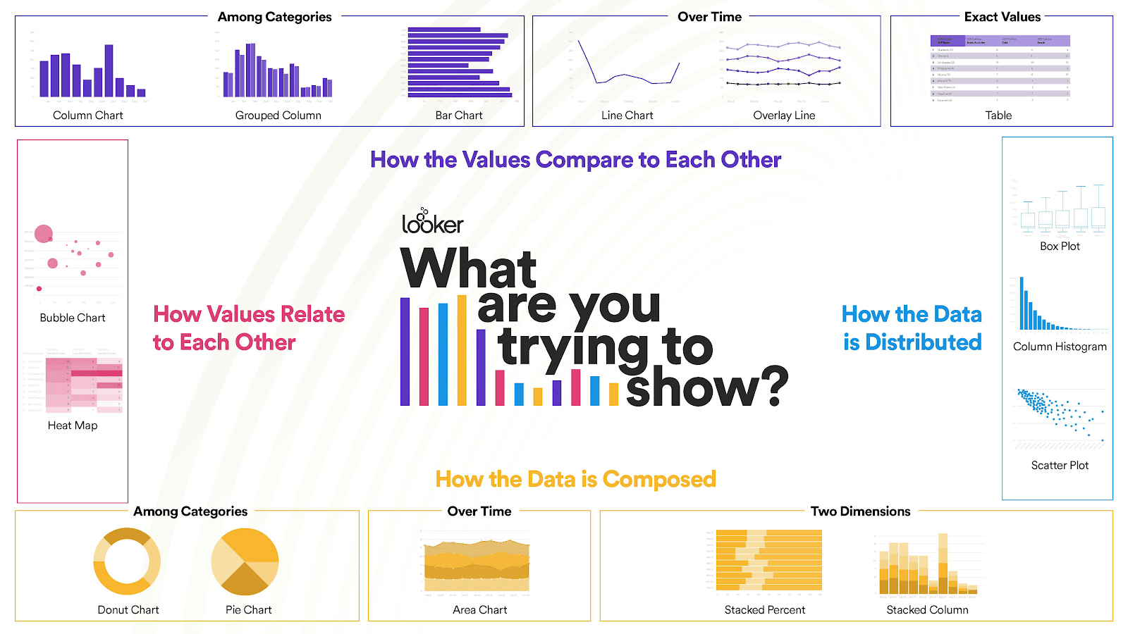

This points you in the right direction, but there are multiple charts in each category. How’s an analyst to choose? Familiarizing yourself with the nuances of each graph will help.
How to choose the best chart for your data
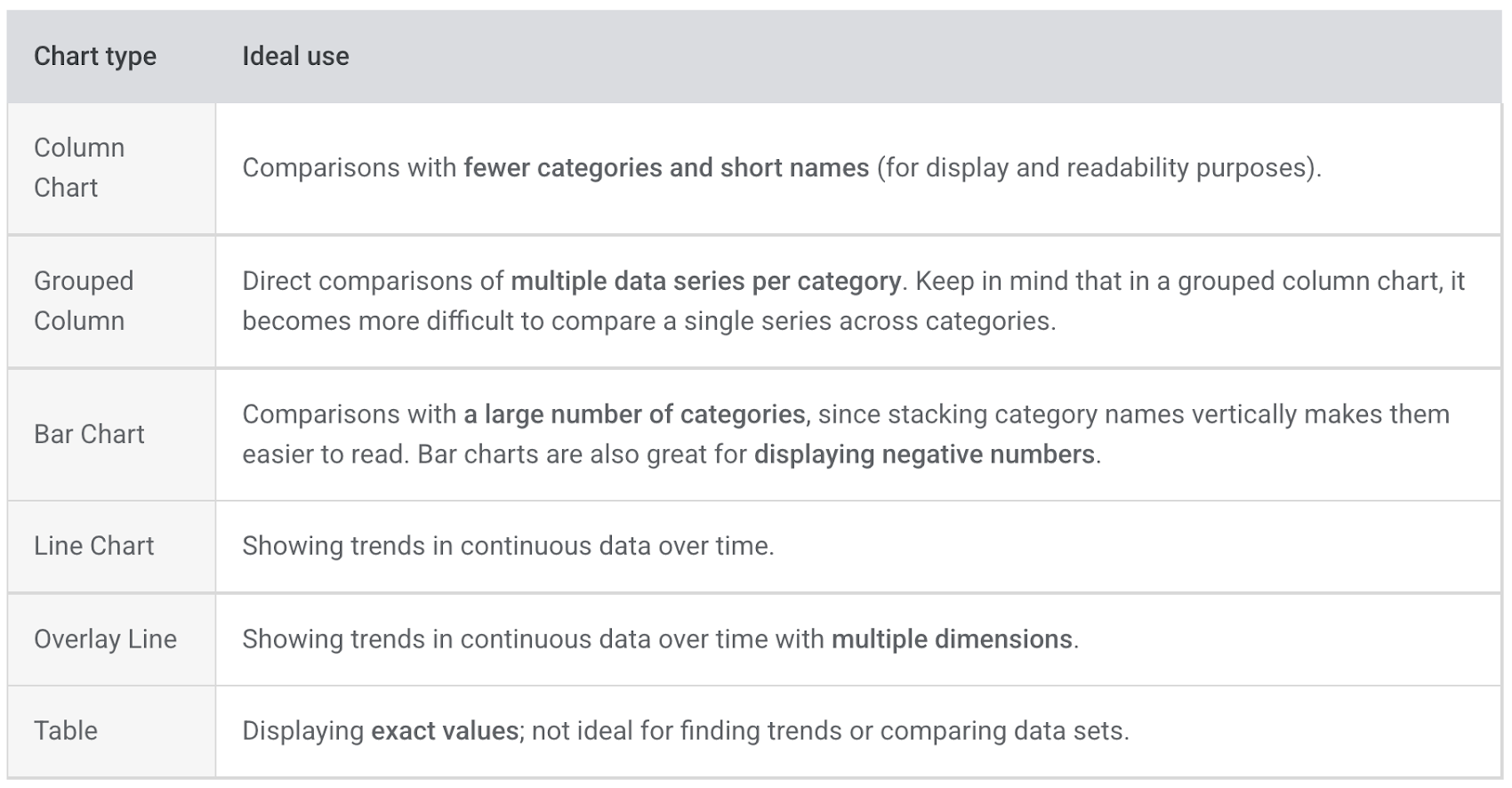
What’s the best chart to show comparison?
Comparison questions ask how different values or attributes within the data compare to each other.
Tables help you compare exact values to one another. Column and bar charts showcase comparisons across different categories, while line charts excel at showing trends over time.

What’s the best chart to show distribution?
Distribution questions seek to understand how individual data points are distributed within the broader data set.
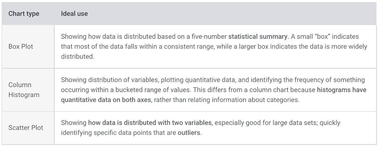
Box plots show distribution based on a statistical summary, while column histograms are great for finding the frequency of an occurrence. Scatter plots are best for showing distribution in large data sets.

What’s the best chart to show composition?
Composition questions ask what general features are present in the data set.
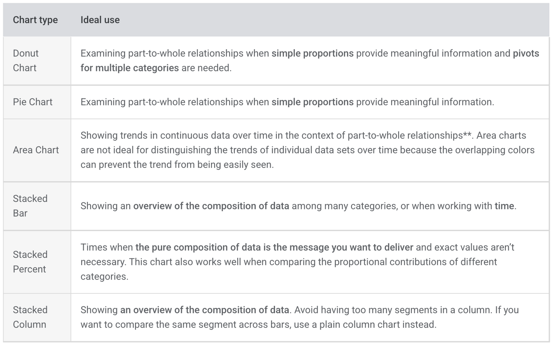
Donut and pie charts are great choices to show composition when simple proportions are useful. Area charts put the composition of data within the context of trends over time. Stacked bar, percent, and column charts show an overview of the data’s composition.

What’s the best chart to show a relationship between values?
Questions in this category ask how values and attributes relate to each other.
Bubble charts and heat maps can help you quickly identify relationships between data points.


Identifying the goal beneath the question
Now you have references to help you choose between chart types. These resources are most powerful when you understand what motivates those choices in the first place.
What’s your data question really asking for? Is the answer to compare data, look at its distribution, examine its composition, or show a particular relationship between data points?
You can recognize that goal using our “question, goal, outcome” framework from the top of the post.
For the sake of putting this framework into action, I’ll don the hat of a marketing analyst creating visualizations for my colleagues. The morning is dedicated to coffee and acquisition metrics, essentially answering questions like: “Are we gaining enough customers? Where are they coming from?”
Question: How many new users are we acquiring every day?
Goal: Compare values (number of users) over time (days)
Outcome: A line chart
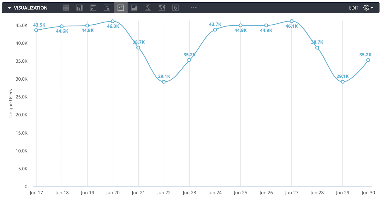

A dip in traffic on the weekends is expected and indeed appears in the data. Now I want to dive into this traffic further and see where these users are coming from.
Question: What channels are these new users coming from?
Goal: Display the composition of the data (which channel source users came from) over time (still comparing the number of new users across days).
Outcome: An area chart
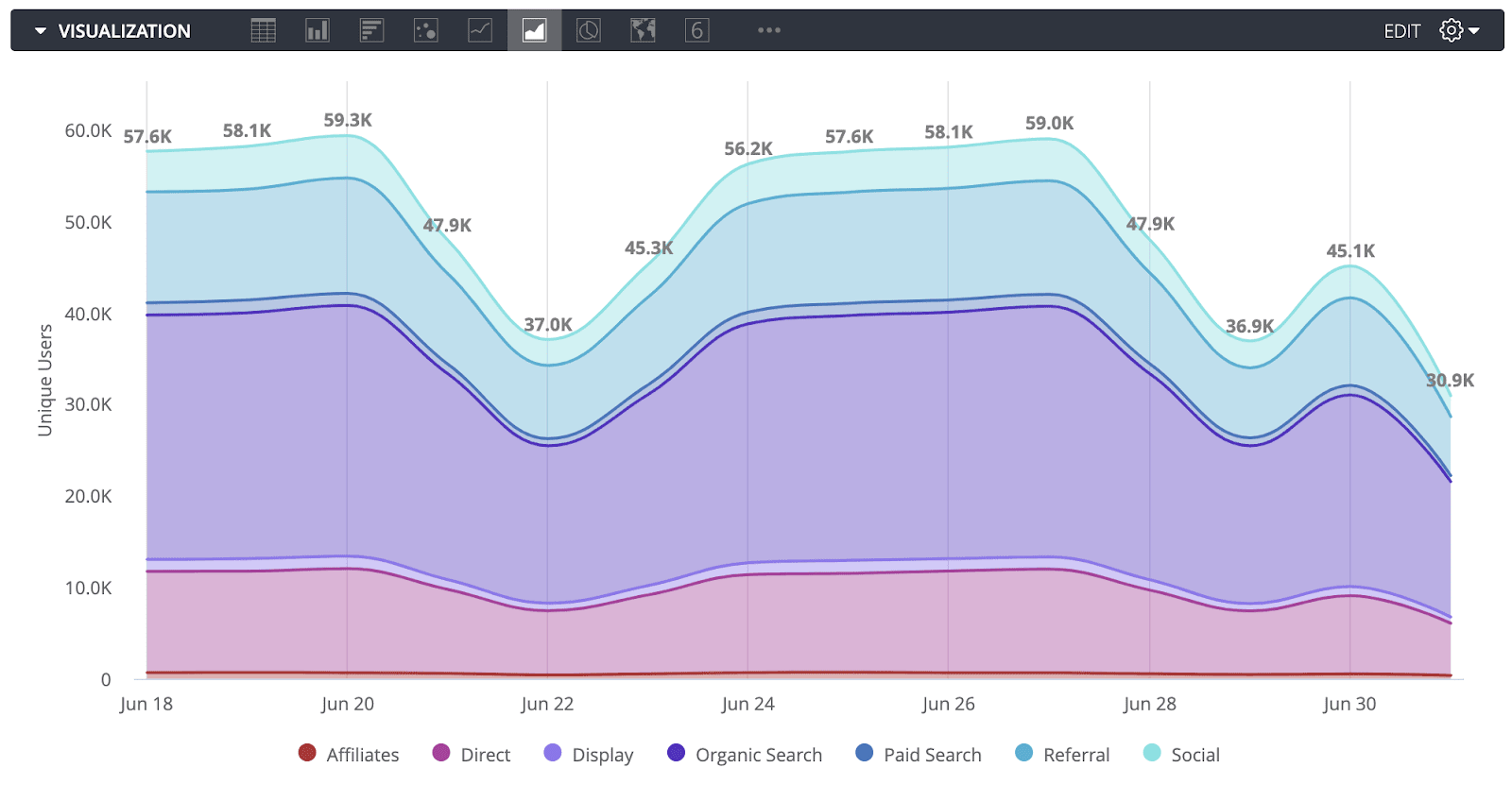

Looks like the organic search category currently accounts for the largest amount of users—meaning that we're doing well in search engine rankings, thanks to our efforts with search engine optimization. We’re getting a lot of traffic from referrers, too—I want to look at that more closely.
Question: Which referrers are driving the most traffic to our website?
Goal: Compare values (number of sessions) across categories (referrers).
Outcome: A bar chart
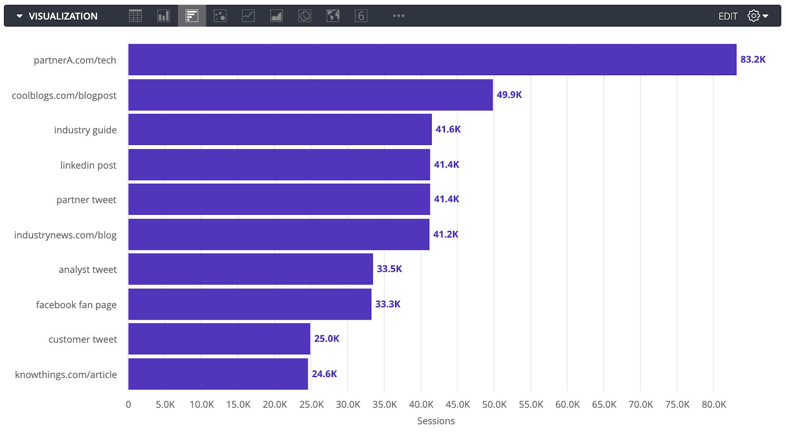

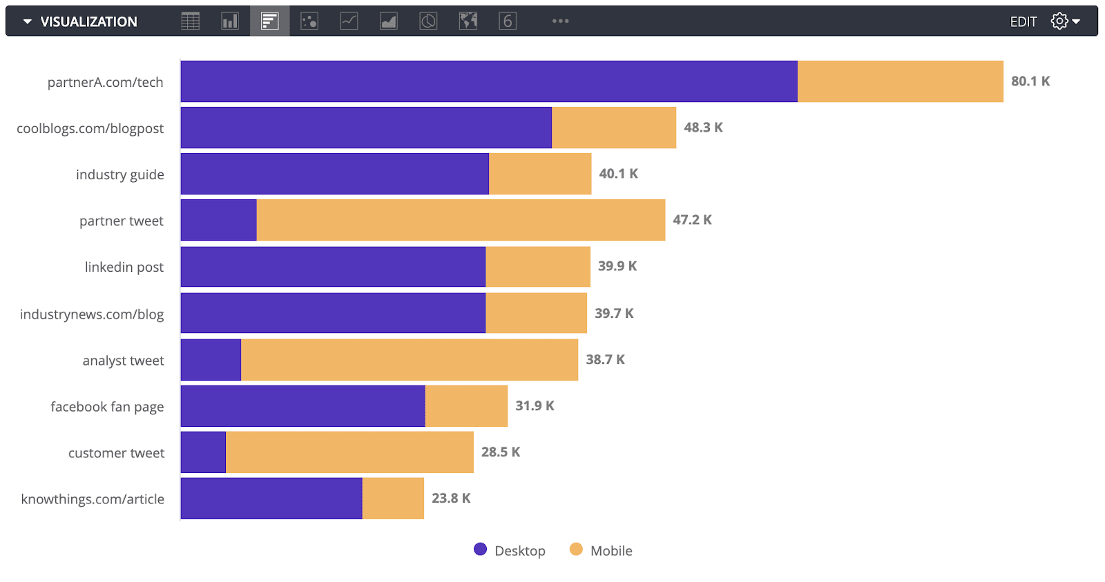
The partner website drives the most traffic by a long shot, followed by a stellar blog post. But how does the traffic break down between desktop and mobile devices?
Question: Which referrers tend to drive more traffic to our website from desktops, and which ones tend to drive more traffic from mobile devices?
Goal: Comparing values (number of sessions) across categories (referrers) and looking at composition within each bar (mobile vs. web traffic).
Outcome: A stacked bar chart

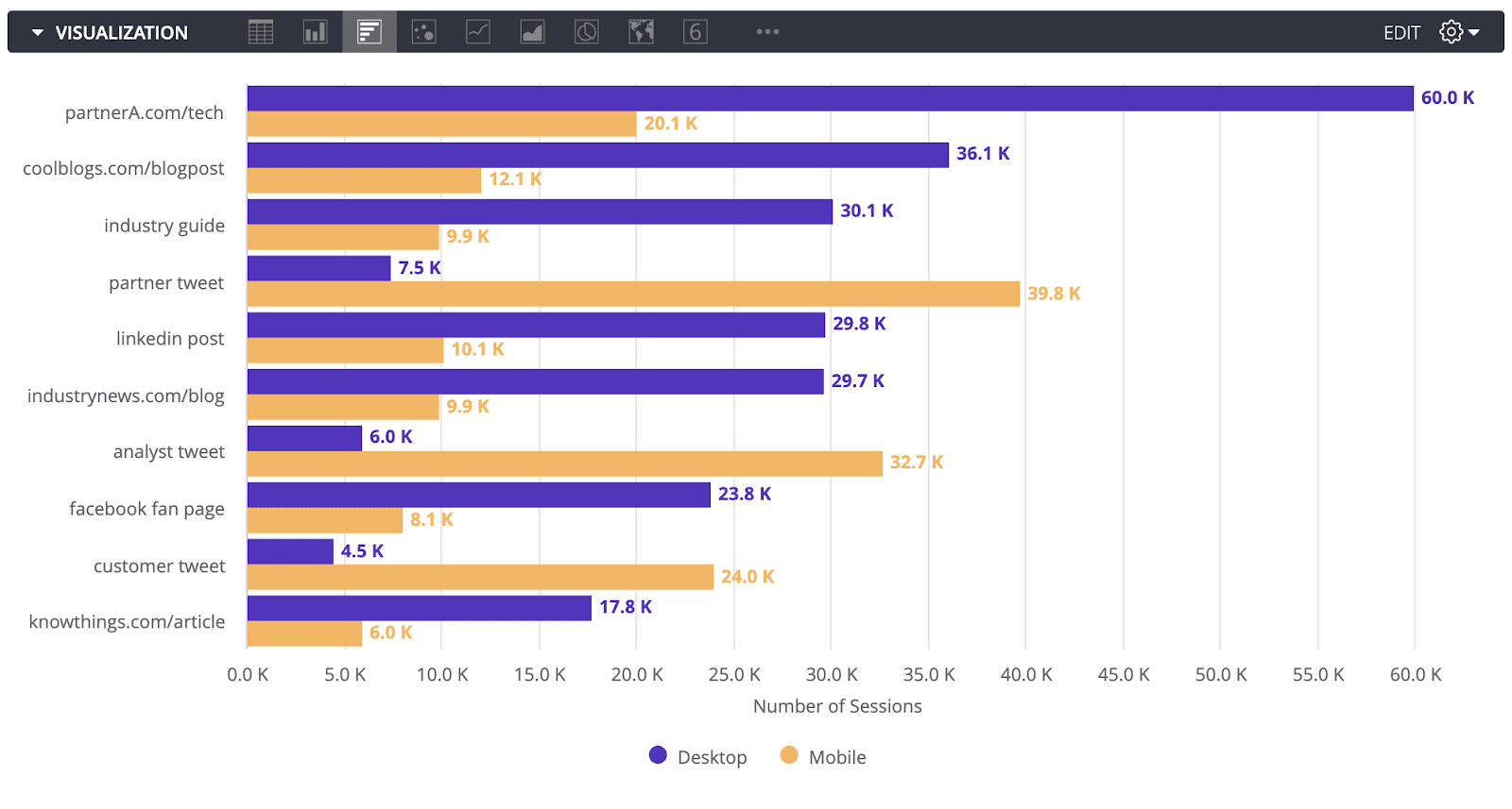
Question: How does the traffic from mobile and desktop stack up across referrers?
Goal: Comparing values (number of sessions) across categories (referrers) in multiple dimensions (mobile and desktop).
Outcome: A grouped bar chart

That should be enough to get the team started on the acquisition metrics.
Another area of marketing that generates interesting questions is behavior. Knowing what people are up to will help determine the best times and places to reach out to them.
Question: What time of day sees the highest number of users on our website?
Goal: Comparing values (number of sessions) over time (hours) across multiple dimensions (days).
Outcome: Overlay line chart
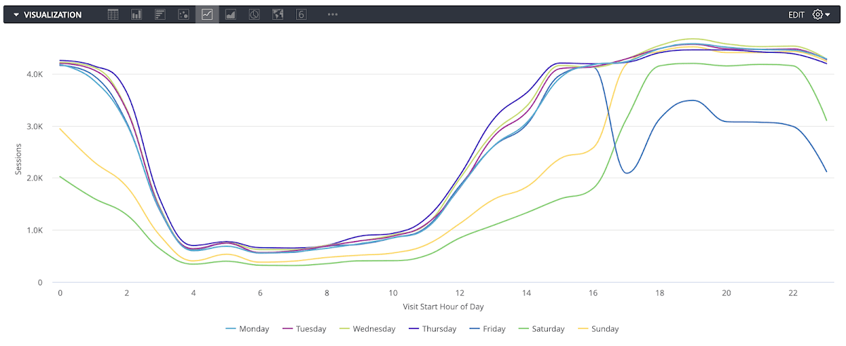

Looks like noon to four o’clock are our most popular times by far. Which pages are our visitors looking at in the afternoon?
Question: Which landing pages are driving the most engagement by channel?
Goal: Look at the relationship between channels and landing pages to see how the different combinations influence average session duration.
Outcome: Heat map
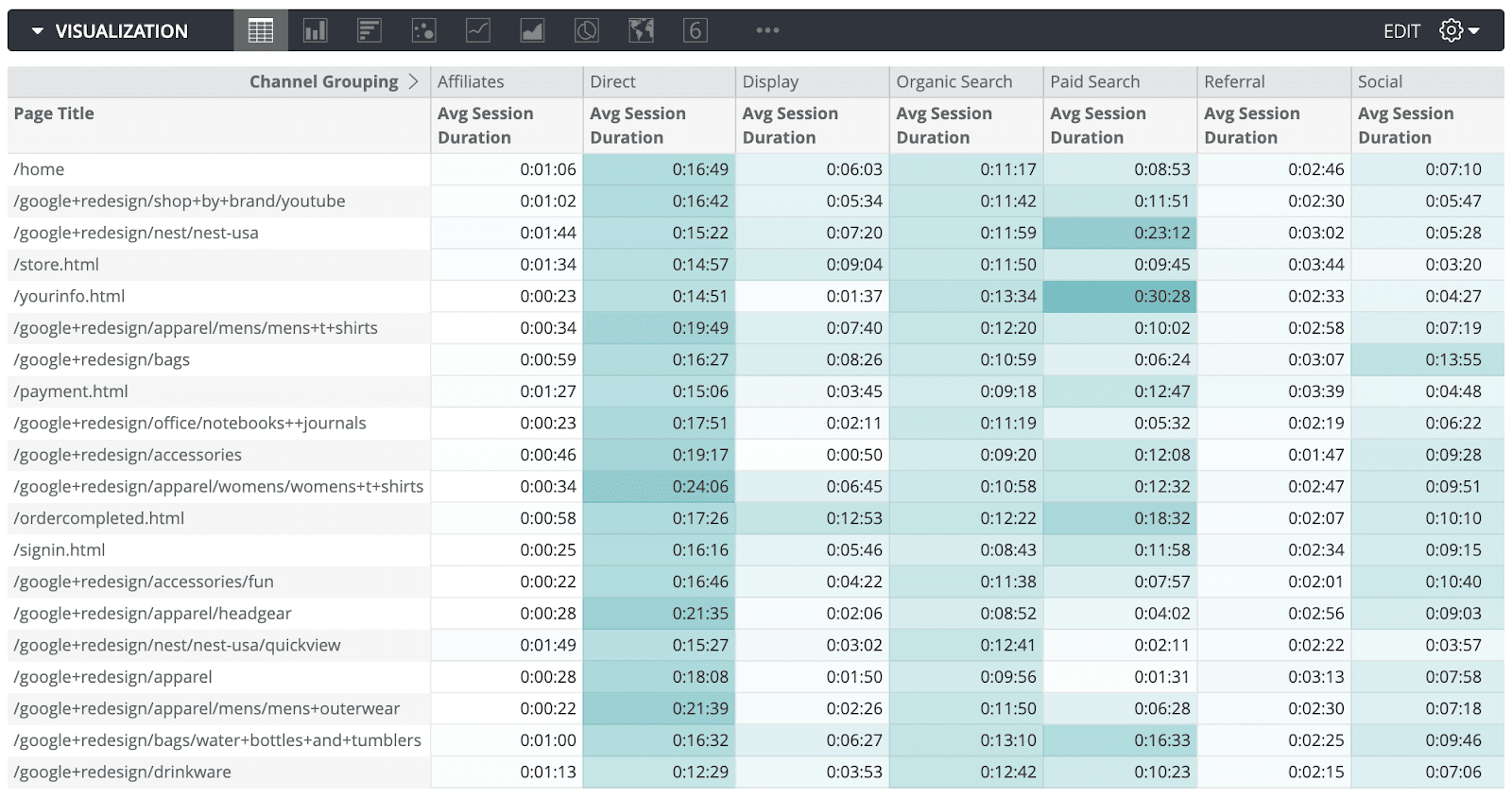

Interesting— sessions coming from paid searches and direct traffic show the most engagement.
Of course, after understanding visitor behavior better, a marketer’s eye naturally turns toward conversion. How do we get our visitors to become customers?
Questions in the conversion realm can be broken down like this:
Question: Where do we have opportunities to drive more traffic to high-performing web pages?
Goal: Show the relationship between values (conversion rates and number of sessions) to help pinpoint pages with high conversion rates that could be better promoted.
Outcome: Scatterplot
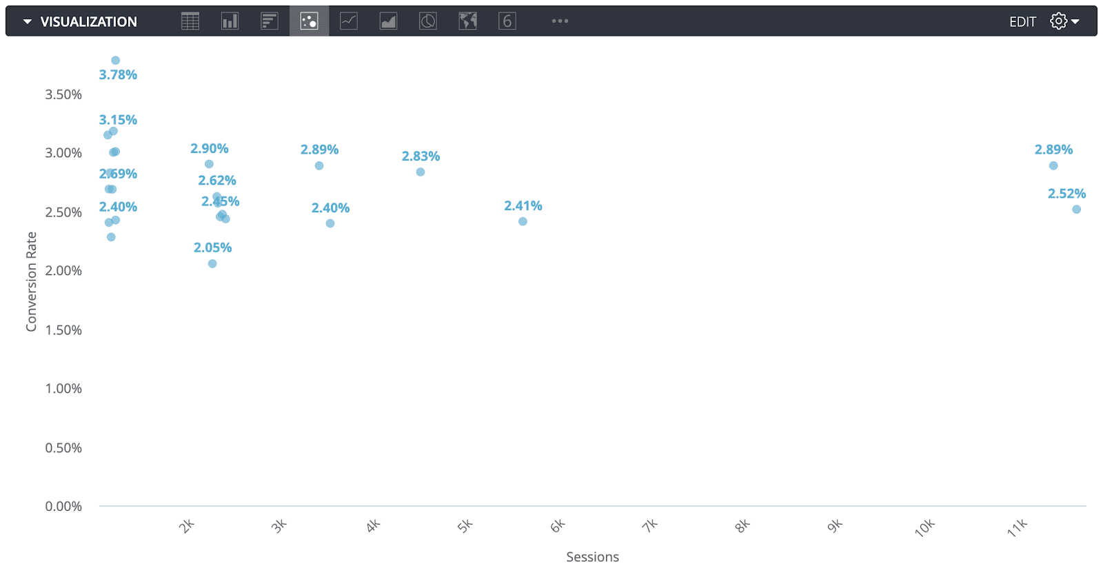

In this example, the page represented by the upper-left corner dot represents an opportunity to promote a page. This page has an extremely high conversion rate compared to the rest but barely sees any traffic.
This framework works for data across all industries, not just marketing.
Try it out for yourself. Take the next data question you encounter and write it out, identify what the goal behind the question is, and use the guidance above to choose the best chart.
Conclusion
Which chart you use impacts how people understand your data and what decisions they make based on that understanding. Happily, you now have some great tools in your pocket to help guide your choices.
Choosing the right chart is one part of the bigger story of communicating with data—but the colors you choose and the way you construct a dashboard also matter. To that end, keep an eye out for the next installment in our data visualization series on designing dashboards for UX/UI.
