Build a custom data viz with Data Studio community visualizations
Yulan Lin
Developer Advocate, Data Studio
Data Studio, Google’s free data visualization and business intelligence product, lets you easily connect to and report on data from hundreds of data sources. Over the past year, we’ve added more than 75 new features to Data Studio. We’ve heard from users that you want more chart options and flexibility, so you can tell more compelling stories with your data.
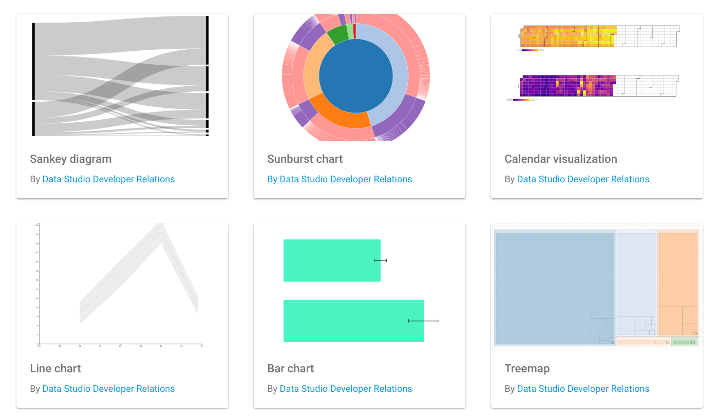
The new Data Studio community visualizations feature, now in developer preview, allows you to design your own custom visualizations and components for Data Studio. This is particularly useful for business intelligence teams who are building custom charts to improve business outcomes, whether it’s a funnel diagram to show conversions, or a network diagram to understand interconnected data. You can see a few sample custom visualizations here:
Using community visualizations
With this new feature, you can go beyond the standard charts that come with Data Studio. Community visualizations allow you to render your own custom JavaScript and CSS into a component that integrates with the rest of your Data Studio dashboard.
With community visualizations, you can:
- Create an endless variety of charts using JavaScript libraries
- Visualize any data that is already part of your dashboard
- Distribute these custom charts to users within your organization (or external stakeholders)
Once you write a custom visualization, end users can interact with the chart through the Data Studio UI just like they would with any other chart. For example, they can change data fields and edit styling options without diving back into the code. You can see how this works below (click on the image below to explore a custom visualization, then copy the report):

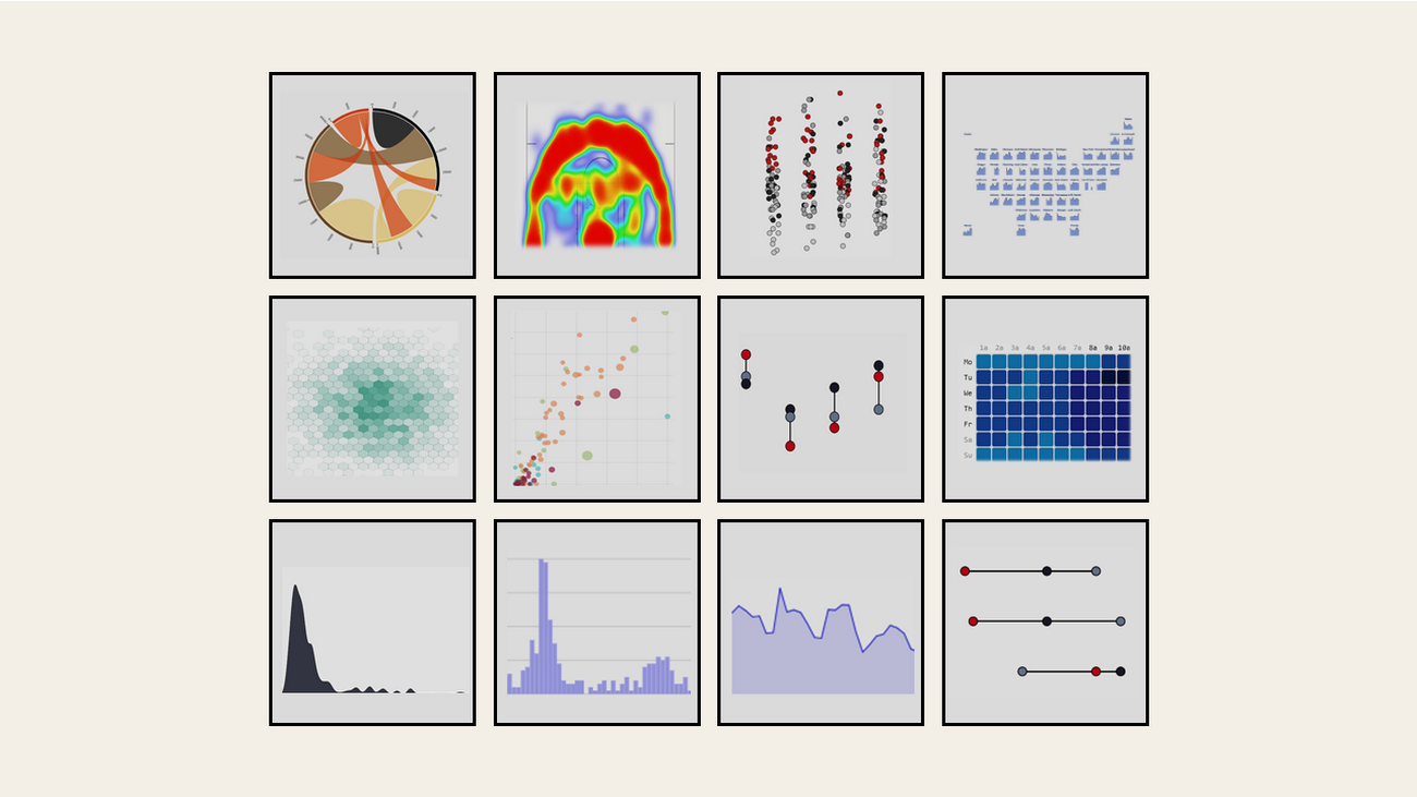
ClickInsight, a Google Marketing Platform partner, has been experimenting with community visualizations.
“Data Studio reports and dashboards have become indispensable to our clients, and community visualizations will enable us to more easily display the funnels, flows, and complex patterns that exist within their data,” says Marc Soares, Manager, Analytics Solutions at ClickInsight. “By combining community visualizations with the community connectors, we can develop fully customized, end-to-end reporting solutions for our clients. We can connect to any data source and visualize it exactly how we want, all while leveraging the powerful infrastructure of Data Studio.”
You can see some of ClickInsight’s visualizations here:
Building and sharing community visualizations
If you’ve ever written a visualization in JavaScript, you can build a community visualization. You can write something from scratch, or from any JavaScript charting library, including D3.js and Chart.js. You can even use your organization's internal visualization libraries and styling to create a unique visual identity.
The reports you build using community visualizations can be shared, just like any other Data Studio report. Additionally, you can share your visualization, allowing others with the same needs to use the visualization.
Getting started with community visualizations
A developer preview launch means that the API is stable, and the feature is ready for you to use. We also have a roadmap of features and improvements to extend the capabilities of community visualizations and create an even better experience for users and developers.
To get started visit the Data Studio community visualization gallery, complete the codelab, or visit our documentation. Once you’ve built a visualization you’d like to share, submit a report to the showcase, or share the code. Happy custom charting!